


注:本文案例转载于《CSS揭秘》这本书。
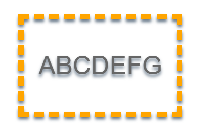
单侧投影
使用 box-shadow 的第四个参数:扩张半径。
box-shadow 0 8px 3px -3px rgba(0,0,0,.5)// 扩张半径的-3px刚好抵消左右两边的3px模糊半径
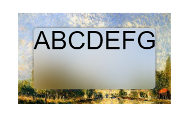
不规则投影
使用 filter的新属性 ~
如果直接使用box-shadow属性,在透明的边框处也会有阴影,比较难看。
border dashed 10px orange
filter drop-shadow(0 5px 3px #678)
染色效果
这里选取了书中最后一种染色效果的方法。需要固定元素的长宽。鼠标覆盖后无染色效果。

.dye
height: 180px
width: 300px
margin 40px auto
background-image url(https://img1.mukewang.com/szimg/5d9c62fb0907ccf012000676-360-202.png)
background-size: cover
background-color: hsl(335, 100%, 50%)
background-blend-mode: luminosity
transition: .5s background-color
&:hover
background-color: transparent
毛玻璃效果
.glass
height: 180px
width: 300px
margin 40px auto
position relative
font-size 50px
text-align center
background-size cover
background-image url(https://timgsa.baidu.com/timg?image&quality=80&size=b9999_10000&sec=1583310555581&di=17d19c3f990900846ab8cdba69d2aed8&imgtype=0&src=http%3A%2F%2Fphoto.16pic.com%2F00%2F30%2F48%2F16pic_3048628_b.jpg)
.main
position absolute
height 120px
width 240px
top 30px
left 30px
border-radius 7px
box-shadow 0 0 5px #666
background hsla(0,0%,100%,.3)
overflow hidden
z-index 100
&:before
content ''
position absolute
top 0
bottom 0
left 0
right 0
background-image url(https://timgsa.baidu.com/timg?image&quality=80&size=b9999_10000&sec=1583310555581&di=17d19c3f990900846ab8cdba69d2aed8&imgtype=0&src=http%3A%2F%2Fphoto.16pic.com%2F00%2F30%2F48%2F16pic_3048628_b.jpg)
filter blur(20px)
z-index -1
background-attachment: fixed
margin -30px // 防止边缘效果减弱
折角效果

mixin中:
folded-corner($background, $size, $angle=30deg)
position: relative
background:$background; /* 回退样式 */
background: linear-gradient($angle - 180deg, transparent $size, $background 0)
border-radius: .5em;
$x=$size/ sin($angle)
$y=$size / cos($angle)
&::before
content: ''
position: absolute
top: 0
right: 0
background: linear-gradient(to left bottom, transparent 50%, rgba(0,0,0,.2) 0, rgba(0,0,0,.4)) 100% 0 no-repeat
width: $y
height: $x
transform: translateY($y - $x) rotate(2*$angle - 90deg)
transform-origin: bottom right
border-bottom-left-radius: inherit
box-shadow: -.2em .2em .3em -.1em rgba(0,0,0,.2)
使用:
.fold-angle
height: 180px
width: 300px
margin 40px auto
folded-corner(#58a, 30px, 30deg)
css太难了。。看不懂= =直接用倒是很方便了。
标签:3px,angle,47,height,Css,background,shadow,CSS,size
来源: https://blog.csdn.net/qq_39083496/article/details/104615930


 247
247


 被折叠的 条评论
为什么被折叠?
被折叠的 条评论
为什么被折叠?
 到【灌水乐园】发言


