


前言
《css 揭秘》这本书以案例的形式,介绍了 47 个网页设计经典难题的解决方案,我在学习之余将其一一记录下来,方便以后回顾;本篇介绍下半部分 20-47 的案例效果及代码。
上一篇:《css揭秘》- 47个不可不知的 css 技巧(上篇0-19)
在线预览 play.csssecrets.io
20-连字符断行
介绍:连字符断行可以解决两端对齐时单词间距异常的 bug, 也就是 单词孤岛现象,css3 中引入了一个属性 hyphens,将其设置为 auto 可以达到我们想要的效果。
/**
 * Hyphenation
 */

width: 8.7em;
font: 180%/1.4 Baskerville, serif;
text-align: justify;
hyphens: auto;
21-插入换行
介绍:当基于结构与样式分离原则,使用语义化 ‘定义列表’ 标签来做样式时候,通常会遇到换行问题,下面介绍一种友好的解决方案。
<dl><dt>Name:</dt><dd>Lea Verou</dd><dt>Email:</dt><dd>lea@verou.me</dd><dd>leaverou@mit.edu</dd><dt>Location:</dt><dd>Earth</dd>
</dl>

/**
 * Inserting line breaks
 */

dt, dd {display: inline;margin: 0;
}

dd {font-weight: 600;
}

dd + dt::before {content: "\A";white-space: pre;
}

dd + dd::before {content: ', ';font-weight: normal;margin-left: -.25em;
}

body {font: 150%/1.6 Baskerville, Palatino, serif;
}
22-文本行的斑马条纹
背景知识:css 渐变、background-size、‘条纹背景’、‘灵活的背景定位’。
介绍:斑马线效果经常用在 table 里,其实文本行中也很适合,这里使用渐变背景来实现。
<pre><code>while (true) {var d = new Date();if (d.getDate()==1 &&d.getMonth()==3) {alert("TROLOLOL");}}</code>
</pre>/**
* Zebra striped text lines
*/
pre { padding: .5em;line-height: 1.5;background: hsl(20, 50%, 95%);background-image: linear-gradient(rgba(120,0,0,.1) 50%, transparent 0);background-size: auto 3em;background-origin: content-box;font-family: Consolas, Monaco, monospace;
}
code { font: inherit }
23-调整 tab 的宽度
介绍:当在网页中显示大量代码时候,默认的tab 锁进8个字符会显的过宽不好看,这里使用 css3 新的 tab-size 属性来改变 tab 锁进的字符数。
<pre><code>// Default tab size
while (true) {
var d = new Date();
if (d.getDate()==1 &&
d.getMonth()==3) {
alert("TROLOLOL");
}
}</code></pre>
/**
* Adjusting tabs
*/
pre { padding: .5em;line-height: 1.5;background: hsl(20, 50%, 95%);font-family: Consolas, Monaco, monospace;
}
pre:nth-of-type(2) { tab-size: 2 }
pre:nth-of-type(3) { tab-size: 4 }
pre:nth-of-type(4) { tab-size: 0 }
code {
font: inherit;
}
24-连字
介绍:英文字体中默认情况下有些字形之间会发生冲突,导致显示不清楚 比如大多数衬线字体中的 f 和 i, 这里介绍 css3 中引入的 font-variant-ligatures 来解决。
/**
 * Ligatures
 */

body {font: 200%/1.6 "Adobe Caslon Pro", Baskerville, serif;font-variant-ligatures: common-ligatures discretionary-ligatures historical-ligatures;
}
25-华丽的 & 符号
背景知识:通过 @font-face 规则实现基本的字体嵌入。
介绍:一种不通过额外的 dom 包裹,来单独对 & 符号进行美化的方案
<h1>HTML & CSS</h1>
/**
 * Fancy Ampersands
 */

@font-face {font-family: Ampersand;src: local('Baskerville-Italic'), local('GoudyOldStyleT-Italic'), local('Garamond-Italic'), local('Palatino-Italic');unicode-range: U+26;
}

h1 {font-family: Ampersand, Helvetica, sans-serif;
}
26-自定义下划线
背景知识:css 渐变、background-size、text-shadow、‘条纹背景’
介绍:默认的下划线虽然很实用,但是太普通,可能无法满满广大设计师们的审美需求,这里介绍一种自定义下划线的最佳方案。
防止下划线穿过文字底部、虚线下划线
<p>“The only way to <a>get rid of a temptation</a> is to <a>yield</a> to it.”</p>
<p>“The only way to <a>get rid of a temptation</a> is to <a>yield</a> to it.”</p>
/**
* Custom underlines
*/
body {font: 250%/1.6 Baskerville, Palatino, serif;
}
a {background: linear-gradient(gray, gray) no-repeat;background-size: 100% 1px;background-position: 0 1.02em;text-shadow: .05em 0 white, -.05em 0 white;
}
p:nth-child(2) a {background: linear-gradient(90deg, gray 66%, transparent 0) repeat-x;background-size: .2em 2px;background-position: 0 1em;
}
波浪下划线
<p>“The only way to <a>get rrid of a temptatoin</a> is to <a>yeild</a> to it.”</p>
/**
* Wavy underlines
*/
body {font: 250%/1.6 Baskerville, Palatino, serif;
}
a {background: linear-gradient(-45deg, transparent 40%, red 0, red 60%, transparent 0) 0 1em,linear-gradient(45deg, transparent 40%, red 0, red 60%, transparent 0) .1em 1em;background-repeat: repeat-x;background-size: .2em .1em;text-shadow: .05em 0 white, -.05em 0 white;
}
27-现实中的文字效果
背景知识:text-shadow
介绍:介绍几种艺术文字的实现方案
凸版印刷效果
/**
 * Letterpress
 */

body {font: 250%/1.6 Baskerville, Palatino, serif;
}

p {padding: .8em 1em;background: hsl(210, 13%, 60%);color: hsl(210, 13%, 30%);text-shadow: 0 1px 1px hsla(0,0%,100%,.8);
}

p + p {background: hsl(210, 13%, 30%);	color: hsl(210, 13%, 60%);text-shadow: 0 -1px 1px black;
}
空心字效果
/**
 * Stroked text
 */

h1 {margin: 0;color: white;
}

h1:first-child {text-shadow: 1px 1px black, -1px -1px black, 1px -1px black, -1px 1px black;
}

h1 text { fill: currentColor }
h1 use {stroke: black; stroke-width: 6;stroke-linejoin: round;
}

body {background: deeppink;font: bold 200%/1 Rockwell, serif;
}
文字外发光效果
<a href="http://csssecrets.io">Glow</a>
/**
 * Glowing text
 */

body {background: #203;font: bold 500%/1 Rockwell, serif;
}

a {color: #ffc;text-decoration: none;transition: 1s;
}

a:hover { text-shadow: 0 0 .1em, 0 0 .3em; }
文字凸起效果
/**
 * Extruded text
 */

body {background: #58a;color: white;text-shadow: 0 1px hsl(0,0%,85%), 0 2px hsl(0,0%,80%), 0 3px hsl(0,0%,75%), 0 4px hsl(0,0%,70%), 0 5px hsl(0,0%,65%), 0 5px 10px black;font: bold 500%/1 Rockwell, serif;
}
28-环形文字
背景知识:基本的 SVG
介绍:通过使用 SVG 路径来实现环形排列的文字效果
/**
 * Text on a circle
 */

body {font: bold 120% Helvetica, sans-serif;
}

.circular {width: 30em;height: 30em;margin: 4em auto 0;
}

.circular svg {display: block;overflow: visible;transition: 10s linear transform;
}

.circular svg:hover { transform: rotate(-2turn); }

.circular text { fill: currentColor }
.circular path { fill: none; }
29-选中合适的鼠标光标
主要就是介绍了 css3 中提供的一些新的鼠标光标效果,其中重点推荐了 cursor: not-allowed 和 隐藏光标的方法 cursor:none;
30-扩大可点击区域
介绍:根据Fitts 法则,我们推论出,目标越大,越容易到达,所以在目标大小固定的情况下,将可点击范围扩大,也可以提高用户体验,这里介绍两种方法。
透明边框 border 来实现
<button>+</button>
/**
 * Extending the hit area — with generated content
 */

button {position: relative;padding: .3em .5em;background: #58a;border-radius: 50%;border: 1px solid rgba(0,0,0,.3);box-shadow:0 .1em .2em -.05em rgba(0,0,0,.5);color: white;font: bold 150%/1 sans-serif;cursor: pointer;
}

button:before {content: '';position: absolute;top: -10px; right: -10px;bottom: -10px; left: -10px;
}
伪元素来实现
使用透明伪元素覆盖,并将半径向外延伸10px 来实现
<button>+</button>
/**
 * Extending the hit area — with generated content
 */

button {position: relative;padding: .3em .5em;background: #58a;border-radius: 50%;border: 1px solid rgba(0,0,0,.3);box-shadow:0 .1em .2em -.05em rgba(0,0,0,.5);color: white;font: bold 150%/1 sans-serif;cursor: pointer;
}

button:before {content: '';position: absolute;top: -10px; right: -10px;bottom: -10px; left: -10px;
}
31-自定义复选框
介绍:为了满足设计师的审美要求,我们需要提供复选框的自定义实现方案
<input type="checkbox" id="awesome" autofocus />
<label for="awesome">Awesome!</label>

<input type="checkbox" id="awesome2" checked />
<label for="awesome2">Awesome!</label>

<input type="checkbox" id="awesome3" disabled />
<label for="awesome3">Awesome!</label>

<input type="checkbox" id="awesome4" checked disabled />
<label for="awesome4">Awesome!</label>
/**
 * Custom checkboxes
 */

input[type="checkbox"] {position: absolute;clip: rect(0,0,0,0);
}

input[type="checkbox"] + label::before {content: '\a0';display: inline-block;vertical-align: .2em;width: .8em;height: .8em;margin-right: .2em;border-radius: .2em;background: silver;text-indent: .15em;line-height: .65;
}

input[type="checkbox"]:checked + label::before {content: '\2713';background: yellowgreen;
}

input[type="checkbox"]:focus + label::before {box-shadow: 0 0 .1em .1em #58a;
}

input[type="checkbox"]:disabled + label::before {background: gray;box-shadow: none;color: #555;cursor: not-allowed;
}

body {font: 150%/1.6 sans-serif;
}
32-通过阴影来弱化背景
背景知识:RGBA 颜色
介绍:通过遮罩层来弱化背景,很常见,但不完美之处在于需要额外的 HTML 元素,虽不是啥大问题,不过我们确实可以通过其他方法来摆脱这个麻烦。
box-shadow 方案
<img src="https://cdn.pixabay.com/photo/2014/12/16/22/25/woman-570883__480.jpg" class="lightbox" />
<p>Bacon ipsum dolor amet consectetu..........</p>
/**
 * Rudimetary overlay with box-shadow
 */

.lightbox {
	position: fixed;
	top: 50%; left: 50%;
	margin: -200px;
	box-shadow: 0 0 0 50vmax rgba(0,0,0,.8);
}
backdrop 原生方案
可改样式,兼容性不好,注意⚠️
/**
 * Native modal dialog (limited support)
 */

dialog::backdrop {
	background: rgba(0,0,0,.8)
}
33-通过模糊来弱化背景
背景知识:过渡动画,“毛玻璃效果”,“通过阴影来弱化背景”
介绍:通过背景虚化的原理,比上面通过阴影更能打造真实的效果,主要是通过滤镜、高斯模糊来实现的,通常叫这个毛玻璃效果。
<dialog>O HAI, I’m a dialog. Click on me to dismiss.</dialog>
<main><button>Show dialog</button><p>Bacon ipsum dolor sit amet consectetur</p>
</main>
/**
 * De-emphasizing by blurring (AND dimming)
 */

main {
	transition: .6s;
	background: white;
}

main.de-emphasized {
	-webkit-filter: blur(3px);
	filter: blur(3px);
}

dialog {
	position: fixed;
	top: 50%; left: 50%;
	z-index: 1;
	width: 10em;
	padding: 2em;
	margin: -5em;
	border: 1px solid silver;
	border-radius: .5em;
	box-shadow: 0 .2em .5em rgba(0,0,0,.5),
	0 0 0 100vmax rgba(0,0,0,.2);
}

dialog:not([open]) {
	display: none;
}

body {
	font: 150%/1.6 Baskerville, Palatino, serif;
}
34-滚动提示
背景知识:css 渐变, background-size
介绍:一种相比原生浏览器滚动条来说,更加优雅的滚动提示效果,当可滚动时,显示上下阴影效果。
<!-- Geeky cat names! -->
<ul>	<li>Ada Catlace</li>	<li>Alan Purring</li><li>Schrödingcat</li><li>Tim Purrners-Lee</li><li>Webkitty</li>	<li>Json</li><li>Void</li><li>Neko</li>	<li>NaN</li><li>Cat5</li><li>Vector</li>
</ul>

/**
 * Scrolling hints
 */

ul {display: inline-block;overflow: auto;width: 7.2em;height: 7em;border: 1px solid silver;padding: .3em .5em;list-style: none;margin-top: 2em;font: 100 200%/1.6 'Frutiger LT Std', sans-serif;background: linear-gradient(white 15px, hsla(0,0%,100%,0)) 0 0 / 100% 50px,radial-gradient(at top, rgba(0,0,0,.2), transparent 70%) 0 0 / 100% 15px,linear-gradient(to top, white 15px, hsla(0,0%,100%,0)) bottom / 100% 50px,radial-gradient(at bottom, rgba(0,0,0,.2), transparent 70%) bottom / 100% 15px;background-repeat: no-repeat;background-attachment: local, scroll, local, scroll;margin-top: 30px;
}
35-交互式的图片对比控件
背景知识:resize 属性
介绍:有时我们需要展示两张图片的外观差异,最常见的解决方案就是两张图片并排放置,然而这样人眼只能观察到非常明显的差异,从而忽略掉相对细小的区别。
还有一种更友好的解决方案业界叫做“图片对比滑动控件”,这个控件会把两张图片叠加起来,允许用户拖动分割条来控制这两张图片的显露区域,不过通常这种控件都需要依 赖 javascript 框架外加一大块 javascript 代码。 此书的亮点在于使用 纯 css 实现了这个控件。
<div class="image-slider"><div><img src="http://placekitten.com/200/300" alt="Before" /></div><img src="http://static.runoob.com/images/demo/demo2.jpg" />
</div>
/**
 * Interactive image comparison - with CSS resize
 */

.image-slider {position:relative;display: inline-block;
}

.image-slider > div {position: absolute;top: 0; bottom: 0; left: 0;width: 50%;max-width: 100%;overflow: hidden;resize: horizontal;
}

.image-slider > div:before {content: '';position: absolute;right: 0; bottom: 0;width: 12px; height: 12px;padding: 5px;background: linear-gradient(-45deg, white 50%, transparent 0);background-clip: content-box;cursor: ew-resize;-webkit-filter: drop-shadow(0 0 2px black);filter: drop-shadow(0 0 2px black);
}

.image-slider img {display: block;user-select: none;
}
36-自适应内部元素
介绍:使用 width: min-content; 来将内部文本宽度根据最小内容宽度计算,得到如下案例,文字的换行宽度依据图片的宽度。
<p>Let’s assume we have some text here. Bacon ipsum dolor sit amet turkey veniam shankle, culpa short ribs kevin t-bone occaecat.</p>
<figure><img src="http://placekitten.com/g/200/300" /><figcaption>The great Sir Adam Catlace was named after Countess Ada Lovelace, the first programmer ever.</figcaption>
</figure>
<p>We also have some more text here. Et laborum venison nostrud, ut veniam sint kielbasa ullamco pancetta.</p>

/**
 * Intrinsic sizing
 */

figure {max-width: 300px;max-width: min-content;margin: auto;
}

figure > img { max-width: inherit }

/* Basic styling */

figure {padding: 10px;border: 1px solid silver;
}
37-精确控制表格列宽
介绍:display: table 布局的用法,相比传统的table 表格更加可控。
/**
 * Taming table column widths
 */

body { background: #ddd }

section {width: 500px;margin: 2em;background: white;
}

table {border-collapse: collapse;margin-bottom: 1em;width: 100%;
}

section + section table { table-layout: fixed }

td {border: 1px solid #aaa;
}

td.preformatted {white-space: pre;font-family: Consolas, Monaco, monospace;text-overflow: ellipsis;overflow: hidden;
}
38-根据兄弟元素的数量来设置样式
背景知识:nth-child(n+b) 会选中 所有从 b 个开始的所有子元素
介绍:某些场景下,我们需要根据兄弟元素的数量来为它们设置样式,比如: 电子邮件列表,当列表中只有少量列表项,我们可以为每一项展示多行预览文字;当列表项不断增加时,需要逐渐减少每一项的预览行数。
调色板程序,每个色块都展示出配套的控件,当色块的数量不断增加时,它们所占据的空间也相应增加,此时我嗯可能希望色块的控件变得紧凑一些。
这里通过 nth-child() 来实现效果。
<ul class="palette"><li><div class="color-options"><a class="add" href="#">Add</a><a class="delete" href="#">Delete</a></div></li>
</ul>

/**
 * Styling by sibling count: Color palette example
 */

/* Hide "color" 4 items or more */
.palette li:first-child:nth-last-child(n+4) .color-options a:after,
.palette li:first-child:nth-last-child(n+4) ~ li .color-options a:after {content: none;
}

/* Hide word when 6 items or more */
.palette li:first-child:nth-last-child(n+6) .color-options a,
.palette li:first-child:nth-last-child(n+6) ~ li .color-options a {color: transparent;font-size: 0;
}

.palette li:only-child .delete {display:none;
}

/* From this point it’s just styling */
.palette {display: flex;height: 200px;max-width:900px;font: bold 90%/1 sans-serif;
}

.palette li {flex: 1;list-style: none;background: #D6E055;
}

.color-options {background: rgba(0,0,0,.5);padding: 10px;margin: 0 10px;overflow:hidden;border-radius:0 0 10px 10px;
}

.color-options .add { float:left; }
.color-options .delete { float:right; }

.color-options a {color: white;text-decoration:none;
}

.color-options a:before {display:inline-block;font-size: 1rem;width:1.3rem;margin-right:.3rem;text-align: center;line-height: 1.3;background:white;border-radius: 50%;letter-spacing: normal;
}

.color-options .add:before {content:'✚';color:#590;
}

.color-options .delete:before {content:'✖';color:#b00;
}

.color-options a:after {content: ' color';font-weight: normal;
}
39-满幅的背景,定宽的内容
介绍:很多官网或者页脚区域都是这样的设计,一大张背景图,上面定宽区域显示文字内容,这需要至少2个HTML 元素来实现, 一个负责背景,一个负责内容区域的包裹,通过 margin 实现居中。
这里使用 calc 动态计算元素位置来去掉了多余的 HTML 元素
<header><h1>Fluid background, fixed content</h1>
</header>
<section><h1>Heading</h1><p>Bacon ipsum dolor amet voluptate et shoulder, ipsum flank tongue exercitation commodo sed beef ribs drumstick in venison laborum. Laboris ut enim id drumstick, et aute esse. Consequat ad kielbasa anim pork loin turkey qui cupidatat drumstick doner labore. Nulla sirloin jerky do sed magna meatloaf. Ribeye ea ut elit leberkas laboris sausage corned beef drumstick cillum non.</p>
</section>
<section><h1>Another heading</h1><p>Nostrud landjaeger cillum beef cow tail cupidatat non mollit voluptate jowl. Enim sunt in, flank hamburger proident qui. Id aute excepteur chuck magna tempor ipsum pork chop t-bone. Frankfurter meatball pork loin beef et leberkas pork. Pig ball tip pancetta in.</p><p>Ribeye in veniam ipsum flank. Elit incididunt t-bone proident meatball. Porchetta exercitation prosciutto sausage chuck ut eu brisket shank pastrami turkey sunt laboris tenderloin anim. Landjaeger do venison laboris kevin.</p>
</section>
<footer><p>© 2015 Lea Verou (j/k, feel free to use wherever)</p><p>Consectetur et t-bone pork loin. Tri-tip cupim in, spare ribs velit exercitation in. Tempor cillum fugiat, nisi leberkas reprehenderit anim laboris proident cow. Eu fatback kevin sint, ad shoulder in venison picanha. Sausage drumstick capicola, culpa boudin pork belly minim aute ipsum biltong picanha venison nulla adipisicing.</p>
</footer>
/**
* Fluid background, fixed content
*/
header, section, footer {padding: 1em calc(50% - 350px);
}
footer {background: #333;color: white;
}
header {background: orange;color: white;
}
section + section {background: #eee;
}
body {margin: 0;font: 100%/1.5 sans-serif;
}
40-垂直居中
介绍了几种垂直居中的方案,其中提出 flex 是最佳选择
基于绝对定位的解决方案
利用绝对定位和CSS变形属性来实现,不用固定设置宽高,但是这个方案也有不足,比如:
绝对定位有时对整个布局的影响太多强烈;
如果居中的元素在高度上超过视口,顶部会被裁切掉;
某些浏览器中会导致元素显示有些模糊,因为元素可能被放置在半个像素上,虽然可以通过 transform-style: preseve-3d 来修复,不过hack 意味太浓,不太可靠。
<main><h1>Am I centered yet?</h1><p>Center me, please!</p>
</main>
/**
 * Vertical centering - absolute positioning method
 */

main {position: absolute;top: 50%;left: 50%;transform: translate(-50%, -50%);padding: 1em 1.5em;box-sizing: border-box;background: #655;color: white;text-align: center;
}

h1 {margin: 0 0 .2em;font-size: 150%;
}

p {margin: 0;
}

body {background: #fb3;font: 100%/1.5 sans-serif;
}
基于视口单位的解决方案
此方案实用性有限,因为它只适用于在视口中居中的场景。
<main><h1>Am I centered yet?</h1><p>Center me, please!</p>
</main>/**
 * Vertical centering - Viewport unit method
 */

main {width: 18em;padding: 1em 1.5em;margin: 50vh auto 0;transform: translateY(-50%);box-sizing: border-box;background: #655;color: white;text-align: center;
}

h1 {margin: 0 0 .2em;font-size: 150%;
}

p {margin: 0;
}

body {background: #fb3;font: 100%/1.5 sans-serif;
}
基于 Flexbox 的解决方案 一( align-items: center)
<main>Center me, please!
</main>

/**
 * Vertical centering - Flexbox solution for text
 */

body {display: flex;align-items: center;min-height: 100%;margin: 0;
}

html { height: 100% }

main {display: flex;justify-content: center;align-items: center;width: 18em;height: 10em;padding: 1em 1.5em;margin: 0 auto;box-sizing: border-box;background: #655;color: white;text-align: center;
}

h1 {margin: 0 0 .2em;font-size: 150%;
}

p {margin: 0;
}

body {background: #fb3;font: 100%/1.5 sans-serif;
}
基于 Flexbox 的解决方案 二(margin: auto)
亮点在于这里并不是用的 align-items: center; 而是对子元素设置 margin: auto; 当使用 Flexbox 时,margin: auto 不仅在水平方向上将元素居中,垂直方向上也是如此。
<main><h1>Am I centered yet?</h1><p>Center me, please!</p>
</main>/**
 * Vertical centering - Flexbox solution
 */

* { margin: 0 }

body {display: flex;min-height: 100vh;
}

main {padding: 1em 2em;margin: auto;box-sizing: border-box;background: #655;color: white;text-align: center;
}

h1 {margin-bottom: .2em;font-size: 150%;
}

body {background: #fb3;font: 100%/1.5 sans-serif;
}
41-紧贴底部的页脚
背景知识:视口相关的长度单位 vw, vh ,calc()
介绍:当页面较短时,底部页脚 foolter 区域不能紧贴在底部,而是紧跟在内容的下方。这里提供了2 种方案来解决这个问题。
固定高度的解决方案
<header>
	<h1>Site name</h1>
</header>
<main><input type="checkbox" id="contents" /><label for="contents">Toggle contents</label><p>Bacon ipsum dolor sit amet turkey veniam shankle, culpa short ribs kevin t-bone occaecat. Et laborum venison nostrud, ut veniam sint kielbasa ullamco pancetta. Qui drumstick tail, bacon leberkas shoulder capicola laborum. Minim ipsum bacon, mollit laboris t-bone pariatur. Ham hock reprehenderit sint beef, sausage pig eiusmod t-bone shankle strip steak.</p><p>Cow enim excepteur, boudin dolore lorem magna fugiat consequat voluptate. Picanha fugiat chicken, cupim aliquip magna filet mignon prosciutto ut nostrud. Kielbasa rump frankfurter sunt corned beef. Andouille in cillum deserunt, rump et picanha landjaeger tongue anim.</p><p>Ad meatball ipsum ground round shank. Quis ipsum meatball exercitation. Laborum swine spare ribs, sunt ball tip magna t-bone venison. Velit doner voluptate non occaecat do ribeye kevin strip steak et. Esse biltong shank ribeye dolor pariatur aute deserunt non est eiusmod pork belly pancetta pork chop. Pork chop id consectetur rump, meatball short loin brisket tail andouille deserunt alcatra irure prosciutto do.</p><p>Dolore reprehenderit ex, meatball doner commodo consectetur ea ribeye. Ad aliqua kevin, chuck excepteur minim et cow esse ham hock landjaeger. Alcatra bresaola dolore tempor do, excepteur in velit flank officia dolore meatloaf corned beef picanha. Eu pancetta brisket eiusmod ipsum aute sausage, culpa rump shoulder excepteur nostrud venison sed pork loin. Tempor proident do magna ground round. Ut venison frankfurter et veniam dolore. Pig pork belly beef ribs kevin, doner exercitation magna esse shankle.</p><p>Flank anim chuck boudin id consectetur bresaola ham pork loin cupim andouille frankfurter. Proident do ball tip nostrud nulla sed, frankfurter ut commodo corned beef ut. Ex aute in, pig deserunt beef ribs turducken pastrami irure ball tip pork belly pork chop sausage id. Chicken sunt nisi tempor sed. In eiusmod non fatback tempor tenderloin pastrami adipisicing cow lorem ut tail jerky cupidatat venison. Jowl consequat commodo pork loin ipsum pork belly prosciutto aute beef. Ball tip shoulder aliqua, fugiat landjaeger kevin pork chop beef ribs leberkas hamburger cillum turkey ut doner culpa.</p>
</main>
<footer><p>© 2015 No rights reserved.</p><p>Made with ♥ by an anonymous pastafarian.</p>
</footer>

/**
 * Sticky footer with fixed height
 */

main {min-height: calc(100vh - 5em - 7em);
}

/* Toggle checkbox to alternate between short/long content */
#contents:checked ~ p { display: none }

/* Basic styling */
body {margin: 0;font: 100%/1.5 Palatino Linotype, Palatino, serif;
}

h1 { margin: .5em 0 0; }

header { text-align: center; height: 3em; }

main, footer {display: block;padding: .5em calc(50% - 400px);
}

footer {background: linear-gradient(#222, #444);color: white;height: 6em;
}
更灵活的解决方案 Flexbox
/**
 * Sticky footer with flexible height
 */

body {display: flex;flex-direction: column;min-height: 100vh;
}

main {flex: 1;
}

/* Toggle checkbox to alternate between short/long content */
#contents:checked ~ p { display: none }

/* Basic styling */
body {margin: 0;font: 100%/1.5 Baskerville, Palatino Linotype, Palatino, serif;
}

h1 { margin: .5em 0 0; }

header { text-align: center; height: 3em; }

main, footer {display: block;padding: .5em calc(50% - 400px);
}

footer {background: linear-gradient(#222, #444);color: white;
}
42-缓动效果
背景知识:基本的 css 过渡,基本的 css 动画
介绍:给过渡和动画加上缓动效果可以使界面显得更加的生动和真实,毕竟在现实世界中,物体从A 点到 B 点到移动往往不是完全匀速的。
下面基于 css 动画实现了一个回弹效果
弹跳动画
<div class="ball"></div>

/**
 * Bouncing animation
 */

@keyframes bounce {60%, 80%, to {transform: translateY(400px);animation-timing-function: ease;}70% { transform: translateY(300px); }90% { transform: translateY(360px); }
}

.ball {width: 0; height: 0; padding: 1.5em;border-radius: 50%;margin: auto;background: red radial-gradient(at 30% 30%, #fdd, red);animation: bounce 2s cubic-bezier(.1,.25,1,.25) forwards;
}

body {background: linear-gradient(skyblue, white 450px, yellowgreen 0);min-height: 100vh;
}
弹性过渡
下面这个输入框在 focus 的时候会显示出一个 tips , 我们通过过渡和自定义调速函数 cubic-bezier() 来改善下效果,使其更加生动。
<label>Your username:<input value="leaverou"></input><span class="callout">Only letters, numbers, underscores (_) and hyphens (-) allowed!</span>
</label>/**
 * Elastic transitions
 */

input:not(:focus) + .callout:not(:hover) {transform: scale(0);transition: .25s transform;
}

.callout {transition: .5s cubic-bezier(.25,.1,.3,1.5) transform;transform-origin: 1.4em -.4em;
}

/* Styling */
body {padding: 1.5em;font: 200%/1.6 Baskerville;
}

input {display: block;padding: 0 .4em;font: inherit;
}

.callout {	position: absolute;max-width: 14em;padding: .6em .8em;border-radius: .3em;margin: .3em 0 0 -.2em;background: #fed;border: 1px solid rgba(0,0,0,.3);box-shadow: .05em .2em .6em rgba(0,0,0,.2);font-size: 75%;
}

.callout:before {content: "";position: absolute;top: -.4em;left: 1em;padding: .35em;background: inherit;border: inherit;border-right: 0;border-bottom: 0;transform: rotate(45deg);
}
反面案例-对颜色的弹性过渡
虽然这种效果挺有趣,但是在 UI 的场景下通常是不合适的。
/**
 * Elastic color
 */

html {background: rgb(100%, 0%, 40%);transition: 1s cubic-bezier(.25,.1,.2,3);
}

html:hover {background: gray;
}
43-逐帧动画
背景知识:基本的 css 动画,“缓动效果”
介绍: 使用 css 实现一个 loading 动画, 主要原理是对一张 png 图片进行 background-position 偏移动画。
<div class="loader">Loading…</div>

/**
 * Frame-by-frame animations
 */

@keyframes loader {to { background-position: -800px 0; }
}

.loader {width: 100px;height: 100px;text-indent: 999px;overflow: hidden; /* Hide text */background: url(http://dabblet.com/img/loader.png) 0 0;animation: loader 1s infinite steps(8);
}
44-闪烁效果
背景知识:基本的 css 动画,“逐帧动画”
介绍:以前有一个 blink 标签可以达到文字闪烁的效果,但是被滥用和诟病,现在主流浏览器都不在支持了,不过闪烁效果在某些场景下还是对可用性有益的。
/**
 * Blinking
 */

@keyframes blink-1 { 50% { color: transparent } }
@keyframes blink-2 { to { color: transparent } }

p {padding: 1em;background: gold;
}

.blink-smooth-1 {animation: 1s blink-1 3;
}

.blink-smooth-2 {animation: .5s blink-2 6;animation-direction: alternate;
}

.blink {animation: 1s blink-1 3 steps(1);
}
45-打字动画
介绍:使用 css 模拟打字效果
<h1>CSS is awesome!</h1>
/**
 * Typing animation
 */

@keyframes typing {from { width: 0 }
}

@keyframes caret {50% { border-right-color: transparent; }
}

h1 {font: bold 200% Consolas, Monaco, monospace;/*width: 8.25em;*/width: 15ch;white-space: nowrap;overflow: hidden;border-right: .05em solid;animation: typing 8s steps(15), caret 1s steps(1) infinite;
}
46-状态平滑的动画
背景知识:基本的 css 动画, animation-direction (在 “闪烁效果”中曾简要提及)
介绍:本案例实现了,当动画终止时,不会僵硬的回到初始状态而是停留在当前帧。
<div class="panoramic"></div>
/**
 * Smooth state animations
 * Photo credits: https://www.flickr.com/photos/employtheskinnyboy/3904743709
 */

@keyframes panoramic {to { background-position: 100% 0; }
}

.panoramic {width: 150px; height: 150px;background: url('http://c3.staticflickr.com/3/2671/3904743709_74bc76d5ac_b.jpg');background-size: auto 100%;	animation: panoramic 10s linear infinite alternate;animation-play-state: paused;
}

.panoramic:hover, .panoramic:focus {animation-play-state: running;
}
47-沿环形路径平移的动画
背景知识: css 动画,css 变形, “平行四边形”, “菱形图片”, “闪烁效果”
介绍:一个实用的案例,元素沿环形路径移动的两种方案
需要两个元素的解决方案
<div class="path"><div class="avatar"><img src="http://lea.verou.me/book/adamcatlace.jpg" /></div>
</div>

/**
 * Animation along a circular path - Solution 1
 */

@keyframes spin {to { transform: rotate(1turn); }
}

.avatar {animation: spin 3s infinite linear;transform-origin: 50% 150px;
}

.avatar > img {animation: inherit;animation-direction: reverse;
}

/* Anything below this is just styling */

.avatar {width: 50px;margin: 0 auto;border-radius: 50%;overflow: hidden;
}

.avatar > img {display: block;width: inherit;
}

.path {width: 300px; height: 300px;padding: 20px;border-radius: 50%;background: #fb3;
}
单个元素的解决方案
<div class="path"><img src="http://lea.verou.me/book/adamcatlace.jpg" class="avatar" />
</div>

/**
 * Animation along a circular path - Solution 2
 */

@keyframes spin {from {transform: rotate(0turn) translateY(-150px) translateY(50%) rotate(1turn)}to {transform: rotate(1turn) translateY(-150px) translateY(50%) rotate(0turn);}
}


.avatar {animation: spin 3s infinite linear;
}

/* Anything below this is just styling */

.avatar {display: block;width: 50px;margin: calc(50% - 25px) auto 0;border-radius: 50%;overflow: hidden;
}

.path {width: 300px; height: 300px;padding: 20px;margin: 100px auto;border-radius: 50%;background: #fb3;
}
总结
我在本篇文章中整理了《css揭秘中》47个有趣的css 技巧案例 20-47 部分,通过温习这本书,学习到了很多 css 技巧,这本书是 6 年前出版的,但是里面很多知识到现在都还是令人眼前一亮,非常值得阅读。
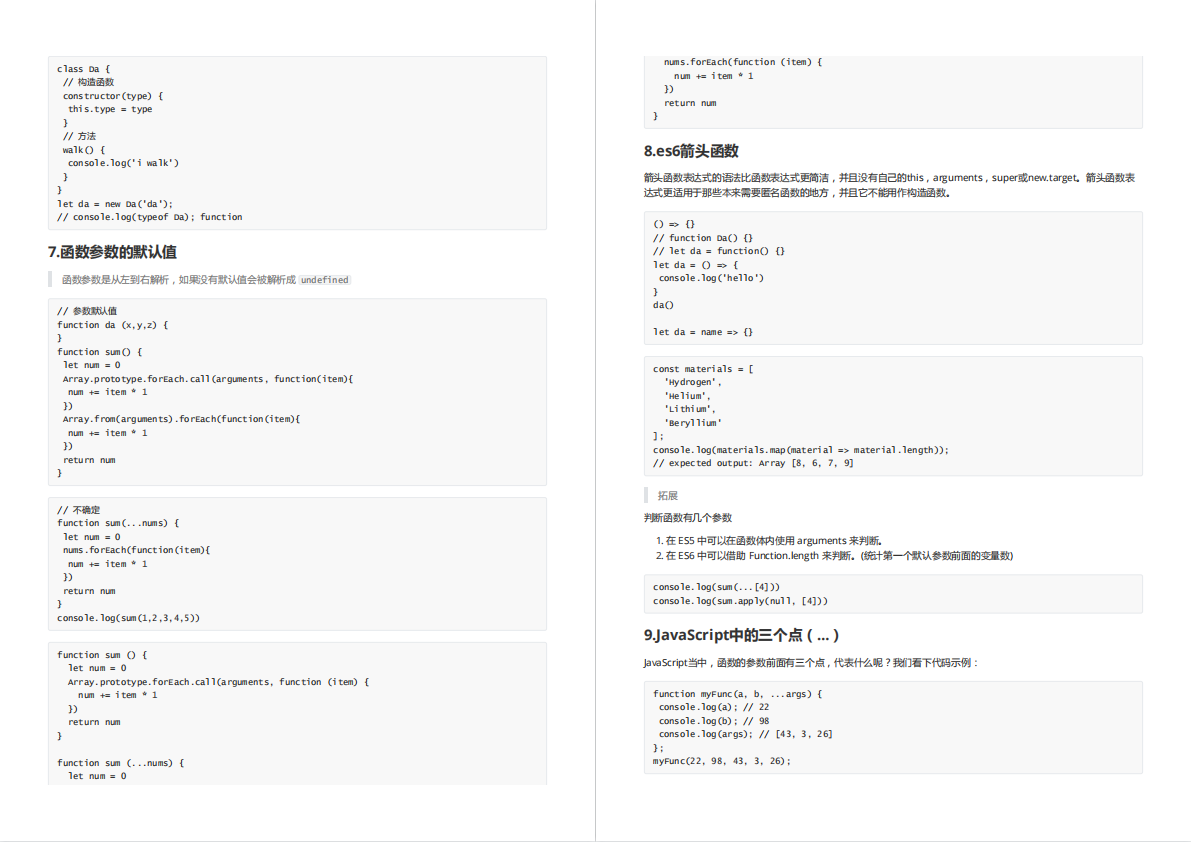
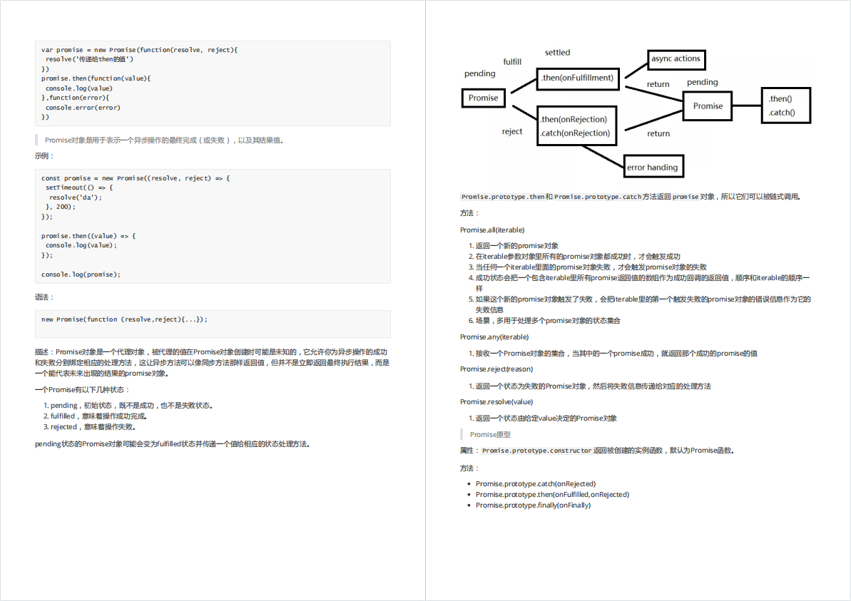
最后,最近还整理一份JavaScript与ES的笔记,一共25个重要的知识点,对每个知识点都进行了讲解和分析。能帮你快速掌握JavaScript与ES的相关知识,提升工作效率。
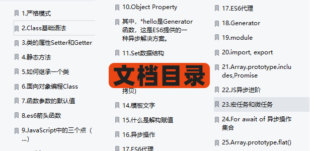

有需要的小伙伴,可以点击下方卡片领取,无偿分享


 5255
5255


 被折叠的 条评论
为什么被折叠?
被折叠的 条评论
为什么被折叠?
 到【灌水乐园】发言


