


前言
现在的手机品牌和型号越来越多,导致我们平时写布局的时候会在个不同的移动设备上显示的效果不同
比如我们的设计稿一个View的大小是300px,如果直接写300px,可能在当前设备显示正常,但到了其他设备可能就会偏小或者偏大,这就需要我们对屏幕进行适配。
安卓原生的话有自己的适配规则,可以根据不同的尺寸建立不同的文件夹,系统会根据当前的设备尺寸取对应的大小的布局。而flutter本身并没有适配规则,而原生的又比较繁琐,这就需要我们自己去对屏幕进行适配。
当然如果你是刚刚接触到Android这块,没有明确的学习方向也没关系,我把我对这方面的一些理解即看法做了一份资料,放到文章后面了,需要的自行领取。
flutter 屏幕适配方案

最新版请看github文档 ,api有些许改动
使用方法:
安装依赖:
安装之前请查看最新版本
dependencies: flutter: sdk: flutter # 添加依赖 flutter_screenutil: ^0.4.2在每个使用的地方导入包:
import 'package:flutter_screenutil/flutter_screenutil.dart';初始化设置尺寸
在使用之前请设置好设计稿的宽度和高度,传入设计稿的宽度和高度(单位px)
一定在MaterialApp的home中的页面设置(即入口文件,只需设置一次),以保证在每次使用之前设置好了适配尺寸:
//设置适配尺寸 (填入设计稿中设备的屏幕尺寸) 假如设计稿是按iPhone6的尺寸设计的(iPhone6 750*1334) ScreenUtil.instance = ScreenUtil(width: 750, height: 1334)..init(context);使用:
适配尺寸:
传入设计稿的px尺寸:
根据屏幕宽度适配 width: ScreenUtil().setWidth(540),
根据屏幕高度适配 height: ScreenUtil().setHeight(200),
注意
高度也根据setWidth来做适配可以保证不变形(当你想要一个正方形的时候)
setHeight方法主要是在高度上进行适配, 在你想控制UI上一屏的高度与实际中显示一样时使用.
例如:
//长方形:Container( width: ScreenUtil().setWidth(375), height: ScreenUtil().setHeight(200), ), //如果你想显示一个正方形:Container( width: ScreenUtil().setWidth(300), height: ScreenUtil().setWidth(300), ),适配字体:
ScreenUtil().setSp(28) //传入字体大小,根据系统的“字体大小”辅助选项来进行缩放 ScreenUtil().setSp(28,false) //传入字体大小,不会根据系统的“字体大小”辅助选项来进行缩放for example: Text( 'My font size is 28px and will not change with the system.', style: TextStyle( color: Colors.black, fontSize: ScreenUtil().setSp(28, false) ) ),其他相关api:
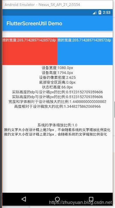
ScreenUtil.pixelRatio //设备的像素密度 ScreenUtil.screenWidth //设备宽度 ScreenUtil.screenHeight //设备高度 ScreenUtil.bottomBarHeight //底部安全区距离,适用于全面屏下面有按键的 ScreenUtil.statusBarHeight //状态栏高度 刘海屏会更高 单位px ScreenUtil.textScaleFactory //系统字体缩放比例 ScreenUtil().scaleWidth // 实际宽度的dp与设计稿px的比例 ScreenUtil().scaleHeight // 实际高度的dp与设计稿px的比例 //导入import 'package:flutter_screenutil/flutter_screenutil.dart';... @override Widget build(BuildContext context) { //设置适配尺寸 (填入设计稿中设备的屏幕尺寸) 假如设计稿是按iPhone6的尺寸设计的(iPhone6 750*1334) ScreenUtil.instance = ScreenUtil(width: 750, height: 1334)..init(context); print('设备宽度:${ScreenUtil.screenWidth}'); //Device width print('设备高度:${ScreenUtil.screenHeight}'); //Device height print('设备的像素密度:${ScreenUtil.pixelRatio}'); //Device pixel density print( '底部安全区距离:${ScreenUtil.bottomBarHeight}'); //Bottom safe zone distance,suitable for buttons with full screen print( '状态栏高度:${ScreenUtil.statusBarHeight}px'); //Status bar height , Notch will be higher Unit px print('实际宽度的dp与设计稿px的比例:${ScreenUtil().scaleWidth}'); print('实际高度的dp与设计稿px的比例:${ScreenUtil().scaleHeight}'); print( '宽度和字体相对于设计稿放大的比例:${ScreenUtil().scaleWidth * ScreenUtil.pixelRatio}'); print( '高度相对于设计稿放大的比例:${ScreenUtil().scaleHeight * ScreenUtil.pixelRatio}'); print('系统的字体缩放比例:${ScreenUtil.textScaleFactory}'); return new Scaffold( appBar: new AppBar( title: new Text(widget.title), ), body: new Center( child: Column( crossAxisAlignment: CrossAxisAlignment.center, children: [ Row( children: [ Container( width: ScreenUtil().setWidth(375), height: ScreenUtil().setHeight(200), color: Colors.red, child: Text( '我的宽度:${ScreenUtil().setWidth(375)}dp', style: TextStyle( color: Colors.white, fontSize: ScreenUtil().setSp(12, false), ), ), ), Container( width: ScreenUtil().setWidth(375), height: ScreenUtil().setHeight(200), color: Colors.blue, child: Text('我的宽度:${ScreenUtil().setWidth(375)}dp', style: TextStyle( color: Colors.white, fontSize: ScreenUtil().setSp(12, false), )), ), ], ), Text('设备宽度:${ScreenUtil.screenWidth}px'), Text('设备高度:${ScreenUtil.screenHeight}px'), Text('设备的像素密度:${ScreenUtil.pixelRatio}'), Text('底部安全区距离:${ScreenUtil.bottomBarHeight}px'), Text('状态栏高度:${ScreenUtil.statusBarHeight}px'), Text( '实际高度的dp与设计稿px的比例:${ScreenUtil().scaleHeight}', textAlign: TextAlign.center, ), Text( '实际高度的dp与设计稿px的比例:${ScreenUtil().scaleHeight}', textAlign: TextAlign.center, ), Text( '宽度和字体相对于设计稿放大的比例:${ScreenUtil().scaleWidth * ScreenUtil.pixelRatio}', textAlign: TextAlign.center, ), Text( '高度相对于设计稿放大的比例:${ScreenUtil().scaleHeight * ScreenUtil.pixelRatio}', textAlign: TextAlign.center, ), SizedBox( height: ScreenUtil().setHeight(100), ), Text('系统的字体缩放比例:${ScreenUtil.textScaleFactory}'), Column( crossAxisAlignment: CrossAxisAlignment.start, children: [ Text('我的文字大小在设计稿上是14px,不会随着系统的文字缩放比例变化', style: TextStyle( color: Colors.black, fontSize: ScreenUtil().setSp(14, false))), Text('我的文字大小在设计稿上是14px,会随着系统的文字缩放比例变化', style: TextStyle( color: Colors.black, fontSize: ScreenUtil().setSp(14))), ], ) ], ), ), ); }使用示例:
效果:
适配原理
说一下适配方案, 比如我们设计师设计的UI是根据Iphone6来做的,我们知道 iPhone6的分辨率是750*1334(px),
又或者是根据hdpi的设备来设计的UI,我们知道hdpi的 Android设备是 (240 dpi),像素密度是1.5,即hdpi设备的分辨率宽度是320px, 总之,无论设计稿的单位是px,或者是dp,我们都能够转换成px.
那么我们如果根据px来适配,ios和 android 就都可以兼容了.
假设,我们的设计稿手机是10801920 px.
设计稿上有一个540960 的组件, 即宽度和宽度是手机的一半. 如果我们直接写的时候组件的尺寸这么定义,在其他尺寸的设备上未必是一半,或多,或少. 但是我们可以按比例来看,即我们要实现的宽度是实际设备的一半.
那么假设我们设备的宽度是deviceWidth和deviceHeight , 我们要写的组件大小为: 宽:(540/1080)*deviceWidth,高度: (960/1920)*deviceHeight.
通过这个公式我们可以发现,我们要写的组件宽度就是设计稿上的尺寸width*(deviceWdith/原型设备宽度).那么每次我们写ui的时候,只要直接哪来设计稿的尺寸*(deviceWdith/设备原型)宽度即可.
原理就是先获取,实际设备与原型设备的尺寸比例.
首先flutter获取设备的尺寸的代码是:
以下数据为我的手机数据:import 'dart:ui';//因为window是dart:ui中提供的,所以需要引入这个包.window.physicalSize //Size(1080.0, 1794.0) 单位pxwidth = window.physicalSize.width //宽度height = window.physicalSize.height //高度//使用这个方法则无需引入包MediaQuery.of(context).size //Size(411.4, 683.4) 单位:dpwidhtDp = MediaQuery.of(context).size.width //宽度 411.4heightDp = MediaQuery.of(context).size.height //高度 683.4设计稿单位是px,且尺寸为1080*1920 px 时:
scaleWidth = width / 1080;scaleHeight = height / 1920;那么我们要写尺寸为500100控件的宽度就是 500scaleWidth .100*scaleHeigh ,注意这时单位是px,flutter中默认组件尺寸单位都是dp,我们还要进行px->dp的操作.除以像素密度就好了.
flutter获取像素密度的方法:
MediaQuery.of(context).devicePixelRatiowindow.physicalSize 上面两种方法得到的是一样的结果,但是window对象来自dart:ui,所以我们引入这个包:
import ‘dart:ui’;设计稿单位是dp,且尺寸为360*640 dp 时:
scaleWidth = widhtDp / 360;scaleHeight = heightDp / 640;那么我们要写尺寸为500*100控件的宽度就是 500*scaleWidth .100*scaleHeigh 学习资料
资料我已经整理好了,头条机制问题,不能放外部(Github)链接需要的朋友私信我【Flutter】我分享给你!
Flutter精选面试题
Flutter大型项目实战
Flutter核心学习资料大全
性能优化核心学习大纲


 扫一扫
扫一扫
 2208
2208

 被折叠的 条评论
为什么被折叠?
被折叠的 条评论
为什么被折叠?
 到【灌水乐园】发言


