


Java的Border是用来呈现围绕Swing组件边缘边框的对象,它本身是一个接口,里面定义了paintBorder、getBorderInsets和isBorderOpaque三个需要实现的方法.如果想用自己的Border类来绘制组件的边框,必须实现这三个方法,里面有很多布局和绘制的问题,比较麻烦.
Java为了方便使用,提供了虚拟类AbstractBorder,继承它就可以比较简单的实现自己的边框了,但还是有布局和重绘以及组件位置的问题需要自己实现,为此Java又提供了EmptyBorder、CompoundBorder、EtchedBorder、LineBorder、MatteBorder和TitledBorder为我们可以使用的大部分Border提供了实现,并且创立了工厂类BorderFactory为各种Border实现提供实例.
对于普通的Border,Java的BorderFactory已经满足我们的要求了,但是如果我们需要的是特殊的Border,比如Border的标题是一个单选框,就必须使用我们自己的类来实现了.这里我们可以把我们需要绘制的Border也想象成一个容器,在它的基础上绘制出自己的边缘,需要填充的组件在放置在它的上面就可以了.
先看比较简单的例子,Sun官方给出了使用的普通例子:
图如下:
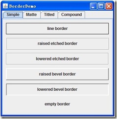
依次创建了
① 实现单色、任意厚度线边框
BorderFactory.createLineBorder(Color.black);
② 具有“浮雕化”外观效果的边框(效果为凸起)
BorderFactory.createEtchedBorder(EtchedBorder.RAISED);
③ 具有“浮雕化”外观效果的边框(效果为凹陷)
BorderFactory.createEtchedBorder(EtchedBorder.LOWERED);
④ 具有凸出斜面边缘的边框
BorderFactory.createRaisedBevelBorder();
⑤ 具有凹入斜面边缘的边框
BorderFactory.createLoweredBevelBorder();
⑥ 不占用空间的空边框
BorderFactory.createEmptyBorder();
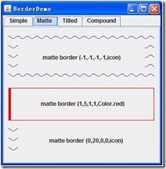
① 多层指定图标组成的、类似衬边的边框
BorderFactory.createMatteBorder(-1, -1, -1, -1, icon)
② 纯色创建一个类似衬边的边框
BorderFactory.createMatteBorder(1, 5, 1, 1, Color.red);
③ 多层指定图标组成的、类似衬边的边框(只有一个边有框)
BorderFactory.createMatteBorder(0, 20, 0, 0, icon);
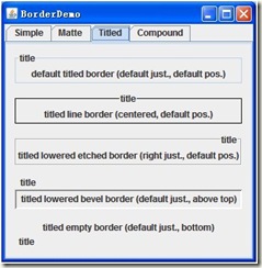
① 创建一个空标题的新标题边框,使其具有指定的边框对象、默认的文本位置(位于顶线上)、默认的调整 (leading),以及默认的字体和文本颜色(由当前外观确定)
BorderFactory.createTitledBorder("title");
② 向现有边框添加一个标题,使其具有默认的位置(位于顶线上)、默认的调整 (leading),以及默认的字体和文本颜色(由当前外观确定)
BorderFactory.createTitledBorder(BorderFactory.createLineBorder(Color.black), "title");
BorderFactory.createTitledBorder(BorderFactory.createEtchedBorder(EtchedBorder.LOWERED), "title");
BorderFactory.createTitledBorder(BorderFactory.createLoweredBevelBorder(), "title");
BorderFactory.createTitledBorder(BorderFactory.createEmptyBorder(), "title");
然后通过Border的方法设置它们的位置和显示属性:
border.setTitleJustification(TitledBorder.CENTER);
border.setTitlePosition(TitledBorder.ABOVE_TOP);
③ 当然也可以再构造时给出这些属性.
向现有边框添加一个标题,使其具有指定的位置、字体和颜色
BorderFactory.createTitledBorder(BorderFactory.createLineBorder(Color.black), "title", TitledBorder.CENTER, TitledBorder.ABOVE_TOP,new Font("宋体", Font.BOLD, 12);,Color.Red);
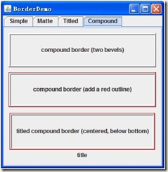
创建一个合成边框,指定了用于外部和内部边缘的 border 对象
BorderFactory.createCompoundBorder(raisedbevel, loweredbevel);
内外Border可以任意组合,也可以为Null.
接下来就是自己实现一个有特殊表现形式的Border了,最基础的方法是实现Border接口,实现paintBorder、getBorderInsets和isBorderOpaque三个方法,这样比较复杂,因为我们要修改的是Border的Title,所以这里我继承TitledBorder:
/**
* the title border that override it.
*/
publicclass MyTitledBorder extends TitledBorder {
它有一个属性:
/**
* the component in the border.
*/
protected JComponent component = null;
代表放置在Border上的组件.
再看它的构造函数:
/**
* Creates a TitledBorder instance.
*/
public MyTitledBorder(JComponent component) {
this(null, component, LEFT, TOP);
}
public MyTitledBorder(Border border, JComponent component,
int titleJustification, int titlePosition) {
super(border, null, titleJustification, titlePosition, null, null);
this.component = component;
if (border == null) {
this.border = super.getBorder();
}
}
它把Border上的组件传入,并设置初始位置.
然后是实现Border的部分方法,设置JComponet的位置,大小和布局等.
/**
* Reinitialize the insets parameter with this Border's current Insets.
*/
@Override
public Insets getBorderInsets(Component c, Insets insets) {
用此边框的当前 Insets 重新初始化 insets 参数.
insets.top = EDGE_SPACING + TEXT_SPACING + borderInsets.top;
insets.right = EDGE_SPACING + TEXT_SPACING + borderInsets.right;
insets.bottom = EDGE_SPACING + TEXT_SPACING + borderInsets.bottom;
insets.left = EDGE_SPACING + TEXT_SPACING + borderInsets.left;
然后在根据Border的位置设置它的准确边界:
先是得出Border上组件的大小:
if (component != null) {
compHeight = component.getPreferredSize().height;
}
然后根据位置计算边:
caseBELOW_TOP:
insets.top += compHeight + TEXT_SPACING;
然后是
/**
* Paints the border for the specified component with the specified * position and size.
*/
@Override
publicvoid paintBorder(Component c, Graphics g, int x, int y, int width,int height) {
按照指定的位置和大小为指定的组件绘制边框.
先得出没有边框的容器的大小:
Rectangle borderR = new Rectangle(x + EDGE_SPACING, y + EDGE_SPACING,
width - (EDGE_SPACING * 2), height - (EDGE_SPACING * 2));
然后得出边框的大小和边框上组件的大小:
Insets insets = getBorderInsets(c);
Rectangle compR = getComponentRect(rect, insets);
然后根据Border上组件的位置,计算哪儿应该加上这个大小:
例如在下面,意味着下面的Border会宽一点:
caseBOTTOM:
diff = insets.bottom / 2 - borderInsets.bottom - EDGE_SPACING;
borderR.height -= diff;
最后是绘制:
border.paintBorder(c, g, borderR.x, borderR.y, borderR.width,
borderR.height);
Color col = g.getColor();
g.setColor(c.getBackground());
g.fillRect(compR.x, compR.y, compR.width, compR.height);
g.setColor(col);
component.repaint();
最后一个方法是根据Border上组件和Border的Insets计算现在组件的宽度和最终组件要占据的位置大小:
/**
* get component Rectangle.
*/
public Rectangle getComponentRect(Rectangle rect, Insets borderInsets) {
先得出不算Boder和Insets组件的大小:
Dimension compD = component.getPreferredSize();
Rectangle compR = new Rectangle(0, 0, compD.width, compD.height);
然后根据位置进行换算,比如组件位于Border的下-右:
caseBELOW_TOP:
compR.y = borderInsets.top - compD.height - TEXT_SPACING;
caseRIGHT:
compR.x = rect.width - borderInsets.right - TEXT_INSET_H
- compR.width;
最后把算好的compR返回就可以了.
接着是一个接口,用处主要是标示Border内的所有组件是否可用,当然以后也可以添加新的接口:
/**
* set the panel enable or not.
*/
publicinterface StateTransmitter {
它只有一个需要实现的方法:
/**
* set panel enable.
*/
publicvoid setChildrenEnabled(boolean enable);
用来管理Border内的所有组件是否可用的.
然后是这个接口的一个简单实现,我们所有的组建需要放置在它的上面,当然你也可以自己实现,只需要实现StateTransmitter接口就可以了:
/**
* the panel that you can override it.
* if you want your panel title can change the panel state,you must override
*/
publicclass MyPanel extends JPanel implements StateTransmitter {
它只有一个实现方法,其它和Jpanel相同:
@Override
publicvoid setChildrenEnabled(boolean enable) {
Component[] children = this.getComponents();
for (int i = 0; i < children.length; i++) {
children[i].setEnabled(enable);
}
}
最后就是把自己写好的MyTitledBorder类放置到指定JPanel组合成最终我们可以使用的特殊Border类了.
publicclass MyTitledPane extends JPanel {
它就是一个普通的JPanel,我们在它的上面放置了自己定义的特殊Border和我们以后需要放置的其他组件根容器,然后通过调整它的doLayout方法和setEnabled方法使它满足我们的要求.
它的属性如下:
/**
* panel border.
*/
private MyTitledBorder border = null;
/**
* the component in the title pane.
*/
private JComponent component = null;
/**
* the title pane.
*/
private JPanel panel = null;
/**
* is enable allow.
*/
privatebooleantransmittingAllowed = false;
/**
* enable or not.
*/
private StateTransmitter transmitter = null;
然后是它的构造函数,在构造函数里我们需要初始化我的定制的特殊的Border和可以放置其它组件的根容器.
public MyTitledPane(JComponent component) {
border = new MyTitledBorder(component);
setBorder(border);
panel = new JPanel();
add(component);
add(panel);
设置可用与否的初始值:
transmittingAllowed = false;
transmitter = null;
然后提供一个可以换Border上容器的方法:
/**
* remove old component and add new one.
*/
publicvoid setTitleComponent(JComponent newComponent) {
remove(component);
add(newComponent);
border.setTitleComponent(newComponent);
component = newComponent;
}
接着重写JPanel的setEnabled方法使它的子组件也不可用:
@Override
publicvoid setEnabled(boolean enable) {
super.setEnabled(enable);
if (transmittingAllowed && transmitter != null) {
transmitter.setChildrenEnabled(enable);
}
}
最后是重写JPanel的doLayout方法,使布局自适应:
/**
* reset the pane layout.
*/
@Override
publicvoid doLayout() {
先取得它的边:
Rectangle rect = getBounds();
再去的Border的边:
Rectangle compR = border.getComponentRect(rect, insets);
component.setBounds(compR);
两者去做合并:
rect.x += insets.left;
rect.y += insets.top;
rect.width -= insets.left + insets.right;
rect.height -= insets.top + insets.bottom;
最后设置新的Layout的边:
panel.setBounds(rect);
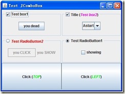
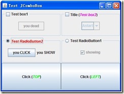
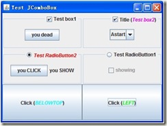
到此为止,一个我们自定义的特殊Border就完成了,我们可以如下使用它:
final MyTitledPane mypane = new MyTitledPane(mycheBox);
然后定义我们的JPanel,把它放置在Bordr面板上.
MyPanel userPanel = new MyPanel();
userPanel.add(new JButton("you add"));
mypane.setTransmittingAllowed(true);
mypane.setTransmitter(userPanel);
mypane.getContentPane().add(userPanel);
到此完成.


 213
213


 被折叠的 条评论
为什么被折叠?
被折叠的 条评论
为什么被折叠?
 到【灌水乐园】发言


