


这一篇文章我们来讲一下图例
这个也算是前面美化留下来的一点小尾巴
图例 有专门的函数 PlotLegends
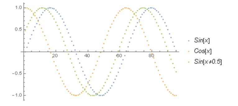
先来看一下一个简单的例子
data = Table[f, {f, {Sin[x], Cos[x], Sin[x + .5]}}, {x, 0, 3 Pi, 0.1}];
ListPlot[
 data,
 PlotLegends -> {Style[#, Italic] & /@ {"Sin[x]", "Cos[x]",
     "Sin[x+0.5]"}}
 ]
得到下面的图
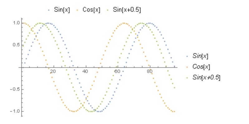
其实通过Placed可以将标签放在 上下左右 四个位置
ListPlot[
 data,
 PlotLegends -> {Style[#, Italic] & /@ {"Sin[x]", "Cos[x]",
     "Sin[x+0.5]"}, Placed[{"Sin[x]", "Cos[x]", "Sin[x+0.5]"}, Top]}
 ]
就像下面的图这样
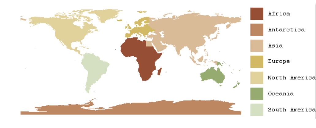
我们来看一个小例子
continents = CountryData["Continents"]graphic = Graphics[
MapIndexed[
Tooltip[{ColorData[33, First[#2]],
CountryData[#1, "SchematicPolygon"]}, #1] &,
continents],
ImageSize -> 500
]将每个大洲的用不同颜色标注出来
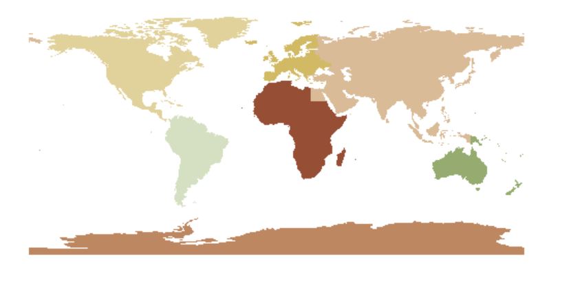
然后把图例也画出来
legend = Column@
  MapIndexed[
   Legended[
     Graphics[{ColorData[33, First[#2]], Rectangle[]},
      ImageSize -> 30], #1] &, continents
   ]
得到下面的图
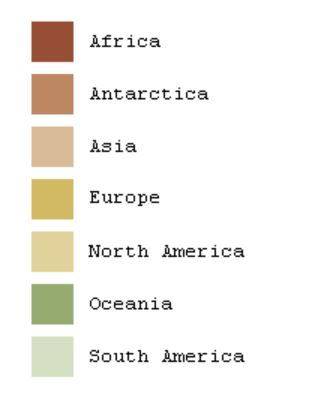
最后我们把两张图和在一起就可以了
Legended[graphic, legend]就好啦
以上就把美化大概都讲完了,以后再有会慢慢补充的
2016/8/18
以上,所有


 3236
3236

 被折叠的 条评论
为什么被折叠?
被折叠的 条评论
为什么被折叠?
 到【灌水乐园】发言


