


圆角图片
border-radius:
圆角图片:
|
1
2
3
4
5
6
7
8
9
10
11
12
13
14
15
16
17
18
|
<!DOCTYPE html>
<
html
>
<
head
>
<
style
>
img {
border-radius: 8px;
}
</
style
>
</
head
>
<
body
>
<
h2
>圆角图片</
h2
>
<
p
>使用 border-radius 属性来创建圆角图片:</
p
>
<
img
src
=
"paris.jpg"
alt
=
"Paris"
width
=
"400"
height
=
"300"
>
</
body
>
</
html
>
|
椭圆形图片:
|
1
2
3
4
5
6
7
8
9
10
11
12
13
14
15
16
17
18
|
<!DOCTYPE html>
<
html
>
<
head
>
<
style
>
img {
border-radius: 50%;
}
</
style
>
</
head
>
<
body
>
<
h2
>椭圆形图片</
h2
>
<
p
>使用 border-radius 属性来创建椭圆形图片:</
p
>
<
img
src
=
"paris.jpg"
alt
=
"Paris"
width
=
"400"
height
=
"300"
>
</
body
>
</
html
>
|
缩略图
|
1
2
3
4
5
6
7
8
9
10
11
12
13
14
15
16
17
18
19
20
|
<!DOCTYPE html>
<
html
>
<
head
>
<
style
>
img {
border: 1px solid red;
border-radius: 4px;
padding: 5px;
}
</
style
>
</
head
>
<
body
>
<
h2
>缩略图</
h2
>
<
p
>我们使用 border 属性来创建缩略图。</
p
>
<
img
src
=
"paris.jpg"
alt
=
"Paris"
width
=
"400"
height
=
"300"
>
</
body
>
</
html
>
|
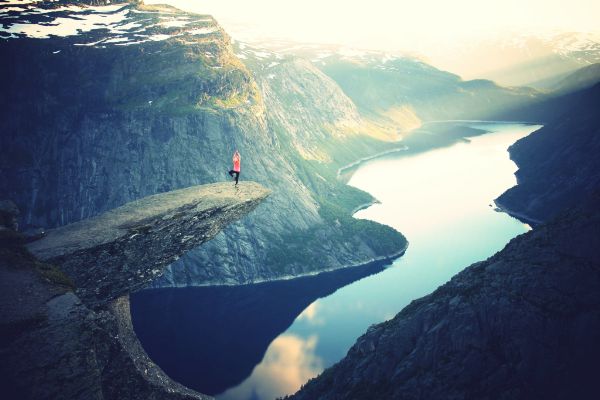
响应式图片
响应式图片会自动适配各种尺寸的屏幕。
|
1
2
3
4
5
6
7
8
9
10
11
12
13
14
15
16
17
18
19
20
|
<!DOCTYPE html>
<
html
>
<
head
>
<
style
>
img {
max-width: 100%;
height: auto;
}
</
style
>
</
head
>
<
body
>
<
h2
>响应式图片</
h2
>
<
p
>响应式图片会自动适配各种尺寸的屏幕。</
p
>
<
p
>通过重置浏览器大小查看效果:</
p
>
<
img
src
=
"http://www.runoob.com/wp-content/uploads/2016/04/trolltunga.jpg"
alt
=
"Norway"
width
=
"1000"
height
=
"300"
>
</
body
>
</
html
>
|
图片文本
|
1
2
3
4
5
6
7
8
9
10
11
12
13
14
15
16
17
18
19
20
21
22
23
24
25
26
27
28
29
30
31
32
33
34
35
36
37
38
39
40
41
42
43
44
45
46
47
48
49
50
51
52
53
54
55
56
57
58
59
60
61
62
63
64
65
66
67
68
|
<!DOCTYPE html>
<
html
>
<
head
>
<
style
>
.container {
position: relative;
}
.topleft {
position: absolute;
top: 8px;
left: 16px;
font-size: 18px;
}
.topright {
position: absolute;
top: 8px;
right: 16px;
font-size: 18px;
}
.bottomleft {
position: absolute;
bottom: 8px;
left: 16px;
font-size: 18px;
}
.bottomright {
position: absolute;
bottom: 8px;
right: 16px;
font-size: 18px;
}
.center {
position: absolute;
left: 0;
top: 50%;
width: 100%;
text-align: center;
font-size: 18px;
}
img {
width: 100%;
height: auto;
opacity: 0.3;
}
</
style
>
</
head
>
<
body
>
<
h2
>图片文本</
h2
>
<
p
>在图片左上角添加文本信息:</
p
>
<
div
class
=
"container"
>
<
img
src
=
"http://www.runoob.com/wp-content/uploads/2016/04/trolltunga.jpg"
alt
=
"Norway"
width
=
"1000"
height
=
"300"
>
<
div
class
=
"topleft"
>左上角</
div
>
<
div
class
=
"topright"
>右上角</
div
>
<
div
class
=
"bottomleft"
>左下角</
div
>
<
div
class
=
"bottomright"
>右下角</
div
>
<
div
class
=
"center"
>居中</
div
>
</
div
>
</
body
>
</
html
>
|
卡片式图片
|
1
2
3
4
5
6
7
8
9
10
11
12
13
14
15
16
17
18
19
20
21
22
23
24
25
26
27
28
29
30
|
<!DOCTYPE html>
<
html
>
<
head
>
<
style
>
body {margin:25px;}
div.polaroid {
width: 80%;
background-color: white;
box-shadow: 0 4px 8px 0 rgba(0, 0, 0, 0.2), 0 6px 20px 0 rgba(0, 0, 0, 0.19);
margin-bottom: 25px;
}
div.container {
text-align: center;
padding: 10px 20px;
}
</
style
>
</
head
>
<
body
>
<
div
class
=
"polaroid"
>
<
img
src
=
"lights600x400.jpg"
alt
=
"Norway"
style
=
"width:100%"
>
<
div
class
=
"container"
>
<
p
>Northern Lights in Norway</
p
>
</
div
>
</
div
>
</
body
>
</
html
>
|
图片滤镜
|
1
2
3
4
5
6
7
8
9
10
11
12
13
14
15
16
17
18
19
20
21
22
23
24
25
26
27
28
29
30
31
32
33
34
35
36
37
38
39
40
41
|
<!DOCTYPE html>
<
html
>
<
head
>
<
style
>
img {
width: 33%;
height: auto;
float: left;
max-width: 235px;
}
.blur {-webkit-filter: blur(4px);filter: blur(4px);}
.brightness {-webkit-filter: brightness(250%);filter: brightness(250%);}
.contrast {-webkit-filter: contrast(180%);filter: contrast(180%);}
.grayscale {-webkit-filter: grayscale(100%);filter: grayscale(100%);}
.huerotate {-webkit-filter: hue-rotate(180deg);filter: hue-rotate(180deg);}
.invert {-webkit-filter: invert(100%);filter: invert(100%);}
.opacity {-webkit-filter: opacity(50%);filter: opacity(50%);}
.saturate {-webkit-filter: saturate(7); filter: saturate(7);}
.sepia {-webkit-filter: sepia(100%);filter: sepia(100%);}
.shadow {-webkit-filter: drop-shadow(8px 8px 10px green);filter: drop-shadow(8px 8px 10px green);}
</
style
>
</
head
>
<
body
>
<
p
><
strong
>注意:</
strong
> Internet Explorer <
span
lang
=
"no-bok"
>或 Safari 5.1 (及更早版本)</
span
> 不支持该属性。</
p
>
<
img
src
=
"pineapple.jpg"
alt
=
"Pineapple"
width
=
"300"
height
=
"300"
>
<
img
class
=
"blur"
src
=
"pineapple.jpg"
alt
=
"Pineapple"
width
=
"300"
height
=
"300"
>
<
img
class
=
"brightness"
src
=
"pineapple.jpg"
alt
=
"Pineapple"
width
=
"300"
height
=
"300"
>
<
img
class
=
"contrast"
src
=
"pineapple.jpg"
alt
=
"Pineapple"
width
=
"300"
height
=
"300"
>
<
img
class
=
"grayscale"
src
=
"pineapple.jpg"
alt
=
"Pineapple"
width
=
"300"
height
=
"300"
>
<
img
class
=
"huerotate"
src
=
"pineapple.jpg"
alt
=
"Pineapple"
width
=
"300"
height
=
"300"
>
<
img
class
=
"invert"
src
=
"pineapple.jpg"
alt
=
"Pineapple"
width
=
"300"
height
=
"300"
>
<
img
class
=
"opacity"
src
=
"pineapple.jpg"
alt
=
"Pineapple"
width
=
"300"
height
=
"300"
>
<
img
class
=
"saturate"
src
=
"pineapple.jpg"
alt
=
"Pineapple"
width
=
"300"
height
=
"300"
>
<
img
class
=
"sepia"
src
=
"pineapple.jpg"
alt
=
"Pineapple"
width
=
"300"
height
=
"300"
>
<
img
class
=
"shadow"
src
=
"pineapple.jpg"
alt
=
"Pineapple"
width
=
"300"
height
=
"300"
>
</
body
>
</
html
>
|
响应式图片相册
|
1
2
3
4
5
6
7
8
9
10
11
12
13
14
15
16
17
18
19
20
21
22
23
24
25
26
27
28
29
30
31
32
33
34
35
36
37
38
39
40
41
42
43
44
45
46
47
48
49
50
51
52
53
54
55
56
57
58
59
60
61
62
63
64
65
66
67
68
69
70
71
72
73
74
75
76
77
78
79
80
81
82
83
84
85
86
87
88
89
90
91
92
93
94
95
96
97
98
99
100
101
102
|
<!DOCTYPE html>
<
html
>
<
head
>
<
style
>
div.img {
border: 1px solid #ccc;
}
div.img:hover {
border: 1px solid #777;
}
div.img img {
width: 100%;
height: auto;
}
div.desc {
padding: 15px;
text-align: center;
}
* {
box-sizing: border-box;
}
.responsive {
padding: 0 6px;
float: left;
width: 24.99999%;
}
@media only screen and (max-width: 700px){
.responsive {
width: 49.99999%;
margin: 6px 0;
}
}
@media only screen and (max-width: 500px){
.responsive {
width: 100%;
}
}
.clearfix:after {
content: "";
display: table;
clear: both;
}
</
style
>
</
head
>
<
body
>
<
h2
style
=
"text-align:center"
>响应式图片相册</
h2
>
<
div
class
=
"responsive"
>
<
div
class
=
"img"
>
<
a
target
=
"_blank"
href
=
"img_fjords.jpg"
>
<
img
src
=
"http://www.runoob.com/wp-content/uploads/2016/04/img_fjords.jpg"
alt
=
"Trolltunga Norway"
width
=
"300"
height
=
"200"
>
</
a
>
<
div
class
=
"desc"
>Add a description of the image here</
div
>
</
div
>
</
div
>
<
div
class
=
"responsive"
>
<
div
class
=
"img"
>
<
a
target
=
"_blank"
href
=
"img_forest.jpg"
>
<
img
src
=
"http://www.runoob.com/wp-content/uploads/2016/04/img_forest.jpg"
alt
=
"Forest"
width
=
"600"
height
=
"400"
>
</
a
>
<
div
class
=
"desc"
>Add a description of the image here</
div
>
</
div
>
</
div
>
<
div
class
=
"responsive"
>
<
div
class
=
"img"
>
<
a
target
=
"_blank"
href
=
"img_lights.jpg"
>
<
img
src
=
"http://www.runoob.com/wp-content/uploads/2016/04/img_lights.jpg"
alt
=
"Northern Lights"
width
=
"600"
height
=
"400"
>
</
a
>
<
div
class
=
"desc"
>Add a description of the image here</
div
>
</
div
>
</
div
>
<
div
class
=
"responsive"
>
<
div
class
=
"img"
>
<
a
target
=
"_blank"
href
=
"img_mountains.jpg"
>
<
img
src
=
"http://www.runoob.com/wp-content/uploads/2016/04/img_mountains.jpg"
alt
=
"Mountains"
width
=
"600"
height
=
"400"
>
</
a
>
<
div
class
=
"desc"
>Add a description of the image here</
div
>
</
div
>
</
div
>
<
div
class
=
"clearfix"
></
div
>
<
div
style
=
"padding:6px;"
>
<
h4
>重置浏览器大小查看效果</
h4
>
</
div
>
</
body
>
</
html
>
|
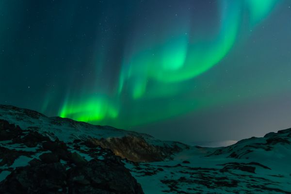
图片 Modal(模态)
本实例演示了如何结合 CSS 和 JavaScript 来一起渲染图片。
首先,我们使用 CSS 来创建 modal 窗口 (对话框), 默认是隐藏的。
然后,我们使用 JavaScript 来显示模态窗口,当我们点击图片时,图片会在弹出的窗口中显示:
|
1
2
3
4
5
6
7
8
9
10
11
12
13
14
15
16
17
18
19
20
21
22
23
24
25
26
27
28
29
30
31
32
33
34
35
36
37
38
39
40
41
42
43
44
45
46
47
48
49
50
51
52
53
54
55
56
57
58
59
60
61
62
63
64
65
66
67
68
69
70
71
72
73
74
75
76
77
78
79
80
81
82
83
84
85
86
87
88
89
90
91
92
93
94
95
96
97
98
99
100
101
102
103
104
105
106
107
108
109
110
111
112
113
114
115
116
117
118
119
120
121
122
123
124
125
126
127
128
129
130
131
132
|
<!DOCTYPE html>
<
html
>
<
head
>
<
style
>
#myImg {
border-radius: 5px;
cursor: pointer;
transition: 0.3s;
}
#myImg:hover {opacity: 0.7;}
/* The Modal (background) */
.modal {
display: none; /* Hidden by default */
position: fixed; /* Stay in place */
z-index: 1; /* Sit on top */
padding-top: 100px; /* Location of the box */
left: 0;
top: 0;
width: 100%; /* Full width */
height: 100%; /* Full height */
overflow: auto; /* Enable scroll if needed */
background-color: rgb(0,0,0); /* Fallback color */
background-color: rgba(0,0,0,0.9); /* Black w/ opacity */
}
/* Modal Content (image) */
.modal-content {
margin: auto;
display: block;
width: 80%;
max-width: 700px;
}
/* Caption of Modal Image */
#caption {
margin: auto;
display: block;
width: 80%;
max-width: 700px;
text-align: center;
color: #ccc;
padding: 10px 0;
height: 150px;
}
/* Add Animation */
.modal-content, #caption {
-webkit-animation-name: zoom;
-webkit-animation-duration: 0.6s;
animation-name: zoom;
animation-duration: 0.6s;
}
@-webkit-keyframes zoom {
from {-webkit-transform: scale(0)}
to {-webkit-transform: scale(1)}
}
@keyframes zoom {
from {transform: scale(0.1)}
to {transform: scale(1)}
}
/* The Close Button */
.close {
position: absolute;
top: 15px;
right: 35px;
color: #f1f1f1;
font-size: 40px;
font-weight: bold;
transition: 0.3s;
}
.close:hover,
.close:focus {
color: #bbb;
text-decoration: none;
cursor: pointer;
}
/* 100% Image Width on Smaller Screens */
@media only screen and (max-width: 700px){
.modal-content {
width: 100%;
}
}
</
style
>
</
head
>
<
body
>
<
h2
>图片模态框</
h2
>
<
p
>本实例演示了如何结合 CSS 和 JavaScript 来一起渲染图片。</
p
><
p
>
首先,我们使用 CSS 来创建 modal 窗口 (对话框), 默认是隐藏的。<
p
>
<
p
>然后,我们使用 JavaScript 来显示模态窗口,当我们点击图片时,图片会在弹出的窗口中显示:</
p
>
<
img
id
=
"myImg"
src
=
"http://www.runoob.com/wp-content/uploads/2016/04/img_lights.jpg"
alt
=
"Northern Lights, Norway"
width
=
"300"
height
=
"200"
>
<!-- The Modal -->
<
div
id
=
"myModal"
class
=
"modal"
>
<
span
class
=
"close"
>×</
span
>
<
img
class
=
"modal-content"
id
=
"img01"
>
<
div
id
=
"caption"
></
div
>
</
div
>
<
script
>
// 获取模态窗口
var modal = document.getElementById('myModal');
// 获取图片模态框,alt 属性作为图片弹出中文本描述
var img = document.getElementById('myImg');
var modalImg = document.getElementById("img01");
var captionText = document.getElementById("caption");
img.onclick = function(){
modal.style.display = "block";
modalImg.src = this.src;
modalImg.alt = this.alt;
captionText.innerHTML = this.alt;
}
// 获取 <
span
> 元素,设置关闭模态框按钮
var span = document.getElementsByClassName("close")[0];
// 点击 <
span
> 元素上的 (x), 关闭模态框
span.onclick = function() {
modal.style.display = "none";
}
</
script
>
</
body
>
</
html
>
|


 扫一扫
扫一扫
 153
153

 被折叠的 条评论
为什么被折叠?
被折叠的 条评论
为什么被折叠?
 到【灌水乐园】发言


