


At the risk of over-repeating myself: every element in web design is a rectangular box. This was my ah-ha moment that helped me really start to understand CSS-based web design and accomplish the layouts I wanted to accomplish. We've talked about the positioning of these boxes a bit, and about their behavior.
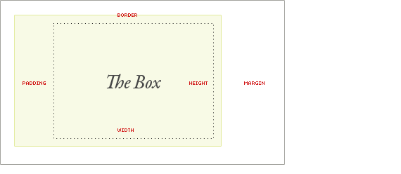
What we haven't talked about much is the box itself. How is the size of the box calculated exactly? Here is a diagram:
If you are a Firebug user, you might be used to the diagram like this, which does a nice job of showing you the numbers affecting any box on the page:
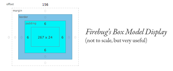
Notice in both examples the margin is in the white. Margin is unique in that it doesn't affect the size of the box itself per-say, but it affects other content interacting with the box, and thus an important part of the CSS box model.
The size of the box itself is calculated like this:
| Width | width + padding-left + padding-right + border-left + border-right |
| Height | height + padding-top + padding-bottom + border-top + border-bottom |
What if these values are undeclared?
If padding or borders are undeclared, they are either zero (likely if you are using a css reset) or the browser default value (probably not zero especially on form elements that are commonly not reset).
If the width of a box is undeclared (and the box is a block level element), things get a little weirder. Let's start with that, and then move on to some other good-to-know stuff about the box model.
The Default Width of Block Level Boxes
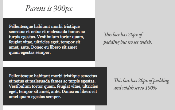
If you don't declare a width, and the box has static or relative positioning, the width will remain 100% in width and the padding and border will push inwards instead of outward. But if you explicitly set the width of the box to be 100%, the padding will push the box outward as normal.
The lesson here being that the default width of a box isn't really 100% but a less tangible "whatever is left". This is particularly valuable to know, since there are lots of circumstances where it is immensely useful to either set or not set a width.
The biggest ass-biter I always find with this is textarea elements, which very much need their widths set to fight the required "cols" attribute, and are unable to have children elements. So you often need the textarea to be explicitly set to 100%, yet have padding as well, pushing it too large to fit. In a static width environment, we often resort to pixel widths that fit, but no such luck in fluid width environments.
Absolute Boxes with No Width
Absolutely positioned boxes that have no width set on them behave a bit strangely. Their width is only as wide as it needs to be to hold the content. So if the box contains a single word, the box is only as wide as that word renders. If it grows to two words, it'll grow that wide.
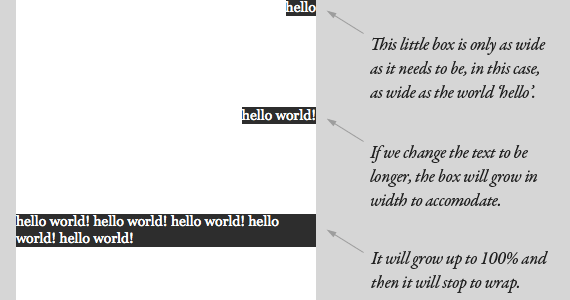
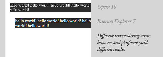
This should continue until the box is 100% of the parent's width (the nearest parent with relative positioning, or browser window) and then begin to wrap. It feels natural and normal for boxes to expand vertically to accommodate content, but it just feels strange when it happens horizontally. That strange feeling is warranted, as there are plenty of quirks in how different browsers handle this, not to mention just the fact that text renders differently across platforms.
Floated Boxes With No Width
The same exact behavior is seen with floated elements with no widths. The box is only as wide as it needs to be to accommodate the content, up to as wide as it's parent element (doesn't need to be relatively positioned though). Because of the fragile nature of these width-less boxes, the lesson to take away here is to not rely on them in mission-critical scenarios, like in overall page layout. If you float a column to use as a sidebar and count on some element inside (like an image) to be responsible for holding it's width, you are asking for trouble.
Inline Elements are Boxes Too
We've been kind of focusing on boxes as block-level elements here. It's easy to think of block-level elements as boxes, but inline elements are boxes too. Think of them as really really long and skinny rectangles, that just so happen to wrap at every line. They are able to have margin, padding, borders just like any other box.
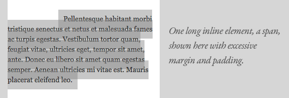
The wrapping is what makes it confusing. A left margin as shown above pushes the box to the right as you would suspect, but only the first line, as that is the beginning of the box. Padding is applied above and below the text like it should be, and when it wraps it ignores the line above its padding and begins where the line-height dictates it should begin. The background was applied with transparency to see how it works more clearly.
See it with your own eyes
Wanna see every single "box" that makes up a page? Try putting this in the stylesheet temporarily:
* {
   border: 1px solid red !important;
}

如果我们没有设定这些值的话会发生什么?
默认Width的块级盒子
01 | <hr align="left" width="240px"/> |
02 | <div style=" height:250px; width:50%; border:#03F solid 20px; padding:20px #093; margin:0px; left: 0px; top: 21px;"> |
03 | |
04 | <div style="position:absolute; background-color:#9C3; border:#43F solid 10px; padding:5px; margin:10px; left: 38px; top: 273px; width: 82px;"> |
05 | 1 |
06 | </div> |
07 | <div style=" background-color:#9C3;width:300px;border:#03F solid 10px; padding:5px; margin:10px"> |
08 | 2 |
09 | </div> |
10 | <div style=" background-color:#9C3; position:relative; border:#03F solid 10px; padding:5px; margin:10px"> |
11 | 3 |
12 | </div> |
13 | <div style=" background-color:#9C3; position:static; border:#03F solid 10px; padding:5px ; margin:15px"> |
14 | 4 |
15 | </div> |
16 | |
17 | </div> |
没有宽度的盒子(设定position属性为absolute的盒子)
对于浮动属性的盒子
联机元素也是盒子
用我们的眼睛好好看看!


 177
177


 被折叠的 条评论
为什么被折叠?
被折叠的 条评论
为什么被折叠?
 到【灌水乐园】发言


