


R图表入门
R语言最强的功能就是统计和作图了,在学习了基本语法之后,博主马上体验了一下R的图表功能
条形图
例1
H = c(7,12,28,3,41)
M = c("Mar","Apr","May","Jun","Jul")

barplot(H, #数据集
        names.arg = M, #坐标项名称
        xlab = "Revenue", #坐标标签
        ylab = "Month", #坐标标签
        col = "blue", #主体颜色
        border = "red", #边缘颜色
        main = "Revenue chart", #标题
        horiz = TRUE) #水平方向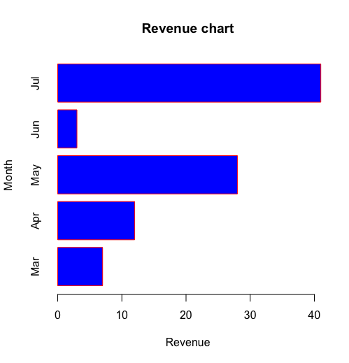
例2
colors = c("green","orange","brown")
months = c("Mar","Apr","May","Jun","Jul")
regions = c("East","West","North")

values = matrix(1:15,nrow = 3)
#调用系统字体显示中
#这里使用了黑体
par( family = 'Hei')
barplot(values, main = "主题",
        names.arg = months,
        xlab = "Month",
        ylab = "revene",
        col = colors)
legend("topleft",regions,
       cex = 1.3,
       fill = colors)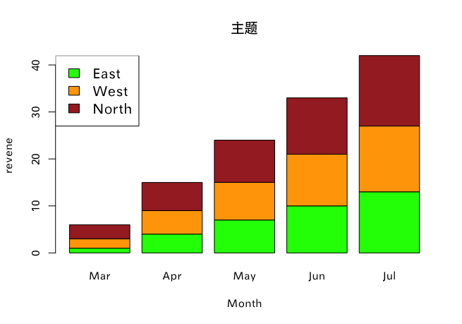
箱式图
input = mtcars[,c('mpg','cyl')] #取mtcars做测试
boxplot(mpg ~ cyl, #mpg关于不同cyl的的分布
        data = mtcars,
        xlab = "Number of Cylinders",
        ylab = "Miles Per Gallon",
        main = "Mileage Data",
        # notch = TRUE, #带槽的图
        # varwidth = FALSE,
        col = c("green","yellow","purple"),
        names = c("High","Medium","Low"))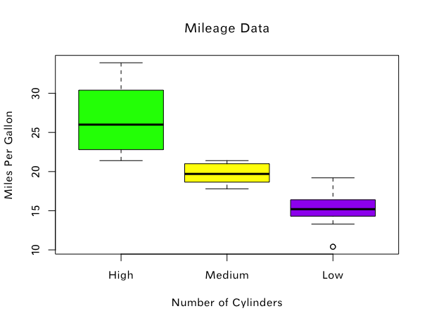
直方图
input = mtcars[,c('mpg')] #取mtcars做测试
hist(
    input,
    main = "Histogram exalple",
    xlab = "x",
    ylab = "y",
    col = "green",
    border = "brown",
    breaks = 10 #分割10次,共11段
)
print(input)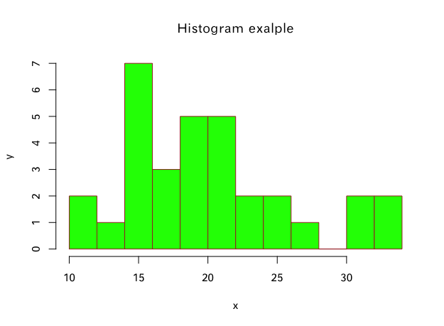
折线图&散点图
v = c(7,12,28,3,41)
#在没有y的情况下,横坐标默认为1,2,3……
#type为图像类型,p为点,l为线,o为点线
plot(v, type = "p", col = "red", main = "theme")
#lines函数可以画多条线
lines(20:50,type = "o", col = "green")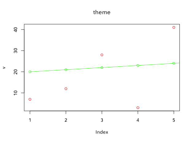
饼图
例1
x = c(21,62,10,53)
labels = c("London", "New york", "Singapore", "Mumbai")
labels = c("London", "New york", "Singapore", "Mumbai")
piepercent = paste( round(100*x/sum(x), digits = 2),'%',seq = '') #计算百分比
pie(x, paste(labels,piepercent),
    main = "City pie chart",
    #可以使用彩虹函数设置颜色
    col = rainbow(length(x),alpha = 0.5)
    )

legend("topright",
       labels,
       cex = 0.8, #调整大小,1为正常
       fill = rainbow(length(x),alpha = 0.5))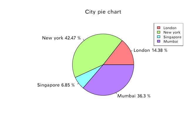
例2
3D饼图
# library(plotrix)
x = c(21,62,10,53)
lbl = c("London","New York","Singapore","Mumbai")
plotrix::pie3D(x,labels = lbl,explode = 0.1, main = "3D Pie Chart")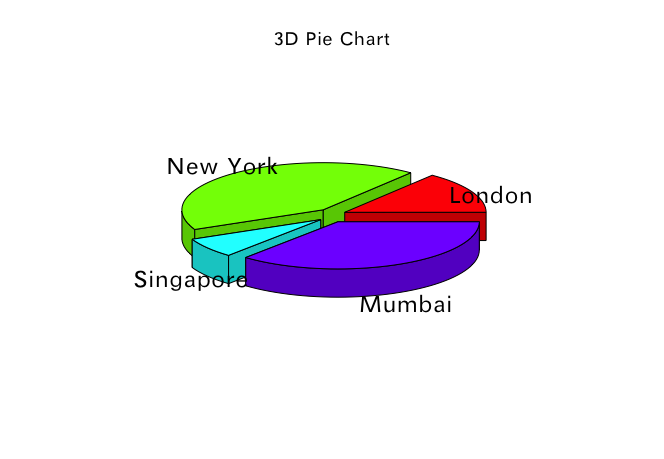
保存到本地
H = c(7,12,28,3,41)

# 创建一个图形的Device
png(file = "barchart.png")

# 在Device上作图
barplot(H)

# 关闭Device(保存)
dev.off()
小结
博主这里学习了R语言基础的作图方法,大体上已经够用,更高阶的应该要请大名鼎鼎的ggplot2登场,以后有机会再学习。


 3274
3274


 被折叠的 条评论
为什么被折叠?
被折叠的 条评论
为什么被折叠?
 到【灌水乐园】发言


