


概要:
昨天在学习用vs2010写一个Silverlight小例子的时候,发现控件一多,布局就乱了,还有的时候将浏览器放大缩小,所显示的控件也会走样。。。现在我学习一下界面布局,让Silverlight随心所欲。

Silverlight的布局有三种,Silverlight1.0中的Canvas,及Silverlight 2中新增加了Grid和Panel两个布局容器。
Canvas:
canvas就是画布,我们可以直接对canvas相对坐标来设计控件的样式。
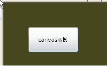
一个简单的例子:

 代码
代码
<
Canvas
Background
="#46461F"
>
< Button x:Name ="btn1" Content ="canvas实例"
Width ="100" Height ="50"
Canvas.Left ="50" Canvas.Top ="50" >
</ Button >
</ Canvas >
< Button x:Name ="btn1" Content ="canvas实例"
Width ="100" Height ="50"
Canvas.Left ="50" Canvas.Top ="50" >
</ Button >
</ Canvas >
运行一下:
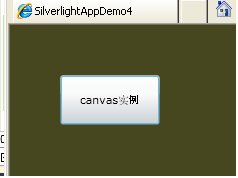
可见控件相对于顶,边的距离为50,即canvas.Left="50" Canvas.Top="50",这两个相对于canvas坐标决定的。
作为初学者,我经常发现拖了好多控件在页面上,可显示的时候怎么没了?!原因是被控件覆盖了,比如:
代码
<
Canvas
Background
="#46461F"
>
< Button x:Name ="btn1" Content ="canvas实例"
Width ="100" Height ="50"
Canvas.Left ="50" Canvas.Top ="50" >
</ Button >
< Button x:Name ="btn2" Content ="canvas重叠"
Width ="100" Height ="50"
Canvas.Left ="50" Canvas.Top ="50" >
</ Button >
</ Canvas >
< Button x:Name ="btn1" Content ="canvas实例"
Width ="100" Height ="50"
Canvas.Left ="50" Canvas.Top ="50" >
</ Button >
< Button x:Name ="btn2" Content ="canvas重叠"
Width ="100" Height ="50"
Canvas.Left ="50" Canvas.Top ="50" >
</ Button >
</ Canvas >
这是一个动态修改canvas.ZIndex的例子:
代码
<
Canvas
Background
="#46461F"
>
< Button x:Name ="btn1" Content ="canvas实例"
Width ="100" Height ="50"
Canvas.Left ="50" Canvas.Top ="50"
Canvas.ZIndex ="1" Click ="btn1_Click" >
</ Button >
< Button x:Name ="btn2" Content ="canvas重叠"
Width ="100" Height ="50"
Canvas.Left ="50" Canvas.Top ="50"
Canvas.ZIndex ="0" Click ="btn2_Click" >
</ Button >
</ Canvas >
代码
private
void
btn2_Click(
object
sender, RoutedEventArgs e)
{
btn2.SetValue(Canvas.ZIndexProperty, 0 );
btn1.SetValue(Canvas.ZIndexProperty, 1 );
}
private void btn1_Click( object sender, RoutedEventArgs e)
{
btn1.SetValue(Canvas.ZIndexProperty, 0 );
btn2.SetValue(Canvas.ZIndexProperty, 1 );
}
{
btn2.SetValue(Canvas.ZIndexProperty, 0 );
btn1.SetValue(Canvas.ZIndexProperty, 1 );
}
private void btn1_Click( object sender, RoutedEventArgs e)
{
btn1.SetValue(Canvas.ZIndexProperty, 0 );
btn2.SetValue(Canvas.ZIndexProperty, 1 );
}
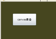
点击一下:
呵呵,有意思吧,再点就会又变过来了。
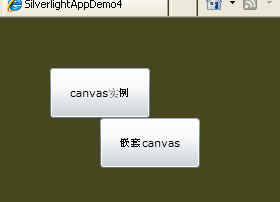
除此之外,您也可以canvas嵌套canvas。
代码
<
Canvas
Background
="#46461F"
>
< Button x:Name ="btn1" Content ="canvas实例"
Width ="100" Height ="50"
Canvas.Left ="50" Canvas.Top ="50"
Canvas.ZIndex ="1" Click ="btn1_Click" >
</ Button >
< Button x:Name ="btn2" Content ="canvas重叠"
Width ="100" Height ="50"
Canvas.Left ="50" Canvas.Top ="50"
Canvas.ZIndex ="0" Click ="btn2_Click" >
</ Button >
< Canvas Canvas.Top ="100" Canvas.Left ="100" >
< Button x:Name ="btn3" Width ="100" Height ="50"
Content ="嵌套canvas"
Canvas.Left ="0" Canvas.Top ="0" ></ Button >
</ Canvas >
</ Canvas >
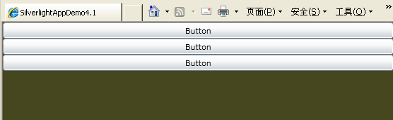
StackPanel:
stackpanel支持用行或列进行布局。默认情况下是横向拉伸填充,控件按垂直排的。
代码
<
StackPanel
Background
="#46461F"
>
< Button Content ="Button" Height ="23" Name ="button1" />
< Button Content ="Button" Height ="23" Name ="button2" />
< Button Content ="Button" Height ="23" Name ="button3" />
</ StackPanel >
< Button Content ="Button" Height ="23" Name ="button1" />
< Button Content ="Button" Height ="23" Name ="button2" />
< Button Content ="Button" Height ="23" Name ="button3" />
</ StackPanel >
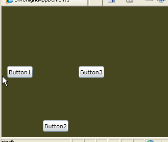
加了属性的StackPanel:
代码
<
StackPanel
Background
="#46461F"
Orientation
="Horizontal"
>
< Button Content ="Button1" Height ="23" Name ="button1" Margin ="10" />
< Button Content ="Button2" Height ="23" Name ="button2" Margin ="10" VerticalAlignment ="Bottom" />
< Button Content ="Button3" Height ="23" Name ="button3" Margin ="10" HorizontalAlignment ="Center" />
</ StackPanel >
< Button Content ="Button1" Height ="23" Name ="button1" Margin ="10" />
< Button Content ="Button2" Height ="23" Name ="button2" Margin ="10" VerticalAlignment ="Bottom" />
< Button Content ="Button3" Height ="23" Name ="button3" Margin ="10" HorizontalAlignment ="Center" />
</ StackPanel >
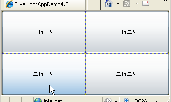
Grid:
Grid控件类似与HTML中的Table,不同的是,Grid是先指定,后使用。通过<Grid.RowDefinitions> 和 <Grid.ColumnDefinitions>
来定义Grid的行和列,使用Grid.Row和Grid.Column两个附加属性指定子元素在Grid中显示的位置,这是一种非常灵活的布局方式。
代码
<
Grid
x:Name
="LayoutRoot"
Background
="#46461F"
ShowGridLines
="True"
>
< Grid.RowDefinitions >
< RowDefinition ></ RowDefinition >
< RowDefinition ></ RowDefinition >
</ Grid.RowDefinitions >
< Grid.ColumnDefinitions >
< ColumnDefinition ></ ColumnDefinition >
< ColumnDefinition ></ ColumnDefinition >
</ Grid.ColumnDefinitions >
< Button Grid.Row ="0" Grid.Column ="0" Content ="一行一列" ></ Button >
< Button Grid.Row ="0" Grid.Column ="1" Content ="一行二列" ></ Button >
< Button Grid.Row ="1" Grid.Column ="0" Content ="二行一列" ></ Button >
< Button Grid.Row ="1" Grid.Column ="1" Content ="二行二列" ></ Button >
</ Grid >
您还可以在列中加上属性:
代码
1,
<
RowDefinition
Height
="40"
></
RowDefinition
>
设定行高度
2, < ColumnDefinition Width ="40*" ></ ColumnDefinition >
设定百分比
3, < ColumnDefinition Width ="Auto" MinWidth ="30" MaxWidth ="150" ></ ColumnDefinition >
设定自动大小,但有大小限制
设定行高度
2, < ColumnDefinition Width ="40*" ></ ColumnDefinition >
设定百分比
3, < ColumnDefinition Width ="Auto" MinWidth ="30" MaxWidth ="150" ></ ColumnDefinition >
设定自动大小,但有大小限制
控件中加上: Grid.ColumnSpan ="2" 即跨行,跨列也可以设置的。
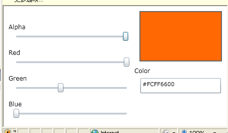
仿照TerryLee的例子:
这个仿照的例子一个代码都没变,但是就是运行不起来。提示说:
提示未将对象Color color = Color.FromArgb((byte)AlphaSlider.Value, (byte)RedSlider.Value, (byte)GreenSlider.Value, (byte)BlueSlider.Value);引用设置到对象的实例。
研究了一下午,终于找到问题所在了:
代码
<
Grid
x:Name
="LayoutRoot"
Background
="White"
>
< Grid.ColumnDefinitions >
< ColumnDefinition Width ="260" />
< ColumnDefinition Width ="*" />
</ Grid.ColumnDefinitions >
< Grid.RowDefinitions >
< RowDefinition Height ="120" />
< RowDefinition Height ="120" />
</ Grid.RowDefinitions >
< Rectangle Grid.Row ="0" Grid.Column ="1" x:Name ="PreviewColor"
Fill ="#FF6600" Margin ="10" Stroke ="#666666" StrokeThickness ="2" />
< StackPanel Grid.Row ="1" Grid.Column ="1" >
< TextBlock FontSize ="12" > Color </ TextBlock >
< TextBox x:Name ="HexColor" Width ="160" Height ="30" Text ="#FF6600" Margin ="10,5" FontSize ="11" />
</ StackPanel >
< StackPanel Grid.Row ="0" Grid.Column ="0" Grid.RowSpan ="2" VerticalAlignment ="Center" >
< TextBlock Text ="Alpha" FontSize ="12" Margin ="10,15,0,0" />
< Slider x:Name ="AlphaSlider" Margin ="20,0,10,0" Maximum ="255" Value ="255" ValueChanged ="RedSlider_ValueChanged" />
< TextBlock Text ="Red" FontSize ="12" Margin ="10,15,0,0" />
< Slider x:Name ="RedSlider" Margin ="20,0,10,0" Maximum ="255" Value ="255" ValueChanged ="RedSlider_ValueChanged" />
< TextBlock Text ="Green" FontSize ="12" Margin ="10,15,0,0" />
< Slider x:Name ="GreenSlider" Margin ="20,0,10,0" Maximum ="255" Value ="102" ValueChanged ="RedSlider_ValueChanged" />
< TextBlock Text ="Blue" FontSize ="12" Margin ="10,15,0,0" />
< Slider x:Name ="BlueSlider" Margin ="20,0,10,0" Maximum ="255" Value ="0" ValueChanged ="RedSlider_ValueChanged" />
</ StackPanel >
</ Grid >
.cs代码
代码
private
void
RedSlider_ValueChanged(
object
sender, RoutedPropertyChangedEventArgs
<
double
>
e)
{
if (AlphaSlider == null ) return ; // 防止初始化时加载。
Color color = Color.FromArgb(( byte )AlphaSlider.Value, ( byte )RedSlider.Value, ( byte )GreenSlider.Value, ( byte )BlueSlider.Value);
PreviewColor.Fill = new SolidColorBrush(color);
HexColor.Text = color.ToString();
}
{
if (AlphaSlider == null ) return ; // 防止初始化时加载。
Color color = Color.FromArgb(( byte )AlphaSlider.Value, ( byte )RedSlider.Value, ( byte )GreenSlider.Value, ( byte )BlueSlider.Value);
PreviewColor.Fill = new SolidColorBrush(color);
HexColor.Text = color.ToString();
}
还有个方法就是在xaml里不设置.value属性,在加载之后设置。因为加载的时候在图形显示之前就会触发valueChanged事件3次。。。
不明白的设个断点自己试一试就知道了。
呵呵,这个例子我也做出来了。
总目录
上一篇: vs2010学习Silverlight学习笔记(3):一些控件的基本应用
下一篇: Vs2010学习Silverlight学习笔记(5):事件响应


 2302
2302

 被折叠的 条评论
为什么被折叠?
被折叠的 条评论
为什么被折叠?
 到【灌水乐园】发言


