


尽管现在很多浏览器都支持圆角border-radius这个属性了。
以前做圆角还没那么简单的时候,能用其他方法模拟出圆角,但是不尽完美就是了。
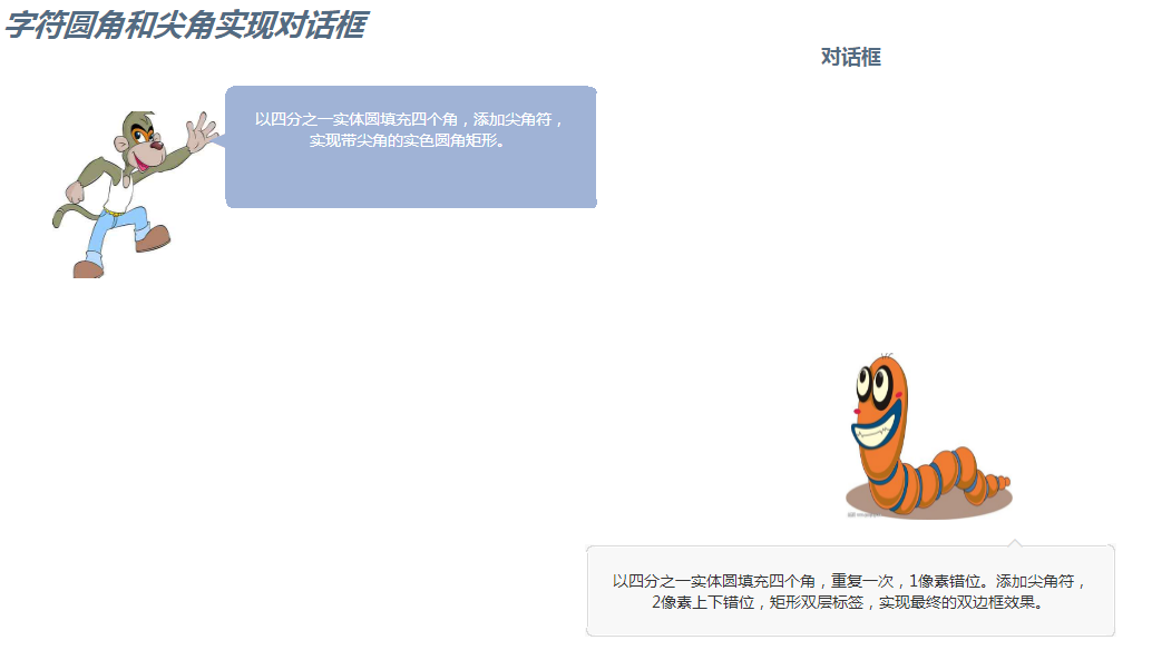
以前在看对话框的时候就疑惑,对话框旁边的小尖角是怎么做的。
看到一篇博客用字符做出来,感觉又get到了技能。
用字符做圆角的话,还是略显粗糙,在浏览器放大到150的时候就显现出来了。
但是尖角的话用作对话的指向确实不错,浏览器兼容也可以。
第二个对话框要实现字符边框效果,关键在于多做一个覆盖层,通过定位的差距遮挡住前一个圆角的绝大部分,只露出圆弧部分实现。
点击看效果demo
<!DOCTYPE html>
<html lang="en">
<head>
    <meta charset="UTF-8">
    <meta name="viewport" content="width=device-width, initial-scale=1.0">
    <meta http-equiv="X-UA-Compatible" content="ie=edge">
    <link rel="styleSheet" href="./demo.css">
    <title>Document</title>
    <style>
        .ml20{
            margin: 0 auto;
            display: inline-block;
        }
        .sharp_square{
            width: 333px;
            height: 110px;
            background: #a0b3d6;
            position: relative;
            color: #a0b3d6;
        }
        .sharp_top_corner{
            line-height: 1;
            position: absolute;
            font-size: 34px;
            top: 32px;
            /* right: 80px; */
            left: -17px;
        }
        .sharp_square .quarter_round {
            position: absolute;
        }
        .quarter_round{
            display:inline-block;
            width:8px;
            height:8px;
            overflow:hidden;
            font-family:'宋体';
        }
        .quarter_round span{
            display:inline-block;
            font-size:16px;
            line-height:1;
        }
        .sharp_square .round_lt {
            left: -1px;
            top: -1px;
        }
        .sharp_square .round_rt {
            right: -1px;
            top: -1px;
        }
        .sharp_square .round_lb {
            left: -1px;
            bottom: 0px;
        }
        .sharp_square .round_rb {
            right: -1px;
            bottom: 0px;
        }
        .content_square{
            color: #fff;
            padding: 20px;
            font-size: 14px;
        }
        .sharp_square .quarter_round span {
            background: white;
        }
        .quarter_round .lt{}
        .quarter_round .rt{margin-left:-7px;}
        .quarter_round .lb{
            position: absolute;
            left: 0px;
            top: -6px;
        }
        .quarter_round .rb{
            position: absolute;
            /* left: 0px; */
            top: -5px;
            right: -1px;
        }
        .square_out_border {
            width: 472px;
            border: 1px solid #dadada;
            background: #f8f8f8;
            position: relative;
            color: #dadada;
        }
        .square_inner_border {
            border: 1px solid #ffffff;
            padding: 20px;
            font-size: 14px;
            color: #333333;
        }
        .square_top_corner{
            line-height: 1;
            height: 15px;
            font-size: 30px;
            position: absolute;
            top: -15.99px;
            right: 80px;
        }
        .square_top_corner2 {
            line-height: 1;
            font-size: 30px;
            color: #f8f8f8;
            position: absolute;
            top: 2px;
            right: 0;
        }
        .square_out_border .round_lt {
            left: -3px;
            top: -3px;
        }

        .square_out_border .quarter_round {
            position: absolute;
            z-index: 1;
        }

        .quarter_round {
            display: inline-block;
            width: 8px;
            height: 8px;
            overflow: hidden;
            font-family: '宋体';
        }
        .square_out_border .quarter_round span {
            background: #f8f8f8;
        }

        .quarter_round .lt {
        }

        .quarter_round span {
            display: inline-block;
            font-size: 16px;
            line-height: 1;
        }
        .square_out_border .round_lb {
            left: -3px;
            bottom: -1px;
        }
        .square_out_border .round_rb {
            right: -2px;
            bottom: -1px;
        }
        .square_out_border .round_rt {
            right: -2px;
            top: -4px;
        }
        .square_out_border .round_lt2 {
            left: -2px;
            top: -2px;
        }

        .square_out_border .quarter_round2 {
            color: #f8f8f8;
            z-index: 2;
        }
        .square_out_border .round_rt2 {
            right: -1px;
            top: -3px;
        }

        .square_out_border .quarter_round2 {
            color: #f8f8f8;
            z-index: 2;
        }
        .square_out_border .round_lb2 {
            left: -2px;
            bottom: 0px;
        }

        .square_out_border .quarter_round2 {
            color: #f8f8f8;
            z-index: 2;
        }
        .square_out_border .round_rb2 {
            right: -1px;
            bottom: 0px;
        }

        .square_out_border .quarter_round2 {
            color: #f8f8f8;
            z-index: 2;
        }
        .square_out_border .quarter_round2 span {
            background: none;
        }
        .method4{
            float: left;
        }
        .con1{
            float: left;
        }
        .method3{
            margin: 0 auto;
        }
        .method3 .zxx_ul_image{
            display: inline-block;
            margin-left: 100px;
        }
    </style>
</head>
<body>
    <div class="demo-container">
            <div class="header">
                    <i>
                        <b>字符圆角和尖角实现对话框</b>
                    </i>
                </div>
        <div class="method-title">
            对话框
        </div>
        <div class="method-container">
            <div class="method4">
                <ul class="zxx_ul_image">
                    <li>
                        <img src=".././images/monkey.jpg" />
                    </li>
                </ul>
            </div>
            <div class="ml20 con1">
                <div class="sharp_square mt20">
                    <span class="sharp_top_corner">◄</span>
                    <span class="quarter_round round_lt"><span class="lt">●</span></span>
                    <span class="quarter_round round_rt"><span class="rt">●</span></span>
                    <span class="quarter_round round_lb"><span class="lb">●</span></span>
                    <span class="quarter_round round_rb"><span class="rb">●</span></span>
                    <div class="content_square"><span>以四分之一实体圆填充四个角,添加尖角符,实现带尖角的实色圆角矩形。</span></div>
                </div>
            </div>
            <br style="clear:both">
        </div>
        <div class="method-container">
            <div class="method3">
                <ul class="zxx_ul_image">
                    <li>
                        <img src=".././images/insect.jpg" />
                    </li>
                </ul>
            </div>
            <div class="ml20">
                <div class="square_out_border mt20">
                    <span class="square_top_corner">◆
                        <span class="square_top_corner2">◆</span>
                    </span>
                    <span class="quarter_round round_lt">
                        <span class="lt">●</span>
                    </span>
                    <span class="quarter_round round_rt">
                        <span class="rt">●</span>
                    </span>
                    <span class="quarter_round round_lb">
                        <span class="lb">●</span>
                    </span>
                    <span class="quarter_round round_rb">
                        <span class="rb">●</span>
                    </span>
                    <div class="square_inner_border">
                        以四分之一实体圆填充四个角,重复一次,1像素错位。添加尖角符,2像素上下错位,矩形双层标签,实现最终的双边框效果。
                    </div>
                    <span class="quarter_round quarter_round2 round_lt2">
                        <span class="lt">●</span>
                    </span>
                    <span class="quarter_round quarter_round2 round_rt2">
                        <span class="rt">●</span>
                    </span>
                    <span class="quarter_round quarter_round2 round_lb2">
                        <span class="lb">●</span>
                    </span>
                    <span class="quarter_round quarter_round2 round_rb2">
                        <span class="rb">●</span>
                    </span>
                </div>
            </div>
        </div>
    </div>
</body>
</html>
google下效果图:

ie11效果图


 7614
7614


 被折叠的 条评论
为什么被折叠?
被折叠的 条评论
为什么被折叠?
 到【灌水乐园】发言


