


/ 导读 /
在matplotlib中,我们经常面临使用多种不同的子图来对比,本文将从实际案例出发,教大家绘制不同类型的子图,探究子图的花样玩法。
均匀子图
返回元素分别是画布和子图构成的列表,第一个数字为行,第二个为列
figsize 参数可以指定整个画布的大小
sharex 和 sharey 分别表示是否共享横轴和纵轴刻度
tight_layout 函数可以调整子图的相对大小使字符不会重叠
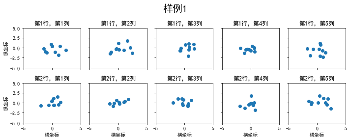
下面是使用plt.subplots绘制均匀状态下的子图示例
import matplotlib.pyplot as pltimport numpy as npimport pandas as pd#画一个两行五列,尺寸宽为10,高为4的图片#这里共享横轴和纵轴的刻度fig, axs = plt.subplots(2, 5, figsize=(10, 4), sharex=True, sharey=True)fig.suptitle('样例1', size=20)#这里使用for循环,对生成的随机数进行子图绘制,设置子图的标题#设置子图的横纵坐标和title#对于横纵坐标刻度值的显示,可以使用set_xticks和set_yticks#学习标题中的i,j显示for i in range(2): for j in range(5): axs[i][j].scatter(np.random.randn(10), np.random.randn(10)) axs[i][j].set_title('第%d行,第%d列'%(i+1,j+1)) axs[i][j].set_xlim(-5,5) axs[i][j].set_ylim(-5,5) if i==1: axs[i][j].set_xlabel('横坐标') if j==0: axs[i][j].set_ylabel('纵坐标')fig.tight_layout()注意:这里的tight_layout可以调整子图的相对大小使字符不会重叠,这个命令是新版本加进来的,需要将matplotlib的版本升至3.3以上,笔者之前是3.1,显示出来的图片就会重叠
除了常规的直角坐标系,也可以通过projection方法创建极坐标系下的图表
下面这几行代码之前同样需要导入画图库
N = 150r = 2 * np.random.rand(N)theta = 2 * np.pi * np.random.rand(N)area = 200 * r**2colors = thetaplt.subplot(projection='polar')plt.scatter(theta, r, c=colors, s=area, cmap='hsv', alpha=0.75)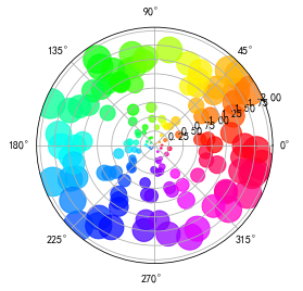
非均匀子图
所谓非均匀包含两层含义,第一是指图的比例大小不同但没有跨行或跨列,第二是指图为跨列或跨行状态
利用 add_gridspec 可以指定相对宽度比例 width_ratios 和相对高度比例参数 height_ratios
下面是使用GridSpec绘制非均匀状态下的子图示例
fig = plt.figure(figsize=(10, 4))#设置子图的宽度比和高度比spec = fig.add_gridspec(nrows=2, ncols=5, width_ratios=[1,2,3,4,5], height_ratios=[1,3])#使用suptitle来设置图片的标题fig.suptitle('样例2', size=20)for i in range(2): for j in range(5): ax = fig.add_subplot(spec[i, j]) ax.scatter(np.random.randn(10), np.random.randn(10)) ax.set_title('第%d行,第%d列'%(i+1,j+1)) if i==1: ax.set_xlabel('横坐标') if j==0: ax.set_ylabel('纵坐标')fig.tight_layout()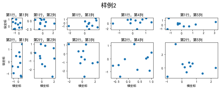
在上面的例子中出现了 spec[i, j] 的用法,事实上通过切片就可以实现子图的合并而达到跨图的功能
fig = plt.figure(figsize=(10, 4))spec = fig.add_gridspec(nrows=2, ncols=6, width_ratios=[2,2.5,3,1,1.5,2], height_ratios=[1,2])fig.suptitle('样例3', size=20)# sub1ax = fig.add_subplot(spec[0, :3])ax.scatter(np.random.randn(10), np.random.randn(10))# sub2ax = fig.add_subplot(spec[0, 3:5])ax.scatter(np.random.randn(10), np.random.randn(10))# sub3ax = fig.add_subplot(spec[:, 5])ax.scatter(np.random.randn(10), np.random.randn(10))# sub4ax = fig.add_subplot(spec[1, 0])ax.scatter(np.random.randn(10), np.random.randn(10))# sub5ax = fig.add_subplot(spec[1, 1:5])ax.scatter(np.random.randn(10), np.random.randn(10))fig.tight_layout()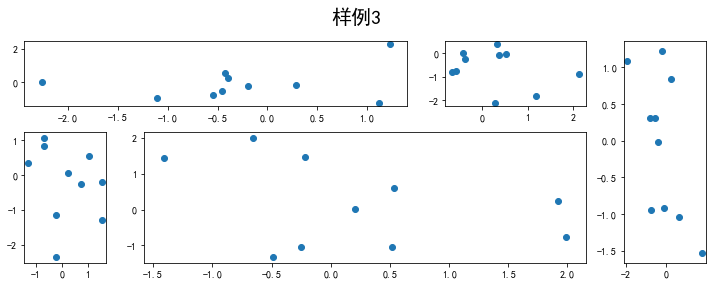
拓展部分:关于切片的基础知识——Python字符串的两种序号体系
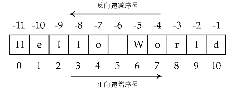
下面通过举例说明
players=['a','b','c','d','e']print(players[0:3])players=['a','b','c','d','e']print(players[:5])players=['a','b','c','d','e']print(players[:-1])players=['a','b','c','d','e']print(players[-3:-1])上述的结果依次为
['a', 'b', 'c']
['a', 'b', 'c', 'd', 'e']
['a', 'b', 'c', 'd']
['c', 'd']
子图上的方法
在 ax 对象上定义了和 plt 类似的图形绘制函数,常用的有: plot, hist, scatter, bar, barh, pie
fig, ax = plt.subplots(figsize=(4,3))ax.plot([1,2],[2,1])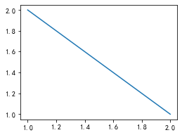
fig, ax = plt.subplots(figsize=(4,3))ax.hist(np.random.randn(1000))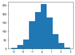
fig, ax = plt.subplots(figsize=(4,3))ax.axhline(0.5,0.2,0.8)ax.axvline(0.5,0.2,0.8)ax.axline([0.3,0.3],[0.7,0.7])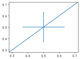
使用 grid 可以加灰色网格
fig, ax = plt.subplots(figsize=(4,3))ax.grid(True)
使用 set_xscale, set_title, set_xlabel 分别可以设置坐标轴的规度(指对数坐标等)、标题、轴名
fig, axs = plt.subplots(1, 2, figsize=(10, 4))fig.suptitle('大标题', size=20)for j in range(2): axs[j].plot(list('abcd'), [10**i for i in range(4)]) if j==0: axs[j].set_yscale('log') axs[j].set_title('子标题1') axs[j].set_ylabel('对数坐标') else: axs[j].set_title('子标题1') axs[j].set_ylabel('普通坐标')fig.tight_layout()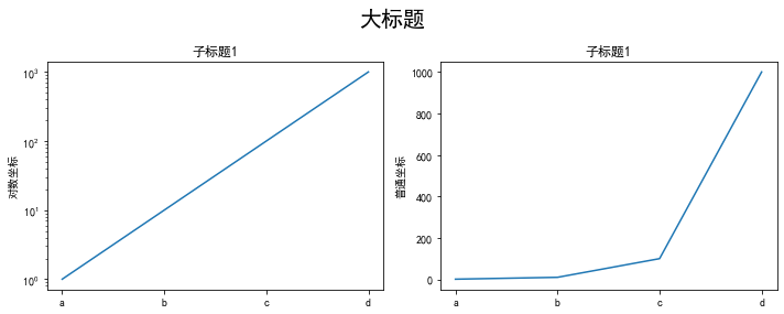
与一般的 plt 方法类似, legend, annotate, arrow, text 对象也可以进行相应的绘制
fig, ax = plt.subplots()ax.arrow(0, 0, 1, 1, head_width=0.03, head_length=0.05, facecolor='red', edgecolor='blue')ax.text(x=0, y=0,s='这是一段文字', fontsize=16, rotation=70, rotation_mode='anchor', color='green')ax.annotate('这是中点', xy=(0.5, 0.5), xytext=(0.8, 0.2), arrowprops=dict(facecolor='yellow', edgecolor='black'), fontsize=16)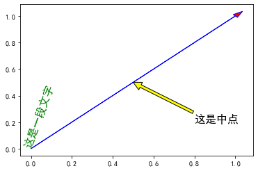
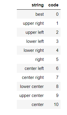
fig, ax = plt.subplots()ax.plot([1,2],[2,1],label="line1")ax.plot([1,1],[1,2],label="line1")ax.legend(loc=1)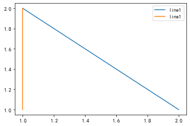
其中,图例的 loc 参数如下:
作业与代码展示
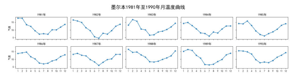
1. 墨尔本1981年至1990年的每月温度情况
请利用数据,画出如下的图:
数据来源:https://github.com/datawhalechina/fantastic-matplotlib/blob/main/data/layout_ex1.csv
代码展示
import matplotlib.pyplot as pltimport numpy as npimport pandas as pdex1 = pd.read_csv('C:/Users/13636/Desktop/数据可视化/fantastic-matplotlib-main/data/layout_ex1.csv')ex1['year'] = pd.to_datetime(ex1['Time']).dt.yearex1['month'] = pd.to_datetime(ex1['Time']).dt.monthex1.head()
from matplotlib.pyplot import MultipleLocatorfig, axs = plt.subplots(2, 5, figsize=(12, 4), sharex=True, sharey=True)fig.suptitle('墨尔本1981年至1990年月温度曲线', size=15)for i in range(2): for j in range(5): if i==0: axs[i][j].set_title('198%d年'%(j+1)) if i==1: axs[i][j].set_title(str(int(1986+j))+'年') if j==0: axs[i][j].set_ylabel('气温') axs[i][j].set_xticks([1,2,3,4,5,6,7,8,9,10,11,12]) axs[i][j].set_yticks([5,10,15]) data = ex1[ex1['year'] == i*5+j+1981] axs[i][j].plot(data['month'], data['Temperature'], color='royalblue',marker='*',linestyle='-')fig.tight_layout()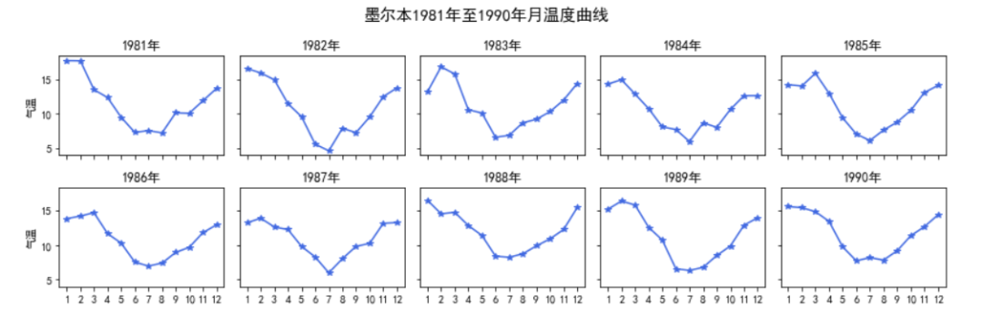
2. 画出数据的散点图和边际分布
用
np.random.randn(2, 150)生成一组二维数据,使用两种非均匀子图的分割方法,做出该数据对应的散点图和边际分布图
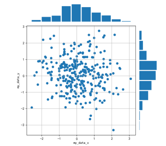
先对文中的图形进行分析,发现有散点和直方图,注意它们的位置,使用子图时标明,直方图没有坐标轴,查看具体的操作说明;整个图形的宽高比选择,子图的横纵坐标以及坐标值说明。下面结合官方文档中的部分资料开始作图
官方说明文档:https://matplotlib.org/gallery/lines_bars_and_markers/scatter_hist.html#sphx-glr-gallery-lines-bars-and-markers-scatter-hist-py

代码展示
import numpy as npimport pandas as pdimport matplotlib.pyplot as plt#随机生成一组二位数据x=np.random.randn(2,150)y=np.random.randn(2,150)设置图片大小,排版位置以及各个子图的说明及绘图形式,引用GridSpec非均匀子图分割方法
fig = plt.figure(figsize=(6, 6))spec = fig.add_gridspec(nrows=2, ncols=2, width_ratios=[3, 1], height_ratios=[1, 3])#sub1 子图1,说明位置和绘图时的宽度比,关闭坐标轴ax = fig.add_subplot(spec[0, 0])ax.hist(x[0],width=0.4)ax.axis('off')#sub2 子图2,说明子图位置,加入网格,坐标值和坐标轴标签ax = fig.add_subplot(spec[1, 0])ax.grid(True)ax.set_xlabel('my_data_x')ax.set_ylabel('my_data_y')ax.set_xticks([-2,-1,0,1,2,3])ax.set_yticks([-3,-2,-1,0,1,2,3])ax.scatter(x, y)#sub3 子图3,说明位置和绘图时的宽度比,规定方向,关闭坐标轴ax = fig.add_subplot(spec[1, 1])ax.hist(x[1], orientation='horizontal', height=0.4)ax.axis('off')plt.tight_layout()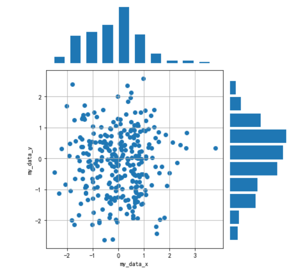
参考:Datawhale数据可视化讲义
Matplotlib官方文档
机器学习课程资料


 284
284


 被折叠的 条评论
为什么被折叠?
被折叠的 条评论
为什么被折叠?
 到【灌水乐园】发言


