


码个蛋(codeegg)第 588 次推文
上节填完了 Scaffold 留下的坑,这节继续填坑,之前留下关于 Layout 的坑,又是一堆部件袭来
Container
为了让我们的界面更容易被扩展,通常会在最外层包裹一层 Container,其构造函数也不是很难理解
Container({Key key,this.alignment, // child 的对齐方式,包括左对齐,居中,右对齐,左上对齐..等等this.padding, // child 和 Container 的边距Color color, // Container 的背景色Decoration decoration, // 样式,可以设置背景图,圆角等属性this.foregroundDecoration, // child 的样式double width, // 宽度double height, // 高度BoxConstraints constraints, // 默认使用 BoxConstraints.tightFor,可以手动传入this.margin, // Container 同上层容器的边距this.transform, // 是个 Matrix4 矩阵,(嗯..这个参数基本很少用,没怎么了解 /捂脸)this.child, // 需要展示的内容})// ...const BoxConstraints.tightFor({double width,double height}): minWidth = width != ? width : 0.0,maxWidth = width != ? width : double.infinity,minHeight = height != ? height : 0.0,maxHeight = height != ? height : double.infinity;
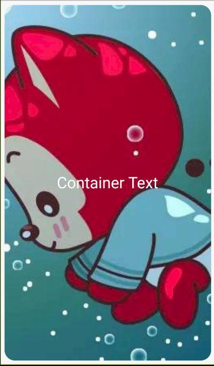
让我们写个圆角矩形的外层,内层值显示白色文字
class HomePage extends StatelessWidget {@overrideWidget build(BuildContext context) {return Scaffold(body: SafeArea(child: Container(alignment: Alignment.center,// 宽,高度同上层容器相同width: MediaQuery.of(context).size.width,height: MediaQuery.of(context).size.height,margin: const EdgeInsets.all(8.0),padding: const EdgeInsets.all(20.0),// Container 的样式decoration: BoxDecoration(borderRadius: BorderRadius.circular(20.0),color: Colors.red,// shape: BoxShape.circle, // 该属性不可同 borderRadius 一起使用backgroundBlendMode: BlendMode.colorDodge, // 背景图片和颜色混合模式image: DecorationImage(image: AssetImage('images/ali.jpg'), fit: BoxFit.cover)),child: Text('Container Text', style: TextStyle(color: Colors.white, fontSize: 30.0)),// color: Theme.of(context).primaryColor, // 该属性不可和 decoration 一起使用)),);}}
效果图如下:
该部分代码查看 column_main.dart 文件
看到这,应该很多小伙伴注意到 margin 和 padding 属性用来和别的部件保持间距,那...那我就是不用 Container 呢(专门来挑事的...),当然没问题,有个专门用来设置间距的部件 Padding,看名字就可以看出来作用了,修改下 child 部分代码,这边先提前用下接下来会讲的部件
child: Column(children: [Text('Container Text', style: TextStyle(color: Colors.white, fontSize: 30.0)),Padding(// 需要传入一个间隔值,`Flutter` 提供了很多 EdgeInsets 来设置间隔,// 参数也很明确,可以一一尝试padding: const EdgeInsets.symmetric(vertical: 12.0),// 传入需要间隔的部件child: Text('Container Text', style: TextStyle(color: Colors.white, fontSize: 30.0)))],),
效果就不展示了,接下来就要开始我的填坑之旅了....
Flex,Row,Column
写 Android 的小伙伴应该比较常用 LinearLayout,在 Flutter 中用两个部件,Row Column来代替 Android 中的 LinearLayout,其中 Row 是横向布局,Column 是垂直布局,因为 Row 和 Column 都是继承于 Flex 部件,Flex 比他们多了 direction 属性用来指定方向,所以主要拿 Column 来讲解,Flex 、Row 用法相同
Column({Key key,// 对齐方式,对于 `Column` start 为顶部,对于 `Row` 需要分语言,和语言同向// 3 种比较特殊的对齐方式,前端的小伙伴会了解,// spaceAround 两个部件之间的间隔是部件和上层容器间隔的两倍// spaceBetween 两侧部件同上层容器间隔为 0,部件之间的间隔相等// spaceEvenly 部件之间的间隔同两侧部件与上层容器间隔MainAxisAlignment mainAxisAlignment = MainAxisAlignment.start,MainAxisSize mainAxisSize = MainAxisSize.max, // 主轴的大小CrossAxisAlignment crossAxisAlignment = CrossAxisAlignment.center, // 副轴对齐方式TextDirection textDirection, // 文字方向,决定 startVerticalDirection verticalDirection = VerticalDirection.down, // 垂直方向TextBaseline textBaseline,List children = const [], // 内部子部件})
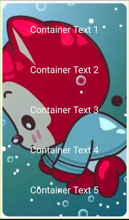
Row 和 Column 都有主轴和副轴,如何区分呢,布局平行方向为主轴,垂直方向为副轴,我们把 Container 的 child 修改成 Column,然后把 Text 放到 Column 中,多放几个,然后自己设置 mainAxisAlignment 属性,查看布局的变化
// ... 省略相同代码child: Column(mainAxisAlignment: MainAxisAlignment.spaceAround,children: [Text('Container Text 1', style: TextStyle(color: Colors.white, fontSize: 30.0)),Text('Container Text 2', style: TextStyle(color: Colors.white, fontSize: 30.0)),Text('Container Text 3', style: TextStyle(color: Colors.white, fontSize: 30.0)),Text('Container Text 4', style: TextStyle(color: Colors.white, fontSize: 30.0)),Text('Container Text 5', style: TextStyle(color: Colors.white, fontSize: 30.0)),],)
最后的效果图如下:
这边 Column 内部的子部件因为高度相同,如果不同还需要等分空间的话,就不可以通过设置 mainAxisAlignment 属性来实现了,这里介绍一个等分的部件 Expanded
const Expanded({Key key,int flex = 1, // 所占比例@required Widget child, // 子部件})
直接给 Text 外层加一个 Expanded 即可实现效果,当然可以按照需求来设置 flex 来修改比例值。
当然,在使用过程中也会遇到那么些坑,我们修改下代码,把 child 的代码修改成如下
child: Row(children: [Text('ABC' * 5, style: TextStyle(color: Colors.white, fontSize: 16.0)),Text('ABC' * 5, style: TextStyle(color: Colors.white, fontSize: 16.0)),Text('ABC' * 5, style: TextStyle(color: Colors.white, fontSize: 16.0)),Text('ABC' * 5, style: TextStyle(color: Colors.white, fontSize: 16.0)),Text('ABC' * 5, style: TextStyle(color: Colors.white, fontSize: 16.0))],)
然后运行下,你的屏幕就提示你 RIGHT OVERFLOWED BY XXX PIXELS 「**, *****」我猜你内心肯定这样的,冷静冷静
既然遇到问题,当然要解决,不然和产品去撕逼吗..?这边,我们把 Row 换成另一个布局 Wrap 然后再运行,Prefect,Wrap 和 Row 的参数基本类似
Wrap
Wrap({Key key,this.direction = Axis.horizontal,this.alignment = WrapAlignment.start,this.spacing = 0.0, // 两个子部件之间的间隔,默认 0.0,如果值过大,可能导致原来同行的两个部件分行this.runAlignment = WrapAlignment.start,this.runSpacing = 0.0, // 排布方向上 两个子部件的间隔this.crossAxisAlignment = WrapCrossAlignment.start,this.textDirection,this.verticalDirection = VerticalDirection.down,List children = const [],})
当然,很多时候只有以上的布局是不行的,比如我们需要实现一个圆形头像,然后一段文字在其上面 ,例如下面的效果
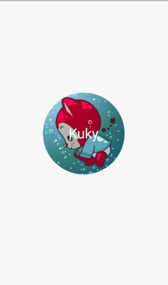
接下来介绍一个堆叠的部件 Stack,源码比较简单,就不贴了,直接上效果代码
class HomePage extends StatelessWidget {@overrideWidget build(BuildContext context) {return Scaffold(body: Center(child: Stack(// 内部子部件的对齐方式alignment: Alignment.center,children: [// 圆形头像,指定半径,指定背景图为头像即可CircleAvatar(backgroundImage: AssetImage('images/ali.jpg'), radius: 100.0),Text('Kuky', style: TextStyle(color: Colors.white, fontSize: 34.0)),],)),);}}
如果我们需要第三个部件,底部距离圆形头像10px,那么只靠 alignment 是不可能实现了
所以,另外一个灰常流弊的部件就出来了 Positioned,其源码也比较简单,我还是不贴了吧~,还是直接上代码,直接修改
class HomePage extends StatelessWidget {@overrideWidget build(BuildContext context) {return Scaffold(body: Center(child: Stack(alignment: Alignment.center,children: [CircleAvatar(backgroundImage: AssetImage('images/ali.jpg'), radius: 100.0),Text('Kuky',style: TextStyle(color: Colors.white, fontSize: 34.0),),Positioned(child: Text('另外一段文字', style: TextStyle(color: Colors.white, fontSize: 20.0)), bottom: 10.0), // left, right, top, bottom 分别表示和 stack 的间距],)),);}}
最后的效果图如下:

很好,今天填了布局的这个大坑,而且讲的部件貌似还挺多的,虽然还是比较简单,剩下的就给小伙伴们慢慢消化今天的内容。
下节,除了有常用的部件外,我会尽量加上实战内容
代码地址:
https://github.com/kukyxs/flutter_arts_demos_app


 5821
5821

 被折叠的 条评论
为什么被折叠?
被折叠的 条评论
为什么被折叠?
 到【灌水乐园】发言


