


css实现各种图形真是太赞了,再也不用切图了,直接用css就可以实现。
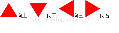
最常用的就是用css实现的小三角了
#triangle-up{
display:inline-block;
width:0;
height:0;
border-left:30px solid transparent;
border-right: 30px solid transparent;
border-bottom:50px solid red;}
#triangle-down {
display:inline-block;
width:0;
height:0;
border-left:30px solid transparent;
border-right: 30px solid transparent;
border-top:50px solid red;}
#triangle-left {
display:inline-block;
width:0;
height:0;
border-top: 30px solid transparent;
border-right: 50px solid red;
border-bottom: 30px solid transparent;}
#triangle-right{
display:inline-block;
width:0;
height:0;
border-top: 30px solid transparent;
border-left: 50px solid red;
border-bottom: 30px solid transparent;}
#triangle-topleft {
display:inline-block;
width: 0;
height: 0;
border-top: 50px solid red;
border-right: 50px solid transparent;
}
#triangle-topright {
display:inline-block;
width: 0;
height: 0;
border-top: 50px solid red;
border-left: 50px solid transparent;
}
#triangle-bottomleft {
display:inline-block;
width: 0;
height: 0;
border-bottom: 50px solid red;
border-right: 50px solid transparent;
}
#triangle-bottomright {
display:inline-block;
width: 0;
height: 0;
border-bottom: 50px solid red;
border-left: 50px solid transparent;
}
通过这样的小箭头在项目中我们可以实现验证提示层箭头这样的样式,非常的实用,再也不用为提示层样式发愁啦。

我们看到了实现css小箭头的style样式中都用到了transparent这样的一个属性,transparent到底是什么意思?于是查看了css参考手册,定义是:
用来指定全透明色彩。
transparent是全透明黑色(black)的速记法,即一个类似rgba(0,0,0,0)这样的值。
在css1中,transparent被用来作为background-color的一个参数值,用于表示背景透明。
在css2中,border-color也开始接受transparent作为参数值。
在css3中,transparent被延伸到任何一个有color值的属性上。
transparent我总结意思就是透明,无颜色的。
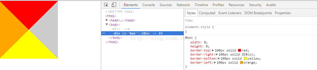
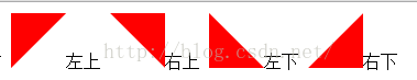
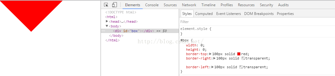
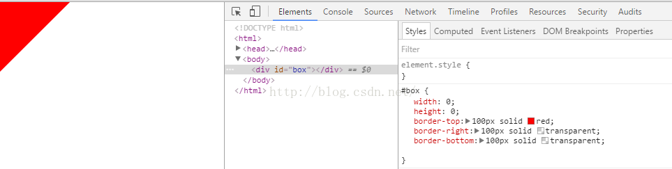
看图,三角形的实现实际上是一个宽度和高度都为0的div的四个边框实现的,如果我们要实现朝下的箭头,那就要让div的左~右 边框都为透明(透明但左右边框还占位置)。
左上箭头 实现思路是什么呢?div的右边框和底部边框都为透明,这样左上角的箭头就露出来了。
css3实现心形

#heart {
position: relative;
width: 100px;
height: 90px;
}
#heart:before,
#heart:after {
position: absolute;
content: "";
left: 50px;
top: 0;
width: 50px;
height: 80px;
background: red;
-moz-border-radius: 50px 50px 0 0;
border-radius: 50px 50px 0 0;
-webkit-transform: rotate(-45deg);
-moz-transform: rotate(-45deg);
-ms-transform: rotate(-45deg);
-o-transform: rotate(-45deg);
transform: rotate(-45deg);
-webkit-transform-origin: 0 100%;
-moz-transform-origin: 0 100%;
-ms-transform-origin: 0 100%;
-o-transform-origin: 0 100%;
transform-origin: 0 100%;
}
#heart:after {
left: 0;
-webkit-transform: rotate(45deg);
-moz-transform: rotate(45deg);
-ms-transform: rotate(45deg);
-o-transform: rotate(45deg);
transform: rotate(45deg);
-webkit-transform-origin: 100% 100%;
-moz-transform-origin: 100% 100%;
-ms-transform-origin: 100% 100%;
-o-transform-origin: 100% 100%;
transform-origin :100% 100%;
}
到此这篇关于css3实现小箭头各种图形效果的文章就介绍到这了,更多相关css 小箭头 内容请搜索萬仟网以前的文章或继续浏览下面的相关文章,希望大家以后多多支持萬仟网!


 2251
2251


 被折叠的 条评论
为什么被折叠?
被折叠的 条评论
为什么被折叠?
 到【灌水乐园】发言


