


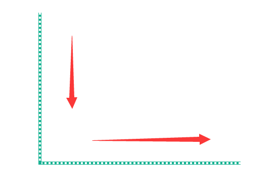
图一是示意,图二是真实效果,动态加不上,只能用红箭头表示下了。。。。。。。。。。。
HTML代码:
<div class="pipecorner_arrows">
    <div class="pipeline_down_arrows position_left_bottom">
        <div class="arrow_down_arrows"></div>
    </div>
    <div class="pipeline_right_arrows position_bottom_left">
        <div class="arrow_right_arrows"></div>
    </div>
</div>

<!--拐角定位div-->
<div class="corner_box corner_box_left_bottom">
    <div class="corner_square"></div>
</div>
CSS代码:
/*向右流动箭头*/
.pipeline_right_arrows {
    width: 100%;
    height: 6px;/*图片height为4px,上下border各为1px*/
    border-top: 1px solid #1AB395;
    border-bottom: 1px solid #1AB395;
}

/*向下流动箭头*/
.pipeline_down_arrows {
    width: 6px;/*图片width为4px,上下border各为1px*/
    height: 100%;
    border-left: 1px solid #1AB395;
    border-right: 1px solid #1AB395;
}

.pipecorner_arrows .position_left_bottom {
    position: absolute;
    bottom: 6px;
    left: 0;
}

.pipecorner_arrows .position_bottom_left {
    position: absolute;
    bottom: 0;
    left: 6px;
}

/*初始化下箭头*/
.arrow_down_arrows {
    width: 100%;
    height: 100%;
    overflow: hidden;
    background: url("../images/square_default_y.png") repeat-y 0 0;

    /*无限循环箭头动画效果*/
    animation: down_arrow_square_default 3s infinite linear;
    -moz-animation: down_arrow_square_default 3s infinite linear;
    -webkit-animation: down_arrow_square_default 3s infinite linear;
    -o-animation: down_arrow_square_default 3s infinite linear;
}

/*初始化右箭头*/
.arrow_right_arrows{
    width: 100%;
    height: 100%;
    overflow: hidden;
    background: url("../images/square_default_x.png") repeat-x 0 0;

    /*无限循环箭头动画效果*/
    animation: right_arrow_square_default 3s infinite linear;
    -moz-animation: right_arrow_square_default 3s infinite linear;
    -webkit-animation: right_arrow_square_default 3s infinite linear;
    -o-animation: right_arrow_square_default 3s infinite linear;
}

@keyframes down_arrow_square_default {
    0% {
        background: url("../images/square_default_y.png") repeat-y 0 0;
    }

    100% {
        /*图片height为8px,两个图片错开,以免卡顿,设置y为height的2倍,16px*/
        background: url("../images/square_default_y.png") repeat-y 0 16px;
    }
}

@keyframes right_arrow_square_default {
    0% {
        background: url("../images/square_default_x.png") repeat-x 0 0;
    }
    100% {
        background: url("../images/square_default_x.png") repeat-x 16px 0;
    }
}

/*拐角方块定位*/
.corner_box {
    width: 6px;
    height: 6px;
    position: absolute;
}

.corner_box_left_bottom {
    bottom: 0;
    left: 0;
}

.corner_box .corner_square {
    width: 6px;
    height: 6px;
    background: #1AB395;
}
背景图片:


square_default_x.png square_default_y.png
8px * 4px 4px * 8px


 2269
2269

 被折叠的 条评论
为什么被折叠?
被折叠的 条评论
为什么被折叠?
 到【灌水乐园】发言


