


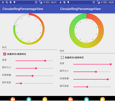
效果图
一、绘制圆环
圆环故名思意,第一个首先绘制是圆环
1:圆环绘制函数
圆环API
public void drawArc (RectF oval, float startAngle, float sweepAngle, boolean useCenter, Paint paint)
参数说明
oval:圆弧所在的椭圆对象。
startAngle:圆弧的起始角度。
sweepAngle:圆弧的角度。
useCenter:是否显示半径连线,true表示显示圆弧与圆心的半径连线,false表示不显示。
paint:绘制时所使用的画笔。
//circleCenter 整个圆半径 radius圆环的半径
RectF oval = new RectF(circleCenter - radius, circleCenter - radius, circleCenter + radius, circleCenter + radius);
//因为-90°才是从12点钟方向开始 所以从-90开始 progress 为进度
canvas.drawArc(oval, -90, (float) (progress * 3.6), false, paint);
2:对圆环上色
因为要的是渐变效果API也有提供
函数名是:SweepGradient
构造函数
public SweepGradient (float cx, float cy, int[] colors, float[] positions)
cx 渲染中心点x 坐标
cy 渲染中心y 点坐标
colors 围绕中心渲染的颜色数组,至少要有两种颜色值
positions 相对位置的 颜色 数组 ,可为null, 若为null,可为null, 颜色 沿渐变线 均匀分布
public SweepGradient (float cx, float cy, int color0, int color1)
cx 渲染中心点x 坐标
cy 渲染中心点y 坐标
color0 起始渲染颜色
color1 结束渲染颜色
实现样式
//渐变颜色 你可以添加很多种但是至少要保持在2种颜色以上
int[] colors = {0xffff4639, 0xffCDD513, 0xff3CDF5F};
//circleWidth 圆的直径 取中心点
SweepGradient sweepGradient = new SweepGradient(this.circleWidth / 2, this.circleWidth / 2, colors, null);
但是最后实现出来的效果是渐变开始角度是从0°开始的 但是我们想要的要求是从-90°开始 因此需要对绘制的圆环进行旋转
//旋转 不然是从0度开始渐变
Matrix matrix = new Matrix();
matrix.setRotate(-90, this.circleWidth / 2, this.circleWidth / 2);
sweepGradient.setLocalMatrix(matrix);
最后将渐变添加到圆环
paint.setShader(sweepGradient);
因为是需要保持第一个圆环的采用渐变,所以在绘制时候在利用完之后 将设置
paint.setShader(null);
3:绘制剩余的进度
一样的是绘制圆环开始角度
//同样的因为是反向绘制的 也可以根据当前的有颜色的角度结束角度开始绘制到-90°
canvas.drawArc(oval, -90, (float) (-(100 - progress) * 3.6), false, paint);
最终实现效果如图1所示
二、刻度
1:圆环刻度
是对整个圆环根据刻度大小进行平分,计算出每个所占的角度 然后根据当前的进度计算该显示几个圆环之后再绘制上去,刻度使用是也是圆环,只是角度很小而已
如下
float start = -90f;
float p = ((float) maxColorNumber / (float) 100);
p = (int) (progress * p);
for (int i = 0; i < p; i++) {
paint.setColor(roundBackgroundColor);
// 绘制间隔快
canvas.drawArc(oval, start + singlPoint - lineWidth, lineWidth, false, paint);
start = (start + singlPoint);
}
2:文字刻度
也就是绘制文字是对文字绘制之后进行相应的旋转
//绘制文字刻度
for (int i = 1; i <= 10; i++) {
canvas.save();// 保存当前画布
canvas.rotate(360 / 10 * i, circleCenter, circleCenter);
canvas.drawText(i * 10 + "", circleCenter, circleCenter - radius + roundWidth / 2 + getDpValue(4) + textSize, mPaintText);
canvas.restore();//
}
最后上整个View代码
package com.example.shall.myapplication;
import android.content.Context;
import android.content.res.TypedArray;
import android.graphics.Canvas;
import android.graphics.Matrix;
import android.graphics.Paint;
import android.graphics.RectF;
import android.graphics.SweepGradient;
import android.util.AttributeSet;
import android.util.TypedValue;
import android.view.View;
public class CircularRingPercentageView extends View {
private Paint paint;
private int circleWidth;
private int roundBackgroundColor;
private int textColor;
private float textSize;
private float roundWidth;
private float progress = 0;
private int[] colors = {0xffff4639, 0xffCDD513, 0xff3CDF5F};
private int radius;
private RectF oval;
private Paint mPaintText;
private int maxColorNumber = 100;
private float singlPoint = 9;
private float lineWidth = 0.3f;
private int circleCenter;
private SweepGradient sweepGradient;
private boolean isLine;
/**
* 分割的数量
*
* @param maxColorNumber 数量
*/
public void setMaxColorNumber(int maxColorNumber) {
this.maxColorNumber = maxColorNumber;
singlPoint = (float) 360 / (float) maxColorNumber;
invalidate();
}
/**
* 是否是线条
*
* @param line true 是 false否
*/
public void setLine(boolean line) {
isLine = line;
invalidate();
}
public int getCircleWidth() {
return circleWidth;
}
public CircularRingPercentageView(Context context) {
this(context, null);
}
public CircularRingPercentageView(Context context, AttributeSet attrs) {
this(context, attrs, 0);
}
public CircularRingPercentageView(Context context, AttributeSet attrs, int defStyle) {
super(context, attrs, defStyle);
TypedArray mTypedArray = context.obtainStyledAttributes(attrs, R.styleable.CircularRing);
maxColorNumber = mTypedArray.getInt(R.styleable.CircularRing_circleNumber, 40);
circleWidth = mTypedArray.getDimensionPixelOffset(R.styleable.CircularRing_circleWidth, getDpValue(180));
roundBackgroundColor = mTypedArray.getColor(R.styleable.CircularRing_roundColor, 0xffdddddd);
textColor = mTypedArray.getColor(R.styleable.CircularRing_circleTextColor, 0xff999999);
roundWidth = mTypedArray.getDimension(R.styleable.CircularRing_circleRoundWidth, 40);
textSize = mTypedArray.getDimension(R.styleable.CircularRing_circleTextSize, getDpValue(8));
colors[0] = mTypedArray.getColor(R.styleable.CircularRing_circleColor1, 0xffff4639);
colors[1] = mTypedArray.getColor(R.styleable.CircularRing_circleColor2, 0xffcdd513);
colors[2] = mTypedArray.getColor(R.styleable.CircularRing_circleColor3, 0xff3cdf5f);
initView();
mTypedArray.recycle();
}
/**
* 空白出颜色背景
*
* @param roundBackgroundColor
*/
public void setRoundBackgroundColor(int roundBackgroundColor) {
this.roundBackgroundColor = roundBackgroundColor;
paint.setColor(roundBackgroundColor);
invalidate();
}
/**
* 刻度字体颜色
*
* @param textColor
*/
public void setTextColor(int textColor) {
this.textColor = textColor;
mPaintText.setColor(textColor);
invalidate();
}
/**
* 刻度字体大小
*
* @param textSize
*/
public void setTextSize(float textSize) {
this.textSize = textSize;
mPaintText.setTextSize(textSize);
invalidate();
}
/**
* 渐变颜色
*
* @param colors
*/
public void setColors(int[] colors) {
if (colors.length < 2) {
throw new IllegalArgumentException("colors length < 2");
}
this.colors = colors;
sweepGradientInit();
invalidate();
}
/**
* 间隔角度大小
*
* @param lineWidth
*/
public void setLineWidth(float lineWidth) {
this.lineWidth = lineWidth;
invalidate();
}
private int getDpValue(int w) {
return (int) TypedValue.applyDimension(TypedValue.COMPLEX_UNIT_DIP, w, getContext().getResources().getDisplayMetrics());
}
/**
* 圆环宽度
*
* @param roundWidth 宽度
*/
public void setRoundWidth(float roundWidth) {
this.roundWidth = roundWidth;
if (roundWidth > circleCenter) {
this.roundWidth = circleCenter;
}
radius = (int) (circleCenter - this.roundWidth / 2); // 圆环的半径
oval.left = circleCenter - radius;
oval.right = circleCenter + radius;
oval.bottom = circleCenter + radius;
oval.top = circleCenter - radius;
paint.setStrokeWidth(this.roundWidth);
invalidate();
}
/**
* 圆环的直径
*
* @param circleWidth 直径
*/
public void setCircleWidth(int circleWidth) {
this.circleWidth = circleWidth;
circleCenter = circleWidth / 2;
if (roundWidth > circleCenter) {
roundWidth = circleCenter;
}
setRoundWidth(roundWidth);
sweepGradient = new SweepGradient(this.circleWidth / 2, this.circleWidth / 2, colors, null);
//旋转 不然是从0度开始渐变
Matrix matrix = new Matrix();
matrix.setRotate(-90, this.circleWidth / 2, this.circleWidth / 2);
sweepGradient.setLocalMatrix(matrix);
}
/**
* 渐变初始化
*/
public void sweepGradientInit() {
//渐变颜色
sweepGradient = new SweepGradient(this.circleWidth / 2, this.circleWidth / 2, colors, null);
//旋转 不然是从0度开始渐变
Matrix matrix = new Matrix();
matrix.setRotate(-90, this.circleWidth / 2, this.circleWidth / 2);
sweepGradient.setLocalMatrix(matrix);
}
public void initView() {
circleCenter = circleWidth / 2;//半径
singlPoint = (float) 360 / (float) maxColorNumber;
radius = (int) (circleCenter - roundWidth / 2); // 圆环的半径
sweepGradientInit();
mPaintText = new Paint();
mPaintText.setColor(textColor);
mPaintText.setTextAlign(Paint.Align.CENTER);
mPaintText.setTextSize(textSize);
mPaintText.setAntiAlias(true);
paint = new Paint();
paint.setColor(roundBackgroundColor);
paint.setStyle(Paint.Style.STROKE);
paint.setStrokeWidth(roundWidth);
paint.setAntiAlias(true);
// 用于定义的圆弧的形状和大小的界限
oval = new RectF(circleCenter - radius, circleCenter - radius, circleCenter + radius, circleCenter + radius);
}
@Override
protected void onDraw(Canvas canvas) {
super.onDraw(canvas);
//背景渐变颜色
paint.setShader(sweepGradient);
canvas.drawArc(oval, -90, (float) (progress * 3.6), false, paint);
paint.setShader(null);
//是否是线条模式
if (!isLine) {
float start = -90f;
float p = ((float) maxColorNumber / (float) 100);
p = (int) (progress * p);
for (int i = 0; i < p; i++) {
paint.setColor(roundBackgroundColor);
canvas.drawArc(oval, start + singlPoint - lineWidth, lineWidth, false, paint); // 绘制间隔快
start = (start + singlPoint);
}
}
//绘制剩下的空白区域
paint.setColor(roundBackgroundColor);
canvas.drawArc(oval, -90, (float) (-(100 - progress) * 3.6), false, paint);
//绘制文字刻度
for (int i = 1; i <= 10; i++) {
canvas.save();// 保存当前画布
canvas.rotate(360 / 10 * i, circleCenter, circleCenter);
canvas.drawText(i * 10 + "", circleCenter, circleCenter - radius + roundWidth / 2 + getDpValue(4) + textSize, mPaintText);
canvas.restore();//
}
}
OnProgressScore onProgressScore;
public interface OnProgressScore {
void setProgressScore(float score);
}
public synchronized void setProgress(final float p) {
progress = p;
postInvalidate();
}
/**
* @param p
*/
public synchronized void setProgress(final float p, OnProgressScore onProgressScore) {
this.onProgressScore = onProgressScore;
progress = p;
postInvalidate();
}
}
以上所述是小编给大家介绍的Android 自定义圆形带刻度渐变色的进度条,希望对大家有所帮助,如果大家有任何疑问请给我留言,小编会及时回复大家的。在此也非常感谢大家对脚本之家网站的支持!


 1628
1628


 被折叠的 条评论
为什么被折叠?
被折叠的 条评论
为什么被折叠?
 到【灌水乐园】发言


