


使用Visual Studio 2008开发已经有一段时间了。其中改善了很多用户体验对我们的开发很有帮助,所提供的模板也大大简化了我们的项目开发。
其中对WPF技术的引入引起了我的极大兴趣,WPF技术的出现,使得传统的UI设计得到了大大的简化,以前我们要做一个用户自定义控件是件很复杂的事情,在WPF里面,将会比较简单。那些只有专业公司才能做的事情现在普通开发者也可以轻松完成。
前段时间收到了来自微软最有影响力开发者项目组的技术光盘,其中就讲到了WPF以及SilverLight的一些相关技术。由于工作关系没有及时拿上来与大家分享。
本文就以在VS2008中使用WPF创建用户自定义按钮为例,来学习一下怎么样使用WPF来工作。
首先,打开VS2008,创建一个WPF应用程序项目。
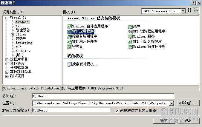
我们取名为WpfDemo1
跟传统的windows应用程序开发一样,VS会自动帮我们完成程序的基本框架的创建工作。
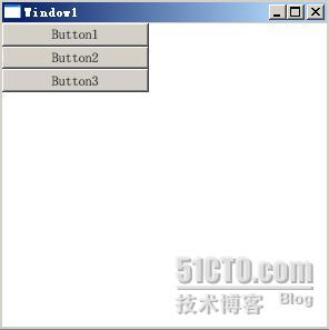
添加基本按钮
在新建立的项目中,我们双击Window1.xaml文件。
通过在解决方案资源管理器中双击
Window1.xaml
文件来打开它。默认情况下,
Window1.xaml
中存在一个
Grid
元素。移除
Grid
元素,并通过向
Window1.xaml
中键入或复制和粘贴以下突出显示的代码来向可扩展应用程序标记语言
(XAML)
页面中添加几个按钮
 <Window x:Class=
"WpfDemo1.Window1"
xmlns=
"http://schemas.microsoft.com/winfx/2006/xaml/presentation" xmlns:x="http://schemas.microsoft.com/winfx/2006/xaml" Title="Window1" Height="300" Width="300"> <StackPanel HorizontalAlignment="Left" Width="132"> <Button>Button1</Button> <Button>Button2</Button> <Button>Button3</Button> </StackPanel> </Window>
<Window x:Class=
"WpfDemo1.Window1"
xmlns=
"http://schemas.microsoft.com/winfx/2006/xaml/presentation" xmlns:x="http://schemas.microsoft.com/winfx/2006/xaml" Title="Window1" Height="300" Width="300"> <StackPanel HorizontalAlignment="Left" Width="132"> <Button>Button1</Button> <Button>Button2</Button> <Button>Button3</Button> </StackPanel> </Window>
F5运行我们的应用程序,我们将会看到我们刚才新添加的基本应用程序按钮。
设置基本属性
<?xml:namespace prefix = o ns = "urn:schemas-microsoft-com:office:office" />
接着,我们将会为这些按钮设置一些属性,以便控制按钮外观和布局。您将使用资源来为整个应用程序定义按钮属性,而不是为这些按钮单独设置属性。在概念上,应用程序资源与网页的外部级联样式表
(CSS)
相似;但是,资源远比级联样式表
(CSS)
强大,在本例结束时您将明白这一点。
使用样式为按钮设置基本属性
1.
定义
Application.Resources
块:
打开
app.xaml
并添加下面突出显示的标记(如果尚未添加):
<Application.Resources>
<Style TargetType=
"Button">
<Setter Property=
"Width" Value=
"90" />
<Setter Property=
"Margin" Value=
"10" />
</Style>
</Application.Resources>
1.
资源范围由资源的定义位置来确定。如果资源是在 app.xaml 文件的 Application.Resoureses 中定义的,则将允许从应用程序中的任何位置使用资源。
2.
创建一个样式并用该样式定义基本属性值:向 Application.Resources 块添加下面的标记。此标记创建一个应用于该应用程序中所有按钮的 Style,并将这些按钮的 Width 设置为 90,将 Margin 设置为 10:
<Application.Resources>
<Style TargetType=
"Button">
<Setter Property=
"Width" Value=
"90" />
<Setter Property=
"Margin" Value=
"10" />
</Style>
</Application.Resources>
TargetType 属性指定将该样式应用于 Button 类型的所有对象。每个 Setter 都为 Style 设置不同的属性值。因此,此时该应用程序中的每个按钮的宽度都为 90,边距都为 10。
3
您还可以对样式进行更多的处理,这包括以各种方式微调对象的目标、指定复杂的属性值,甚至将样式作为其他样式的输入。
4
为资源设置样式属性值:
使用资源,可以通过一种简单的方式来重用通常定义的对象和值。为了使代码更加模块化,使用资源定义复杂值尤其有用。向
app.xaml
添加下面突出显示的标记。
<Application.Resources>
<LinearGradientBrush x:Key=
"GrayBlueGradientBrush"
StartPoint=
"0,0" EndPoint=
"1,1">
<GradientStop Color=
"DarkGray" Offset=
"0" />
<GradientStop Color=
"#CCCCFF" Offset=
"0.5" />
<GradientStop Color=
"DarkGray" Offset=
"1" />
</LinearGradientBrush>
<Style TargetType=
"{x:Type Button}">
<Setter Property=
"Background"
Value=
"{StaticResource GrayBlueGradientBrush}" />
<Setter Property=
"Width" Value=
"90" />
<Setter Property=
"Margin" Value=
"10" />
</Style>
</Application.Resources>
5
您已经在
Application.Resources
块的正下方创建了一个名为
“GrayBlueGradientBrush”
的资源。此资源将定义一个水平渐变。此资源可以在该应用程序中的任何位置(包括在
Background
属性的按钮样式
setter
内部中)用作属性值。现在,所有的按钮都具有此渐变的
Background
属性值。
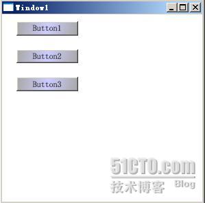
按
F5
运行该应用程序。其外观类似于下图:
<?xml:namespace prefix = v ns = "urn:schemas-microsoft-com:vml" />
创建一个定义按钮外观的模板
在本节中,将创建一个用来自定义按钮外观(表示)的模板。按钮表示是由几个赋予按钮独特外观的对象(包括矩形和其他组件)组成的。
到目前为止,对应用程序中按钮外观的控制已限制为更改按钮的属性。如果您希望更彻底地改变按钮的外观,该怎么办?
使用模板可以强有力地控制对象的表示。由于模板可以在样式中使用,因此您可以将模板应用于所有应用了样式的对象(在本例中为按钮)。
使用模板定义按钮的外观
1.
设置模板:
由于控件(如
Button
)具有
Template
属性,因此您可以像对
Style
中所设置的其他属性值那样,使用
Setter
来定义模板属性值。向按钮样式中添加下面突出显示的标记。
<Application.Resources>
<LinearGradientBrush x:Key=
"GrayBlueGradientBrush"
StartPoint=
"0,0" EndPoint=
"1,1">
<GradientStop Color=
"DarkGray" Offset=
"0" />
<GradientStop Color=
"#CCCCFF" Offset=
"0.5" />
<GradientStop Color=
"DarkGray" Offset=
"1" />
</LinearGradientBrush>
<Style TargetType=
"{x:Type Button}">
<Setter Property=
"Background" Value=
"{StaticResource GrayBlueGradientBrush}" />
<Setter Property=
"Width" Value=
"80" />
<Setter Property=
"Margin" Value=
"10" />
<Setter Property=
"Template">
<Setter.Value>
<!-- The button template
is defined here. -->
</Setter.Value>
</Setter>
</Style>
</Application.Resources>
未完,待续……
转载于:https://blog.51cto.com/seanli888/129806


 2767
2767

 被折叠的 条评论
为什么被折叠?
被折叠的 条评论
为什么被折叠?
 到【灌水乐园】发言


