


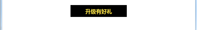
一、目标
目标完成下图效果:

二、完成
1、分析
在::before和::after伪元素的用法一文中有说到使用::befrore和::after可以完成一个六边形。这个案例是用一个#star-six完成一个正三角形,通过::after实现一个倒三角形,然后绝对定位放好位置。我们接下来也用这个思路完成。
2、完成
第一步,先完成如下基本的效果,实现一个在浏览器中居中的文本
代码如下:
<style>
.middle{
text-align:center;
}
.title{
background-color:black;
color:#f3e14f;
display:inline-block;
font-size:18px;
height:40px;
line-height:40px;
padding:0 50px;
}
</style>
<div class="middle">
<h5 class="title">升级有好礼</h5>
</div>
第二步,做左右两边尖尖的效果。可以根据做五角星的代码修改。

代码如下:
<style>
#star-three {
  width: 0;
  height: 0;
  border-left: 100px solid transparent;
  border-top: 50px solid red;
  border-bottom: 50px solid red;
/*  position: relative;*/
}
</style>
<div id="star-three"></div>
第三步,通过::before来实现第二步中的效果。
代码还是第二步中的代码,但是是通过::before来实现记得写上content:""。然后调整一下尺寸。
.title::before{
  width: 0;
  height: 0;
  border-left: 40px solid transparent;
  border-top: 20px solid red;
  border-bottom: 20px solid red;
  content: "";
}
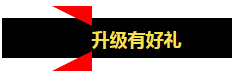
如果给border-left设置蓝色会发现效果如下。【原理还不是很懂,不知道这个高度是因为什么原因??】
结果这是什么鬼?不是想要的效果。此时需要调整布局。
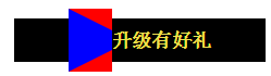
第四步,使用绝对定位调整布局。
.title设置relative,.title::before设置absolute。效果如下。

第五步,通过left调整。
.title{
background-color:black;
color:#f3e14f;
display:inline-block;
font-size:18px;
height:40px;
line-height:40px;
position:relative;
padding:0 50px;
}

.title::before{
  width: 0;
  height: 0;
  border-left: 40px solid transparent;
  border-top: 20px solid red;
  border-bottom: 20px solid red;
  content: "";
  position:absolute;
  left:-40px;
}

第六步,同理,通过::after实现右边效果。
.title::after{
  width: 0;
  height: 0;
  border-right: 40px solid transparent;
  border-top: 20px solid red;
  border-bottom: 20px solid red;
  content: "";
  position:absolute;
  right:-40px;

}

第七步,改下颜色就好了。
完整代码如下:


<!DOCTYPE html>
<html>
<head>
<meta charset="utf-8"/>
<title>demo of starof</title>
<style>
.middle{
text-align:center;
}
.title{
background-color:black;
color:#f3e14f;
display:inline-block;
font-size:18px;
height:40px;
line-height:40px;
position:relative;
padding:0 50px;
}
.title::before{
  width: 0;
  height: 0;
  border-left: 40px solid transparent;
  border-top: 20px solid black;
  border-bottom: 20px solid black;
  content: "";
  position:absolute;
  left:-40px;
}
.title::after{
  width: 0;
  height: 0;
  border-right: 40px solid transparent;
  border-top: 20px solid black;
  border-bottom: 20px solid black;
  content: "";
  position:absolute;
  right:-40px;

}
</style>
</head>
<body>
<div class="middle">
  <h5 class="title">升级有好礼</h5>
</div>
</body>
</html>
效果

3、浏览器兼容性
IE8如果要使用before和after伪元素,加上<!DOCTYPE html>,然后使用单冒号的:before和:after。
IE6,IE7是不支持的。
IE6和IE7兼容性的处理可参考:小tip:我是如何在实际项目中使用before/after伪元素的
本文作者starof,因知识本身在变化,作者也在不断学习成长,文章内容也不定时更新,为避免误导读者,方便追根溯源,请诸位转载注明出处:http://www.cnblogs.com/starof/p/4832598.html有问题欢迎与我讨论,共同进步。


 6040
6040


 被折叠的 条评论
为什么被折叠?
被折叠的 条评论
为什么被折叠?
 到【灌水乐园】发言


