


圆角样式示例(仅在firefox内核,safari,chrome等内核浏览器下支持)

CSS3的border-radius规范
- 属性:
border-top-right-radius
border-bottom-right-radius
border-bottom-right-radius
border-bottom-right-radius
值:<length> <length>?。它们分别是定义角形状的四分之一椭圆的两个半径。如图:

- 第一个值是水平半径。
- 如果第二个值省略,则它等于第一个值,这时这个角就是一个四分之一圆角。
- 如果任意一个值为0,则这个角是矩形,不会是圆的。
- 值不允许是负值。
- 属性:border-radius。它是上面四个属性值的简写。
值:<length>{1,4} [ / <length>{1,4} ]?- 如果斜线前后的值都存在,那么斜线前的值设置水平半径,且斜线后的值设置垂直半径。如果没有斜线,则水平半径和垂直半径相等。
- 四个值是按照top-left、top-right、 bottom-right、 bottom-left的顺序来设置的。如果bottom-left省略,那么它等于top-right。如果bottom-right省略,那么它等于top-left。如果top-right省略,那么它等于top-left。
- 应用范围:所有的元素,除了table的样式属性border-collapse是collapse时
- 内边半径等于外边半径减去对应边的厚度。当这个结果是负值时,内边半径是0。所以内外边曲线的圆心并不一定是一致的。
- border-radius也会导致该元素的背景也是圆的,即使border是none。如果background-clip是padding-box,则背景(background)会被曲线的内边裁剪。如果是border-box则被外边裁剪。border和padding定义的区域也一样会被曲线裁剪。
- 所有的边框样式(solid、dotted、inset等)都遵照角的曲线。如果设置了border-image,则曲线以外的部分会被裁剪掉。
- 如果角的两个相邻边有不同的宽度,那么这个角将会从宽的边平滑过度到窄的边。其中一条边甚至可以是0。
- 两条相邻边颜色和样式转变的中心点是在一个和两边宽度成正比的角上。比如,两条边宽度相同,这个点就是一个45°的角上,如果一条边是另外一条边的两倍,那么这个点就在一个30°的角上。界定这个转变的线就是连接在内外曲线上的两个点的直线
- 角不允许相互重叠,所以当相邻两个角半径的和大于所在矩形区域的大小时,用户代理(浏览器)比如缩小一个或多个角半径。运算法则如下:f = min(Li/Si),i ∈ {top, right, bottom, left},Ltop = Lbottom = 所在矩形区域的宽,Lleft = Lright = 所在矩形区域的高。如果f < 1,那么所有角半径都乘以f。
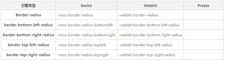
实际CSS应用,需要根据不同浏览器HACK
复制代码
- -moz-border-radius-topleft: 11px;
- -moz-border-radius-topright: 11px;
- -khtml-border-top-left-radius: 11px;
- -khtml-border-top-right-radius: 11px;
- -webkit-border-top-left-radius: 11px;
- -webkit-border-top-right-radius: 11px;
- border-top-right-radius: 11px;
- border-top-left-radius: 11px;
- -moz-border-radius-bottomleft: 11px;
- -moz-border-radius-bottomright: 11px;
- -khtml-border-bottom-left-radius: 11px;
- -khtml-border-bottom-right-radius: 11px;
- -webkit-border-bottom-left-radius: 11px;
- -webkit-border-bottom-right-radius: 11px;
- border-bottom-left-radius: 11px;
- border-bottom-right-radius: 11px;
可简写为
复制代码


- -moz-border-radius: 15px;
- -khtml-border-radius: 15px;
- -webkit-border-radius: 15px;
- border-radius: 15px;
-----------------------------------------------------------------------------------------------------------------------------------------
语法:
border-radius : none | <length>{1,4} [ / <length>{1,4} ]?
相关属性: border-top-right-radius , border-bottom-right-radius , border-bottom-left-radius , border-top-left-radius
取值:
-
<length>:
- 由浮点数字和单位标识符组成的长度值。不可为负值。 border-top-left-radius:
- 由浮点数字和单位标识符组成的长度值。不可为负值。
说明:
- 第一个值是水平半径。
- 如果第二个值省略,则它等于第一个值,这时这个角就是一个四分之一圆角。
- 如果任意一个值为0,则这个角是矩形,不会是圆的。
- 值不允许是负值。
radius,就是半径的意思。用这个属性可以很容易做出圆角效果,当然,也可以做出圆形效果。原理很简单,“正方形的内切圆的半径等于正方形边长的一半”。下面就做一个红色的圆。
完整的代码如下:
<!DOCTYPE html>
 <html>
     <head>
         <meta charset="utf-8">
         <title>CSS3的border-radius属性</title>
         <style>
         .circle {
             background-color:#f00;
             width: 600px;   /* div的宽和高为600px即正方形的边长为600px */
             height: 600px;
             text-align: center;

             -moz-border-radius: 300px;   /* 圆的半径为边长的一半,即300px */
             -webkit-border-radius: 300px;
             border-radius: 300px;

             display: -moz-box;
             display: -webkit-box;
             display: box;

             -moz-box-orient: horizontal;
             -webkit-box-orient: horizontal;
             box-orient: horizontal;

             -moz-box-pack: center;
             -moz-box-align: center;

             -webkit-box-pack: center;
             -webkit-box-align: center;

             box-pack: center;
             box-align: center;

             font:normal 80px/100% Arial;
             text-shadow:1px 1px 1px #000;
             color:#fff;
         }
        </style>
     </head>
     <body>
         <div class="circle">
            Hello,World!
         </div>
     </body>
 </html>
接下来用这个属性做一个奥运五环,与前面不同的是,圆环是有边的厚度的,这里用的是相对单位em。代码如下:
<!DOCTYPE html>
 <html>
     <head>
         <meta charset="UTF-8" />
         <title>The Olympic Flag</title>
         <style type="text/css" media="screen">
         body {
             margin:20px;
             background-color:#efefef;
         }
         ul.flag {
             list-style-type:none;
             position: relative;
             margin: 20px auto;
         }

         .flag li, .flag li:before, .flag li:after {
             -webkit-border-radius: 6em;
             -moz-border-radius: 6em;
             border-radius: 6em;
             position: absolute;
         }

         .flag li {
             width: 12em;
             height: 12em;
             left: 0;
             top: 0;
             font-size: 1em;
         }

         .flag li:after {
             display: block;
             content: "";
             top: -0.1em;
             left: -0.1em;
             right: -0.1em;
             bottom: -0.1em;
             border: solid 1.4em black;
         }

         .flag .blue   { z-index: 10; left: 0; top: 0; }
         .flag .yellow { z-index: 20; left: 6.8em;  top: 5.7em; }
         .flag .black  { z-index: 21; left: 13.6em; top: 0; }
         .flag .green  { z-index: 20; left: 20.4em; top: 5.7em; }
         .flag .red    { z-index: 10; left: 27.2em; top: 0px; }

         .flag .blue:after   { border-color: blue; }
         .flag .yellow:after { border-color: yellow; }
         .flag .black:after  { border-color: black; }
         .flag .green:after  { border-color: green; }
         .flag .red:after    { border-color: red; }
         /* 蓝色压住黄色 */
         .flag .blue.alt { z-index: 24; }
         .flag .blue.alt,
         .flag .blue.alt:before,
         .flag .blue.alt:after {
             border-top-color: transparent;
             border-left-color: transparent;
             border-bottom-color: transparent;
         }
         /* 黄色压住黑色 */
         .flag .yellow.alt { z-index: 23; }
         .flag .yellow.alt,
         .flag .yellow.alt:before,
         .flag .yellow.alt:after {
             border-right-color: transparent;
             border-left-color: transparent;
             border-bottom-color: transparent;
         }
         /* 绿色压住黑色  */
         .flag .green.alt { z-index: 23; }
         .flag .green.alt,
         .flag .green.alt:before,
         .flag .green.alt:after {
             border-top-color: transparent;
             border-right-color: transparent;
             border-bottom-color: transparent;
         }
         /* 红色压住绿色  */
         .flag .red.alt { z-index: 23; }
         .flag .red.alt,
         .flag .red.alt:before,
         .flag .red.alt:after {
             border-top-color: transparent;
             border-right-color: transparent;
             border-left-color: transparent;
         }
         </style>
     </head>
     <body>
         <ul class="flag">
             <li class="blue"></li>
             <li class="blue alt"></li>
             <li class="yellow"></li>
             <li class="yellow alt"></li>
             <li class="black"></li>
             <li class="green"></li>
             <li class="green alt"></li>
             <li class="red"></li>
             <li class="red alt"></li>
         </ul>
     </body>
 </html>


 50
50

 被折叠的 条评论
为什么被折叠?
被折叠的 条评论
为什么被折叠?
 到【灌水乐园】发言


