


引子:
开始的时候我想先要解决一个问题,怎么设置一个div盒子撑满整个屏幕?
看下面的html代码:
|
1
2
3
4
5
|
<body>
<div
id
=
"father-body"
>
<div
class
=
"item1"
>
</div>
</div>
</body>
|
实现方法一:
|
1
2
3
4
5
|
html
,
body
,
#
father
-
body
{
height
:
100
%
;
width
:
100
%
;
background
-
color
:
#
123456
;
}
|
这里主要解释下%(百分号)在CSS中使用的问题。% 主要是在父级元素或者是祖先元素定义了固定的width 和height 的时候才可以使用(或者说使用的时候才会有效果)。
实现方法二:
|
1
2
3
4
5
6
|
#
father
-
body
{
position
:
fixed
;
width
:
100
%
;
height
:
100
%
;
background
-
color
:
#
123456
;
}
|
这里为#father-body 设置position属性,触发自身的BFC。当对自身使用width 和 height的时候才可以生效。
position的fixed值的含义:
对象脱离常规流,使用 top,right,bottom,left等属性以窗口为参考点进行定位,当出现滚动条时,对象不会随着滚动。
position属性的几个值的概念:
1.相对定位
有了以上的定义,来看一段代码:
|
1
2
3
4
5
6
7
8
9
10
11
12
13
14
15
16
17
18
19
20
21
22
23
24
25
26
27
28
|
<!DOCTYPE html>
<html
lang
=
"en"
>
<head>
<meta
charset
=
"UTF-8"
>
<title>
Document
</title>
<style type="text/css">
.item1, .item2, .item3
{
width
:
300px
;
height
:
100px
;
background-color
:
#123456
;
margin
:
20px
;
}
.item2
{
position
:
relative
;
/*top:40px;
left:40px;*/
margin
:
40px
0
0
40px
;
}
</style>
</head>
<body>
<div>
<div
class
=
"item1"
>
</div>
<div
class
=
"item2"
>
</div>
<div
class
=
"item3"
>
</div>
</div>
</body>
</html>
|
效果如下图:
当我们使用top right bottom left 这样的属性的时候,CSS代码如下:
|
1
2
3
4
5
6
7
8
9
10
11
12
13
14
|
<style
type
="text/css">
.item1, .item2, .item3
{
width
:
300px
;
height
:
100px
;
background-color
:
#123456
;
margin
:
20px
;
}
.item2
{
position
:
relative
;
top
:
40px
;
left
:
40px
;
/*margin:40px 0 0 40px;*/
}
</style>
|
可以看到的效果图如下图:
到这里可以验证当使用top right bottom left (这四个属性可以设置具体的像素数也可以设置百分比)这样属性改变元素的位置的时候,不会影响其他元素的位置。而使用margin 这样的属性改变元素的位置会影响其他元素的位置。
示意图如下(图片来自W3CSchool):
2.绝对定位
看下面的一段代码:
|
1
2
3
4
5
6
7
8
9
10
11
12
13
14
15
16
17
18
19
20
21
22
23
24
25
26
27
28
|
<!DOCTYPE html>
<html
lang
=
"en"
>
<head>
<meta
charset
=
"UTF-8"
>
<title>
Document
</title>
<style type="text/css">
body
{
margin
:
20px
;
}
#body-div
{
padding
:
15px
;
background-color
:
#a0c8ff
;
border
:
1px
solid
#000000
;
}
#body-div div
{
padding
:
10px
;
background-color
:
#fff0ac
;
border
:
1px
solid
#000000
;
}
</style>
</head>
<body>
<div
id
=
"body-div"
>
<div
class
=
"item1"
>
Box-1
</div>
<div
class
=
"item2"
>
Box-2
</div>
<div
class
=
"item3"
>
Box-3
</div>
</div>
</body>
</html>
|
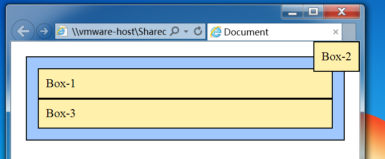
效果图如下:
我们为Box-2设置绝对定位属性
|
1
2
3
|
.item2
{
position
:
absolute
;
}
|
此时Box-2脱离文档流,效果如下:
这个时候Box-3的位置会占据之前Box-2的位置。且Box-2和Box-3的左边框会重合。且盒子的宽度会根据盒子内部的元素自适应。
当盒子设置了绝对定位但是没有使用top right bottom left设置盒子的偏移量的时候,它仍会占据原先的位置。
那么当设置top right bottom left这些属性的时候会是什么效果呢?
设置下面的代码:
|
1
2
3
4
5
|
.item2
{
position
:
absolute
;
top
:
0
;
right
:
0
;
}
|
效果如下图:
那么当我们把直接父级元素设置为已定位的元素会怎么样呢?
由上可以得出两个结论:
1.使用绝对定位的盒子以它的“最近”的一个“已经定位”的“祖先元素”为基准进行偏移(定位)。如果没有已经定位的祖先元素,那么就会以浏览器窗口为基准进行定位。
2.决对定位的框从标准流中脱离,这意味着它们对其后的兄弟盒子的定位没有影响。其它的盒子好像就当这个盒子(绝对定位的盒子)不存在一样。
3.z-index属性
z-index属性用于调整定位时重叠块的上下位置,与它的名称一样,如果页面为x-y轴,则垂直于页面的方向为z轴。z-index大的页面位于其值小的的上面。
看下面的代码:
|
1
2
3
4
5
6
7
8
9
10
|
.item1
{
position
:
relative
;
z-index
:
3
;
}
.item2
{
position
:
absolute
;
top
:
0
;
right
:
0
;
z-index
:
1
;
}
|
常见定位拓展:
以下的代码我都亲测过,均可以达到效果,就不在展示效果图(如果对代码有疑问可以留言):
1.水平居中
1.1行内元素的水平居中
|
1
2
3
4
|
/*行内元素水平居中*/
#body-div
{
text-align
:
center
;
}
|
1.2块级元素的水平居中
|
1
2
3
4
|
/*块级元素水平居中*/
#body-div
{
margin
:
0
auto
;
}
|
1.3多个块级元素水平居中
|
1
2
3
4
5
6
7
|
/*多个块级元素水平居中*/
#body-div
{
text-align
:
center
;
}
##body-div-container
{
display
:
inline-block
;
}
|
2.水平垂直居中
2.1已知宽度高度的垂直水平居中
|
1
2
3
4
5
6
7
8
9
10
11
12
|
/*已知高度和宽度的水平垂直居中*/
#body-div
{
position
:
relative
;
}
#body-div-container
{
width
:
100px
;
height
:
100px
;
position
:
absolute
;
top
:
50%
;
left
:
50%
;
margin
:
-50px
0
0
-50px
;
}
|
2.2未知宽度高度的垂直水平居中
|
1
2
3
4
5
6
7
8
9
10
11
12
|
/*未知高度和宽度的水平垂直居中*/
#body-div
{
position
:
relative
;
}
##body-div-container
{
position
:
absolute
;
margin
:
auto
;
top
:
0
;
right
:
0
;
bottom
:
0
;
left
:
0
;
}
|
2.3当被居中的元素是inline或者是inline-block
|
1
2
3
4
5
6
7
8
|
#body-div
{
display
:
table-cell
;
text-align
:
center
;
vertical-align
:
middle
;
}
##body-div-container
{
}
|


 扫一扫
扫一扫
 1103
1103

 被折叠的 条评论
为什么被折叠?
被折叠的 条评论
为什么被折叠?
 到【灌水乐园】发言


