


flex-grow
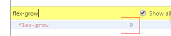
默认值是0,表示不去放大项目。
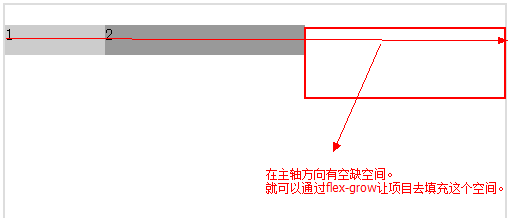
注意!!! 放大因子。使用前提:主轴方向上有多余的空间可以让项目去“伸展”
如果一个项目的flex-grow为0。则它的宽度不会放大
项目的flex-grow越大,说明它在放大后,会得到更多的空间
项目的flex-grow越小,说明它在放大后,会得到更少的空间
特别地:如果所有的项目有一样的flex-grow值,它们会等分多余的空间。就是说,放大后的大小 = 自己的大小 + 平均分配的值
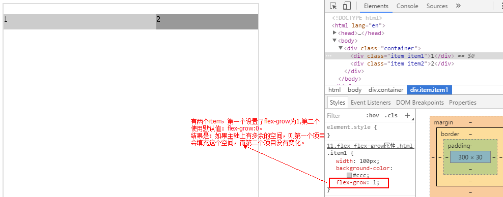
假设有两个item
第一个设置了flex-grow:1 第二个使用默认值flex:0
如果主轴上有多余的空间 则第一个项目填充这个空间 第二个项目没有变化
flex-shrink
项目默认会被缩小(空间不够)flex-shrink:1 [即使设置了宽度也会缩小]
Flex-shrink越大,被压缩越多
Flex-shrink越小,被压缩越少。如果flex-shrink=0,不会被压缩
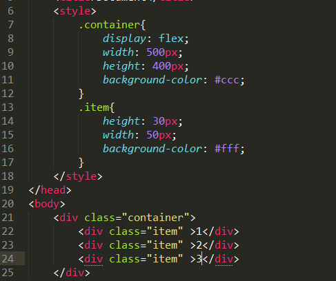
flex属性
flex属性是flex-grow, flex-shrink 和 flex-basis的简写,默认值为0 1 auto。后两个属性可选
该属性有两个快捷值:auto (1 1 auto) 和 none (0 0 auto)
即:
flex:auto; = flex:1,1,auto; = flex:1;
如果主轴上有多余空间 则这个项目会填充多余的空间
flex:none===flex:0,0,auto
如果主轴的空间不够不会被压缩
如果项目没有指定高度,则会被拉伸,会铺满整个交叉轴。
flex-flex弹性盒子布局
写在前面的话
起源09开始提出。
taotao手机网页
作用
小例子:
实现完美居中效果
对直接子元素的影响
修改了display:block
会将直接子元素display:改成block

对于嵌套的子元素(孙子)不产生影响。
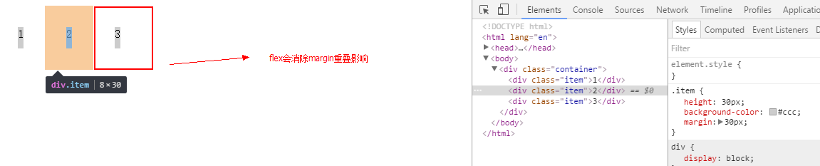
解决了margin重叠的问题
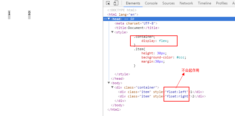
干掉了float
几个基本概念
容器&项目
容器:如果你给一个元素添加display:flex,称为这是一个容器。
项目:容器里面的直接子元素,称为项目
主轴&交叉轴
主轴:在容器当中,项目(多个)按一定的方向进行排列的。默认是按从左向右的方向进行排列。这里排列的方向就是主轴方向,在容器内部,主轴方向与容器交集的部分,就是主轴。
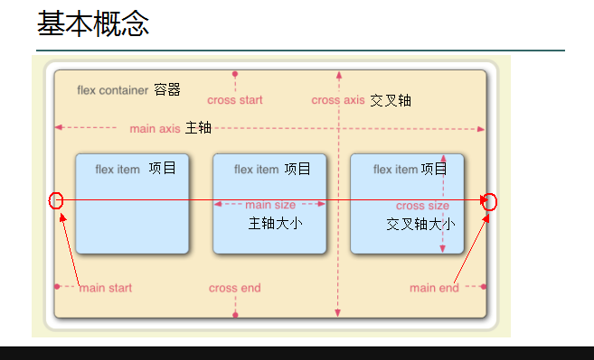
交叉轴。就是与主轴垂直的那个轴。默认是从上向下的方向。
容器的属性值
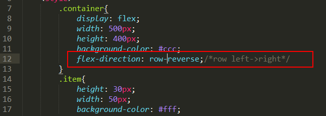
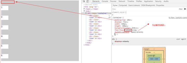
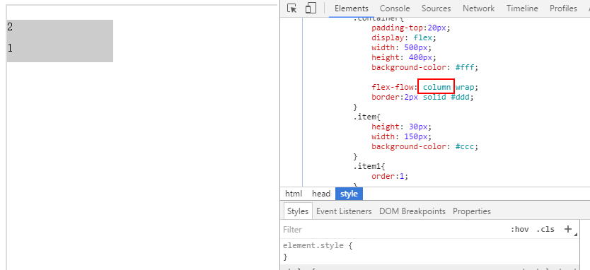
flex-direction
功能:设置主轴的方向(项目排列的方向)
取值:row | row-reverse | column | column-reverse
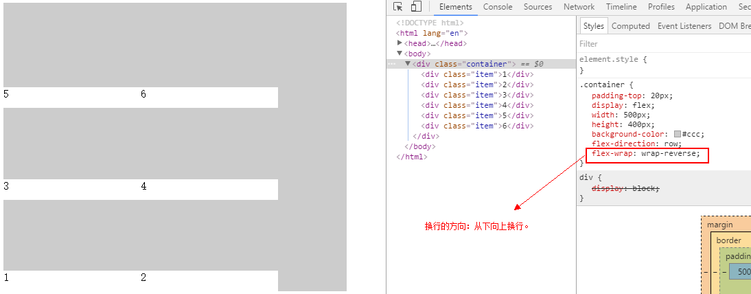
flex-wrap
取值:nowrap | wrap | wrap-reverse
功能:控制容器中的项目的换行。
主轴方向是水平方向。
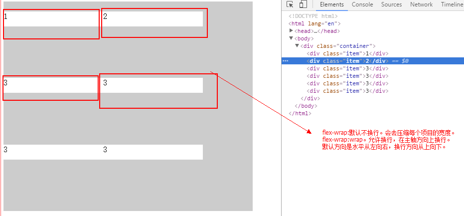
换行及换行的方向是与主轴方向相关的。你必须要先知道主轴的方向是什么方向。
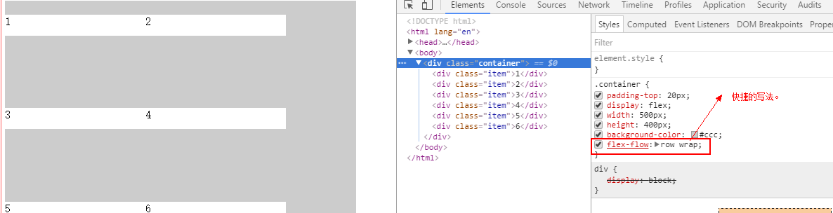
flex-flow
功能:简化代码。是flex-direction与flex-wrap的合写。
flex-flow: flex-direction flex-wrap
justify-content
取值:flex-start | flex-end | center | space-between | space-around
功能:容器内的项目在按主轴方向上进行排列,这个属性决定了项目与项目之间的位置关系。在主轴方向上有富余的空间(项目的宽度之和小于容器的宽度),如何去处理这个富余的空间?

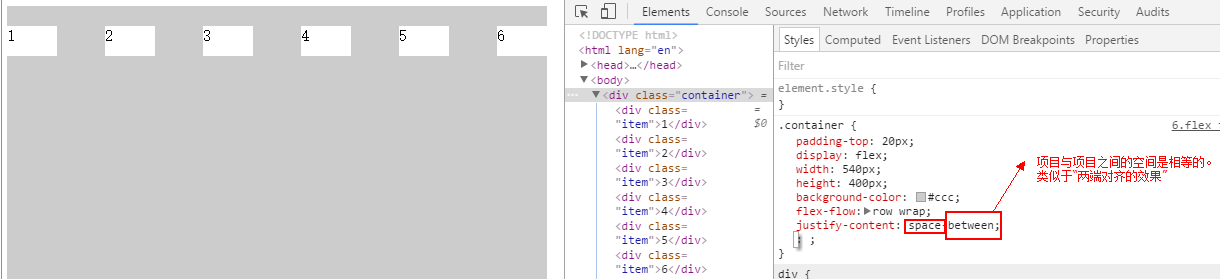
注意:主轴方向。
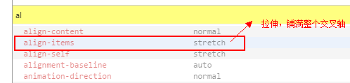
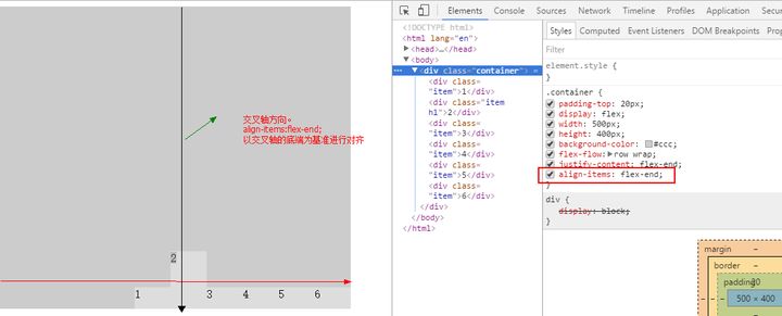
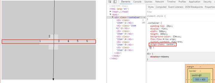
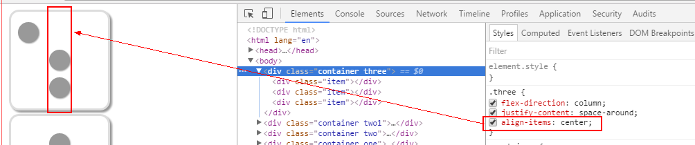
align-items
取值:stretch | flex-start | flex-end | center | baseline
作用:项目在交叉轴(与主轴垂直的轴)方向上的摆放位置。
stretch是默认值。如果项目没有指定高度,则会被拉伸,会铺满整个交叉轴。
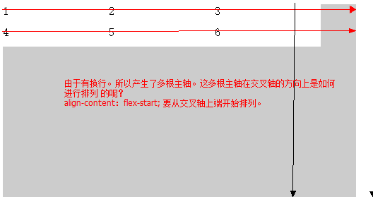
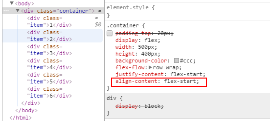
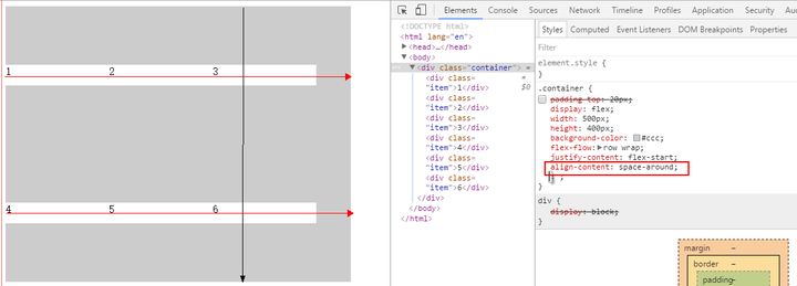
align-content
取值:stretch | flex-start | flex-end | space-between | space-around
功能:当容器中有多行项目(当然,前提是允许换行)时,每一行项目就会产生一根主轴,多行项目就会产生多个主轴。这个属性决定这多根主轴之间的位置关系。
项目的属性值
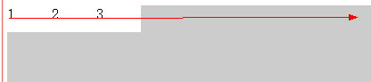
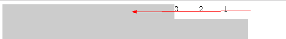
order
取值:数值
功能:容器中有多个项目,项目的默认摆放是沿主轴方向,按文档中dom元素的书写顺序进行排列的。order属性用于更改排列顺序。数值越小,排列越靠前,默认为0。可以为负数。
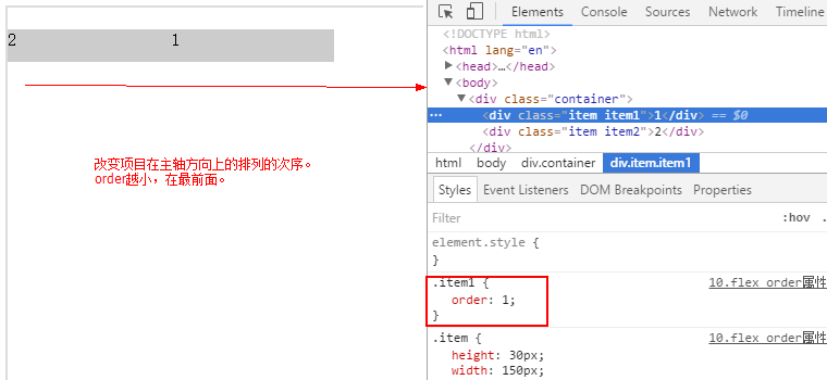
强调与主轴方向相关。
flex-grow
取值:数值
功能:放大因子。使用前提:主轴方向上有多余的空间可以让项目去“伸展”。
计算步骤:
(1)统计多余的空间:M=容器的宽度-所有项目宽度之和
(2)确定均分的份数:N=项目flex-grow的值之和
(3)计算单位空间P=M/N。
(4)项目放大后的宽度:R=宽度+P*当前flex-grow值
默认值是0,表示不去放大项目。
结论:
如果一个项目的flex-grow为0。则它的宽度不会放大。
项目的flex-grow越大,说明它在放大后,会得到更多的空间。
项目的flex-grow越小,说明它在放大后,会得到更少的空间。
特别地:如果所有的项目有一样的flex-grow值,它们会等分多余的空间。就是说,放大后的大小 = 自己的大小 + 平均分配的值。
flex-shrink
取值:数值
功能:缩小因子。使用前提:主轴方向上的空间不够,项目被压缩。默认值为1(当容器主轴方向不能容下全部的项目,并且也不允许换行,由于flex-shrink为1,所有的项目都会被压缩。各自被压缩数值是不一样的,如下公式).
计算步骤:
(1)总差值,即需要被压缩的大小:M=容器的宽度-项目的宽度之和
(2)加权和:N =flex-shrink*项目宽度值之和
(3)缩小后的宽度 = 项目值 - 项目值 * flex-shrink /N * M。

结论:
- 项目默认会被缩小(空间不够).flex-shrink:1
- Flex-shrink越大,被压缩越多。
- Flex-shrink越小,被压缩越少。如果flex-shrink=0,不会被压缩。
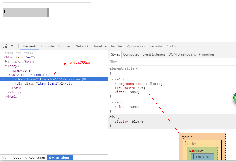
flex-basis
项目在主轴上占据的大小。默认为auto(主轴是水平方向时就是宽度,主轴是垂直方向时:默认为height值。
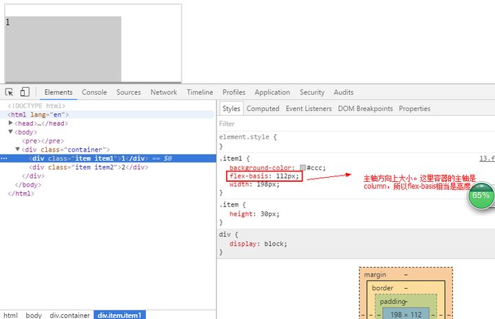
也可以使用百分比。以容器内部的大小为基准。
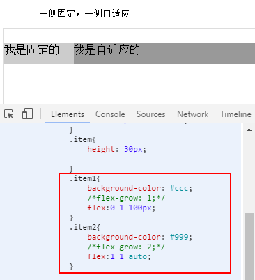
flex
flex属性是flex-grow, flex-shrink 和 flex-basis的简写,默认值为0 1 auto。后两个属性可选。
该属性有两个快捷值:auto (1 1 auto) 和 none (0 0 auto)。
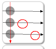
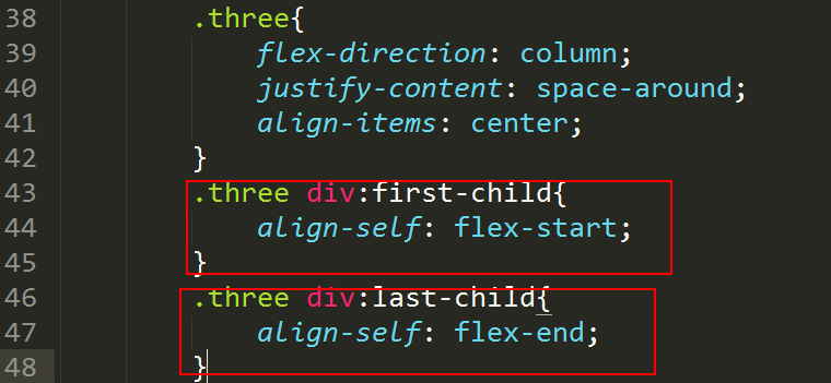
align-self
取值:auto | flex-start | flex-end | center | baseline | stretch
属性允许单个项目有与其他项目不一样的对齐方式,可覆盖容器的align-items属性。
在容器,align-items:center;
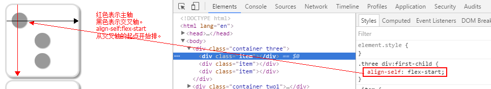
在当前的项目中,align-self与容器的align-items不一样。以当前的align-self为准。
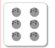
阶段案例:色子
3点
4点:
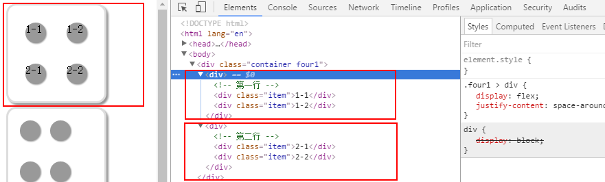
在container里面进行嵌套。
container本身是一个容器
它有两个项目
同时,这两个项目本身也是容器。
6点
总结:
flex就是一个 display的属性值。
它约定了一套设置项目的大小,排列,排序的规则。
flex与布局
轻松搞定各类布局
基本网格布局
分情况:
- 如果所有的项目有相同的结构,可以通过flex-grow:1(把所有的项目flex-grow设为相同即可。)
- 如果所有的项目可能有不一样的结构,可以通过设置flex-basis百分比来达到等宽的效果。
百分比布局

一侧固定一侧自适应
导航两端对齐
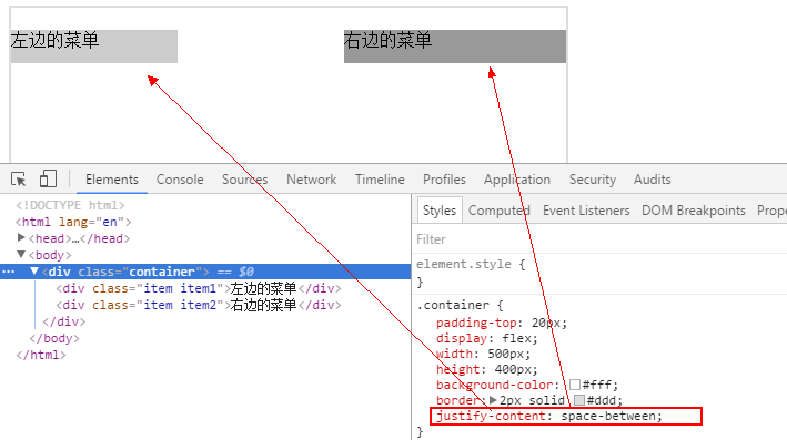
导航两端对齐 通过margin:auto实现
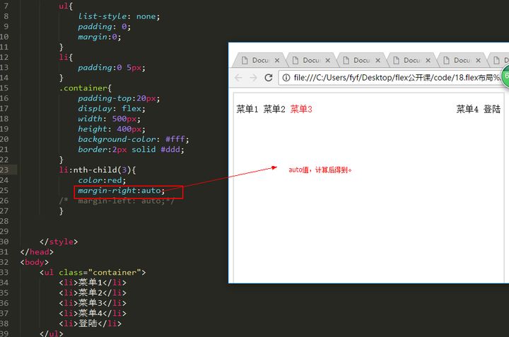
原因:
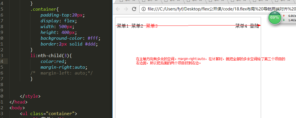
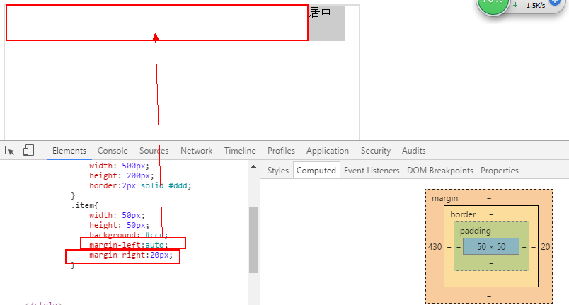
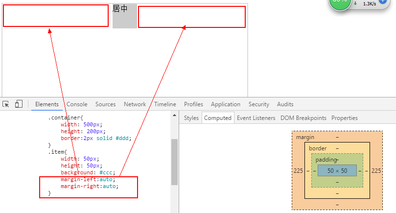
Auto:计算的过程
对于块状元素来讲,它要独占一行(在不给width情况下,它充满一整行)。如果你它设置了width值,但在水平方向上,还有剩余的空间(它的宽度比外部的容器的宽度要小),这个空间就会被用来计算。
1. 一侧auto另一侧固定:auto就是整个多余空间 - 另一个侧的固定值。
- 两侧都是auto。会平均分配多余空间。
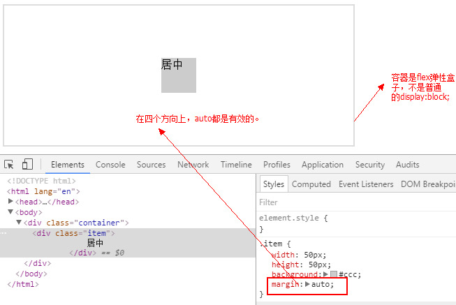
block盒子 为什么不能垂直方向居中呢?
对于元素来讲,如果不设置高度,在垂直方向上,它不会去铺满整个列。所以在垂直方向上,它没有多余的空间给它。
flex弹性盒子 可以完美居中
媒体查询
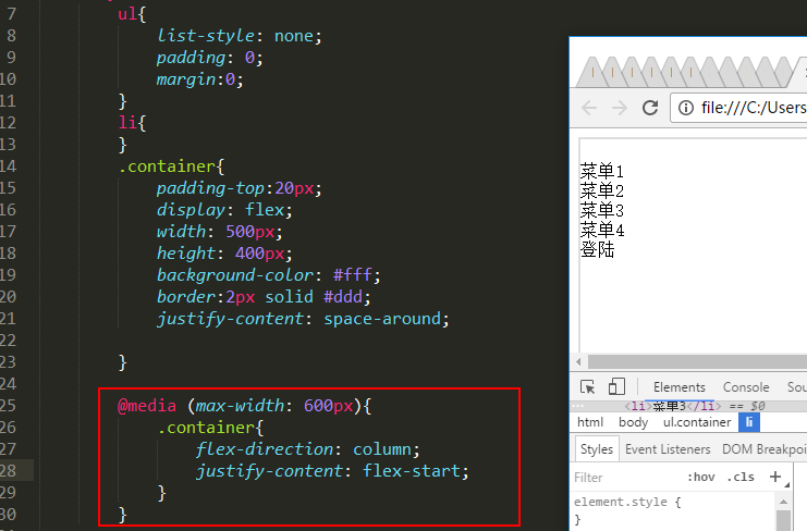
当页面的宽度小于等于600px时
第26行的样式就会起作用。做两件事情:
- 把项目主轴方向从默认的水平,改成垂直。
- 把项目在主轴方向的排列位置关系:从第21行的space-around改成第28行的flex-start;
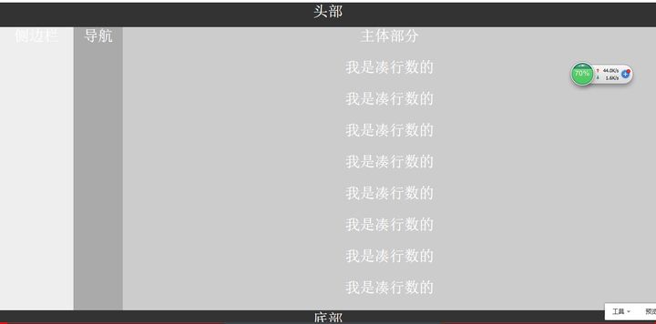
圣杯布局
flex实战 移动web app开发
App分类
原生app
混合app
Web app:就是一个移动站(pc站,一个网站用户可能从pc端去访问。移动站,用户通过移动设备去访问。)
移动站与pc站之间的区别
pc站

移动站
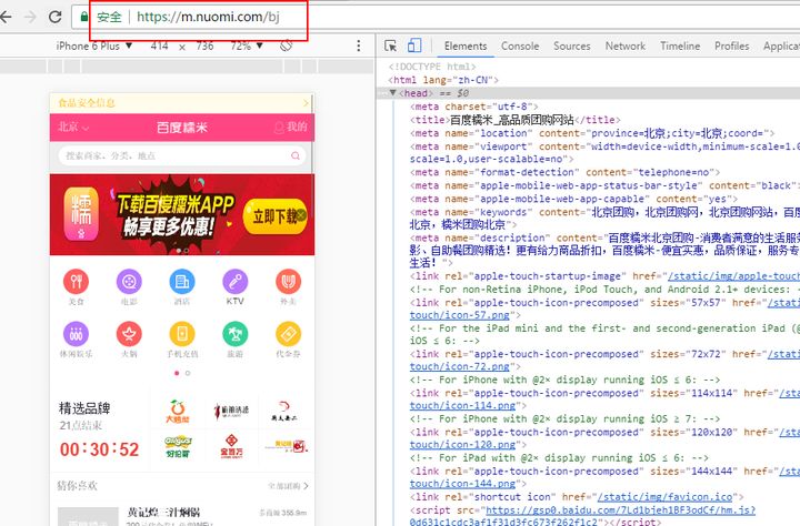
用户交互的方式不一样:鼠标,手指。
呈现的数据量也不一样:pc站(屏幕大)内容多;移动站,内容少。
移动站:用户会特别注意“流量”,也就说,要求代码的体积要小,所以在使用框架,第三方插件时,就会与pc站不一样的选择。
Jquery.js <--> zepto.js
flex的兼容性问题
pc站,由于flex现在没有得到ie低版本的支持。所以,不建议大家现在使用flex做pc站。(如果你自己决定,我的产品就不要ie浏览器打交道)
移动站:你可以使用flex。国产uc浏览器的安卓低版本不支持flex语法,但它是支持flexbox写法。
参考文章 Flex布局的前世今生
视口设置
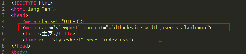
注意:这里的多个设置之间使用 “ , “ 隔开。
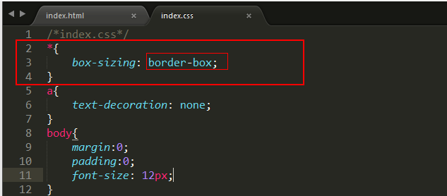
css盒模型设置
-----------------------------------------------更新-------------------------------------
flex-shrink

<!DOCTYPE html>
<html lang="en">
  <head>
    <meta charset="UTF-8" />
    <meta name="viewport" content="width=device-width, initial-scale=1.0" />
    <meta http-equiv="X-UA-Compatible" content="ie=edge" />
    <title>flex-shrink</title>
    <style>
      * {
        margin: 0;
        padding: 0;
      }
      div {
        display: flex;
        width: 100px;
        background: sandybrown;
      }
      span {
        background-color: #778787;
        border: red solid 2px;
        /* 如果主轴的空间不够且不换行 此属性不起作用  因为项目默认会被压缩 */
        width: 50px;
      }
      .yasuo {
        /* 此属性越大项目被压缩的越多  0为不压缩 */
        flex-shrink: 3;
      }
    </style>
  </head>
  <body>
    <div>
      <span>1</span>
      <span>2</span>
      <span class="yasuo">2</span>
    </div>
  </body>
</html>
空间不够带滚动条的等分布局
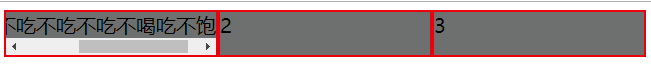
<!DOCTYPE html>
<html lang="en">
    <head>
        <meta charset="UTF-8" />
        <meta name="viewport" content="width=device-width, initial-scale=1.0" />
        <meta http-equiv="X-UA-Compatible" content="ie=edge" />
        <title>Document</title>
        <style>
            div {
                display: flex;
            }
            span {
                background: #787878;
                border: 2px red solid;
                /* flex-grow: 1; */
                /* width: 0; */
                /* flex-basis: 0; */
                flex: 1 0 0;
               /* flex:1; */
            }

            .gundong {
                white-space: nowrap;
                overflow: auto;
            }
        </style>
    </head>

    <body>
        <div>
            <span class="gundong">都后悔当初不吃不吃不吃不喝吃不饱好</span>
            <span>2</span>
            <span>3</span>
        </div>
    </body>
</html>


 11万+
11万+


 被折叠的 条评论
为什么被折叠?
被折叠的 条评论
为什么被折叠?
 到【灌水乐园】发言


