


 本文介绍了如何使用CSS3的flex布局在Vue中开发一个底部导航栏组件,通过设置display:flex和flex:1实现自适应固定在底部的效果。同时解决了路由嵌套问题,并给出了html布局、样式配置、router.js配置以及组件引用和最终效果展示。
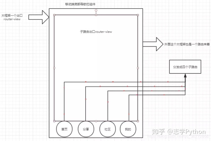
这个想法源于最近自己在开发一个移动端博客的一个底部导航栏,原型设计如下:

我们来分析一下这个导航栏,其实很简单啦,就是自适应固定在底部 我们可以使用CSS3属性display:flex设置父级盒子为伸缩盒子模型,子元素设置flex:1自适应大小。
html布局如下
<template>
	<div class="footer">
		<div v-for='(item,index) of items' :key="index" :class='[item.cls,{on:index === idx}]' @click="change(item,index)">
			<img :src="index===idx?item.srcSelect:item.src" v-if="showIconOrSrc">
			<i :class="index===idx?item.iconSelect:item.icon" v-if="!showIconOrSrc"></i>
			<span :class="['colorChange',{on:index===idx}]" >{{item.name}}</span>
		</div>
	</div>

</template>
样式如下:
<style  scoped>
.footer{
	display: flex;
	position: fixed;
	left: 0;
	bottom: 0;
	box-sizing: border-box;
	background: rgb(248, 248, 248);
	width: 100%;
}
div{
	flex: 1;
	padding: 5px;
}
div img{
	width: 30px;
	height: 30px;
}
div span{
	display: block;
	color:black;
	color: rgb(168, 168, 168);
}
.on{
	color: rgb(25, 137, 250);
}
</style>
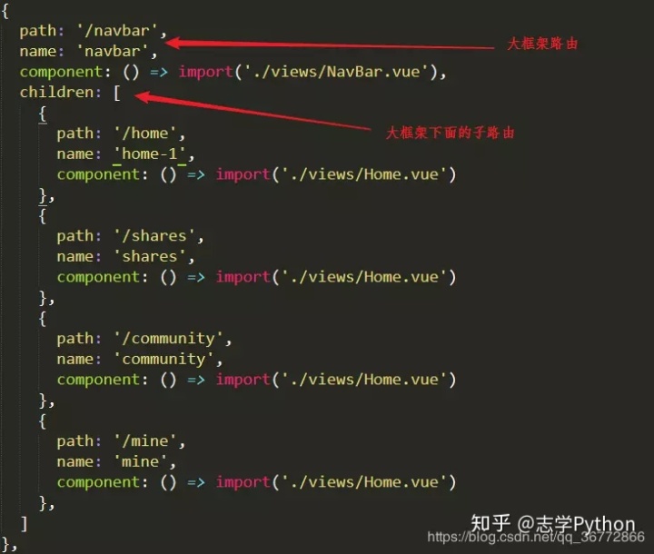
此间碰到一个路由嵌套问题
router.js配置
这个组件可以设置是iconfont图标样式,也可以使用图片 js逻辑如下:
<script type="text/javascript">
// eslint-disable-next-line
/* eslint-disable */
	export default{
		props:{
			idx: {
				type: Number,
				default: 0,
			},
			showIconOrSrc:{
				// true表示显示图片途径 src
				// false 表示icon图标类名
				type: Boolean,
				default: true,
			},
			items: {
				type: Array,
				default: function(){
					return ([{
						cls:"home",
						name:"首页",
						push:"/home",
						icon: 'iconfont icon-shouye',
						iconSelect: 'iconfont icon-shouye',
						src:"http://118.190.209.124/img/home_normal.png",
						srcSelect:"http://118.190.209.124/img/home_selected.png"
					},
					{
						cls:"shares",
						name:"归档",
						push:"/shares",
						icon: "iconfont icon-guidang",
						iconSelect: 'iconfont icon-guidang',
						src:"http://118.190.209.124/img/guidang_normal.png",
						srcSelect:"http://118.190.209.124/img/guidang_selected.png"
					},
					{
						cla:"community",
						name:"博主",
						push:"/community",
						icon: "iconfont icon-bozhuguanli",
						iconSelect: 'iconfont icon-bozhuguanli',
						src:"http://118.190.209.124/img/user_normal.png",
						srcSelect:"http://118.190.209.124/img/user_selected.png"
					},
					{
						cla:"mine",
						name:"链接",
						push:"/mine",
						icon: "iconfont icon-lianjie2",
						iconSelect: 'iconfont icon-lianjie2',
						src:"http://118.190.209.124/img/lianjie_normal.png",
						srcSelect:"http://118.190.209.124/img/lianjie_selected.png"
					}]);
				}
			}
		},
		data(){
			return {
			}
		},
		methods: {
			change(item,index) {
				this.$router.push(item.push);
				this.$emit("change",index)
			}
		}
	}

</script>
接下来就是引用:
<template>
	<div class="box">
		<router-view></router-view>
		<v-navbar :items="items" :showIconOrSrc="showIconOrSrc" :idx="idx" @change="change"></v-navbar>
	</div>
</template>

<script>
import NavBar from "@/navbar/navbar"
export default {
	name: 'navbar',
	data() {
		return {
			idx:0,
			showIconOrSrc: false,
			items: [{
						cls:"home",
						name:"首页",
						push:"/home",
						icon: 'iconfont icon-shouye',
						iconSelect: 'iconfont icon-shouye',
						src:"http://118.190.209.124/img/home_normal.png",
						srcSelect:"http://118.190.209.124/img/home_selected.png"
					},
					{
						cls:"shares",
						name:"归档",
						push:"/shares",
						icon: "iconfont icon-guidang",
						iconSelect: 'iconfont icon-guidang',
						src:"http://118.190.209.124/img/guidang_normal.png",
						srcSelect:"http://118.190.209.124/img/guidang_selected.png"
					},
					{
						cla:"community",
						name:"博主",
						push:"/community",
						icon: "iconfont icon-bozhuguanli",
						iconSelect: 'iconfont icon-bozhuguanli',
						src:"http://118.190.209.124/img/user_normal.png",
						srcSelect:"http://118.190.209.124/img/user_selected.png"
					},
					{
						cla:"mine",
						name:"链接",
						push:"/mine",
						icon: "iconfont icon-lianjie2",
						iconSelect: 'iconfont icon-lianjie2',
						src:"http://118.190.209.124/img/lianjie_normal.png",
						srcSelect:"http://118.190.209.124/img/lianjie_selected.png"
					}],

		}
	},
	components: {
		"v-navbar": NavBar,
	},
	methods: {
		change(index){
			this.idx = index
		}
	}
}
</script>

<style scoped>
.box{
	width: 100%;
	height: 100%;
}
</style>
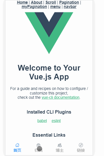
最终效果就是入下图:
作者:Ken_Coding
链接:https://juejin.im/post/5c4f0e28f265da61616f0e51
来源:掘金
著作权归作者所有。商业转载请联系作者获得授权,非商业转载请注明出处。


 1294
1294

 被折叠的 条评论
为什么被折叠?
被折叠的 条评论
为什么被折叠?
 到【灌水乐园】发言


