


1、声明:@keyframes name{ };
2、涉及到的属性
animation-name:动画名称
animation-duration:单次动画总时长
animation-timing-function:时间函数
animation-delay:播放前延时的时长
animation-iteration-count:播放次数 (特殊值:infinite 循环播放)
animation-direction:播放顺序(normal:正常播放 alternate:轮流反向播放)
3、简写animation: name duration timing-function delay iteration-count direction fill-mode;
4、例子:
@keyframes cart {
from {
left: 0;
top: 0;
border-radius: 0;
}
20% {
left: 200px;
top: 500px;
transform: rotateZ(720deg);
}
40% {
left: 400px;
top: 0;
border-radius: 50px;
}
60% {
top: 500px;
left: 600px;
border-radius: 50%;
}
80% {
top: 0px;
left: 800px;
border-radius: 50px;
}
to {
left: 0;
top: 0;
}
}
.Z {
height: 150px;
width: 150px;
position: relative;
background-color: blue;
animation: cart 10s linear 2s infinite alternate;
transition: all 2s;
}
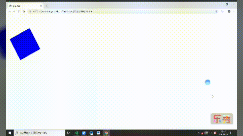
得到的效果:
标签:动画,top,animation,radius,播放,border,css,left
来源: https://www.cnblogs.com/qxz17760485467/p/11606479.html


 600
600


 被折叠的 条评论
为什么被折叠?
被折叠的 条评论
为什么被折叠?
 到【灌水乐园】发言


