


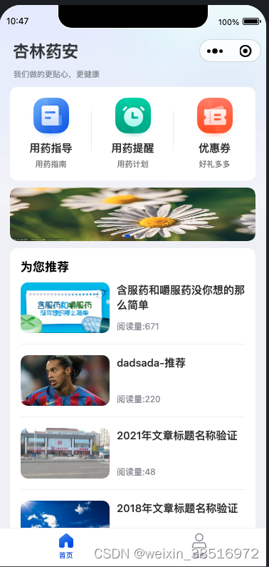
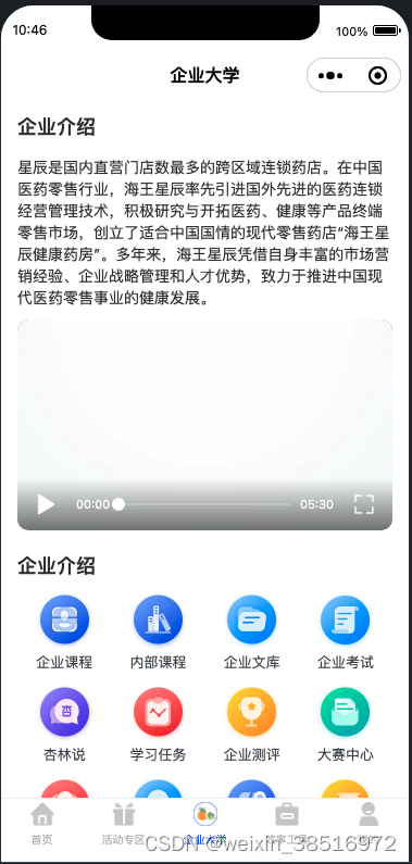
我们在开发小程序时经常会遇到小程序原有的导航和需求不一致的情况比如带背景的导航等,比如下图:
这时候为了保持和小程序原有的导航UI一致性和交互的一致性开发一个自定义的导航组件,方便后续的开发和复用是非常有必要的。
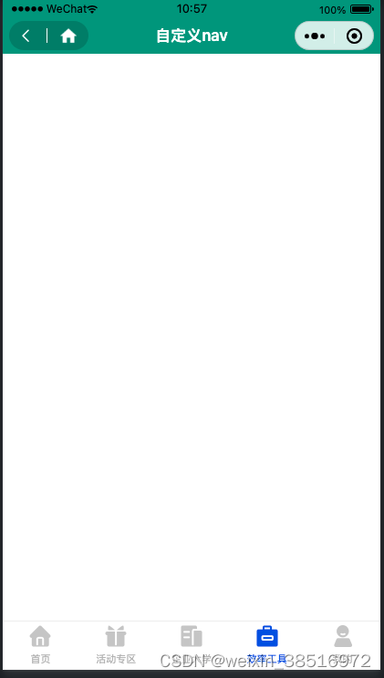
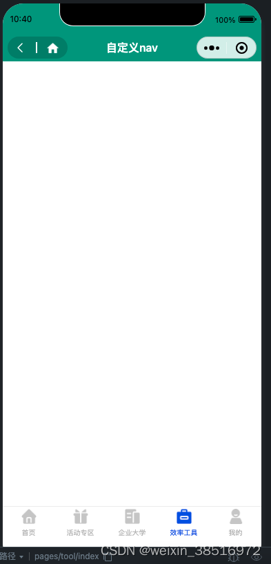
开发完成的效果,可以很好的适配刘海屏:
具体实现:
index.js
const app = getApp();
Component({
    /**
     * 组件的属性列表
     */
    properties: {
        backType: {
            type: Number,
            value: 0 // 0  无返回键  1 有返回键 2 有左侧胶囊导航
        },
        title: {
            type: String,
        },
        titleColor: {
            type: String,
            value: "#000"
        },
    },

    /**
     * 组件的初始数据
     */
    data: {
        // 获取右侧胶囊的信息,为左边的胶囊大小提供具体信息
        custom: wx.getMenuButtonBoundingClientRect(),
        systemInfo: app.globalData.systemInfo,
        customHeight: 32
    },
    /**
     * 组件的方法列表
     */
    methods: {
        goBack() {
            this.triggerEvent("goBack")
        },
        goHome() {
            wx.switchTab({
                url: "/pages/home/index",
            })
        }
    },
    pageLifetimes: {
        show: function () {
            console.log(this.data.custom);
            console.log(app.globalData.systemInfo);
            this.setData({
                customHeight: this.data.custom.height, // 获取左侧胶囊位的高度
                leftCapsule: `height:${this.data.custom.height}px;width:${this.data.custom.width}px;border-radius:${this.data.custom.height/2}px;`  // 设置出左侧胶囊位的样式信息
            })
        },
    }
})
index.wxml 重点是设置好 导航 custom-bar 的 style;
<view class="custom-bar" style="height:{{customHeight}}px;padding-top: {{custom.top}}px;padding-bottom: {{custom.top-systemInfo.safeArea.top}}px;">
    <view class="custom-bar-main" style="height:{{custom.height}}px;padding:0 {{systemInfo.screenWidth - custom.left - custom.width}}px">
        <view class="bar-left">
            <van-icon wx:if="{{backType==1}}" name="arrow-left" size="20px" bindtap="goBack" />
            <view wx:if="{{backType==2}}" style="{{leftCapsule}}" class="left-capsule">
                <van-icon name="arrow-left" size="18px" color="#fff" />
                <view class="line"></view>
                <image class="home-img" src="../../assets/img/home.png" bindtap="goHome"></image>
            </view>
        </view>
        <view class="bar-middle fs32 c3 fw6" style="color:{{titleColor}}">
            {{title}}
        </view>
        <view class="bar-right"></view>
    </view>
</view>
index.wxss
@import "../../app.wxss";

.custom-bar {
  width: 100%;
}
.custom-bar-main {
  width: 100%;
  box-sizing: border-box;
  display: flex;
  align-items: center;
  justify-content: space-between;
  /* background-color: #e67e22; */
}
.bar-left,
.bar-right {
  flex: 0 0 25%;
}
.bar-middle {
  flex: 1;
  color: #000;
  text-align: center;
}

.left-capsule {
  display: flex;
  align-items: center;
  background: rgba(0, 0, 0, 0.15);
  justify-content: space-around;
  padding: 0 6px;
  padding-left: 2px;
  box-sizing: border-box;
}
.line {
  height: 16px;
  width: 1.5px;
  background-color: #fff;
}

.home-img {
  width: 34rpx;
  height: 34rpx;
}


 775
775


 被折叠的 条评论
为什么被折叠?
被折叠的 条评论
为什么被折叠?
 到【灌水乐园】发言


