


- 字体小于12px:使用transform:scale(0.5)
- 0.5px边框:使用transform:scale(0.5)、使用伪类
一、字体小于12px的解决方案
浏览器默认字体最小为12px,如果想使用小于12px的字体该怎么办?
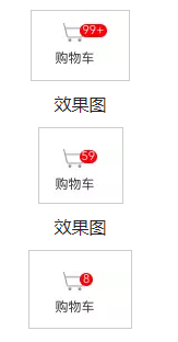
常见的例子是购物车图标
常用的方法是利用transform: scale(0.5)。
具体使用时,发现把整个div宽高都缩放了,所以使用方法有两种:
- 先将整个盒子的尺寸属性都放大2倍,再利用scale(0.5)缩小为原来的一半。这里可以同时解决1px border问题,省的再添加一个伪类
- 将字体单独放在一个盒子内,利用transform: scale缩小字体。Eg:把红点和字放在两个div上,红点控制宽高,字体上的缩小用transform: scale
.cart {
  height: 20px;
  line-height: 20px;
  font-size: 10px;      //不会实现的 最小为12px
  border: 1px solid #000;
}

//使用 transform: scale(0.5);
.cart {
  height: 40px;
  line-height: 40px;
  font-size: 20px;                //缩小后为font-size:10px
  border: 1px solid #000;          //缩小后为border:0.5px
  -webkit-transform: scale(0.5);
  transform: scale(0.5);
  -webkit-transform-origin: 100% 100%;
  transform-origin: 100% 100%;
}
.cartDot{
height: .75rem; //rem 响应式设置字体大小,相对单位,相对根元素的font-size
min-width: .75rem;
border-radius: .375rem;
background: red;
color: white;
text-align: center;
line-height: .75rem;
}
.Num{
font-size: 20px; //font-size缩小为10px
-webkit-transform: scale(0.5);
}
二、不兼容0.5px
- 使用transform:scale(0.5)将1px缩小为0.5 (如上,比较麻烦的是盒子的其他尺寸属性也需要改,如果结合字体可以使用此方法)
- 使用伪元素(推荐使用)
移动端的设备各种各样,分辨率、屏幕比等都会有差异,要想做到一套代码多种设备适用尤其困难,比如部分安卓手机不识别0.5px的边框
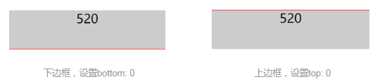
一、单条边框(上边框或者下边框)
.box {
    width: 200px;
    height: 50px;
    background-color: #ccc;
    text-align: center;
    position: relative;
}
.box::after {
    content: '';
    display: block;
    position: absolute;
    left: -50%;           //关键
    bottom: 0;
    width: 200%;          //关键
    height: 1px;
    background-color: red;
    transform: scale(0.5);
}
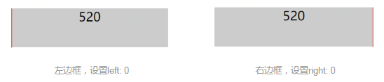
二、单条边框(左或右边框)
.box {
    width: 200px;
    height: 50px;
    background-color: #ccc;
    text-align: center;
    position: relative;
}
.box::after {
    content: '';
    display: block;
    position: absolute;
    right: 0;
    top: -50%;
    width: 1px;
    height: 200%;
    background-color: red;
    transform: scale(0.5);
}
二、四条边框
.box {
    width: 200px;
    height: 50px;
    background-color: #ccc;
    text-align: center;
    position: relative;
}
.box::after {
    content: '';
    display: block;
    position: absolute;
    left: -50%;/*根据实际情况微调*/
    top: -50%;/*根据实际情况微调*/
    width: 200%;
    height: 200%;
    border: 1px solid red;
    background-color: red;
    border-radius: 3px;
    transform: scale(0.5);
}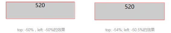
原则上应该设置top: -50%,left: -50%的,但是设置之后会发现边框有点靠右下角,所以可根据实际情况进行微调,单条边框也有这种现象,也可以进行微调
参考:


 2万+
2万+


 被折叠的 条评论
为什么被折叠?
被折叠的 条评论
为什么被折叠?
 到【灌水乐园】发言


