


这是小小本周的第二篇,在第二篇中,将会着重介绍Element UI 中对表格组件的封装。
使用效果
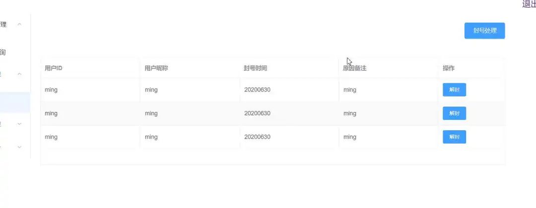
此表格可自适应。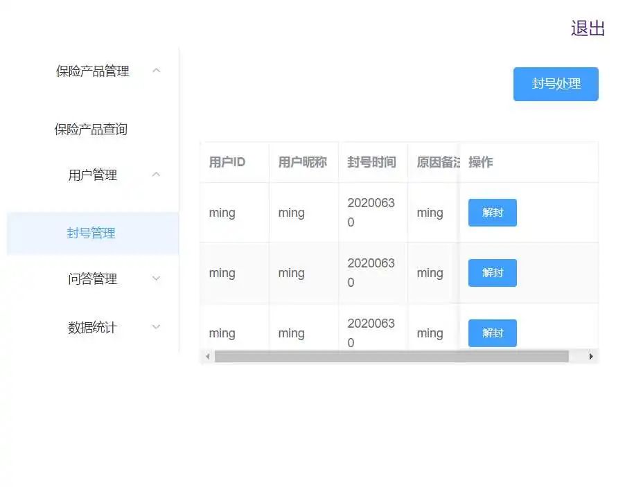
新建组件目录
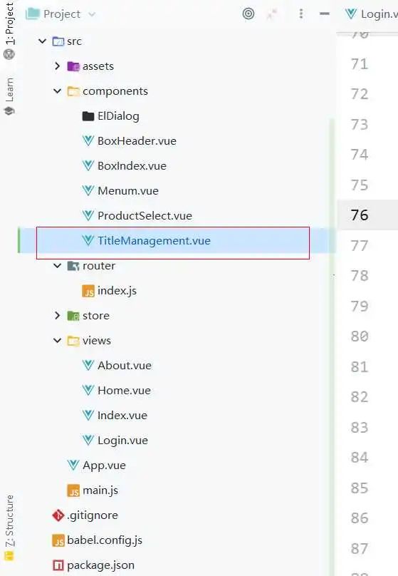
其中新建了TitleManagement组件。
添加相关的表格代码
警告 此处有大段代码
此时需要添加封装好的表格代码,建议直接复制粘贴使用。
                  ref="multipleTable"
                  highlight-current-row
                  :height="tabheight"
                  @row-dblclick="rowDblclick"
                  v-loading="loading"
                  element-loading-text="拼命加载中"
                  element-loading-background="rgba(0, 0, 0, 0.3)"
        >


                           :key="key"
                           :prop="th.prop"
                           :label="th.label"
                           :fixed="th.fixed"
                           :width="th.width"
                           :min-width="th.minWidth" align="left">
 :key="key" @click="clickFun(scope.row)"
 :type="o.style"
 :icon="o.icon"
 size="small">{{o.name}}
{{ scope.row[th.prop] }}{{ scope.row[th.prop] | formatters(th.formatData) }}{{ scope.row[th.prop] | formatters(th.formatData) }}{{ scope.row[th.prop] | formatters(th.formatData) }}
相关的script代码
export default {
        name: "index",
        // 传入的数据
        props: {
            tableData: { // 表格数据
                type: Array,
                default: function () {
                    return []
                }
            },
            rowDblclick: { // 单行点击事件
                type: Function,
                default: (row, event, column) => {
                    console.log('default: ' + row + '---' + event + '---' + column)
                }
            },
            tableHeader: { // 表格头部
                type: Array,
                default: function () {
                    return []
                }
            },
            tabheight: {
                type: String,
                default: '100%'
            },
            loading: { // 加载等待
                type: Boolean,
                default: false
            },
            isshow: {
                type: Boolean,
                default: false
            }
        },
        methods: {
            // 获取选择行数信息
            getmydata() {
                let data = this.$refs.multipleTable.selection
                let IDS = []
                for (let i = 0; i < data.length; i++) {
                    IDS.push(data[i].ID)
                }
                this.$emit('func', IDS)
            }
        }
    }
父组件中使用子组件
相关的父组件
                                 :tableHeader="tableHeader"
                                 :loading="loading" :isshow="isshow">
相关的文件父页面中的相关数据
// data 属性
data(){
  return{
                loading: false,
                isshow: true,
                tabheight: '100%', // 表格高度,这里是做了自适应高度,正常是需要写固定值的
                tableHeader: [      // 表头
                    {prop: 'Name', label: '卡号'},
                    {prop: 'LabelType', label: '标签类型'},
                    {prop: 'ObjectType', label: '对象类型'},
                    {prop: 'ObjectValue', label: '对象值'},
                    {
                        prop: 'Enable', label: '是否启用', isok: '1', formatData: function (val) {
                            return val == true ? '启用' : '禁用'
                        }
                    },
                 // 如果后端传过来的值不是我们所预期的,此处可以如下判断修改,isok是是否需要渲染为el-tag,效果为下图
                    {
                        prop: 'Protect', label: '是否设防', isok: '1', formatData: function (val) {
                            return val == true ? '设防' : '未设防'
                        }
                    },
                  // 此处为操作栏,不需要可以删除,clickFun绑定此操作按钮的事件
                    {
                        prop: 'oper', label: '操作', fixed: 'right', minWidth: '160px', width: '160px',
                        oper: [
                            {name: '修改', style: 'primary', clickFun: this.handleClick},
                            {name: '删除', style: 'danger', clickFun: this.delClick},
                        ]
                    }
                ],
                tableData: [],
   }
}
制作完成以后表格效果

添加相关的mock
这里使用的是http://mock-api.com/
创建相关的mock数据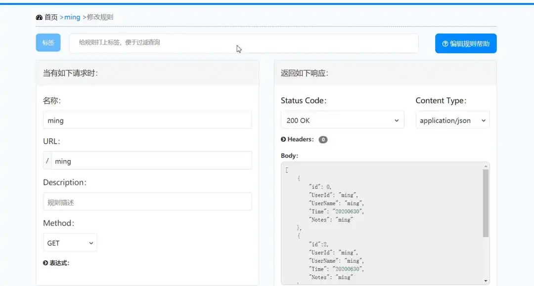
返回的数据如下
[
	{
    	"id": 0,
    	"UserId": "ming",
    	"UserName": "ming",
    	"Time": "20200630",
    	"Notes": "ming"
    },
    {
    	"id":2,
    	"UserId": "ming",
    	"UserName": "ming",
    	"Time": "20200630",
    	"Notes": "ming"
    },
    {
    	"id":3,
    	"UserId": "ming",
    	"UserName": "ming",
    	"Time": "20200630",
    	"Notes": "ming"
    }
]
在这可以访问如下链接进行查看 http://mock-api.com/wz2vlNzL.mock/ming
添加相关的axios
let that = this;
            axios.get("http://mock-api.com/wz2vlNzL.mock/ming").then(function (res) {
                console.log(res.data);
                console.log(that.msg);
                that.tableData = res.data;
            })
这里需要注意,that和this,由于js作用域的问题,所以这里直接在外部使用that=this作为js的作用域,实现作用域的基本实现。然后在axios内部,就可以直接访问到非作用域相关的内容。

小明菜市场
推荐阅读● ● 应用 | Redis实现 主从,单例,集群,哨兵,配置应用
● 了解 | 你必须了解的Mysql 三大日志
● 实战 | GitLab + Docker 实现多环境部署
● 明晰 | Java序列化与反序列化
● 理论 | 三天两夜,万字长文,吃透TCP/IP


 2822
2822


 被折叠的 条评论
为什么被折叠?
被折叠的 条评论
为什么被折叠?
 到【灌水乐园】发言


