


效果如下:
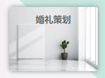
实例1
实例2以实例1【婚礼策划】为例
HTML:
婚礼策划
状态:待完成
执行者:张三
截止日期:2020/03/15
CSS:
/*外层div部分*/
.itemInWorks{
width: 180px;
height: 130px;
border-radius:5px;/*圆角*/
font-size: 18px;
font-weight: 600;
color: dimgrey;
text-align: center;/*文字“婚礼策划”水平居中*/
line-height: 50px;/*文字“婚礼策划”垂直居中*/
background: url('image/works_image/4.jpg');
background-repeat: no-repeat;
background-size: 180px 130px;
box-shadow: #909090 0px 0px 10px;/*周围阴影*/
/*以上根据个人的效果自定义*/
overflow: hidden;
position: relative;
}
/*半透明部分*/
.itemInWorks .mask{
height:80px;
width:172px;
color: #f5f1e5;
line-height: 23px;
text-align: left;
padding-left: 8px;
border-radius:2px 2px 5px 5px;
font-size: 14px;
font-weight: 300;
/*以上根据个人的效果自定义*/
position: absolute;
top:130px;/*鼠标不放时,半透明部分最高处离外层div顶端的距离*/
background-color:rgba(0,0,0,0.5);/*透明度*/
transition:top 0.5s ease-in-out;/*改变top属性,0.5秒完成,慢开始慢结束*/
}
.itemInWorks:hover .mask{
top:50px ;/*鼠标放上时,滑动到的最高处离外层div顶端的距离*/
}
全部代码:
Title.itemInWorks{
width: 180px;
height: 130px;
border-radius:5px;
font-size: 18px;
font-weight: 600;
color: dimgrey;
text-align: center;
line-height: 50px;
background: url('image/works_image/4.jpg');
background-repeat: no-repeat;
background-size: 180px 130px;
box-shadow: #909090 0px 0px 10px;
overflow: hidden;
position: relative;
}
/*半透明部分*/
.itemInWorks .mask{
height:80px;
width:172px;
color: #f5f1e5;
line-height: 23px;
text-align: left;
padding-left: 8px;
border-radius:2px 2px 5px 5px;
font-size: 14px;
font-weight: 300;
position: absolute;
top:130px;
background-color:rgba(0,0,0,0.5);
transition:top 0.5s ease-in-out;
}
.itemInWorks:hover .mask{
top:50px ;
}
婚礼策划
状态:待完成
执行者:张三
截止日期:2020/03/15
总结
以上所述是小编给大家介绍的 纯CSS实现鼠标放上滑动出半透明效果的文字说明(新手小白 必看),希望对大家有所帮助!


 4669
4669


 被折叠的 条评论
为什么被折叠?
被折叠的 条评论
为什么被折叠?
 到【灌水乐园】发言


