


介绍
提示:这里可以添加系列文章的所有文章的目录,目录需要自己手动添加
在本笔记本中,我们将仔细研究保险索赔,并弄清一些有关血压、BMI、糖尿病、吸烟、年龄和性别等条件如何影响索赔价值的事实。
我们将使用散点图、饼图、直方图等通过探索性数据分析 (EDA) 来触及主题。
稍后我们构建模型并对其进行评估。
最后,我们进行预测,并衡量预测的数字。
提示:写完文章后,目录可以自动生成,如何生成可参考右边的帮助文档
前言
提示:这里可以添加本文要记录的大概内容:
例如:随着人工智能的不断发展,机器学习这门技术也越来越重要,很多人都开启了学习机器学习,本文就介绍了机器学习的基础内容。
提示:以下是本篇文章正文内容,下面案例可供参考
一、数据导入
示例:pandas 是基于NumPy 的一种工具,该工具是为了解决数据分析任务而创建的。
二、使用步骤
1.引入库
代码如下(示例):
## Import relevant libraries for data processing & visualisation

import numpy as np              # linear algebra
import pandas as pd             # data processing, dataset file I/O (e.g. pd.read_csv)
import matplotlib.pyplot as plt # data visualization & graphical plotting
import seaborn as sns           # to visualize random distributions
%matplotlib inline

## Add additional libraries to prepare and run the model

from sklearn.preprocessing import StandardScaler
from sklearn.preprocessing import LabelEncoder
from sklearn.model_selection import train_test_split
from sklearn.metrics import r2_score, mean_squared_error, mean_absolute_error
from sklearn.linear_model import LinearRegression
from sklearn.tree import DecisionTreeRegressor
from sklearn.ensemble import RandomForestRegressor
import xgboost as xgb
from sklearn.neighbors import KNeighborsRegressor
from sklearn.ensemble import ExtraTreesRegressor

import warnings                 # to deal with warning messages
warnings.filterwarnings('ignore')
2.读入数据
代码如下(示例):
## Import the dataset to read and analyse
df_ins = pd.read_csv("/kaggle/input/insurance-claim-analysis-demographic-and-health/insurance_data.csv")
该处使用的url网络请求的数据。
3.数据预处理与可视化
代码如下(示例):
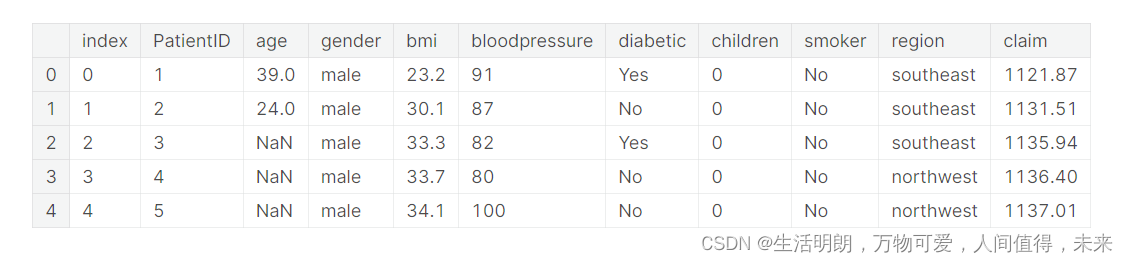
# checking the datasct contents, with head() function
df_ins.head()
检查空值,并适当地填充它们
## Checking the null values with isna() function
df_ins.isna().sum()
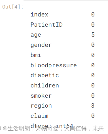
观察到age特征有5条记录为空值,region特征有3条记录为空值。
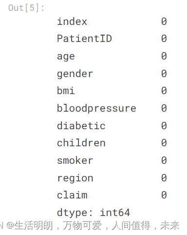
## interpolating the null values
df = df_ins.interpolate()                ## numerical features
df = df_ins.fillna(df.mode().iloc[0])    ## categorical features
df.isna().sum()
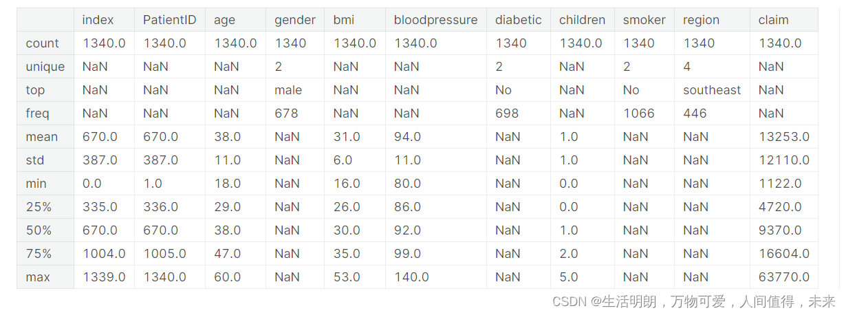
## Having a more deeper look into the data, gauging descriptive data for each feature
df.describe(include='all').round(0)
## Checking the shape of the dataset
print("The number of rows and number of columns are ", df.shape)
行数和列数为(1340, 11)
## Checking the labels in categorical features
for col in df.columns:
    if df[col].dtype=='object':
        print()
        print(col)
        print(df[col].unique())
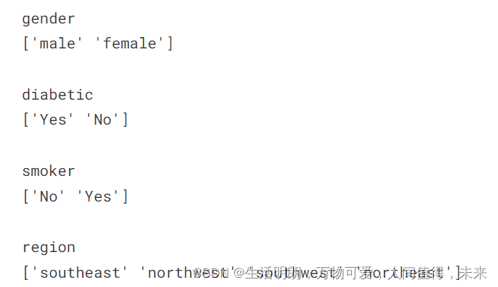
使用 .replace() 函数适当地重新标记“糖尿病”、“吸烟者”变量中的类别
这有助于更好地理解图表和绘图中的内容
## Relabeling the categories in 'diabetic', 'smoker' variables appropriatly with .replace() function
## This helps in having a greater understanding of contents in charts & plots
df['diabetic'] = df['diabetic'].replace({'Yes': 'diabetic', 'No': 'non-diabetic'})
df['smoker'] = df['smoker'].replace({'Yes': 'smoker', 'No': 'non-smoker'})
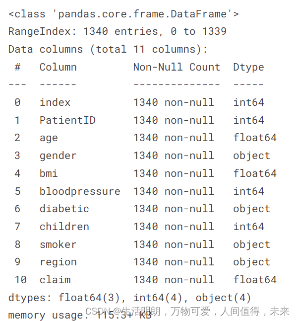
# Before proceeding to EDA, see the information about the DataFrame with .info() function
df.info()
三、数据导入
按地区、性别分类的计数图,首先,我们将使用 pd.crosstab() 以表格格式检查数据
## First we will use pd.crosstab() to check the data in tabular format
pd.crosstab(df['region'], df['gender'], margins = True, margins_name = "Total").sort_values(by="Total", ascending=True)
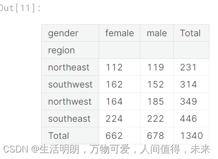
由于我们只有 4 个类别,我们可以快速从表中找出一些信息
然而,当类别数很高时,很难从表格中获得洞察力
这就是可视化是更好选择的地方
## Now we use countplot() to visualise the data
sns.countplot(x='region', hue='gender', palette="Set2", data=df).set(title='Number of Insurance Claimants by Gender, by Region')
plt.legend(bbox_to_anchor=(1.02, 1), loc='upper left', borderaxespad=0)
现在我们使用 countplot() 来可视化数据
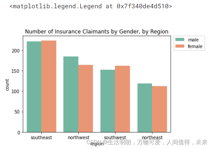
上图显示东南总体上有更高的索赔
东南、西南女性宣称率较高; 西北,东北,男性要求较高
按性别与年龄划分的箱线图
## Boxplot gender vs age of insurance claimants
sns.boxenplot(x='gender', y='age', palette="Set2", data=df).set(title='Number of Insurance Claimants by Gender, by Age')

按地区、索赔价值、性别划分的箱线图
sns.boxplot(x="region", y="claim",hue="gender", palette="Set2",data=df).set(title='Claim Value by Region, by Gender')
sns.despine(offset=10, trim=True)
plt.legend(bbox_to_anchor=(1.02, 1), loc='best', borderaxespad=0)
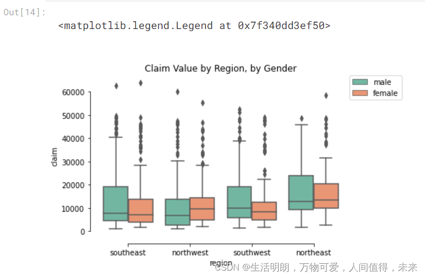
该图显示声称中值位于大约
10,000-15,000 所有地区,男女皆宜
索赔价值异常值在所有地区都很猖獗,无论是性别
数值变量的直方图
## Generating histograms for numerical variables –– age, bmi, bloodpressure, claim
fig, axes = plt.subplots(1, 4, figsize=(14,3))
age = df.age.hist(ax=axes[0], color="#32B5C9", ec="white", grid=False).set_title('age')
bmi = df.bmi.hist(ax=axes[1], color="#32B5C9", ec="white", grid=False).set_title('bmi')
bloodpressure = df.bloodpressure.hist(ax=axes[2], color="#32B5C9", ec="white", grid=False).set_title('bloodpressure')
claim = df.claim.hist(ax=axes[3], color="#32B5C9", ec="white", grid=False).set_title('claim')
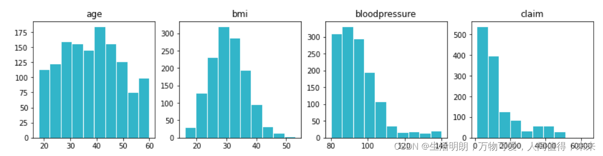
直方图生成显示
个人的年龄或多或少是平均分布的
bmi 显示典型的正态分布
bloodpressure & claims 有更高的正偏度
散点图
提示:散点图有助于了解习惯和健康状况对保险索赔价值的影响,让我们尝试分析吸烟习惯和年龄对索赔价值的影响
## Scatterplots help in understanding the impact of habits & health conditions on insurance claim value
## Let us try analyse the impact of smoking habit and age on claim value
sns.scatterplot(x='age', y='claim', hue='smoker', palette="Set2", data=df).set(title='Impact of Age & Smoking Habit on Claim Value')
plt.legend(bbox_to_anchor=(1.02, 1), loc='best', borderaxespad=0)
plt.show()
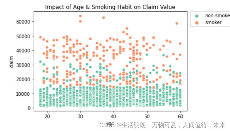
该图显示,对于有吸烟习惯的人来说,索赔价值通常更高
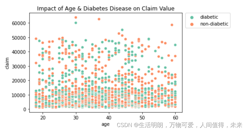
## Impact of diabetes disease and age on claim value
sns.scatterplot(x='age', y='claim', hue='diabetic', palette="Set2", data=df).set(title='Impact of Age & Diabetes Disease on Claim Value')
plt.legend(bbox_to_anchor=(1.02, 1), loc='best', borderaxespad=0)
plt.show()
参考文献:
https://www.kaggle.com/code/ravivarmaodugu/insclaim-eda-modeling


 1465
1465


 被折叠的 条评论
为什么被折叠?
被折叠的 条评论
为什么被折叠?
 到【灌水乐园】发言


