


 (由Python大本营付费下载自视觉中国)
作者 | zsx_yiyiyi
来源 | CSDN博客
昨天我们跟大家分享了50个Matplotlib可视化 - 主图(带有完整的Python代码)上 ,详情链接请戳:
50个Matplotlib可视化 - 主图(带有完整的Python代码)上
接下来则继续分享。
(由Python大本营付费下载自视觉中国)
作者 | zsx_yiyiyi
来源 | CSDN博客
昨天我们跟大家分享了50个Matplotlib可视化 - 主图(带有完整的Python代码)上 ,详情链接请戳:
50个Matplotlib可视化 - 主图(带有完整的Python代码)上
接下来则继续分享。
26. 箱形图
箱形图是一种可视化分布的好方法,记住中位数,第25个第45个四分位数和异常值。但是,您需要小心解释可能会扭曲该组中包含的点数的框的大小。因此,手动提供每个框中的观察数量可以帮助克服这个缺点。
# Import Data
df = pd.read_csv("https://github.com/selva86/datasets/raw/master/mpg_ggplot2.csv")# Draw Plot
plt.figure(figsize=(13,10), dpi= 80)
sns.boxplot(x='class', y='hwy', data=df, notch=False)# Add N Obs inside boxplot (optional)def add_n_obs(df,group_col,y):
    medians_dict = {grp[0]:grp[1][y].median() for grp in df.groupby(group_col)}
    xticklabels = [x.get_text() for x in plt.gca().get_xticklabels()]
    n_obs = df.groupby(group_col)[y].size().valuesfor (x, xticklabel), n_ob in zip(enumerate(xticklabels), n_obs):
        plt.text(x, medians_dict[xticklabel]*1.01, "#obs : "+str(n_ob), horizontalalignment='center', fontdict={'size':14}, color='white')
add_n_obs(df,group_col='class',y='hwy')    # Decoration
plt.title('Box Plot of Highway Mileage by Vehicle Class', fontsize=22)
plt.ylim(10, 40)
plt.show()

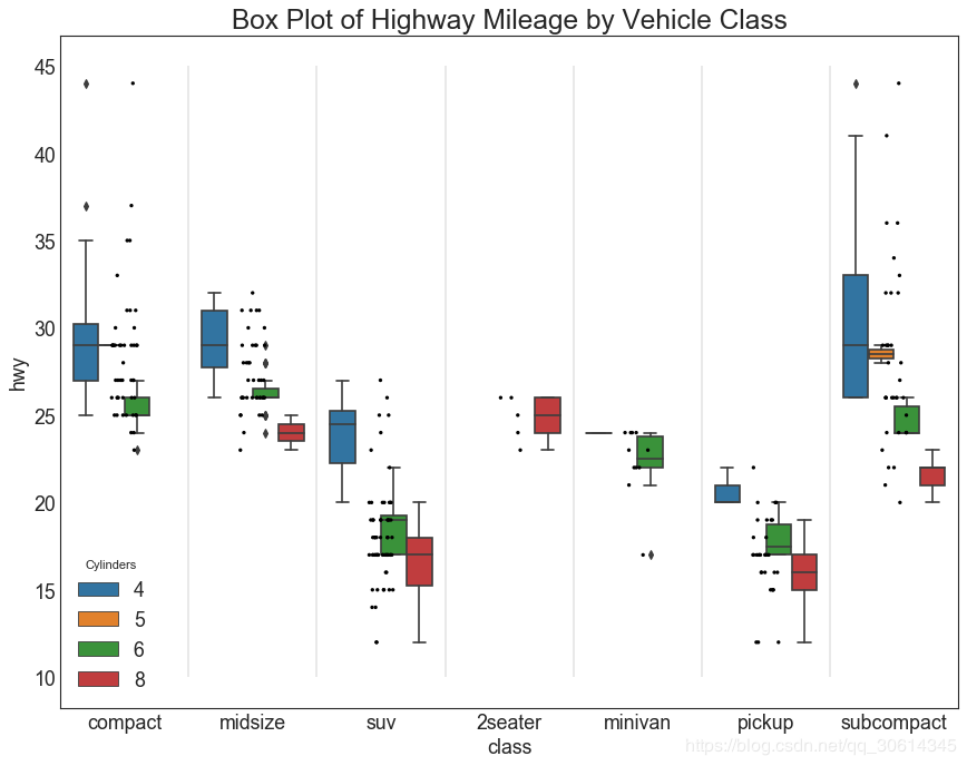
27. 包点+箱形图
Dot + Box plot传送类似于分组的boxplot信息。此外,这些点给出了每组中有多少数据点的感觉。
# Import Data
df = pd.read_csv("https://github.com/selva86/datasets/raw/master/mpg_ggplot2.csv")# Draw Plot
plt.figure(figsize=(13,10), dpi= 80)
sns.boxplot(x='class', y='hwy', data=df, hue='cyl')
sns.stripplot(x='class', y='hwy', data=df, color='black', size=3, jitter=1)for i in range(len(df['class'].unique())-1):
    plt.vlines(i+.5, 10, 45, linestyles='solid', colors='gray', alpha=0.2)# Decoration
plt.title('Box Plot of Highway Mileage by Vehicle Class', fontsize=22)
plt.legend(title='Cylinders')
plt.show()
28. 小提琴图
小提琴情节是箱形图的视觉上令人愉悦的替代品。小提琴的形状或面积取决于它所持有的观察次数。然而,小提琴图可能更难以阅读,并且在专业设置中不常用。
# Import Datadf = pd.read_csv("https://github.com/selva86/datasets/raw/master/mpg_ggplot2.csv")# Draw Plot
plt.figure(figsize=(13,10), dpi= 80)
sns.violinplot(x='class', y='hwy', data=df, scale='width', inner='quartile')# Decoration
plt.title('Violin Plot of Highway Mileage by Vehicle Class', fontsize=22)
plt.show()

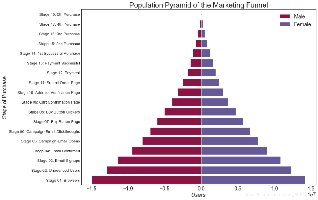
29. 人口金字塔
人口金字塔可用于显示由volumne排序的组的分布。或者它也可以用于显示人口的逐级过滤,因为它在下面用于显示有多少人通过营销渠道的每个阶段。
# Read data
df = pd.read_csv("https://raw.githubusercontent.com/selva86/datasets/master/email_campaign_funnel.csv")# Draw Plot
plt.figure(figsize=(13,10), dpi= 80)
group_col = 'Gender'
order_of_bars = df.Stage.unique()[::-1]
colors = [plt.cm.Spectral(i/float(len(df[group_col].unique())-1)) for i in range(len(df[group_col].unique()))]for c, group in zip(colors, df[group_col].unique()):
    sns.barplot(x='Users', y='Stage', data=df.loc[df[group_col]==group, :], order=order_of_bars, color=c, label=group)# Decorations
plt.xlabel("$Users$")
plt.ylabel("Stage of Purchase")
plt.yticks(fontsize=12)
plt.title("Population Pyramid of the Marketing Funnel", fontsize=22)
plt.legend()
plt.show()
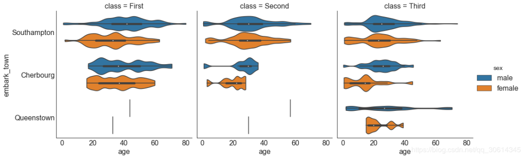
30. 分类图
由Seaborn库提供的分类图可用于可视化彼此相关的2个或更多分类变量的计数分布。
# Load Dataset
titanic = sns.load_dataset("titanic")# Plot
g = sns.catplot("alive", col="deck", col_wrap=4,
                data=titanic[titanic.deck.notnull()],
                kind="count", height=3.5, aspect=.8,
                palette='tab20')
fig.suptitle('sf')
plt.show()

# Load Dataset
titanic = sns.load_dataset("titanic")# Plot
sns.catplot(x="age", y="embark_town",
            hue="sex", col="class",
            data=titanic[titanic.embark_town.notnull()],
            orient="h", height=5, aspect=1, palette="tab10",
            kind="violin", dodge=True, cut=0, bw=.2)
组成
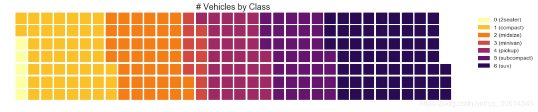
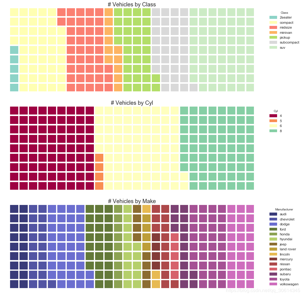
31.华夫饼图
所述waffle图表可使用来创建pywaffle包和用于显示组的组合物在较大的人口。
#! pip install pywaffle# Reference: https://stackoverflow.com/questions/41400136/how-to-do-waffle-charts-in-python-square-piechartfrom pywaffle import Waffle# Import
df_raw = pd.read_csv("https://github.com/selva86/datasets/raw/master/mpg_ggplot2.csv")# Prepare Data
df = df_raw.groupby('class').size().reset_index(name='counts')
n_categories = df.shape[0]
colors = [plt.cm.inferno_r(i/float(n_categories)) for i in range(n_categories)]# Draw Plot and Decorate
fig = plt.figure(
    FigureClass=Waffle,
    plots={'111': {'values': df['counts'],'labels': ["{0} ({1})".format(n[0], n[1]) for n in df[['class', 'counts']].itertuples()],'legend': {'loc': 'upper left', 'bbox_to_anchor': (1.05, 1), 'fontsize': 12},'title': {'label': '# Vehicles by Class', 'loc': 'center', 'fontsize':18}
        },
    },
    rows=7,
    colors=colors,
    figsize=(16, 9)
)
#! pip install pywaffle
from pywaffle import Waffle
# Import
# df_raw = pd.read_csv("https://github.com/selva86/datasets/raw/master/mpg_ggplot2.csv")
# Prepare Data
# By Class Data
df_class = df_raw.groupby('class').size().reset_index(name='counts_class')
n_categories = df_class.shape[0]
colors_class = [plt.cm.Set3(i/float(n_categories)) for i in range(n_categories)]
# By Cylinders Data
df_cyl = df_raw.groupby('cyl').size().reset_index(name='counts_cyl')
n_categories = df_cyl.shape[0]
colors_cyl = [plt.cm.Spectral(i/float(n_categories)) for i in range(n_categories)]
# By Make Data
df_make = df_raw.groupby('manufacturer').size().reset_index(name='counts_make')
n_categories = df_make.shape[0]
colors_make = [plt.cm.tab20b(i/float(n_categories)) for i in range(n_categories)]
# Draw Plot and Decorate
fig = plt.figure(
    FigureClass=Waffle,
    plots={'311': {'values': df_class['counts_class'],'labels': ["{1}".format(n[0], n[1]) for n in df_class[['class', 'counts_class']].itertuples()],'legend': {'loc': 'upper left', 'bbox_to_anchor': (1.05, 1), 'fontsize': 12, 'title':'Class'},'title': {'label': '# Vehicles by Class', 'loc': 'center', 'fontsize':18},'colors': colors_class
        },'312': {'values': df_cyl['counts_cyl'],'labels': ["{1}".format(n[0], n[1]) for n in df_cyl[['cyl', 'counts_cyl']].itertuples()],'legend': {'loc': 'upper left', 'bbox_to_anchor': (1.05, 1), 'fontsize': 12, 'title':'Cyl'},'title': {'label': '# Vehicles by Cyl', 'loc': 'center', 'fontsize':18},'colors': colors_cyl
        },'313': {'values': df_make['counts_make'],'labels': ["{1}".format(n[0], n[1]) for n in df_make[['manufacturer', 'counts_make']].itertuples()],'legend': {'loc': 'upper left', 'bbox_to_anchor': (1.05, 1), 'fontsize': 12, 'title':'Manufacturer'},'title': {'label': '# Vehicles by Make', 'loc': 'center', 'fontsize':18},'colors': colors_make
        }
    },
    rows=9,
    figsize=(16, 14)
)
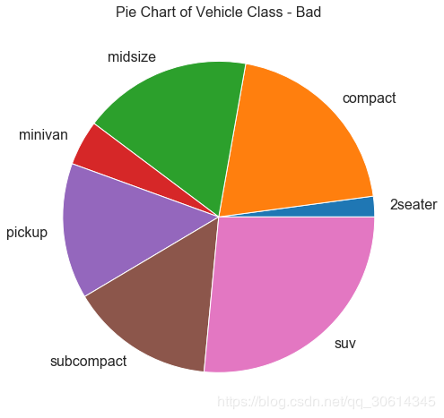
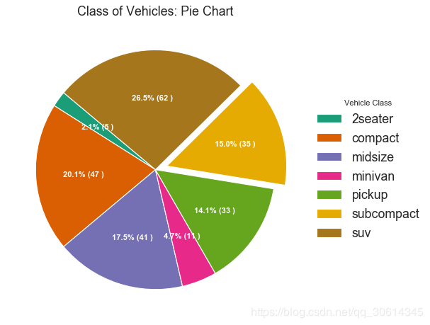
32. 饼图
饼图是显示群组成的经典方式。然而,现在通常不建议使用它,因为馅饼部分的面积有时会变得误导。因此,如果您要使用饼图,强烈建议明确记下饼图每个部分的百分比或数字。
# Import
df_raw = pd.read_csv("https://github.com/selva86/datasets/raw/master/mpg_ggplot2.csv")# Prepare Data
df = df_raw.groupby('class').size()# Make the plot with pandas
df.plot(kind='pie', subplots=True, figsize=(8, 8), dpi= 80)
plt.title("Pie Chart of Vehicle Class - Bad")
plt.ylabel("")
plt.show()
# Import
df_raw = pd.read_csv("https://github.com/selva86/datasets/raw/master/mpg_ggplot2.csv")# Prepare Data
df = df_raw.groupby('class').size().reset_index(name='counts')# Draw Plot
fig, ax = plt.subplots(figsize=(12, 7), subplot_kw=dict(aspect="equal"), dpi= 80)
data = df['counts']
categories = df['class']
explode = [0,0,0,0,0,0.1,0]
def func(pct, allvals):
    absolute = int(pct/100.*np.sum(allvals))
    return "{:.1f}% ({:d} )".format(pct, absolute)
wedges, texts, autotexts = ax.pie(data,
                                  autopct=lambda pct: func(pct, data),
                                  textprops=dict(color="w"),
                                  colors=plt.cm.Dark2.colors,
                                 startangle=140,
                                 explode=explode)# Decoration
ax.legend(wedges, categories, title="Vehicle Class", loc="center left", bbox_to_anchor=(1, 0, 0.5, 1))
plt.setp(autotexts, size=10, weight=700)
ax.set_title("Class of Vehicles: Pie Chart")
plt.show()
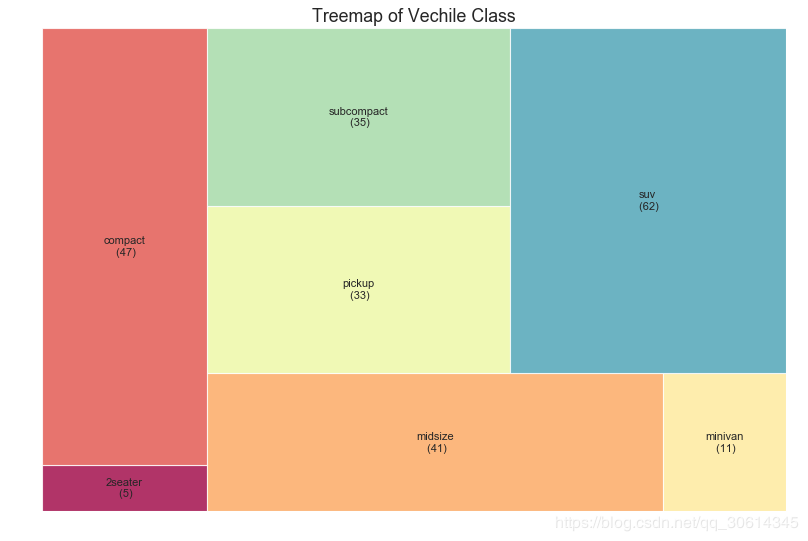
33. 树形图
树形图类似于饼图,它可以更好地完成工作,而不会误导每个组的贡献。
# pip install squarify
import squarify # Import Data
df_raw = pd.read_csv("https://github.com/selva86/datasets/raw/master/mpg_ggplot2.csv")# Prepare Data
df = df_raw.groupby('class').size().reset_index(name='counts')
labels = df.apply(lambda x: str(x[0]) + "\n (" + str(x[1]) + ")", axis=1)
sizes = df['counts'].values.tolist()
colors = [plt.cm.Spectral(i/float(len(labels))) for i in range(len(labels))]# Draw Plot
plt.figure(figsize=(12,8), dpi= 80)
squarify.plot(sizes=sizes, label=labels, color=colors, alpha=.8)# Decorate
plt.title('Treemap of Vechile Class')
plt.axis('off')
plt.show()
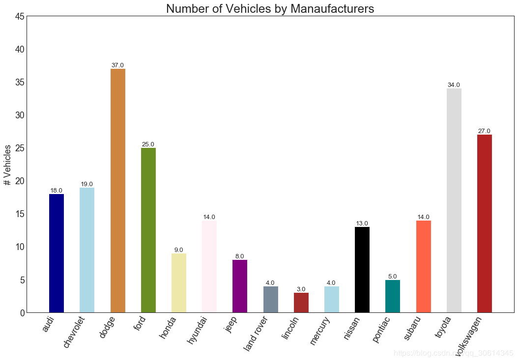
34. 条形图
条形图是根据计数或任何给定指标可视化项目的经典方式。在下面的图表中,我为每个项目使用了不同的颜色,但您通常可能希望为所有项目选择一种颜色,除非您按组对它们进行着色。颜色名称存储在all_colors下面的代码中。您可以通过设置color参数来更改条形的颜色。
import random# Import Data
df_raw = pd.read_csv("https://github.com/selva86/datasets/raw/master/mpg_ggplot2.csv")# Prepare Data
df = df_raw.groupby('manufacturer').size().reset_index(name='counts')
n = df['manufacturer'].unique().__len__()+1
all_colors = list(plt.cm.colors.cnames.keys())
random.seed(100)
c = random.choices(all_colors, k=n)# Plot Bars
plt.figure(figsize=(16,10), dpi= 80)
plt.bar(df['manufacturer'], df['counts'], color=c, width=.5)for i, val in enumerate(df['counts'].values):
    plt.text(i, val, float(val), horizontalalignment='center', verticalalignment='bottom', fontdict={'fontweight':500, 'size':12})# Decoration
plt.gca().set_xticklabels(df['manufacturer'], rotation=60, horizontalalignment= 'right')
plt.title("Number of Vehicles by Manaufacturers", fontsize=22)
plt.ylabel('# Vehicles')
plt.ylim(0, 45)
plt.show()
更改
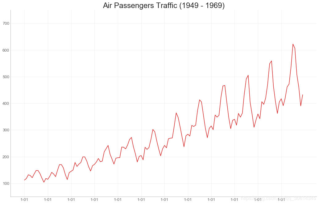
35. 时间序列图
时间序列图用于显示给定度量随时间变化的方式。在这里,您可以看到1949年至1969年间航空客运量的变化情况。
# Import Data
df = pd.read_csv('https://github.com/selva86/datasets/raw/master/AirPassengers.csv')# Draw Plot
plt.figure(figsize=(16,10), dpi= 80)
plt.plot('date', 'traffic', data=df, color='tab:red')# Decoration
plt.ylim(50, 750)
xtick_location = df.index.tolist()[::12]
xtick_labels = [x[-4:] for x in df.date.tolist()[::12]]
plt.xticks(ticks=xtick_location, labels=xtick_labels, rotation=0, fontsize=12, horizontalalignment='center', alpha=.7)
plt.yticks(fontsize=12, alpha=.7)
plt.title("Air Passengers Traffic (1949 - 1969)", fontsize=22)
plt.grid(axis='both', alpha=.3)# Remove borders
plt.gca().spines["top"].set_alpha(0.0)
plt.gca().spines["bottom"].set_alpha(0.3)
plt.gca().spines["right"].set_alpha(0.0)
plt.gca().spines["left"].set_alpha(0.3)
plt.show()
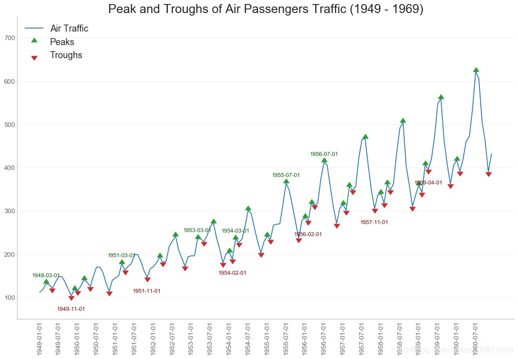
36. 带波峰波谷标记的时序图
下面的时间序列绘制了所有的峰值和低谷,并注释了所选特殊事件的发生。
# Import Data
df = pd.read_csv('https://github.com/selva86/datasets/raw/master/AirPassengers.csv')# Get the Peaks and Troughs
data = df['traffic'].values
doublediff = np.diff(np.sign(np.diff(data)))
peak_locations = np.where(doublediff == -2)[0] + 1
doublediff2 = np.diff(np.sign(np.diff(-1*data)))
trough_locations = np.where(doublediff2 == -2)[0] + 1# Draw Plot
plt.figure(figsize=(16,10), dpi= 80)
plt.plot('date', 'traffic', data=df, color='tab:blue', label='Air Traffic')
plt.scatter(df.date[peak_locations], df.traffic[peak_locations], marker=mpl.markers.CARETUPBASE, color='tab:green', s=100, label='Peaks')
plt.scatter(df.date[trough_locations], df.traffic[trough_locations], marker=mpl.markers.CARETDOWNBASE, color='tab:red', s=100, label='Troughs')# Annotatefor t, p in zip(trough_locations[1::5], peak_locations[::3]):
    plt.text(df.date[p], df.traffic[p]+15, df.date[p], horizontalalignment='center', color='darkgreen')
    plt.text(df.date[t], df.traffic[t]-35, df.date[t], horizontalalignment='center', color='darkred')# Decoration
plt.ylim(50,750)
xtick_location = df.index.tolist()[::6]
xtick_labels = df.date.tolist()[::6]
plt.xticks(ticks=xtick_location, labels=xtick_labels, rotation=90, fontsize=12, alpha=.7)
plt.title("Peak and Troughs of Air Passengers Traffic (1949 - 1969)", fontsize=22)
plt.yticks(fontsize=12, alpha=.7)# Lighten borders
plt.gca().spines["top"].set_alpha(.0)
plt.gca().spines["bottom"].set_alpha(.3)
plt.gca().spines["right"].set_alpha(.0)
plt.gca().spines["left"].set_alpha(.3)
plt.legend(loc='upper left')
plt.grid(axis='y', alpha=.3)
plt.show()
37. 自相关和部分自相关图
ACF图显示时间序列与其自身滞后的相关性。每条垂直线(在自相关图上)表示系列与滞后0之间的滞后之间的相关性。图中的蓝色阴影区域是显着性水平。那些位于蓝线之上的滞后是显着的滞后。
那么如何解读呢?
对于AirPassengers,我们看到多达14个滞后穿过蓝线,因此非常重要。这意味着,14年前的航空旅客交通量对今天的交通状况有影响。
PACF在另一方面显示了任何给定滞后(时间序列)与当前序列的自相关,但是删除了滞后的贡献。
from statsmodels.graphics.tsaplots import plot_acf, plot_pacf# Import Data
df = pd.read_csv('https://github.com/selva86/datasets/raw/master/AirPassengers.csv')# Draw Plot
fig, (ax1, ax2) = plt.subplots(1, 2,figsize=(16,6), dpi= 80)
plot_acf(df.traffic.tolist(), ax=ax1, lags=50)
plot_pacf(df.traffic.tolist(), ax=ax2, lags=20)# Decorate# lighten the borders
ax1.spines["top"].set_alpha(.3); ax2.spines["top"].set_alpha(.3)
ax1.spines["bottom"].set_alpha(.3); ax2.spines["bottom"].set_alpha(.3)
ax1.spines["right"].set_alpha(.3); ax2.spines["right"].set_alpha(.3)
ax1.spines["left"].set_alpha(.3); ax2.spines["left"].set_alpha(.3)# font size of tick labels
ax1.tick_params(axis='both', labelsize=12)
ax2.tick_params(axis='both', labelsize=12)
plt.show()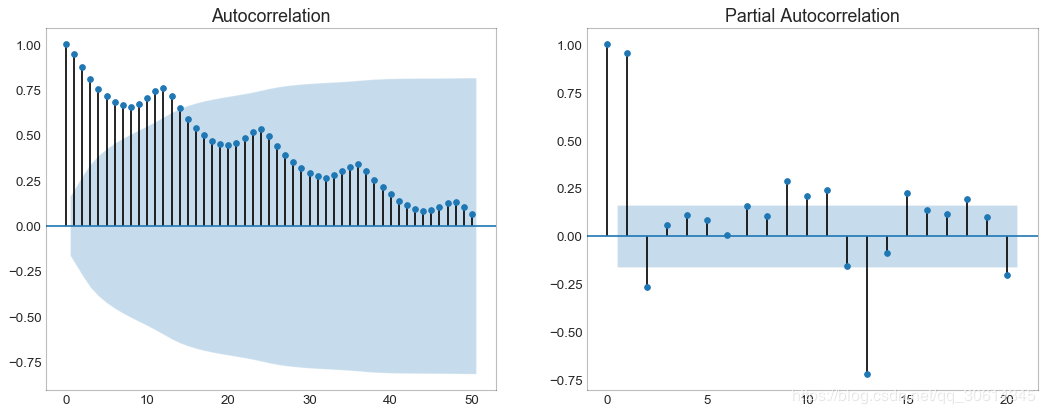
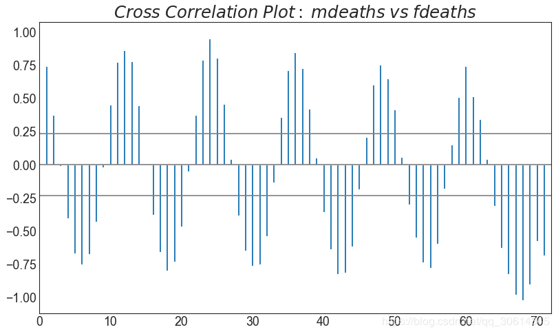
38. 交叉相关图
互相关图显示了两个时间序列相互之间的滞后。
import statsmodels.tsa.stattools as stattools# Import Data
df = pd.read_csv('https://github.com/selva86/datasets/raw/master/mortality.csv')
x = df['mdeaths']
y = df['fdeaths']# Compute Cross Correlations
ccs = stattools.ccf(x, y)[:100]
nlags = len(ccs)# Compute the Significance level# ref: https://stats.stackexchange.com/questions/3115/cross-correlation-significance-in-r/3128#3128
conf_level = 2 / np.sqrt(nlags)# Draw Plot
plt.figure(figsize=(12,7), dpi= 80)
plt.hlines(0, xmin=0, xmax=100, color='gray')  # 0 axis
plt.hlines(conf_level, xmin=0, xmax=100, color='gray')
plt.hlines(-conf_level, xmin=0, xmax=100, color='gray')
plt.bar(x=np.arange(len(ccs)), height=ccs, width=.3)# Decoration
plt.title('$Cross\; Correlation\; Plot:\; mdeaths\; vs\; fdeaths$', fontsize=22)
plt.xlim(0,len(ccs))
plt.show()
39. 时间序列分解图
时间序列分解图显示时间序列分解为趋势,季节和残差分量。
from statsmodels.tsa.seasonal import seasonal_decomposefrom dateutil.parser import parse# Import Data
df = pd.read_csv('https://github.com/selva86/datasets/raw/master/AirPassengers.csv')
dates = pd.DatetimeIndex([parse(d).strftime('%Y-%m-01') for d in df['date']])
df.set_index(dates, inplace=True)# Decompose
result = seasonal_decompose(df['traffic'], model='multiplicative')# Plot
plt.rcParams.update({'figure.figsize': (10,10)})
result.plot().suptitle('Time Series Decomposition of Air Passengers')
plt.show()

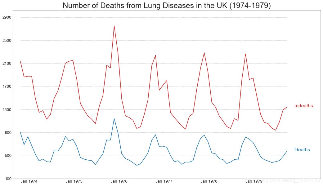
40. 多个时间序列
您可以绘制多个时间序列,在同一图表上测量相同的值,如下所示。
# Import Data
df = pd.read_csv('https://github.com/selva86/datasets/raw/master/mortality.csv')# Define the upper limit, lower limit, interval of Y axis and colors
y_LL = 100
y_UL = int(df.iloc[:, 1:].max().max()*1.1)
y_interval = 400
mycolors = ['tab:red', 'tab:blue', 'tab:green', 'tab:orange']    # Draw Plot and Annotate
fig, ax = plt.subplots(1,1,figsize=(16, 9), dpi= 80)
columns = df.columns[1:]  for i, column in enumerate(columns):
    plt.plot(df.date.values, df[column].values, lw=1.5, color=mycolors[i])
    plt.text(df.shape[0]+1, df[column].values[-1], column, fontsize=14, color=mycolors[i])# Draw Tick lines  for y in range(y_LL, y_UL, y_interval):
    plt.hlines(y, xmin=0, xmax=71, colors='black', alpha=0.3, linestyles="--", lw=0.5)# Decorations
plt.tick_params(axis="both", which="both", bottom=False, top=False,
                labelbottom=True, left=False, right=False, labelleft=True)        # Lighten borders
plt.gca().spines["top"].set_alpha(.3)
plt.gca().spines["bottom"].set_alpha(.3)
plt.gca().spines["right"].set_alpha(.3)
plt.gca().spines["left"].set_alpha(.3)
plt.title('Number of Deaths from Lung Diseases in the UK (1974-1979)', fontsize=22)
plt.yticks(range(y_LL, y_UL, y_interval), [str(y) for y in range(y_LL, y_UL, y_interval)], fontsize=12)
plt.xticks(range(0, df.shape[0], 12), df.date.values[::12], horizontalalignment='left', fontsize=12)
plt.ylim(y_LL, y_UL)
plt.xlim(-2, 80)
plt.show()
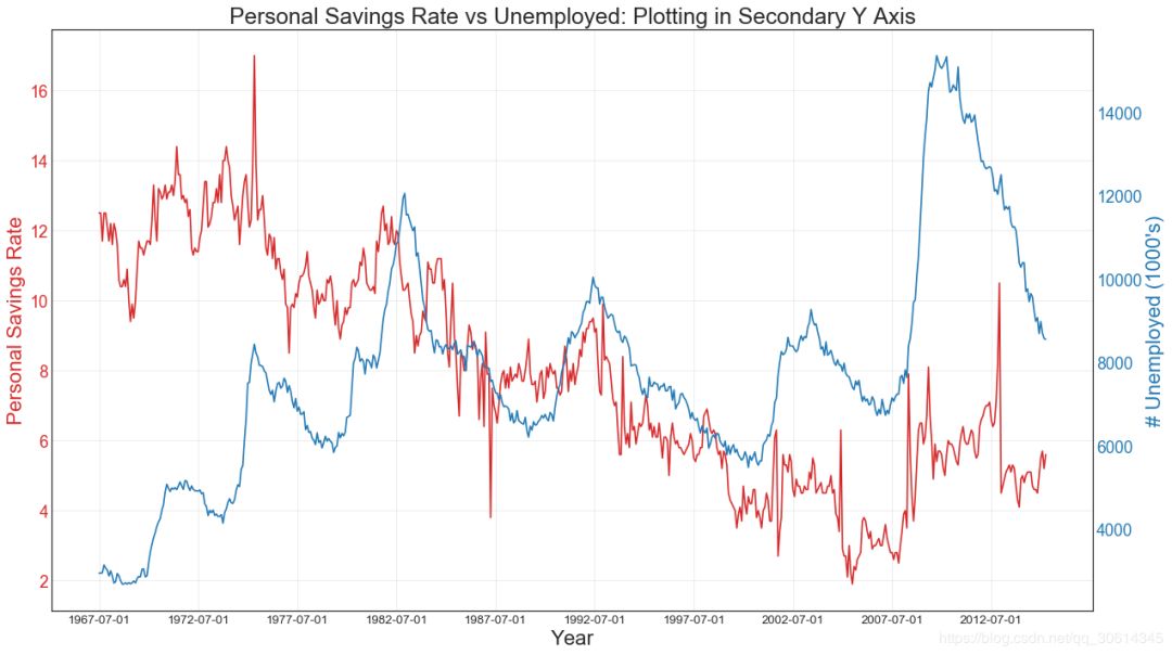
41. 使用辅助Y轴来绘制不同范围的图形
如果要显示在同一时间点测量两个不同数量的两个时间序列,则可以在右侧的辅助Y轴上再绘制第二个系列。
# Import Data
df = pd.read_csv("https://github.com/selva86/datasets/raw/master/economics.csv")
x = df['date']
y1 = df['psavert']
y2 = df['unemploy']# Plot Line1 (Left Y Axis)
fig, ax1 = plt.subplots(1,1,figsize=(16,9), dpi= 80)
ax1.plot(x, y1, color='tab:red')# Plot Line2 (Right Y Axis)
ax2 = ax1.twinx()  # instantiate a second axes that shares the same x-axis
ax2.plot(x, y2, color='tab:blue')# Decorations# ax1 (left Y axis)
ax1.set_xlabel('Year', fontsize=20)
ax1.tick_params(axis='x', rotation=0, labelsize=12)
ax1.set_ylabel('Personal Savings Rate', color='tab:red', fontsize=20)
ax1.tick_params(axis='y', rotation=0, labelcolor='tab:red' )
ax1.grid(alpha=.4)# ax2 (right Y axis)
ax2.set_ylabel("# Unemployed (1000's)", color='tab:blue', fontsize=20)
ax2.tick_params(axis='y', labelcolor='tab:blue')
ax2.set_xticks(np.arange(0, len(x), 60))
ax2.set_xticklabels(x[::60], rotation=90, fontdict={'fontsize':10})
ax2.set_title("Personal Savings Rate vs Unemployed: Plotting in Secondary Y Axis", fontsize=22)
fig.tight_layout()
plt.show()
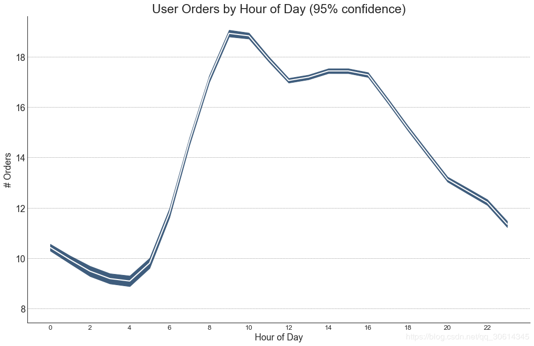
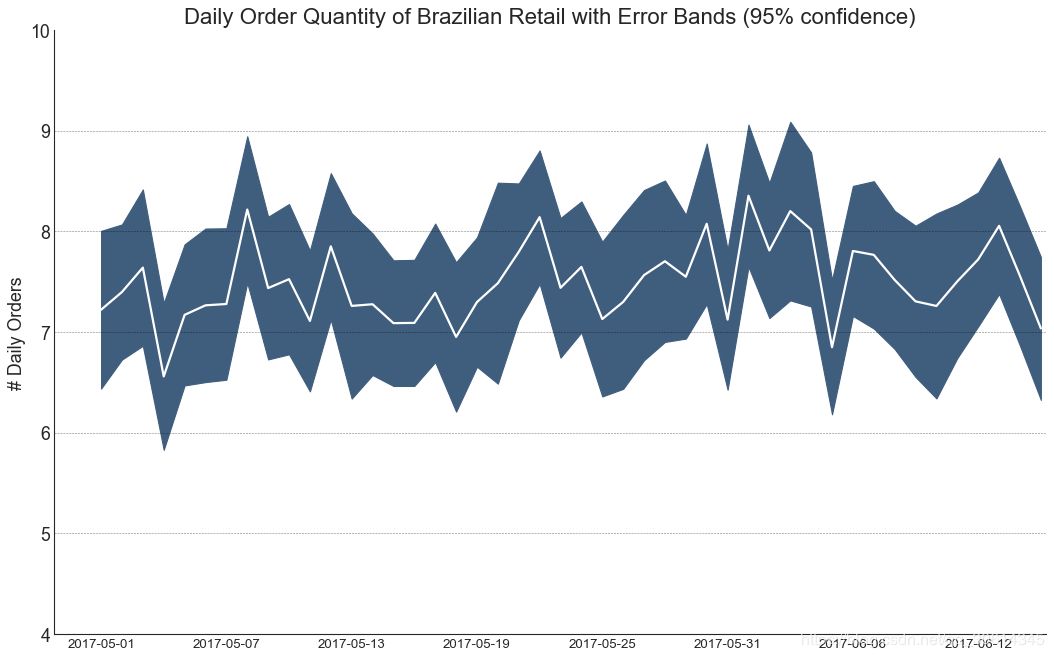
42.带有误差带的时间序列
如果您有一个时间序列数据集,每个时间点(日期/时间戳)有多个观测值,则可以构建带有误差带的时间序列。您可以在下面看到一些基于每天不同时间订单的示例。另一个关于45天持续到达的订单数量的例子。
在该方法中,订单数量的平均值由白线表示。并且计算95%置信带并围绕均值绘制。
from scipy.stats import sem# Import Data
df = pd.read_csv("https://raw.githubusercontent.com/selva86/datasets/master/user_orders_hourofday.csv")
df_mean = df.groupby('order_hour_of_day').quantity.mean()
df_se = df.groupby('order_hour_of_day').quantity.apply(sem).mul(1.96)# Plot
plt.figure(figsize=(16,10), dpi= 80)
plt.ylabel("# Orders", fontsize=16)
x = df_mean.index
plt.plot(x, df_mean, color="white", lw=2)
plt.fill_between(x, df_mean - df_se, df_mean + df_se, color="#3F5D7D")  # Decorations# Lighten borders
plt.gca().spines["top"].set_alpha(0)
plt.gca().spines["bottom"].set_alpha(1)
plt.gca().spines["right"].set_alpha(0)
plt.gca().spines["left"].set_alpha(1)
plt.xticks(x[::2], [str(d) for d in x[::2]] , fontsize=12)
plt.title("User Orders by Hour of Day (95% confidence)", fontsize=22)
plt.xlabel("Hour of Day")
s, e = plt.gca().get_xlim()
plt.xlim(s, e)# Draw Horizontal Tick lines  for y in range(8, 20, 2):
    plt.hlines(y, xmin=s, xmax=e, colors='black', alpha=0.5, linestyles="--", lw=0.5)
plt.show()
"Data Source: https://www.kaggle.com/olistbr/brazilian-ecommerce#olist_orders_dataset.csv"from dateutil.parser import parsefrom scipy.stats import sem# Import Data
df_raw = pd.read_csv('https://raw.githubusercontent.com/selva86/datasets/master/orders_45d.csv',
                     parse_dates=['purchase_time', 'purchase_date'])# Prepare Data: Daily Mean and SE Bands
df_mean = df_raw.groupby('purchase_date').quantity.mean()
df_se = df_raw.groupby('purchase_date').quantity.apply(sem).mul(1.96)# Plot
plt.figure(figsize=(16,10), dpi= 80)
plt.ylabel("# Daily Orders", fontsize=16)
x = [d.date().strftime('%Y-%m-%d') for d in df_mean.index]
plt.plot(x, df_mean, color="white", lw=2)
plt.fill_between(x, df_mean - df_se, df_mean + df_se, color="#3F5D7D")  # Decorations# Lighten borders
plt.gca().spines["top"].set_alpha(0)
plt.gca().spines["bottom"].set_alpha(1)
plt.gca().spines["right"].set_alpha(0)
plt.gca().spines["left"].set_alpha(1)
plt.xticks(x[::6], [str(d) for d in x[::6]] , fontsize=12)
plt.title("Daily Order Quantity of Brazilian Retail with Error Bands (95% confidence)", fontsize=20)# Axis limits
s, e = plt.gca().get_xlim()
plt.xlim(s, e-2)
plt.ylim(4, 10)# Draw Horizontal Tick lines  for y in range(5, 10, 1):
    plt.hlines(y, xmin=s, xmax=e, colors='black', alpha=0.5, linestyles="--", lw=0.5)
plt.show()
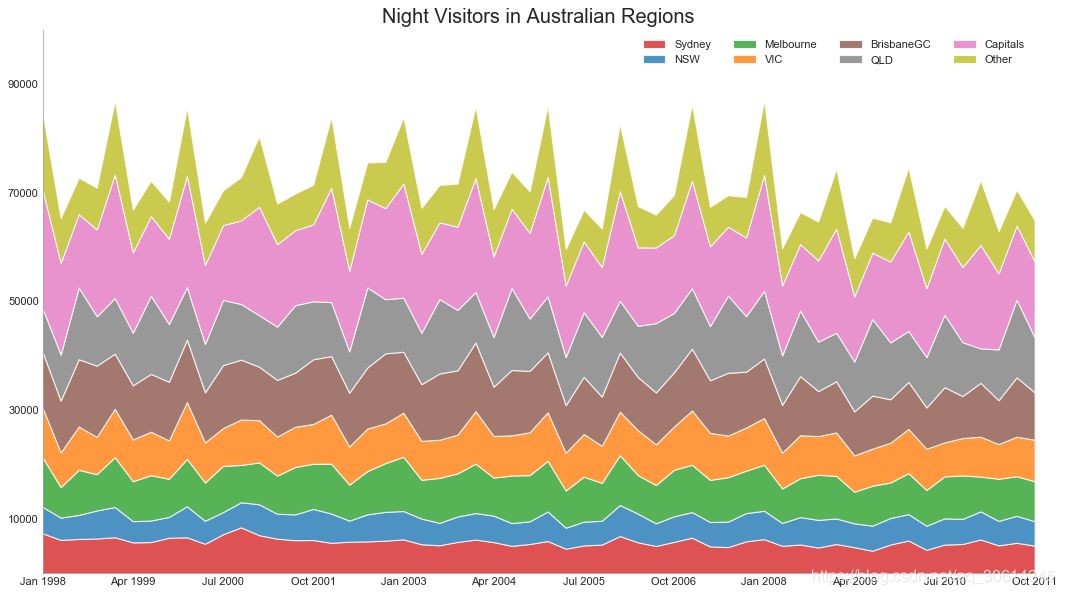
43.堆积面积图
堆积面积图可以直观地显示多个时间序列的贡献程度,因此可以轻松地相互比较。
# Import Data
df = pd.read_csv('https://raw.githubusercontent.com/selva86/datasets/master/nightvisitors.csv')# Decide Colors
mycolors = ['tab:red', 'tab:blue', 'tab:green', 'tab:orange', 'tab:brown', 'tab:grey', 'tab:pink', 'tab:olive']      # Draw Plot and Annotate
fig, ax = plt.subplots(1,1,figsize=(16, 9), dpi= 80)
columns = df.columns[1:]
labs = columns.values.tolist()# Prepare data
x  = df['yearmon'].values.tolist()
y0 = df[columns[0]].values.tolist()
y1 = df[columns[1]].values.tolist()
y2 = df[columns[2]].values.tolist()
y3 = df[columns[3]].values.tolist()
y4 = df[columns[4]].values.tolist()
y5 = df[columns[5]].values.tolist()
y6 = df[columns[6]].values.tolist()
y7 = df[columns[7]].values.tolist()
y = np.vstack([y0, y2, y4, y6, y7, y5, y1, y3])# Plot for each column
labs = columns.values.tolist()
ax = plt.gca()
ax.stackplot(x, y, labels=labs, colors=mycolors, alpha=0.8)# Decorations
ax.set_title('Night Visitors in Australian Regions', fontsize=18)
ax.set(ylim=[0, 100000])
ax.legend(fontsize=10, ncol=4)plt.xticks(x[::5], fontsize=10, horizontalalignment='center')
plt.yticks(np.arange(10000, 100000, 20000), fontsize=10)
plt.xlim(x[0], x[-1])# Lighten borders
plt.gca().spines["top"].set_alpha(0)
plt.gca().spines["bottom"].set_alpha(.3)
plt.gca().spines["right"].set_alpha(0)
plt.gca().spines["left"].set_alpha(.3)
plt.show()
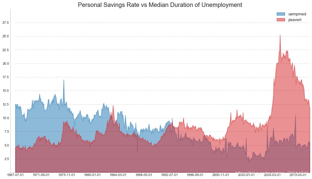
44. 未堆积的面积图
未堆积区域图用于可视化两个或更多个系列相对于彼此的进度(起伏)。在下面的图表中,您可以清楚地看到随着失业中位数持续时间的增加,个人储蓄率会下降。未堆积的区域图表很好地揭示了这种现象。
# Import Data
df = pd.read_csv("https://github.com/selva86/datasets/raw/master/economics.csv")# Prepare Data
x = df['date'].values.tolist()
y1 = df['psavert'].values.tolist()
y2 = df['uempmed'].values.tolist()
mycolors = ['tab:red', 'tab:blue', 'tab:green', 'tab:orange', 'tab:brown', 'tab:grey', 'tab:pink', 'tab:olive']
columns = ['psavert', 'uempmed']# Draw Plot
fig, ax = plt.subplots(1, 1, figsize=(16,9), dpi= 80)
ax.fill_between(x, y1=y1, y2=0, label=columns[1], alpha=0.5, color=mycolors[1], linewidth=2)
ax.fill_between(x, y1=y2, y2=0, label=columns[0], alpha=0.5, color=mycolors[0], linewidth=2)# Decorations
ax.set_title('Personal Savings Rate vs Median Duration of Unemployment', fontsize=18)
ax.set(ylim=[0, 30])
ax.legend(loc='best', fontsize=12)
plt.xticks(x[::50], fontsize=10, horizontalalignment='center')
plt.yticks(np.arange(2.5, 30.0, 2.5), fontsize=10)
plt.xlim(-10, x[-1])# Draw Tick lines  for y in np.arange(2.5, 30.0, 2.5):
    plt.hlines(y, xmin=0, xmax=len(x), colors='black', alpha=0.3, linestyles="--", lw=0.5)# Lighten borders
plt.gca().spines["top"].set_alpha(0)
plt.gca().spines["bottom"].set_alpha(.3)
plt.gca().spines["right"].set_alpha(0)
plt.gca().spines["left"].set_alpha(.3)
plt.show()
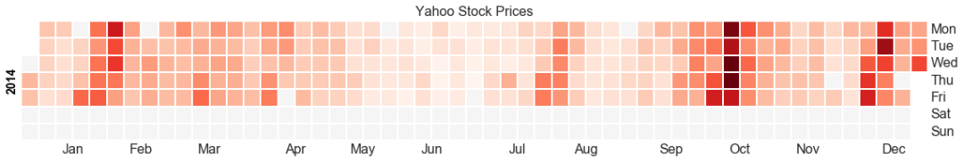
45. 日历热力图
与时间序列相比,日历映射是可视化基于时间的数据的备选和不太优选的选项。虽然可以在视觉上吸引人,但数值并不十分明显。然而,它可以很好地描绘极端值和假日效果。
import matplotlib as mplimport calmap# Import Data
df = pd.read_csv("https://raw.githubusercontent.com/selva86/datasets/master/yahoo.csv", parse_dates=['date'])
df.set_index('date', inplace=True)# Plot
plt.figure(figsize=(16,10), dpi= 80)
calmap.calendarplot(df['2014']['VIX.Close'], fig_kws={'figsize': (16,10)}, yearlabel_kws={'color':'black', 'fontsize':14}, subplot_kws={'title':'Yahoo Stock Prices'})
plt.show()
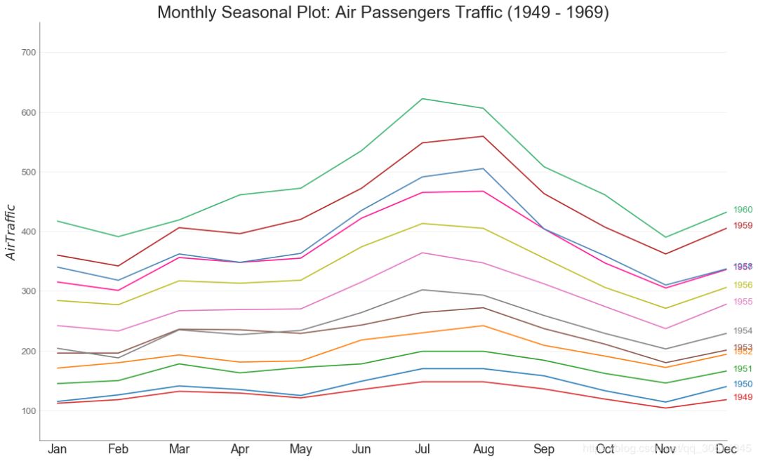
46. 季节图
季节性情节可用于比较上一季节当天(年/月/周等)的时间序列。
from dateutil.parser import parse # Import Data
df = pd.read_csv('https://github.com/selva86/datasets/raw/master/AirPassengers.csv')# Prepare data
df['year'] = [parse(d).year for d in df.date]
df['month'] = [parse(d).strftime('%b') for d in df.date]
years = df['year'].unique()# Draw Plot
mycolors = ['tab:red', 'tab:blue', 'tab:green', 'tab:orange', 'tab:brown', 'tab:grey', 'tab:pink', 'tab:olive', 'deeppink', 'steelblue', 'firebrick', 'mediumseagreen']
plt.figure(figsize=(16,10), dpi= 80)for i, y in enumerate(years):
    plt.plot('month', 'traffic', data=df.loc[df.year==y, :], color=mycolors[i], label=y)
    plt.text(df.loc[df.year==y, :].shape[0]-.9, df.loc[df.year==y, 'traffic'][-1:].values[0], y, fontsize=12, color=mycolors[i])# Decoration
plt.ylim(50,750)
plt.xlim(-0.3, 11)
plt.ylabel('$Air Traffic$')
plt.yticks(fontsize=12, alpha=.7)
plt.title("Monthly Seasonal Plot: Air Passengers Traffic (1949 - 1969)", fontsize=22)
plt.grid(axis='y', alpha=.3)# Remove borders
plt.gca().spines["top"].set_alpha(0.0)
plt.gca().spines["bottom"].set_alpha(0.5)
plt.gca().spines["right"].set_alpha(0.0)
plt.gca().spines["left"].set_alpha(0.5)   # plt.legend(loc='upper right', ncol=2, fontsize=12)
plt.show()
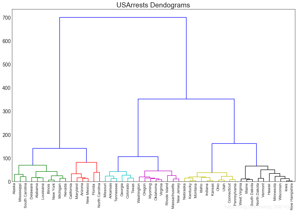
47.树状图
树形图基于给定的距离度量将相似的点组合在一起,并基于点的相似性将它们组织在树状链接中。
import scipy.cluster.hierarchy as shc# Import Data
df = pd.read_csv('https://raw.githubusercontent.com/selva86/datasets/master/USArrests.csv')# Plot
plt.figure(figsize=(16, 10), dpi= 80)
plt.title("USArrests Dendograms", fontsize=22)
dend = shc.dendrogram(shc.linkage(df[['Murder', 'Assault', 'UrbanPop', 'Rape']], method='ward'), labels=df.State.values, color_threshold=100)
plt.xticks(fontsize=12)
plt.show()
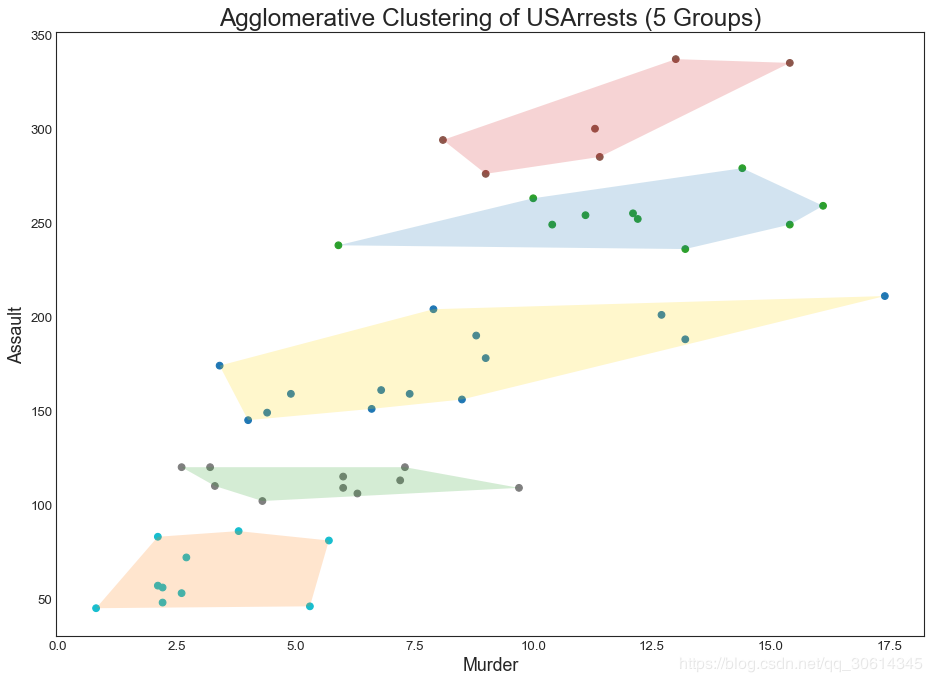
48. 簇状图
Cluster Plot可用于划分属于同一群集的点。下面是根据USArrests数据集将美国各州分为5组的代表性示例。该集群图使用“谋杀”和“攻击”列作为X和Y轴。或者,您可以将第一个到主要组件用作X轴和Y轴。
from sklearn.cluster import AgglomerativeClusteringfrom scipy.spatial import ConvexHull# Import Data
df = pd.read_csv('https://raw.githubusercontent.com/selva86/datasets/master/USArrests.csv')# Agglomerative Clustering
cluster = AgglomerativeClustering(n_clusters=5, affinity='euclidean', linkage='ward')
cluster.fit_predict(df[['Murder', 'Assault', 'UrbanPop', 'Rape']])  # Plot
plt.figure(figsize=(14, 10), dpi= 80)
plt.scatter(df.iloc[:,0], df.iloc[:,1], c=cluster.labels_, cmap='tab10')  # Encircledef encircle(x,y, ax=None, **kw):if not ax: ax=plt.gca()
    p = np.c_[x,y]
    hull = ConvexHull(p)
    poly = plt.Polygon(p[hull.vertices,:], **kw)
    ax.add_patch(poly)# Draw polygon surrounding vertices
encircle(df.loc[cluster.labels_ == 0, 'Murder'], df.loc[cluster.labels_ == 0, 'Assault'], ec="k", fc="gold", alpha=0.2, linewidth=0)
encircle(df.loc[cluster.labels_ == 1, 'Murder'], df.loc[cluster.labels_ == 1, 'Assault'], ec="k", fc="tab:blue", alpha=0.2, linewidth=0)
encircle(df.loc[cluster.labels_ == 2, 'Murder'], df.loc[cluster.labels_ == 2, 'Assault'], ec="k", fc="tab:red", alpha=0.2, linewidth=0)
encircle(df.loc[cluster.labels_ == 3, 'Murder'], df.loc[cluster.labels_ == 3, 'Assault'], ec="k", fc="tab:green", alpha=0.2, linewidth=0)
encircle(df.loc[cluster.labels_ == 4, 'Murder'], df.loc[cluster.labels_ == 4, 'Assault'], ec="k", fc="tab:orange", alpha=0.2, linewidth=0)# Decorations
plt.xlabel('Murder'); plt.xticks(fontsize=12)
plt.ylabel('Assault'); plt.yticks(fontsize=12)
plt.title('Agglomerative Clustering of USArrests (5 Groups)', fontsize=22)
plt.show()
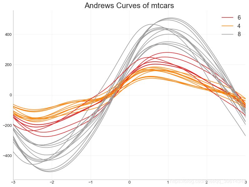
49. 安德鲁斯曲线
安德鲁斯曲线有助于可视化是否存在基于给定分组的数字特征的固有分组。如果功能(数据集中的列)无法区分组(cyl)那么线条将不会很好地隔离,如下所示。
from pandas.plotting import andrews_curves# Import
df = pd.read_csv("https://github.com/selva86/datasets/raw/master/mtcars.csv")
df.drop(['cars', 'carname'], axis=1, inplace=True)# Plot
plt.figure(figsize=(12,9), dpi= 80)
andrews_curves(df, 'cyl', colormap='Set1')# Lighten borders
plt.gca().spines["top"].set_alpha(0)
plt.gca().spines["bottom"].set_alpha(.3)
plt.gca().spines["right"].set_alpha(0)
plt.gca().spines["left"].set_alpha(.3)
plt.title('Andrews Curves of mtcars', fontsize=22)
plt.xlim(-3,3)
plt.grid(alpha=0.3)
plt.xticks(fontsize=12)
plt.yticks(fontsize=12)
plt.show()
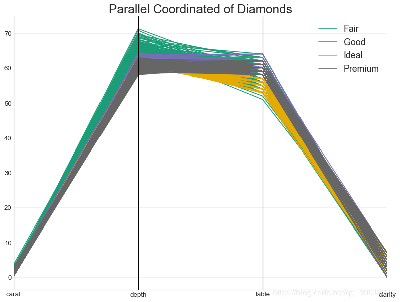
50. 平行坐标
平行坐标有助于可视化特征是否有助于有效地隔离组。如果实现隔离,则该特征可能在预测该组时非常有用。
from pandas.plotting import parallel_coordinates# Import Data
df_final = pd.read_csv("https://raw.githubusercontent.com/selva86/datasets/master/diamonds_filter.csv")# Plot
plt.figure(figsize=(12,9), dpi= 80)
parallel_coordinates(df_final, 'cut', colormap='Dark2')# Lighten borders
plt.gca().spines["top"].set_alpha(0)
plt.gca().spines["bottom"].set_alpha(.3)
plt.gca().spines["right"].set_alpha(0)
plt.gca().spines["left"].set_alpha(.3)
plt.title('Parallel Coordinated of Diamonds', fontsize=22)
plt.grid(alpha=0.3)
plt.xticks(fontsize=12)
plt.yticks(fontsize=12)
plt.show()
本文参考自:
https://www.machinelearningplus.com/plots/top-50-matplotlib-visualizations-the-master-plots-python/
扫码阅读作者更多精彩文章
▼▼▼

(*本文为Python大本营转载文章,转载请联系原作者)
◆
精彩推荐
◆
#2019 中国大数据技术大会(BDTC)# 微众银行首席人工智能官,香港科技大学讲席教授杨强确认出席BDTC 2019并担任大会主席。大会还将邀请更多业内顶尖大数据应用领航者,与1500+观众分享最佳案例实践。详情https://t.csdnimg.cn/f9VS 推荐阅读
推荐阅读
对比C++和Python,谈谈指针与引用
Pandas中第二好用的函数 | 优雅的Apply
限时早鸟票 | 2019 中国大数据技术大会(BDTC)超豪华盛宴抢先看!
Python老司机给上路新手的3点忠告
即学即用的30段Python实用代码
使用Python对大脑成像数据进行可视化分析
5大必知的图算法,附Python代码实现
吐血整理!140种Python标准库、第三方库和外部工具都有了
如何用爬虫技术帮助孩子秒到心仪的幼儿园(基础篇)
Python传奇:30年崛起之路
2019年最新华为、BAT、美团、头条、滴滴面试题目及答案汇总
 你点的每个“在看”,我都认真当成了喜欢


 1906
1906

 被折叠的 条评论
为什么被折叠?
被折叠的 条评论
为什么被折叠?
 到【灌水乐园】发言


