


 本文介绍如何使用Qt设置QComboBox的下拉选项框行高及宽度,并提供了一个详细的样式表示例,展示了如何定制QComboBox的外观。
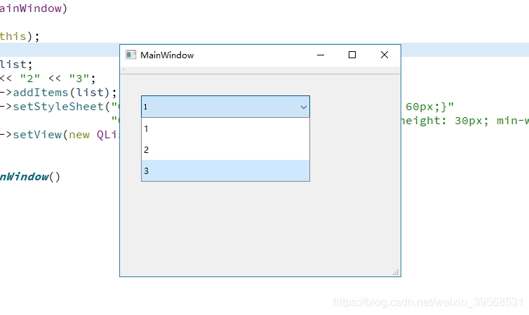
    QStringList list;
    list << "1" << "2" << "3";
    ui->comboBox->addItems(list);
    ui->comboBox->setStyleSheet("QComboBox { min-height: 30px; min-width: 60px;}"
                                "QComboBox QAbstractItemView::item { min-height: 30px; min-width: 60px;}");
    ui->comboBox->setView(new QListView());
顺便附一个QComboBox的样式表Example:
QComboBox {
     border: 1px solid gray;
     border-radius: 3px;
     padding: 1px 18px 1px 3px;
     min-width: 6em;
 }

 QComboBox:editable {
     background: white;
 }

 QComboBox:!editable, QComboBox::drop-down:editable {
      background: qlineargradient(x1: 0, y1: 0, x2: 0, y2: 1,
                                  stop: 0 #E1E1E1, stop: 0.4 #DDDDDD,
                                  stop: 0.5 #D8D8D8, stop: 1.0 #D3D3D3);
 }

 /* QComboBox gets the "on" state when the popup is open */
 QComboBox:!editable:on, QComboBox::drop-down:editable:on {
     background: qlineargradient(x1: 0, y1: 0, x2: 0, y2: 1,
                                 stop: 0 #D3D3D3, stop: 0.4 #D8D8D8,
                                 stop: 0.5 #DDDDDD, stop: 1.0 #E1E1E1);
 }

 QComboBox:on { /* shift the text when the popup opens */
     padding-top: 3px;
     padding-left: 4px;
 }

 QComboBox::drop-down {
     subcontrol-origin: padding;
     subcontrol-position: top right;
     width: 15px;

     border-left-width: 1px;
     border-left-color: darkgray;
     border-left-style: solid; /* just a single line */
     border-top-right-radius: 3px; /* same radius as the QComboBox */
     border-bottom-right-radius: 3px;
 }

 QComboBox::down-arrow {
     image: url(/usr/share/icons/crystalsvg/16x16/actions/1downarrow.png);
 }

 QComboBox::down-arrow:on { /* shift the arrow when popup is open */
     top: 1px;
     left: 1px;
 }

QComboBox QAbstractItemView {
     border: 2px solid darkgray;
     selection-background-color: lightgray;
 }


 扫一扫
扫一扫


 1767
1767

 被折叠的 条评论
为什么被折叠?
被折叠的 条评论
为什么被折叠?
 到【灌水乐园】发言


