


GroupBox 是 WPF 中用于将相关的控件分组并添加一个标题的控件。它通常用于组织表单、选项或设置,使用户界面更加清晰和结构化。以下是GroupBox控件的详细使用教程。
1. 基本结构
GroupBox 由一个标题和一个内容区域组成。你可以在内容区域放置其他控件,如文本框、按钮、复选框等。
基本示例:
<Window x:Class="WpfApp.MainWindow"
        xmlns="http://schemas.microsoft.com/winfx/2006/xaml/presentation"
        xmlns:x="http://schemas.microsoft.com/winfx/2006/xaml"
        Title="GroupBox Example" Height="200" Width="300">
    <Grid>
        <GroupBox Header="User Information" Height="150" Width="250" VerticalAlignment="Top" HorizontalAlignment="Left">
            <StackPanel>
                <TextBlock Text="Name:" Margin="5" />
                <TextBox Width="200" Margin="5" />
                <TextBlock Text="Email:" Margin="5" />
                <TextBox Width="200" Margin="5" />
            </StackPanel>
        </GroupBox>
    </Grid>
</Window>
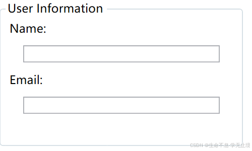
在这个示例中,GroupBox 被用来包含用户信息的输入控件,包括TextBlock和TextBox。
2. 自定义样式
你可以通过设置GroupBox的属性或使用样式和模板来定制GroupBox的外观。
自定义样式示例:
<Window x:Class="WpfApp.MainWindow"
        xmlns="http://schemas.microsoft.com/winfx/2006/xaml/presentation"
        xmlns:x="http://schemas.microsoft.com/winfx/2006/xaml"
        Title="GroupBox Example" Height="200" Width="300">
    <Grid>
        <GroupBox Header="Custom GroupBox" Height="150" Width="250" VerticalAlignment="Top" HorizontalAlignment="Left"
                  BorderBrush="DarkBlue" BorderThickness="2" Background="LightGray"
                  FontSize="14" FontWeight="Bold" Foreground="DarkBlue">
            <StackPanel>
                <TextBlock Text="Username:" Margin="5" />
                <TextBox Width="200" Margin="5" />
                <TextBlock Text="Password:" Margin="5" />
                <PasswordBox Width="200" Margin="5" />
            </StackPanel>
        </GroupBox>
    </Grid>
</Window>
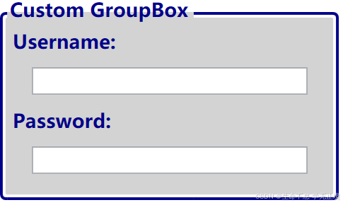
在这个示例中,GroupBox 的边框颜色、厚度、背景色、字体大小、字体粗细和前景色都被自定义了。
3. 使用 GroupBox 布局多个控件
GroupBox 通常与布局容器(如 StackPanel、Grid 等)一起使用,以便在其内容区域内组织多个控件。
使用 Grid 布局的示例:
<GroupBox Header="Account Settings" Height="200" Width="300">
    <Grid Margin="5">
        <Grid.RowDefinitions>
            <RowDefinition Height="Auto" />
            <RowDefinition Height="Auto" />
            <RowDefinition Height="Auto" />
        </Grid.RowDefinitions>
        <Grid.ColumnDefinitions>
            <ColumnDefinition Width="Auto" />
            <ColumnDefinition Width="*" />
        </Grid.ColumnDefinitions>

        <TextBlock Text="Username:" Grid.Row="0" Grid.Column="0" VerticalAlignment="Center" Margin="5"/>
        <TextBox Grid.Row="0" Grid.Column="1" Width="150" Margin="5"/>

        <TextBlock Text="Password:" Grid.Row="1" Grid.Column="0" VerticalAlignment="Center" Margin="5"/>
        <PasswordBox Grid.Row="1" Grid.Column="1" Width="150" Margin="5"/>

        <Button Content="Login" Grid.Row="2" Grid.Column="1" Width="80" Margin="5" HorizontalAlignment="Right"/>
    </Grid>
</GroupBox>
在这个示例中,Grid 布局被用来组织控件,使得表单更加整洁。
4. 动态控制 GroupBox
你可以通过代码动态地修改GroupBox的属性或内容。
示例:
// 修改GroupBox的标题
myGroupBox.Header = "Updated Header";

// 添加控件到GroupBox
TextBox newTextBox = new TextBox { Width = 200, Margin = new Thickness(5) };
(myGroupBox.Content as StackPanel).Children.Add(newTextBox);
5. GroupBox 与数据绑定
如果你希望GroupBox与数据绑定,可以绑定Header属性或其他控件的内容。
绑定示例:
<Window.DataContext>
    <local:UserViewModel />
</Window.DataContext>

<GroupBox Header="{Binding GroupTitle}">
    <StackPanel>
        <TextBox Text="{Binding UserName}" Width="200" Margin="5"/>
    </StackPanel>
</GroupBox>
public class UserViewModel
{
    public string GroupTitle { get; set; } = "User Details";
    public string UserName { get; set; } = "John Doe";
}
6. GroupBox 的常用属性
- Header: 设置或获取
GroupBox的标题。 - Content: 设置或获取
GroupBox的内容。 - BorderBrush: 设置边框的颜色。
- BorderThickness: 设置边框的厚度。
- Background: 设置
GroupBox的背景色。 - FontSize/FontWeight/Foreground: 设置标题的字体大小、粗细和颜色。
总结
GroupBox 是 WPF 中非常有用的控件,可以帮助你组织和分组界面中的元素。通过使用布局控件、数据绑定和样式定制,你可以根据需求创建更加易于理解和使用的用户界面。


 扫一扫
扫一扫


 2820
2820

 被折叠的 条评论
为什么被折叠?
被折叠的 条评论
为什么被折叠?
 到【灌水乐园】发言


