


如下:有A容器和B容器,A容器宽度和高度已知,使用CSS满足如下条件:
B容器高度是A容器宽度的一半
B容器左右离A容器都是10px
B容器在A中上下居中
B容器内部文字水平垂直居中
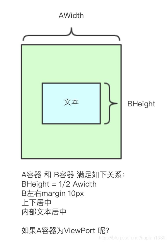
这里面水平垂直居中不难实现,在上篇CSS 居中对齐中已经介绍,但是B容器高度为A容器width的一半如何实现呢?
可以用到margin 和 padding 的一个特性:百分比。 margin 和padding 的百分比是基于父元素的宽度。
如果A容器是视窗ViewPort,可以说使用 "vw" 单位来设置B容器的高度:50vw 即表示视窗宽度的一半
1. 弹性盒子实现居中,padding实现B容器高度控制,注意要把height设为0,这里用的默认的标准盒模型:content-box
.A{
background-color: beige;
height: 400px;
width: 400px;
//子元素水平垂直居中
display: flex;
align-items: center;
justify-content: center;
}
.B{
// 水平方向占满,左右保留10px
flex: 1;
margin: 0 10px;
// 高度为父亲容器一半
padding: 25% 0;
height: 0px;
background: wheat;
// 内部文案居中
display: flex;
justify-content: center;
align-items: center;
}
2. absolute 实现居中, padding实现B容器高度控制
.A{
position: relative;
height:400px;
width:400px;
background-color: beige;
}
.B{
position: absolute;
left: 0;
top:0;
right: 0;
bottom: 0;
margin: auto 10px;
padding: 25% 0;
height: 0;
background: wheat;
}
.text-content{
position: absolute;
left: 50%;
top: 50%;
transform: translate(-50%, -50%);
}
3. 若A是视窗,宽度为100vw ,高度为100wh,直接设置 B 高度为50vw即可
.B{
position: absolute;
left: 0;
top:0;
right: 0;
bottom: 0;
margin: auto 10px;
height: 50vw;
background: wheat;
}
.text-content{
position: absolute;
left: 50%;
top: 50%;
transform: translate(-50%, -50%);
}


 1564
1564


 被折叠的 条评论
为什么被折叠?
被折叠的 条评论
为什么被折叠?
 到【灌水乐园】发言


