


MOST COMMON USE
FORM CONTROLS
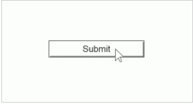
The HTML button is the classic form control. Its style is set by the browser and operating system. If you want more control over the look of your button, use a shape widget instead.
EDITING
ADDING TEXT
Double-click an HTML button widget to edit its text. (Double-clicking gives you access to the most common editing function for each widget type.) If you want to add new text to an HTML button widget, you can just begin typing while the widget is selected.
LOCATION
To move a widget, drag and drop it into place or use the arrow keys to nudge. You can also choose the exact location of a widget using the "x" and "y" fields in the top toolbar or in the Inspector’s Style tab.
SIZE AND STYLING
The majority of the visual style of an HTML button widget is determined by the browser. It's possible to set the widget’s size and text font, font family, size, and color.
To change the widget size, drag the handles on the widget's border when it is selected or use the "w" and "h" fields in the Style Toolbar or Style tab of the Inspector. To set the text style, use the top toolbar or Style tab of the Inspector.
INTERACTIVITY
LINKS
The quickest way to add a link to an HTML button is to select the widget and click "Create Link" in the Interactions tab. A list of pages in the project will appear. Click on the name of the target page to create the link and close the dialog. Learn more about creating interactions.
LIMITATIONS AND WORKAROUNDS
STYLES AND INTERACTION STYLES
The style of the HTML button is determined by the browser. It's not possible to give it a custom style. It's also not possible to give an HTML button widget interaction styles like MouseOver or Selected. For a custom-styled button, use a shape widget.
DYNAMICALLY READ OR SET TEXT
It's not possible to interact with the text on an HTML button widget in an interaction. To read or set the text on a button dynamically, use a shape widget.


 431
431


 被折叠的 条评论
为什么被折叠?
被折叠的 条评论
为什么被折叠?
 到【灌水乐园】发言


