


英文 | https://www.blog.duomly.com/html-button-hover-effects/
作者 | Anna Danilec
翻译 | web前端开发(ID:web_qdkf)
按钮悬停效果简介
按钮是每个页面,Web应用程序或移动应用程序中经常使用的基本元素。
按钮是CSS布局中必不可少的元素,因为在很多情况下,它是用户在呼吁采取行动并说服单击时必须注意到的元素。
前端开发人员和设计人员经常尝试以任何不错的方式突出显示按钮,尤其是当用户与它们交互时,例如悬停或聚焦时。
因此,今天我决定向你展示8种出色的按钮悬停效果,你可以在项目中使用它们,让客户感到惊讶。
我希望你会发现这些示例很有用,并分享你喜欢的方法以使按钮更加出色。
和往常一样,还有一件事,我为您提供了一个视频教程,因此,如果您是喜欢观看而不是阅读的人,请跳到我们的Youtube频道,您可以观看所有内容。
Youtube频道地址:https://www.youtube.com/watch?v=zWagGz7H--I&feature=youtu.be
你准备好了一起来变魔术了吗?
1、发送按钮悬停效果
最终实现效果如下:
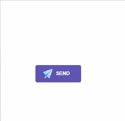 关于HTML按钮悬停效果的第一个想法是使用发送按钮和纯图标。大多数发送按钮很无聊,没有给人以惊讶之感,这就是为什么今天我对如何使其令人难忘具有一个想法。
在这种情况下,当用户将鼠标悬停在“发送”按钮上时,纯文本图标将变为动画,因为消息刚刚起飞。
让我们看一下代码示例:
HTML
关于HTML按钮悬停效果的第一个想法是使用发送按钮和纯图标。大多数发送按钮很无聊,没有给人以惊讶之感,这就是为什么今天我对如何使其令人难忘具有一个想法。
在这种情况下,当用户将鼠标悬停在“发送”按钮上时,纯文本图标将变为动画,因为消息刚刚起飞。
让我们看一下代码示例:
HTML
// 这里是一个svg的占位 Send #send-btn{ display: flex; align-items: center; justify-content: center; height: 100vh;}button { background: #5f55af; border: 0; border-radius: 5px; padding: 10px 30px 10px 20px; color: white; text-transform: uppercase; font-weight: bold;}button svg { display: inline-block; vertical-align: middle; padding-right: 5px;}button:hover svg { animation: fly 2s ease 1;}@keyframes fly { 0% { transform: translateX(0%); } 50% { transform: translateX(300%); } 100% { transform: translateX(0); }}2、霓虹灯按钮悬停效果
最终实现效果如下 :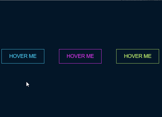 这是我的第二个想法,霓虹灯按钮悬停效果。在此示例中,我将使用非常霓虹的颜色使其真正出色且令人难忘。在深色背景上使用会产生很大的效果。
除此之外,用户肯定不会错过霓虹灯按钮。
让我们看一下具有三种颜色的示例:
HTML
这是我的第二个想法,霓虹灯按钮悬停效果。在此示例中,我将使用非常霓虹的颜色使其真正出色且令人难忘。在深色背景上使用会产生很大的效果。
除此之外,用户肯定不会错过霓虹灯按钮。
让我们看一下具有三种颜色的示例:
HTML
Hover me Hover me Hover me#neon-btn { display: flex; align-items: center; justify-content: space-around; height: 100vh; background: #031628; }.btn { border: 1px solid; background-color: transparent; text-transform: uppercase; font-size: 14px; padding: 10px 20px; font-weight: 300;}.one { color: #4cc9f0;}.two { color: #f038ff; }.three { color: #b9e769;}.btn:hover { color: white; border: 0;}.one:hover { background-color: #4cc9f0; -webkit-box-shadow: 10px 10px 99px 6px rgba(76,201,240,1); -moz-box-shadow: 10px 10px 99px 6px rgba(76,201,240,1); box-shadow: 10px 10px 99px 6px rgba(76,201,240,1);}.two:hover { background-color: #f038ff; -webkit-box-shadow: 10px 10px 99px 6px rgba(240, 56, 255, 1); -moz-box-shadow: 10px 10px 99px 6px rgba(240, 56, 255, 1); box-shadow: 10px 10px 99px 6px rgba(240, 56, 255, 1);}.three:hover { background-color: #b9e769; -webkit-box-shadow: 10px 10px 99px 6px rgba(185, 231, 105, 1); -moz-box-shadow: 10px 10px 99px 6px rgba(185, 231, 105, 1); box-shadow: 10px 10px 99px 6px rgba(185, 231, 105, 1);}3、绘制边框按钮悬停效果
最终实现效果如下 :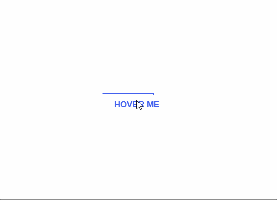 我的第三个想法,创建一个在悬停时具有绘画效果的HTML按钮。
让我向你解释我的意思,假设你有一个没有边框和背景色的链接。当用户将链接悬停时,按钮的边框将带有动画。
让我们看看示例中的外观代码。
HTML
我的第三个想法,创建一个在悬停时具有绘画效果的HTML按钮。
让我向你解释我的意思,假设你有一个没有边框和背景色的链接。当用户将链接悬停时,按钮的边框将带有动画。
让我们看看示例中的外观代码。
HTML
Hover me#draw-border { display: flex; align-items: center; justify-content: center; height: 100vh;}button { border: 0; background: none; text-transform: uppercase; color: #4361ee; font-weight: bold; position: relative; outline: none; padding: 10px 20px; box-sizing: border-box;}button::before, button::after { box-sizing: inherit; position: absolute; content: ''; border: 2px solid transparent; width: 0; height: 0;}button::after { bottom: 0; right: 0;}button::before { top: 0; left: 0;}button:hover::before, button:hover::after { width: 100%; height: 100%;}button:hover::before { border-top-color: #4361ee; border-right-color: #4361ee; transition: width 0.3s ease-out, height 0.3s ease-out 0.3s;}button:hover::after { border-bottom-color: #4361ee; border-left-color: #4361ee; transition: border-color 0s ease-out 0.6s, width 0.3s ease-out 0.6s, height 0.3s ease-out 1s;}4、圆形按钮悬停效果
最终实现效果如下 :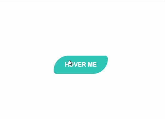 HTML按钮悬停的第四个想法是圆形效果。我想到的是我们的按钮上有一个带有某种颜色的圆圈和一个图标。圆形元素的颜色与按钮不同,悬停时,圆形中的颜色会慢慢加载到整个按钮上。
让我们来看一些代码:
HTML
HTML按钮悬停的第四个想法是圆形效果。我想到的是我们的按钮上有一个带有某种颜色的圆圈和一个图标。圆形元素的颜色与按钮不同,悬停时,圆形中的颜色会慢慢加载到整个按钮上。
让我们来看一些代码:
HTML
// 这里有一个svg元素 Hover me #circle-btn { display: flex; align-items: center; justify-content: center; height: 100vh;}.btn-container { position: relative; }button { border: 0; border-radius: 50px; color: white; background: #5f55af; padding: 15px 20px 16px 60px; text-transform: uppercase; background: linear-gradient(to right, #f72585 50%, #5f55af 50%); background-size: 200% 100%; background-position: right bottom; transition:all 2s ease;}svg { background: #f72585; padding: 8px; border-radius: 50%; position: absolute; left: 0; top: 0%;}button:hover { background-position: left bottom;}5、边框半径按钮悬停效果
最终实现效果如下 :
HTML按钮悬停效果的下一个令人惊奇的想法是边框半径效果。在这种情况下,按钮悬停边框后,它将改变相对角的半径,因此按钮将以叶子的形式改变。
让我们看看示例中的外观代码:
HTML
Hover me#border-btn { display: flex; align-items: center; justify-content: center; height: 100vh;}button { border: 0; border-radius: 10px; background: #2ec4b6; text-transform: uppercase; color: white; font-size: 16px; font-weight: bold; padding: 15px 30px; outline: none; position: relative; transition: border-radius 3s; -webkit-transition: border-radius 3s;}button:hover { border-bottom-right-radius: 50px; border-top-left-radius: 50px; border-bottom-left-radius: 10px; border-top-right-radius: 10px;}6、冻结按钮悬停效果
最终实现效果如下 :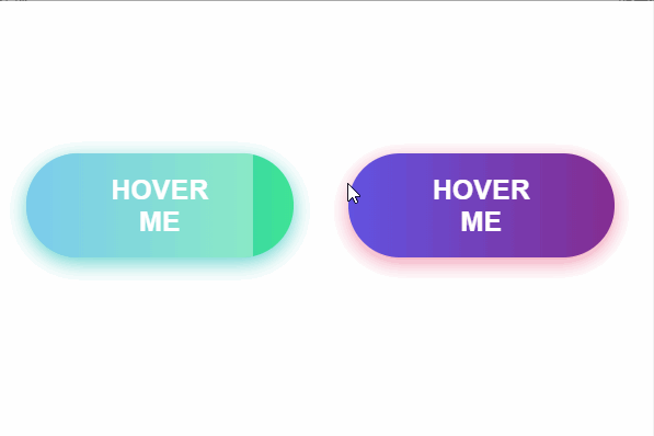 可以为你的应用程序带来惊人效果的按钮的惊人悬停效果的第六个想法是冻结按钮效果。
在此示例中,我将创建一个具有渐变颜色的按钮,当用户将鼠标悬停在该按钮上时,白色的不透明颜色将显示并扩展到整个元素。
让我们来看一下代码。
HTML
可以为你的应用程序带来惊人效果的按钮的惊人悬停效果的第六个想法是冻结按钮效果。
在此示例中,我将创建一个具有渐变颜色的按钮,当用户将鼠标悬停在该按钮上时,白色的不透明颜色将显示并扩展到整个元素。
让我们来看一下代码。
HTML
Hover me Hover me#frozen-btn { display: flex; align-items: center; justify-content: center; height: 100vh;}button { border: 0; margin: 20px; text-transform: uppercase; font-size: 20px; font-weight: bold; padding: 15px 50px; border-radius: 50px; color: white; outline: none; position: relative;}button:before{ content: ''; display: block; background: linear-gradient(to left, rgba(255, 255, 255, 0) 50%, rgba(255, 255, 255, 0.4) 50%); background-size: 210% 100%; background-position: right bottom; height: 100%; width: 100%; position: absolute; top: 0; bottom:0; right:0; left: 0; border-radius: 50px; transition: all 1s; -webkit-transition: all 1s;}.green { background-image: linear-gradient(to right, #25aae1, #40e495); box-shadow: 0 4px 15px 0 rgba(49, 196, 190, 0.75);}.purple { background-image: linear-gradient(to right, #6253e1, #852D91); box-shadow: 0 4px 15px 0 rgba(236, 116, 149, 0.75);} .purple:hover:before { background-position: left bottom;}.green:hover:before { background-position: left bottom;}7、闪亮的阴影元素按钮悬停效果
最终实现效果如下 :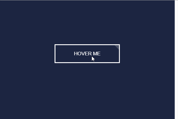 改进HTML按钮设计并将其添加到奇妙的悬停效果的第七个想法是元素上的闪亮阴影。
让我向你解释阴影元素的含义。想象一下,你有一个带有背景和边框的简单按钮。当用户将鼠标悬停在按钮上时,会有一个带有某种阴影的动画通过按钮。
让我们来看一下代码。
HTML
改进HTML按钮设计并将其添加到奇妙的悬停效果的第七个想法是元素上的闪亮阴影。
让我向你解释阴影元素的含义。想象一下,你有一个带有背景和边框的简单按钮。当用户将鼠标悬停在按钮上时,会有一个带有某种阴影的动画通过按钮。
让我们来看一下代码。
HTML
Hover me#shiny-shadow { display: flex; align-items: center; justify-content: center; height: 100vh; background: #1c2541;}button { border: 2px solid white; background: transparent; text-transform: uppercase; color: white; padding: 15px 50px; outline: none; overflow: hidden; position: relative;}span { z-index: 20; }button:after { content: ''; display: block; position: absolute; top: -36px; left: -100px; background: white; width: 50px; height: 125px; opacity: 20%; transform: rotate(-45deg);}button:hover:after { left: 120%; transition: all 600ms cubic-bezier(0.3, 1, 0.2, 1); -webkit-transition: all 600ms cubic-bezier(0.3, 1, 0.2, 1);}8、加载按钮悬停效果
最终实现效果如下 :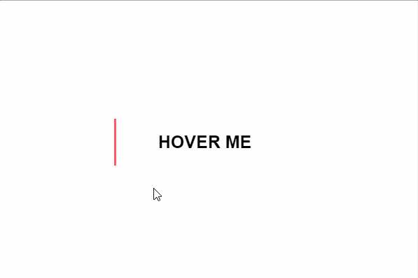 我今天想与大家分享的最后一个例子是加载动画效果。想象一下,您有一个链接,该链接看起来不像一个按钮,但它的左侧只有一条线。当用户将链接悬停时,然后通过更改链接的颜色并加载背景将其转换为按钮。
让我们看一下代码示例。
HTML
我今天想与大家分享的最后一个例子是加载动画效果。想象一下,您有一个链接,该链接看起来不像一个按钮,但它的左侧只有一条线。当用户将链接悬停时,然后通过更改链接的颜色并加载背景将其转换为按钮。
让我们看一下代码示例。
HTML
Hover me#loading-btn { display: flex; align-items: center; justify-content: center; height: 100vh;}button { background: transparent; border: 0; border-radius: 0; text-transform: uppercase; font-weight: bold; font-size: 20px; padding: 15px 50px; position: relative;}button:before { transition: all 0.8s cubic-bezier(0.7, -0.5, 0.2, 2); content: ''; width: 1%; height: 100%; background: #ff5964; position: absolute; top: 0; left: 0;}button span { mix-blend-mode: darken;}button:hover:before { background: #ff5964; width: 100%;}总结
在本文中,我介绍了8种采用CSS实现的按钮悬停效果,值得你尝试使用,这个会使你的网站或应用程序上的按钮令人难忘。 就个人而言,我认为你不应添加太多疯狂的效果,但是始终值得以某种方式标记网站上最重要的按钮,该用户肯定会好奇当他或她单击按钮时会发生什么,如果悬停后发生了这种效果。 我希望你会发现这些示例对你有用,并且你可以尝试其中的一些示例。除此之外,我希望你也能分享一些想法。 感谢你的阅读。


 475
475

 被折叠的 条评论
为什么被折叠?
被折叠的 条评论
为什么被折叠?
 到【灌水乐园】发言


