


您需要将其添加到轴。A Circle是的子类Artist,并且axes具有add_artist方法。
这是执行此操作的示例:
import matplotlib.pyplot as plt
circle1 = plt.Circle((0, 0), 0.2, color='r')
circle2 = plt.Circle((0.5, 0.5), 0.2, color='blue')
circle3 = plt.Circle((1, 1), 0.2, color='g', clip_on=False)
fig, ax = plt.subplots() # note we must use plt.subplots, not plt.subplot
# (or if you have an existing figure)
# fig = plt.gcf()
# ax = fig.gca()
ax.add_artist(circle1)
ax.add_artist(circle2)
ax.add_artist(circle3)
fig.savefig('plotcircles.png')
结果如下图:
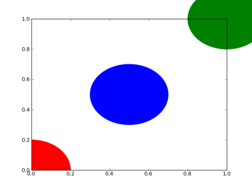
第一个圆是原点,但默认情况下clip_on是True,因此,只要圆超出,就会对其进行裁剪axes。第三个(绿色)圆圈显示了不剪切时会发生的情况Artist。它超出了轴(但不超出图形,即图形大小不会自动调整以绘制所有艺术家)。
默认情况下,x,y和半径的单位对应于数据单位。在这种情况下,我没有在轴上绘制任何内容(fig.gca()返回当前轴),并且由于从未设置极限,因此它们的默认x和y范围为0到1。
这是该示例的继续,显示了单位的重要性:
circle1 = plt.Circle((0, 0), 2, color='r')
# now make a circle with no fill, which is good for hi-lighting key results
circle2 = plt.Circle((5, 5), 0.5, color='b', fill=False)
circle3 = plt.Circle((10, 10), 2, color='g', clip_on=False)
ax = plt.gca()
ax.cla() # clear things for fresh plot
# change default range so that new circles will work
ax.set_xlim((0, 10))
ax.set_ylim((0, 10))
# some data
ax.plot(range(11), 'o', color='black')
# key data point that we are encircling
ax.plot((5), (5), 'o', color='y')
ax.add_artist(circle1)
ax.add_artist(circle2)
ax.add_artist(circle3)
fig.savefig('plotcircles2.png')
结果是:
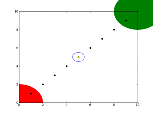
您会看到如何将第二个圆的填充设置为False,这对于环绕关键结果(例如我的黄色数据点)很有用。


 6030
6030


 被折叠的 条评论
为什么被折叠?
被折叠的 条评论
为什么被折叠?
 到【灌水乐园】发言


