


废话不多说了,炫下效果图并附上演示和源码下载。
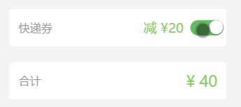
实现效果如下:
HTML结构代码:
CSS代码:
/*表单开关样式*/
.ui-switch {
position: absolute;
font-size: .16rem;
right:0.07rem;
top: 50%;
margin-top: -0.16rem;
width: .7rem;
height: .3rem;
line-height: .3rem;
}
.ui-switch input {
width: .7rem;
height: .3rem;
position: absolute;
top: 0;left: 0;
z-index: 2;
border: 0;
background: 0 0;
-webkit-appearance: none;
outline: 0
}
.ui-switch input:before {
content: '';
width: .68rem;
height: .3rem;
border: 1px solid #dfdfdf;
background-color: #fdfdfd;
border-radius: .2rem;
cursor: pointer;
display: inline-block;
position: relative;
vertical-align: middle;
-webkit-box-sizing: content-box;
box-sizing: content-box;
border-color: #dfdfdf;
-webkit-box-shadow: #dfdfdf 0 0 0 0 inset;
box-shadow: #dfdfdf 0 0 0 0 inset;
-webkit-transition: border .4s,-webkit-box-shadow .4s;
transition: border .4s,box-shadow .4s;
-webkit-background-clip: content-box;
background-clip: content-box
}
.ui-switch input:checked:before {
border-color: #64bd63;
-webkit-box-shadow: #64bd63 0 0 0 0.16rem inset;
box-shadow: #64bd63 0 0 0 0.16rem inset;
background-color: #64bd63;
transition: border .4s,box-shadow .4s,background-color 1.2s;
-webkit-transition: border .4s,-webkit-box-shadow .4s,background-color 1.2s;
background-color: #64bd63
}
.ui-switch input:checked:after {
left: .4rem
}
.ui-switch input:after {
content: '';
width:.3rem;
height: .3rem;
position: absolute;
top: 50%;
left: 0;
-webkit-transform:translateY(-50%);
border-radius: 100%;
background-color: #fff;
-webkit-box-shadow: 0 0.01rem 0.03rem rgba(0,0,0,.4);
box-shadow: 0 0.01rem 0.03rem rgba(0,0,0,.4);
-webkit-transition: left .2s;
transition: left .2s
}


 5312
5312


 被折叠的 条评论
为什么被折叠?
被折叠的 条评论
为什么被折叠?
 到【灌水乐园】发言


