


您可以使用svg而不是.panel ( div )并将其浮动到右侧。
body { background: #007FC1; } .container { border-bottom: 4px solid #B4CAD8; } .container { background-color: #fff; z-index: -1; } .container > .text { padding: 0.5em; } .panel { position: relative; float: right; margin-top: -4px; }
Lorem ipsum dolor sit amet, consectetur adipisicing elit. Voluptates nam fuga eligendi ipsum sed ducimus quia adipisci unde atque enim quasi quidem perspiciatis totam soluta tempora hic voluptatem optio perferendis.
这是一种使用CSS实现波形的方法。 (这只是说明如何用CSS实现它,但SVG仍然是推荐使用的工具 。)
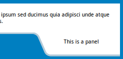
基地是一个白色矩形框的div 。 在框中,底部50px有透明色,3px之后有浅蓝色,其余的有白色。 这使得它看起来像上半部分是一个带浅蓝色边框的白色矩形。 底部的透明50px部分有助于使裁剪区域看起来好像它不是容器的一部分。
伪元素倾斜并放置在父容器的右下angular以产生弯曲的效果。 他们也有一些盒子阴影添加到产生的边界。
内容使用单独的div添加,并再次位于父级的右下angular。
.content { position: relative; height: 150px; padding: 10px; background: linear-gradient(270deg, transparent 200px, lightblue 200px) no-repeat, linear-gradient(0deg, transparent 50px, white 50px); background-position: 100% 117px, 100% 100%; background-size: 100% 3px, 100% 100%; overflow: hidden; } .content:before { position: absolute; content: ''; height: 25px; width: 50px; bottom: 25px; right: 170px; background: transparent; border-top-right-radius: 18px; box-shadow: 4px -3px 0px lightblue, 4px 0px 0px lightblue, 20px 0px 0px white; transform: skew(30deg); z-index: 2; } .content:after { position: absolute; content: ''; right: 0px; bottom: 0px; height: 50px; width: 177px; background: white; border-bottom-left-radius: 18px; box-shadow: inset 4px -3px 0px lightblue; transform-origin: right top; transform: skew(30deg); } .panel { position: absolute; bottom: 3px; right: 0px; height: 50px; width: 135px; line-height: 50px; z-index: 3; } /* just for demo */ body { background: linear-gradient(90deg, crimson, indianred, purple); font-family: Calibri; }
CSS只有解决scheme
正如你所要求的那样,我只做了形状。 使用定位将其添加到页面非常简单。 对于这样的任务,使用CSS不太实际。 我做了一个简单的形状浪费了15-20分钟! 在这种情况下,SVG更为可取。 但是,如果可以这样做,就必须完成。 这里 :
body{ margin:0; padding:0; } #one{ position:absolute; top:30px; left:-30px; height:10px; width:10px; } #one > span{ position:relative; top:-215px; left:300px; text-align:center; width:300px; height:80px; display:block; line-height:80px; z-index:4; } .one{ position: relative; height: 90px; width: 300px; background-color: #007FC1; border-radius: 25px; -webkit-transform: skew(30deg); transform: skew(30deg); z-index:2; } .obefore { height:35px; width:60px; position:relative; top:-35px; left:290px; background-color: #007FC1; -webkit-transform: skew(30deg); transform: skew(30deg); z-index:1; } .oafter{ position: relative; top: -135px; left:310px; height: 90px; width: 300px; background-color: white; border-bottom-left-radius: 25px; -webkit-transform: skew(30deg); transform: skew(30deg); z-index:3; } #two{ position:absolute; top:20px; left:-20px; } .two{ position: relative; height: 90px; width: 300px; background-color: #B4CAD8; border-radius: 25px; -webkit-transform: skew(30deg); transform: skew(30deg); z-index:0; } .tafter{ position: relative; top: -80px; left:290px; height: 90px; width: 300px; background-color: #B4CAD8; border-top-left-radius: 45px; border-bottom-left-radius: 25px; -webkit-transform: skew(30deg); transform: skew(30deg); z-index:2; }
使用两个元素来创buildwave:
html,body{background:black;} .wave{ height:40px; width:100%; transform:skewX(30deg); background:blue; border-top:5px solid lightblue; border-right:5px solid lightblue; margin-left:-20%; position:relative; border-radius:5px; } .wave:before{ position:absolute; content:""; height:100%; width:20%; background:transparent; right:-20%; top:-5px; border-radius:5px; border-bottom:5px solid lightblue; } .wave:after{ position:absolute; content:""; height:5px; width:5px; background:black; right:-1.65%; bottom:4px; border-radius:50%; }
post的形状如何在CSS中获取此形状而不是在SVG中 :
#shape { width:210px; } #left { border-bottom: 5px solid black; border-right: 5px solid black; border-bottom-right-radius: 70px; background-color: white; width: 40px; height: 80px; float: left; margin-top: 65px; z-index: 1; position: relative; } #right { border-left:5px solid black; border-top:5px solid black; border-top-left-radius:70px; margin-left: -5px; width:30px; height:100px; float:left; background-color:yellow; width: 165px; } #bottom { width:205px; height:50px; background-color:yellow; border-left:5px solid black; clear:both; } #middle { height: 45px; width: 205px; background-color: yellow; top: 105px; position: relative; z-index: 0; border-left: 5px solid black; }


 1302
1302

 被折叠的 条评论
为什么被折叠?
被折叠的 条评论
为什么被折叠?
 到【灌水乐园】发言


