


本文翻译自 bokeh/bokeh-notebooks 项目,并经过修改。
from bokeh.io import output_notebook, show
from bokeh.plotting import figure
output_notebook()
基本条形图
条形图是常见且重要的绘图类型。通过 Bokeh,可以轻松创建各种堆积或嵌套的条形图,并通常处理分类数据。
下面的示例显示了一个简单的条形图,它使用 vbar 方法创建,用于绘制垂直条形图。(有一个相应的 hbar 对应水平条。) 我们还设置了一些绘图属性以使图表看起来更好,有关视觉属性的信息,请参见《Bokeh教程:样式和主题》。
# 下面是分类数值
fruits = [
'Apples',
'Pears',
'Nectarines',
'Plums',
'Grapes',
'Strawberries',
]

# 将 x_range 设置为上面的分类
p = figure(
    x_range=fruits,
    plot_height=250,
    title="Fruit Counts"
)

# 分类数据同样可以用于坐标
p.vbar(
    x=fruits,
    top=[5, 3, 4, 2, 4, 6],
    width=0.9
)

# 设置属性,让绘图更美观
p.xgrid.grid_line_color = None
p.y_range.start = 0

show(p)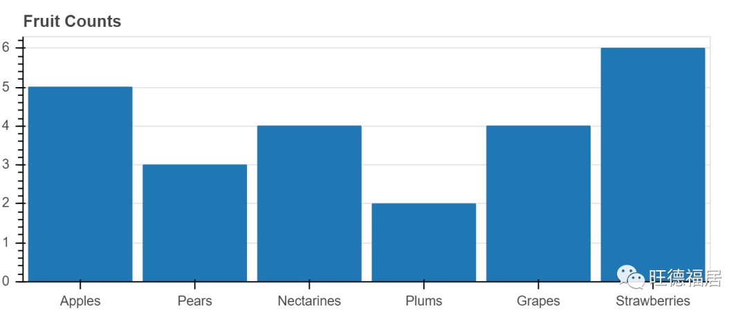
当我们想创建一个具有分类范围的图时,我们将分类值的有序列表传递给 figure,例如 x_range = ['a', 'b', 'c']。在上面的图中,我们将水果列表传递给 x_range,我们可以看到这些水果被设置为 x 轴。
vbar glyph 方法在需要一个定位条形中心的 x 位置,一个 top,一个 bottom(默认为0),和一个 width。当我们像这里这样使用分类范围时,每个类别的宽度隐式为 1,因此,如我们在此处设置的那样,设置 width = 0.9 会使条形图彼此分开。(另一种选择是在范围内添加一些间隔。)
练习
创建你自己的简单条形图
由于 vbar 是一种 glyph 方法,因此我们可以将其与 ColumnDataSource 一起使用,就像我们可以与任何其他 glyph 一样。在下面的示例中,我们将数据(包括颜色数据)放入 ColumnDataSource 中,并使用它来驱动绘图。我们还添加了图例,有关图例和其他标注的更多信息,请参见 《Bokeh教程:添加标注》。
from bokeh.models import ColumnDataSource
from bokeh.palettes import Spectral6

fruits = [
'Apples',
'Pears',
'Nectarines',
'Plums',
'Grapes',
'Strawberries'
]
counts = [5, 3, 4, 2, 4, 6]

source = ColumnDataSource(
    data=dict(
        fruits=fruits,
        counts=counts,
        color=Spectral6
    )
)

p = figure(
    x_range=fruits,
    plot_height=250,
    y_range=(0, 9),
    title="Fruit Counts"
)
p.vbar(
    x='fruits',
    top='counts',
    width=0.9,
    color='color',
    legend_field="fruits",
    source=source
)

p.xgrid.grid_line_color = None
p.legend.orientation = "horizontal"
p.legend.location = "top_center"

show(p)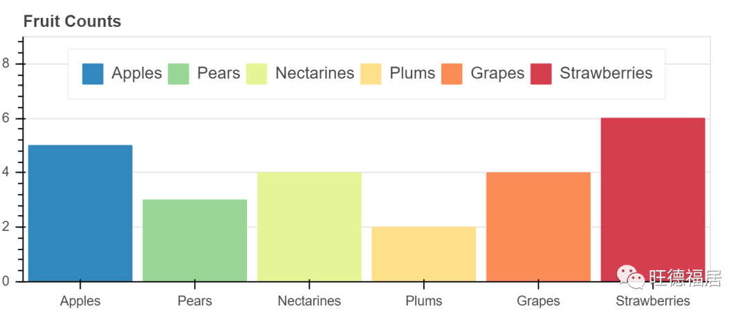
练习
< 最低0.47元/天 解锁文章


 3709
3709


 被折叠的 条评论
为什么被折叠?
被折叠的 条评论
为什么被折叠?
 到【灌水乐园】发言


