


C#自定义控件Button
接上一篇文章,GDI+绘制Lable控件,此控件两个知识点。
一、绘制外形边框。(备注:可以添加一个属性是否显示边框)
二、绘制按钮文字。(备注:按钮文字水平垂直方向居中)。
上一篇文章中已经将文字绘制详细说明,当前教程,只贴部分代码。不做详细说明。可以浏览上一篇文章详细了解。C#控件美化之路自己动手绘制用GDI+绘制一个Lable控件(二)
新建一个类,继承Control。构造函数中可以设置一个默认大小
this.Size = new Size(80, 30);
声明公有属性,属性包含,显示文本,已经是否显示外边框。外边框可以用bool值,根据个人喜好修改。文中直接使用BorderStyle。具体代码可以在VS中使用F12转跳查看详情。
#region 公有属性 public string Text { get => base.Text; set { base.Text = value; this.Invalidate(); } } [Category("Wen"),Description("是否显示边框"),DefaultValue(BorderStyle.None)] public BorderStyle BorderStyle { get; set; } #endregion接下来贴关键代码。重绘内容,依然是重写Paint。
代码片段一。绘制文本居中(其他部分代码可以在如何手绘Lable中找到方法)
g.DrawString(this.Text, this.Font, new SolidBrush(this.ForeColor), rec, new StringFormat(StringFormatFlags.NoClip | StringFormatFlags.NoWrap) { LineAlignment = StringAlignment.Center, Alignment = StringAlignment.Center, Trimming = StringTrimming.EllipsisCharacter });代码片段二。绘制外边框:
if (this.BorderStyle == BorderStyle.FixedSingle) { System.Drawing.Drawing2D.GraphicsPath path = CreateRoundedRectanglePath(new Rectangle(0, 0, Width - 1, Height - 1), 10); using (Pen pen = new Pen(Color.FromArgb(153, 153, 153))) { g.DrawPath(pen, path); } }此方法,主要将一个矩形形状生成一个矩形圆弧形状 CreateRoundedRectanglePath 代码块如下
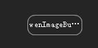
/// /// 根据矩形和圆得到一个圆角矩形Path /// /// The rect. /// The corner radius. /// GraphicsPath. public static GraphicsPath CreateRoundedRectanglePath(this Rectangle rect, int cornerRadius) { GraphicsPath roundedRect = new GraphicsPath(); roundedRect.AddArc(rect.X, rect.Y, cornerRadius * 2, cornerRadius * 2, 180, 90); roundedRect.AddLine(rect.X + cornerRadius, rect.Y, rect.Right - cornerRadius * 2, rect.Y); roundedRect.AddArc(rect.X + rect.Width - cornerRadius * 2, rect.Y, cornerRadius * 2, cornerRadius * 2, 270, 90); roundedRect.AddLine(rect.Right, rect.Y + cornerRadius * 2, rect.Right, rect.Y + rect.Height - cornerRadius * 2); roundedRect.AddArc(rect.X + rect.Width - cornerRadius * 2, rect.Y + rect.Height - cornerRadius * 2, cornerRadius * 2, cornerRadius * 2, 0, 90); roundedRect.AddLine(rect.Right - cornerRadius * 2, rect.Bottom, rect.X + cornerRadius * 2, rect.Bottom); roundedRect.AddArc(rect.X, rect.Bottom - cornerRadius * 2, cornerRadius * 2, cornerRadius * 2, 90, 90); roundedRect.AddLine(rect.X, rect.Bottom - cornerRadius * 2, rect.X, rect.Y + cornerRadius * 2); roundedRect.CloseFigure(); return roundedRect; }到此一个按钮形状完成。预览效果
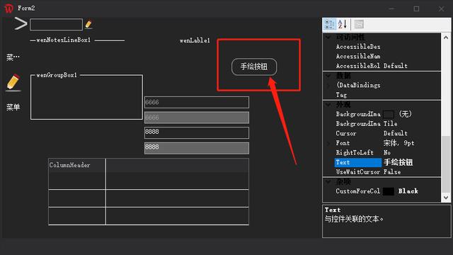
目前为止,按钮形状完成。一般按钮,鼠标移动到按钮位置,背景颜色会改变。所以我们可以重写鼠标事件。直接修改背景。
#region 私有属性 private Color backColor = Color.Transparent; #endregion私有属性,主要记录鼠标进入控件之前的颜色,便于鼠标离开后,控件恢复之前颜色。
protected override void OnMouseLeave(EventArgs e) { base.OnMouseLeave(e); this.BackColor = this.backColor; } protected override void OnMouseEnter(EventArgs e) { base.OnMouseEnter(e); this.backColor = this.BackColor; this.BackColor = Color.FromArgb(63, 63, 65); }至此。一个按钮绘制完成。
当然本文中,鼠标事件主要用背景颜色改变实现。为了更加美化,可以是直接使用文中描述的Path路径填充绘制。具体方法有兴趣的小伙伴可以试试。
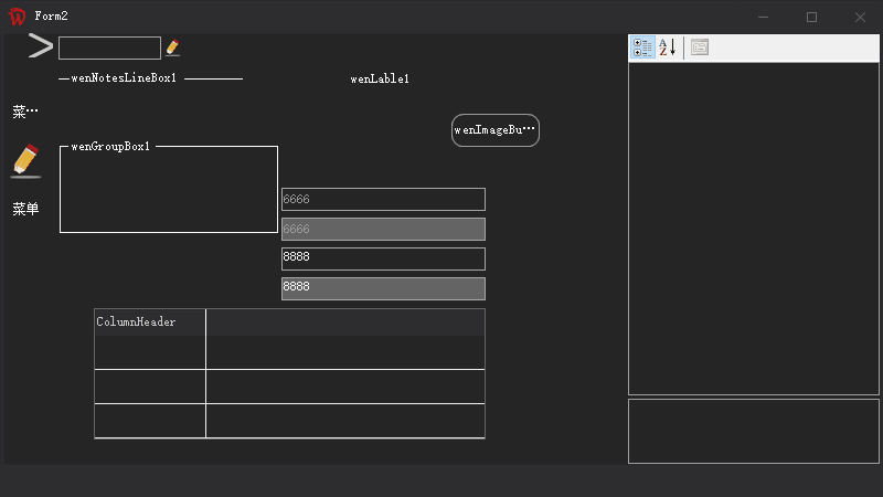
预览效果


 9989
9989


 被折叠的 条评论
为什么被折叠?
被折叠的 条评论
为什么被折叠?
 到【灌水乐园】发言


