


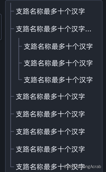
效果
前提思路:
将嵌套的树形数据扁平化,根据每项的层级实现缩进效果。
实现
<!-- 三级树形带线条样式组件 -->
<template>
  <div class="tree-level-item" :class="isNodeEnd && 'tree-last'">
    <!-- 缩进项 -->
    <span class="tree-indent">
      <!-- 缩进单元,个数取决于 当前 tree 的级别 -->
      <!-- 缩进个数 -->
      <span class="tree-indent-unit" v-for="index of info.treeLevel - 3" :key="index"></span>
    </span>
    <!--  树形开关展开收起项目 -->
    <span class="tree-switcher">
      <!-- line -->
      <span class="switcher-line"></span>
    </span>
    <!-- 内容文字 -->
    <span class="leaf">
      <span class="title" v-ptitle>{{ info.name || '--' }}</span>
    </span>
  </div>
</template>
<script>
export default {
  name: 'treeLineLevelItem',
  mixins: [],
  components: {},
  // 数据部分
  props: {
    info: {
      type: Object,
      default: () => ({})
    },
    // 是否是当前书层级结束
    isNodeEnd: {
      type: Boolean,
      default: false
    }
  },
  data () {
    return {}
  },
  computed: {},
  watch: {},
  // 生命周期
  created () {},
  mounted () {},
  unmounted () {},
  // 方法
  methods: {}
}
</script>
<style lang="less" scoped>
.tree-level-item {
  display: flex;
  align-items: flex-start;
  outline: none;
  height: 40px;
  line-height: 40px;
  position: relative;
  &::after {
    content: '';
    left: 11px;
    top: 0;
    bottom: 0;
    right: -5px;
    position: absolute;
    border-radius: 4px;
  }
  &:hover {
    &::after {
      background-color: var(--grey300);
    }
  }
  // 结尾层级的  switcher-line before
  &.tree-last {
    .tree-switcher {
      .switcher-line {
        &:before {
          height: 20px;
        }
      }
    }
  }
  .tree-indent {
    align-self: stretch;
    white-space: nowrap;
    user-select: none;
    .tree-indent-unit {
      display: inline-block;
      width: 22px;
      position: relative;
      height: 100%;
      z-index: 1;
      &:before {
        position: absolute;
        top: -20px;
        // inset-inline-end: 11px;
        margin-left: 10px;
        bottom: -4px;
        border-inline-end: 1px solid #71768e;
        content: '';
      }
    }
  }
  // tree-switcher
  .tree-switcher {
    position: relative;
    flex: none;
    align-self: stretch;
    width: 22px;
    margin: 0;
    // line-height: 22px;
    text-align: center;
    cursor: pointer;
    user-select: none;
    .switcher-line {
      position: relative;
      z-index: 1;
      display: inline-block;
      width: 100%;
      height: 100%;
      &:before {
        position: absolute;
        top: 0;
        inset-inline-end: 11px;
        bottom: -4px;
        margin-inline-start: -1px;
        border-inline-end: 1px solid #71768e;
        content: '';
      }
      &:after {
        position: absolute;
        width: 9.600000000000001px;
        height: 20px;
        border-bottom: 1px solid #71768e;
        content: '';
      }
    }
  }
  // leaf
  .leaf {
    // line-height: 22px;
    user-select: none;
    width: 100%;
    .title {
      white-space: nowrap;
      overflow: hidden;
      text-overflow: ellipsis;
      display: inline-block;
      padding-left: 4px;
      position: relative;
      z-index: 2;
      width: 100%;
      padding-right: 16px;
    }
  }
}
</style>


 5264
5264


 被折叠的 条评论
为什么被折叠?
被折叠的 条评论
为什么被折叠?
 到【灌水乐园】发言


