


SVG is the recommended way to create such shapes. It offers simplicity and scale-ability.
We can use SVG's polygon or path element to create a shape like above and stroke / fill it with some solid color, gradient or a pattern.
Only one attribute points is used to define shapes in polygon element. This attribute consists of a list of points. Each point must have 2 numbers, an x coordinate and a y coordinate. A straight line is drawn automatically from the last point to the starting point to close the shape.
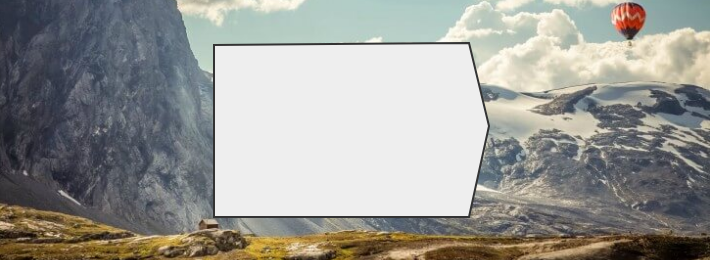
Below is the necessary code to create this shape:
stroke="#333"
stroke-width="2"
fill="#eee" />
Below is a brief description of the above code:
points attribute defines the structure of the shape.
stroke attribute defines the color for the outline / border.
stroke-width defines the thickness of the outline / border.
fill attribute defines the color for the interior shape to be filled.
Output Image:
Working Example:
body {
background: #b6cdc7 url("https://www.hdwallpapers.net/previews/hot-air-balloon-over-the-mountain-987.jpg") no-repeat;
background-position: center bottom;
background-size: cover;
margin: 0;
}
.box {
justify-content: center;
align-items: center;
height: 100vh;
display: flex;
}
This shape can be filled with gradient or pattern as well.
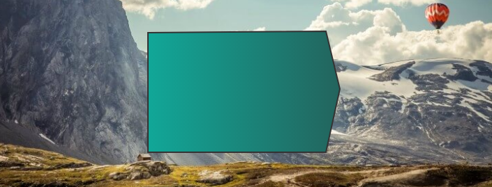
Working Example:
body {
background: #b6cdc7 url("https://www.hdwallpapers.net/previews/hot-air-balloon-over-the-mountain-987.jpg") no-repeat;
background-position: center bottom;
background-size: cover;
margin: 0;
}
.box {
justify-content: center;
align-items: center;
height: 100vh;
display: flex;
}
We can apply shadow on this shape using SVG's filters.
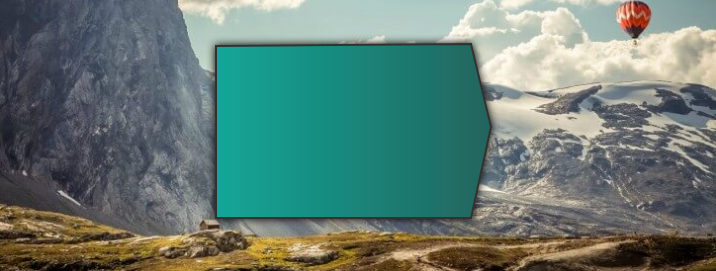
Working Example:
body {
background: #b6cdc7 url("https://www.hdwallpapers.net/previews/hot-air-balloon-over-the-mountain-987.jpg") no-repeat;
background-position: center bottom;
background-size: cover;
margin: 0;
}
.box {
justify-content: center;
align-items: center;
height: 100vh;
display: flex;
}


 2448
2448

 被折叠的 条评论
为什么被折叠?
被折叠的 条评论
为什么被折叠?
 到【灌水乐园】发言


