


css 3个元素中间的元素

It’s always a delight to see some non-straight elements in web design. Angled shapes and diagonal lines can create an interesting visual flow and add some unexpected excitement. Inspired by many superb designs that use non-straight elements, I want to show you some simple examples and ways how to create slopy, skewed elements with CSS only.
看到网页设计中的某些非直线元素总是很高兴的。 倾斜的形状和对角线可以创建有趣的视觉效果,并增加一些意外的刺激。 受许多使用非直线元素的精湛设计的启发,我想向您展示一些简单的示例和方法,说明如何仅使用CSS创建倾斜,倾斜的元素。
So, let’s begin!
所以,让我们开始吧!
例子1 (Example 1)
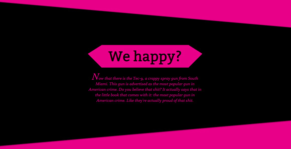
In our first example, we want to have a pretty normal layout with a little twist: we want a diagonal separation between the elements. We will achieve that by rotating the wrappers of the content articles. But, since we don’t want the content itself to be rotated, we’ll simply rotate each article back.
在第一个示例中,我们希望有一个稍微扭曲的普通布局:我们想要元素之间的对角线分隔。 我们将通过旋转内容文章的包装器来实现这一目标。 但是,由于我们不希望内容本身被轮换,因此我们只需将每篇文章轮换回去。
标记 (The Markup)
Let’s create a section for our whole content and inside we’ll add some divisions with the class se-slope. Each one is going to have an article with some headline and text:
让我们为整个内容创建一个部分,并在内部添加带有se-slope类的一些划分。 每个人都会有一篇带有标题和文字的文章:
<section class="se-container">
	<div class="se-slope">
		<article class="se-content">
			<h3>Some headline</h3>
			<p>Some text</p>
		</article>
	</div>
	<div class="se-slope">
		<!-- ... -->
	</div>
	<!-- ... -->
</section>
Now, let’s check our the style.
现在,让我们检查一下样式。
CSS (The CSS)
The body will have the same background color like all the even se-slope elements, which is pink. This will “hide” some edges of the rotated elements:
身体将具有与所有偶数坡度元素相同的背景色,即粉红色。 这将“隐藏”旋转元素的某些边缘:
body{
	background: #e90089;
}
The main wrapper will have the overflow hidden because we will want to pull the rotated elements in a way that they would stick out, so let’s not show that:
主包装器将隐藏溢出,因为我们希望以旋转的元素伸出的方式拉动它们,因此,我们不要显示它:
.se-container{
	display: block;
	width: 100%;
	overflow: hidden;
	padding-top: 150px;
}
The divisions will all be rotated: the odd ones will be black and rotated 5 degrees and the even ones will be pink and rotated -5 degrees. Because of the rotation, we’ll need to adjust the positioning of the odd elements in order to fit as we want them to. So, we’ll add a negative top margin in order to pull them up:
分隔将全部旋转:奇数分隔为黑色,旋转5度,偶数分隔为粉红色,旋转-5度。 由于旋转,我们需要调整奇数元素的位置,以使其适合我们的期望。 因此,我们将添加负的上边距来拉高它们:
.se-slope{
	margin: 0 -50px;
	transform-origin: left center;
}
.se-slope:nth-child(odd){
	background: #000;
	transform: rotate(5deg);
	margin-top: -200px;
	box-shadow: 0px -1px 3px rgba(0,0,0,0.4);
}
.se-slope:nth-child(even){
	background: #e90089;
	transform: rotate(-5deg);
	box-shadow: 0px 2px 3px rgba(0,0,0,0.4) inset;
}
Let’s center the article:
让我们将文章居中:
.se-content{
	margin: 0 auto;
}
Let’s give the headline a special look. We’ll add the :before and :after pseudo element in order to create some asymmetric triangles on both sides using the transparent border trick:
让我们给标题做个特殊的外观。 我们将添加:before和:after伪元素,以便使用透明边框技巧在两侧创建一些非对称三角形:
.se-content h3{
	font-size: 60px;
	position: relative;
	display: inline-block;
	padding: 10px 30px 8px 30px;
	height: 80px;
	line-height: 80px;
	margin-bottom: 20px;
	font-family: 'Bitter', 'Trebuchet MS', Arial;
	text-shadow: 1px 1px 1px rgba(0,0,0,0.9);
}
.se-slope:nth-child(odd) .se-content h3{
	background: #e90089;
	color: #000;
}
.se-slope:nth-child(even) .se-content h3{
	background: #000;
	color: #e90089;
}
.se-content h3:before{
	content: '';
	width: 0;
	height: 0;
	border-top: 38px solid transparent;
	border-bottom: 60px solid transparent;
	border-right: 60px solid black;
	position: absolute;
	left: -59px;
	top: 0px;
}
.se-content h3:after{
	content: '';
	width: 0;
	height: 0;
	border-top: 38px solid transparent;
	border-bottom: 60px solid transparent;
	border-left: 60px solid black;
	position: absolute;
	right: -59px;
	top: 0px;
}
Let’s adjust the color for the odd elements:
让我们为奇数元素调整颜色:
.se-slope:nth-child(odd) .se-content h3:before,
.se-slope:nth-child(odd) .se-content h3:after{
	border-right-color: #e90089;
	border-left-color: #e90089;
}
The style for the paragraph will be the following:
该段的样式如下:
.se-content p{
	width: 75%;
	max-width: 500px;
	margin: 0 auto;
	font-style: italic;
	font-size: 18px;
	line-height: 24px;
	padding-top: 10px;
}
With the :first-letter selector we can style the first letter differently:
使用:first-letter选择器,我们可以为第一个字母设置不同的样式:
.se-content p:first-letter{
	font-size: 40px;
	font-family: 'Adobe Garamond Pro', Georgia, serif;
}
Let’s rotate the article back to 0 and adjust the paddings to fit the content nicely:
让我们将文章旋转回0并调整填充以使内容很好地适合:
.se-slope:nth-child(odd) .se-content{
	transform: rotate(-5deg);
	color: #e90089;
	padding: 130px 100px 250px 100px;
}
.se-slope:nth-child(even) .se-content{
	transform: rotate(5deg);
	color: #000;
	padding: 150px 100px 250px 100px;
}
And that was the first example! Let’s look at the second one.
那是第一个例子! 让我们看第二个。
例子2 (Example 2)
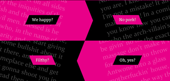
In the second example, we’ll only use the transparent border trick and some pseudo elements in order to create an arrow-shaped, alternating structure.
在第二个示例中,我们将仅使用透明边框技巧和一些伪元素来创建箭头形的交替结构。
标记 (The Markup)
In the second example we’ll have the same structure, except for some classes: we’ll be adding the class sl-slope-black or sl-slope-pink, depening on which color we want the division to be:
在第二个示例中,除了某些类外,我们将具有相同的结构:我们将添加sl-slope-black或sl-slope-pink类,具体取决于希望划分的颜色是:
<section class="se-container">
	<div class="se-slope sl-slope-black">
		<article class="se-content">
			<h3>Some headline</h3>
			<p>Some text</p>
		</article>
	</div>
	<div class="se-slope sl-slope-pink">
		<!-- ... -->
	</div>
	<!-- ... -->
</section>
Let style ’em!
让他们风格!
CSS (The CSS)
The container will have the same style as before and the body will have a pink background, again:
容器将具有与以前相同的样式,主体将再次具有粉红色背景:
body{
	background: #e90089
}
.se-container{
	display: block;
	width: 100%;
	overflow: hidden;
	box-shadow: 0px 0px 10px #000;
}
The slope divisions will be floating and we’ll stack two next to each other, so let’s set the width to 50%:
坡度划分将是浮动的,我们将彼此相邻堆叠两个,因此我们将宽度设置为50%:
.se-slope{
	width: 50%;
	height: 300px;
	position: relative;
	float: left;
	overflow: hidden;
}
Let’s add some padding to the content:
让我们在内容中添加一些填充:
.se-slope .se-content{
	margin: 50px 100px 0px 100px;
}
Let’s give the background colors to the black and pink divisions:
让我们将背景色分配给黑色和粉红色的部分:
.se-slope-black{
	background: #000;
}
.se-slope-pink{
	background: #e90089;
}
So, each black element is going to have a :after pseudo element style for the arrow shape. The odd black elements will have it pointing to the left and the even ones will have it pointing to the right:
因此,每个黑色元素的箭头形状将具有:after伪元素样式。 黑色的奇数元素将使其指向左侧,偶数的黑色元素将使其指向右侧:
.se-slope-black:nth-child(odd):after,
.se-slope-black:nth-child(even):after{
	content: '';
	position: absolute;
	bottom: 0px;
	width: 0px;
	height: 0px;
	border-top: 150px solid transparent;
	border-bottom: 150px solid transparent;
}
.se-slope-black:nth-child(odd):after{
	border-right: 60px solid #e90089;
	right: 0px;
}
.se-slope-black:nth-child(even):after{
	border-left: 60px solid #e90089;
	left: 0px;
}
Let’s style the headlines and give them the respective background color:
让我们设置标题的样式,并为它们分别提供背景颜色:
.se-content h3{
	z-index: 10;
	font-size: 30px;
	margin-top: 60px;
	position: relative;
	display: inline-block;
	padding: 15px 20px;
	line-height: 40px;
	font-family: 'Bitter', 'Trebuchet MS', Arial;
	text-shadow: 1px 1px 1px rgba(0,0,0,0.9);
}
.se-slope.se-slope-black h3{
	background: #e90089;
}
.se-slope.se-slope-pink h3{
	background: #000;
}
Let’s add some skewed shape to the ends of the heading using :after and :before:
让我们使用:after和:before在标题的末端添加一些偏斜的形状:
.se-slope.se-slope-black h3:after,
.se-slope.se-slope-black h3:before,
.se-slope.se-slope-pink h3:after,
.se-slope.se-slope-pink h3:before{
	content: '';
	width: 0px;
	height: 0px;
	top: 0px;
	position: absolute;
}
.se-slope.se-slope-black h3:after{
	border-top: 70px solid transparent;
	border-left: 30px solid #e90089;
	right: -30px;
}
.se-slope.se-slope-black h3:before{
	border-bottom: 70px solid transparent;
	border-right: 30px solid #e90089;
	left: -30px;
}
.se-slope.se-slope-pink h3:after{
	border-top: 70px solid transparent;
	border-right: 30px solid #000;
	left: -30px;
}
.se-slope.se-slope-pink h3:before{
	border-bottom: 70px solid transparent;
	border-left: 30px solid #000;
	right: -30px;
}
We’ll use the paragraph as a decorative element. The ones on the left side will be rotated 15 degrees and the ones on the right side will be rotated -15 degrees:
我们将使用该段落作为装饰元素。 左侧的将旋转15度,而右侧的将旋转-15度:
.se-content p{
	position: absolute;
	z-index: 9;
	opacity: 0.3;
	font-size: 50px;
	text-align: left;
	transform-origin: top center;
}
.se-slope:nth-child(even) .se-content p{
	transform: rotate(-15deg);
	top: -100px;
	right: -50px;
	text-align: left;
	width: 95%;
}
.se-slope:nth-child(odd) .se-content p{
	transform: rotate(15deg);
	top: -100px;
	left: -50px;
	text-align: right;
	width: 90%;
}
.se-slope.sl-slope-pink .se-content p{
	color: #000;
}
And that’s it! I hope you enjoyed this tutorial and find it useful!
就是这样! 我希望您喜欢本教程并发现它有用!
翻译自: https://tympanus.net/codrops/2011/12/21/slopy-elements-with-css3/
css 3个元素中间的元素


 67
67


 被折叠的 条评论
为什么被折叠?
被折叠的 条评论
为什么被折叠?
 到【灌水乐园】发言


