


(给前端大学加星标,提升前端技能.)
作者:Stephanie Eckles
https://moderncss.dev/keep-the-footer-at-the-bottom-flexbox-vs-grid/
This is the first post in a series examining modern CSS solutions to problems I've been solving over the last 13+ years of being a frontend developer.
这是一系列研究现代 CSS 解决方案的第一篇文章,我在过去13年多的时间里一直致力于前端开发。
For many years, I constantly referred to this article by Matthew James Taylor for a method to keep a webpage footer at the bottom of the page regardless of the main content length. This method relied on setting an explicit footer height, which is not scalable but a very good solution BF (Before Flexbox).
多年来,我一直参考Matthew James Taylor的这篇文章,想找到一种方法,在不考虑内容长度的情况下,让网页页脚保持在页面的底部。这种方法依赖于设置一个明确的页脚高度,在Flexbox之前这是一个不可伸缩的,非常好的解决方案。
If you mostly deal with SPA development, you may be confused about why this problem is still around, but it's still a possibility to find your footer floating up for:
如果您主要处理SPA开发,你可能会困惑为什么这个问题仍然存在,但是仍然有可能发现你的页脚漂浮起来:
login pages
blog/news articles (with no ads...)
nterstitial pages of a flow like confirming actions
product listing pages
calendar event details
登录页面
博客/新闻文章(无广告...)
流程的插页式页面,例如确认动作
产品列表页
日历活动详细信息
There are two ways to handle this with modern CSS: flexbox and grid.
使用现代CSS有两种方法来处理这个问题:flexbox和grid。
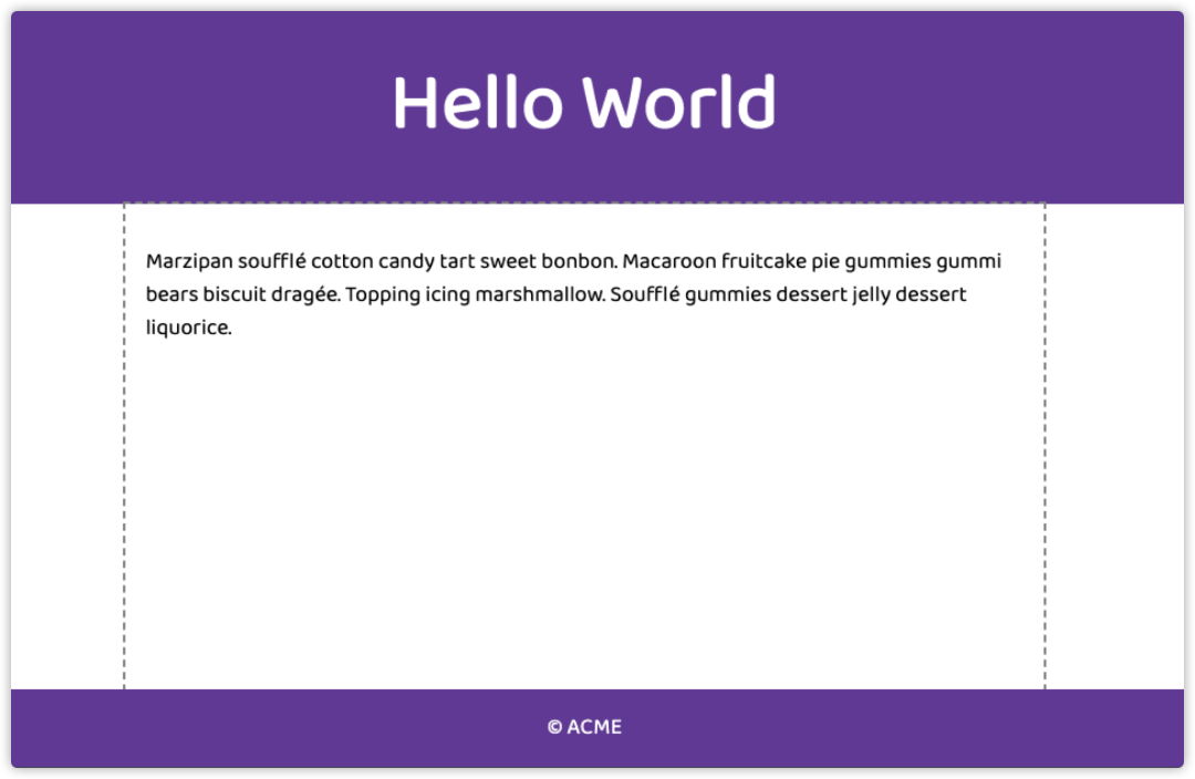
Here's the demo, defaulted to the flexbox method. If you open the full Codepen, you can swap the $method variable to grid to view that alternative.
这是演示,默认为flexbox方法。如果你打开Codepen,你可以将$method变量换成grid来查看这个备选方案。
Read on past the demo to learn about each method.
通过阅读演示来了解每种方法。
Hello WorldMarzipan soufflé cotton candy tart sweet bonbon. Macaroon fruitcake pie gummies gummi bears biscuit dragée. Topping icing marshmallow. Soufflé gummies dessert jelly dessert liquorice.
© ACME
// Options: flexbox | grid
$method: flexbox;
$color: rebeccapurple;
* {
box-sizing: border-box;
}
body {
font-family: "Baloo 2", sans-serif;
min-height: 100vh;
@if($method == "flexbox") {
// Flexbox method
display: flex;
flex-direction: column;
} @else{
// Grid method
display: grid;
grid-template-rows: auto1frauto;
}
}
@if($method == "flexbox") {
footer {
margin-top: auto;
}
}
header,
footer {
display: grid;
place-items: center;
background-color: $color;
color: #fff;
}
main {
padding: 1rem;
max-width: 80ch;
margin: 0auto;
outline: 2px dashed grey;
}
h1 {
font-size: 4rem;
}
p {
font-size: 1.125rem;
line-height: 1.5;
}
Flexbox Method
Flexbox方法
This method is accomplished by defining:
这种方法通过定义以下内容来实现:
body {
min-height: 100vh;
display: flex;
flex-direction: column;
}
footer {
margin-top: auto;
}
// Optional
main {
margin: 0auto;
// or: align-self: center
max-width: 80ch;
}

How it Works
它是如何工作的
First, we ensure the body element will stretch to at least the full height of the screen with min-height: 100vh. This will not trigger overflow if content is short (exception: certain mobile browsers) and it will allow content to continue stretching the height as needed.
首先,我们确保body元素至少能撑满屏幕的全部高度(最小高度为100vh)。如果内容很短(某些移动浏览器除外),将不会触发溢出,并且允许内容根据需要继续撑满高度。
Setting flex-direction: column keeps the behavior of normal document flow in terms of retaining stacked block-elements (which assumes direct children of body are all indeed block elements).
设置 flex-direction: 列在保留堆叠块元素(假设 body 的直接子元素实际上都是块元素)方面保留了正常文档流的行为。
The advantage of flexbox is in leveraging the margin: auto behavior. This one weird trick will cause the margin to fill any space between the item it is set on its nearest sibling in the corresponding direction. Setting margin-top: auto effectively pushes the footer to the bottom of the screen.
flexbox的优势在于利用margin:自动行为。这个诡异的技巧会导致页边距填充对应方向上最近的同级上设置的项之间的任何空格。设置margin-top: auto可以有效地将页脚推到屏幕底部。
Gotcha
陷阱
In the demo, I've added an outline to main to demonstrate that in the flexbox method the main element doesn't fill the height. Which is why we have to use the margin-top: auto trick. This is not likely to matter to you, but if it does, see the grid method which stretches the main to fill the available space.
在演示中,我向main添加了一个轮廓,以演示在flexbox方法中main元素未填充高度。这就是为什么我们必须使用margin-top:auto技巧的原因。这对您来说不太重要,但如果需要,请参见网格方法,该方法可以拉伸主体以填充可用空间。
Grid Method
网格法
This method is achieved by setting
这种方法是通过设置以下参数实现的
body {
min-height: 100vh;
display: grid;
grid-template-rows: auto1frauto;
}
// Optional
main {
margin: 0auto;
max-width: 80ch;
}
How it Works
它是如何工作的
We retain the min-height: 100vh for this method, but we then use of grid-template-rows to space things correctly.
对于此方法,我们保留min-height: 100vh,但是我们随后使用grid-template-rows来正确地分隔内容。
This method's weird trick is using the special grid unit fr. The fr means "fraction" and using it requests that the browser computes the available "fraction" of space that is left to distribute to that column or row. In this case, it fills all available space between the header and footer, which also solves the "gotcha" from the flexbox method.
这个方法的奇怪的技巧是使用特殊的网格单位fr。fr的意思是“fraction”,使用它要求浏览器计算出可用的 "fraction "空间,并将其分配到该列或行。在本例中,它填充了页眉和页脚之间的所有可用空间,这也解决了flexbox方法的“问题”。
Which is Better?
哪个更好?
After seeing grid, you may have a moment of thinking it's clearly superior. However, if you add more elements between the header and footer you need to update your template (or ensure there's always a wrapping element such as a div to not affect any nested semantics/hierarchy).
看完grid之后,你可能会有一瞬间认为它显然更优越。但是,如果在页眉和页脚之间添加更多元素,则需要更新模板(或者确保始终存在一个包装元素,比如 div,以免影响任何嵌套的语义/层次结构)。
On the other hand, the flexbox method is usable across various templates with multiple block elements in the midsection - for example, a series of elements instead of a single for an archive page.
另一方面,flexbox 方法可以跨多个模板使用,这些模板在中间部分有多个块元素——例如,一系列 < article > 元素而不是一个归档页面的单个 < main > 元素。
So as with all techniques, it depends on the project :) But we can all agree it's amazing to have these modern CSS layout methods!
所以和所有的技术一样,这取决于项目:)但是我们都同意有这些现代的CSS布局方法是令人惊奇的!
❤️爱心三连击

点分享点点赞点在看


 137
137


 被折叠的 条评论
为什么被折叠?
被折叠的 条评论
为什么被折叠?
 到【灌水乐园】发言


