


目录
前言
本文根据 YouTube 最受欢迎的技术大佬之一 Gary Simon 的课程改编而来,以方便自己或有兴趣的小伙伴学习。作为一名前端开发工程师,你可以通过以下七个方面的设计基础知识来提高UI设计技能,使用 HTML 和 CSS 在浏览器中创建美观的用户界面。
- 留白(white space)
- 对齐(alignment)
- 对比度(contrast)
- 比例(scale)
- 排版(typography)
- 颜色(color)
- 视觉层次(visual hierarchy)
1 留白(white space)
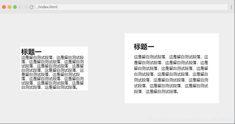
第一个设计基础是留白(white space),也称之为负空间(negative space)。顾名思义,这是页面元素之间的空间。如果页面元素没有留白,不仅会不美观,也难以浏览阅读。而适当的留白则能解决这些问题,在 CSS 中,可以通过 padding,margin,line-height 等多种方式调整留白。
留白示例:
HTML
<html>
    <head>
        <link rel="stylesheet" href="index.css">
    </head>
    <body>
        <div class="card">
            <h1>标题一</h1>
            <p>这是留白测试段落,这是留白测试段落,这是留白测试段落,这是留白测试段落,这是留白测试段落,这是留白测试段落,这是留白测试段落,这是留白测试段落,这是留白测试段落,这是留白测试段落,这是留白测试段落,这是留白测试段落,这是留白测试段落,这是留白测试段落。</p>
        </div>
        <div class="card secondary">
            <h1>标题一</h1>
            <p>这是留白测试段落,这是留白测试段落,这是留白测试段落,这是留白测试段落,这是留白测试段落,这是留白测试段落,这是留白测试段落,这是留白测试段落,这是留白测试段落,这是留白测试段落,这是留白测试段落,这是留白测试段落,这是留白测试段落,这是留白测试段落。</p>
        </div>
    </body>
</html>
CSS
/* CSS */
html, body {
    margin: 0;
    padding: 0;
    height: 100vh;
}

body {
    background: #eeeeee;
    display: grid;
    place-items: center;
    grid-template-columns: repeat(2, auto);
}

.card {
    background: white;
    padding: .2em;
    width: 60%;
}

h1, p {
    margin: 0;
}
h1 {
    font-size: 1.4em;
}
p {
    font-size: .8em;
}

/* 留白 CSS */
.secondary {
    padding: 1.9em;
}

.secondary h1 {
    margin-bottom: .5em;
}

.secondary p {
    line-height: 1.5em;
}
2 对齐(alignment)
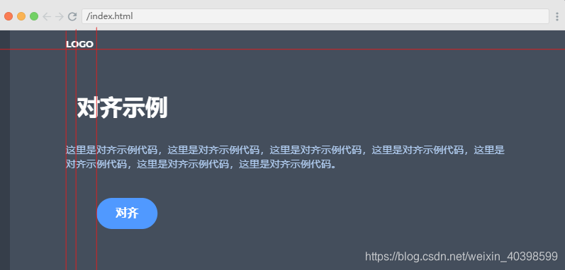
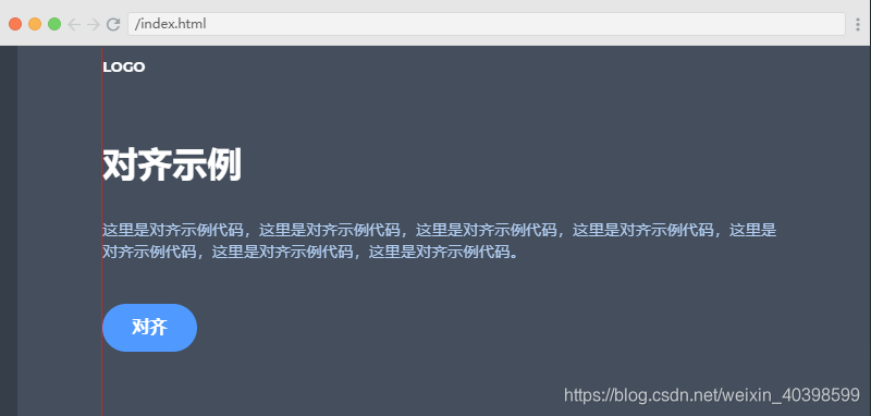
对齐用来设置页面元素相对于其他元素的放置位置,比如按列将页面上的元素从上到下居左对齐。如下图所示,经过对齐处理后,其吸引力和可读性高了许多。
对齐示例:
对齐前
对齐后
HTML
<html>
    <head>
        <link rel="stylesheet" href="index.css">
    </head>
    <body>
        <div class="container">
            <a href="#" class="logo">logo</a>

            <h1>对齐示例</h1>

            <p>这里是对齐示例代码,这里是对齐示例代码,这里是对齐示例代码,这里是对齐示例代码,这里是对齐示例代码,这里是对齐示例代码,这里是对齐示例代码。 </p>

            <a href="#" class="cta">对齐</a>
        </div>
    </body>
</html>
CSS
html, body {
    margin: 0;
    padding: 0;
    font-family: 'Montserrat';
}

body {
    background-color: #444E5C;
    border-left: 17px solid rgba(0,0,0,.2);
    height: 100vh;
}

.container {
    width: 80%;
    margin: 0 auto;
}

a {
    color: white;
    text-decoration: none;
}
a.logo {
    display: block;
    padding-top: 1em;
    font-weight: bold;
    text-transform: uppercase;
    font-size: .8em;
}

h1 {
    margin: 2em 0 1em .5em;
    color: white;
}

p {
    color: #B2CEF2;
    line-height: 1.4em;
    font-size: .9em;
}

a.cta {
    display: inline-block;
    background: #5099FF;
    padding: .8em 1.7em;
    font-weight: bold;
    border-radius: 2em;
    transform: translateX(50%);
    margin-top: 1.5em;
}

/* 对齐 */
h1 { margin-left: 0; }
a.cta { transform: none; }
a.logo { text-align: left; }
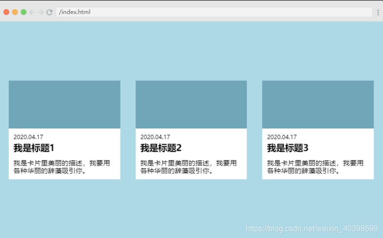
案例实践一
原页面

页面改进
以下改进不是唯一改进方案,只是一个参考,为了对比改进前后效果,实际开发中可根据情况灵活应用。
- 页面左右两边留白
- 卡片内内容区留白
- 卡片内日期居左对齐
- 卡片内日期与标题间距
- 卡片内内容区上下留白上少下多,对下方留白进行调整
 HTML
HTML
<html>
    <head>
        <link rel="stylesheet" href="index.css">
    </head>
    <body>
        <div class="card">
            <span></span>
            <div class="content">
                 <p class="date">2020.04.17</p>
                <h3>我是标题1</h3>
                <p class="desc">我是卡片里美丽的描述,我要用各种华丽的辞藻吸引你。</p>
            </div>
        </div>
        <div class="card">
            <span></span>
            <div class="content">
                <p class="date">2020.04.17</p>
                <h3>我是标题2</h3>
                <p class="desc">我是卡片里美丽的描述,我要用各种华丽的辞藻吸引你。</p>
            </div>
        </div>
        <div class="card">
            <span></span>
            <div class="content">
                <p class="date">2020.04.17</p>
                <h3>我是标题3</h3>
                <p class="desc">我是卡片里美丽的描述,我要用各种华丽的辞藻吸引你。</p>
            </div>
        </div>
    </body>
</html>
CSS
html, body {
    margin: 0;
    padding: 0;
}

body {
    height: 100vh;
    display: grid;
    grid-template-columns: repeat(3, auto);
    place-items: center;
    background: lightblue;
    grid-gap: 2em;
}

.card {
    background: white;
}
span {
    height: 100px;
    display: block;
    width: 100%;
    background: #71A6B8;
}

p.date {
    text-align: center;
    font-size: .7em;
    text-transform: uppercase;
}
h3 {
    margin: 0;
}
p.desc {
    font-size: .9em;
}
/*改进*/
body {
    padding:0 20px;
}
.content {
    padding:0 10px;
}

p.date {
    text-align: left;
    margin-bottom:5px;
}

p.desc {
    margin-bottom:10px;
}
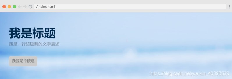
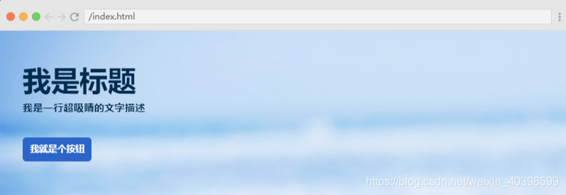
3 对比度(contrast)
对比度是颜色之间的对比程度,在构建页面或应用中是非常重要的。对比度对视觉效果的影响非常关键,一般来说对比度越大,图像越清晰醒目,色彩也越鲜明艳丽;而对比度小,则会让整个画面都灰蒙蒙的。
对比度示例:
对比度差(阅读困难,元素不突出)
对比度好(更加美观,更好的用户友好性和可访问性)
HTML
<html>
    <head>
        <link rel="stylesheet" href="index.css">
    </head>
    <body>
        <header>
            <div class="container">
                <h1>我是标题</h1>
                <p>我是一行超吸睛的文字描述</p>
                <a href="#">我就是个按钮</a>
            </div>
        </header>
    </body>
</html>
CSS
html, body {
    margin: 0;
    padding: 0;
}
body {
    font-family: 'Montserrat';
}
.container {
    padding: 3em 2em;
}
header {
    position: relative;
    display: block;
    width: 100%;
}
header::after {
    content: "";
    position: absolute;
    z-index: -1;
    background: url('asset1.jpg');
    background-position: 0% 20%;
    top: 0;
    left: 0;
    width: 100%;
    height: 100%;
}

h1 {
    margin: 0;
    font-size: 2.5em;
    color: #002A4E;
}
p {
    color: rgba(0,0,0,.3);
    margin-top: .5em;
    font-size: .9em;
    font-weight: bold;
}
a {
    background: #CCCCCC;
    padding: .8em;
    text-decoration: none;
    color: gray;
    font-weight: bold;
    font-size: .8em;
    border-radius: .4em;
    margin-top: 1.5em;
    display: inline-block;
    text-transform: uppercase;
}

/*对比度调整*/
p{
    color:#002A4E;
}
a{
    background:#2c65ca;
    color:#fff;
}
对比度设计建议
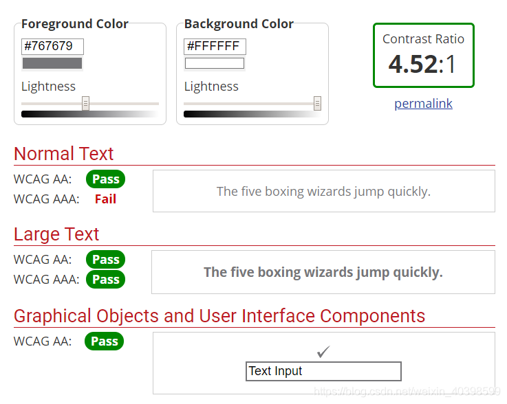
根据 WCAG 2.0 (Web 内容无障碍指南)的建议:
1.4.3 对比度(最小): 文本的视觉呈现以及文本图像至少要有4.5:1的对比度(AA级),
大文本: 大号文本以及大文本图像至少有3:1的对比度;
1.4.6 对比度(加强): 文本视觉呈现以及文本图像至少有7:1的对比度(AAA级),
大文本: 大号文本以及大文本图像至少有 4.5:1的对比度。
Ps:大文本:至少 18pt(24px)或 14pt(19px)bold。
将规范总结成表格如下:
| Text | Normal | Bold | Ratio AA | Ratio AAA |
|---|---|---|---|---|
| Small | <24px | <19px | 4.5:1 | 7:1 |
| Large | >=24px | >=19px | 3:1 | 4.5:1 |
比如,当字号大于等于24px normal / 19px bold时,白色背景上能用的最浅的纯灰色是#959590;
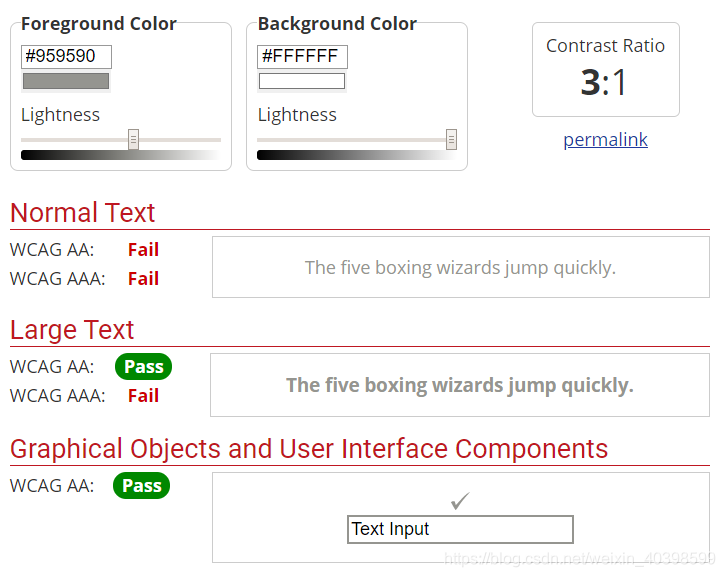
当字号小于 24px normal / 19px bold时,白色背景上可以用的最浅的纯灰色是#767679。(如果在灰色背景上,文字颜色应该更深)
对比度工具推荐
- 浏览器插件:
Kontrast - WCAG Contrast Checker(百度一下会有更多) - 在线工具:
WebAIM’s Color Contrast Checker
Tanaguru Contrast-Finder
Easily calculate color contrast ratios
Color Safe
color tool
Color Oracle - UI设计应用插件:
Sketch
Figma
Adobe Experience Design
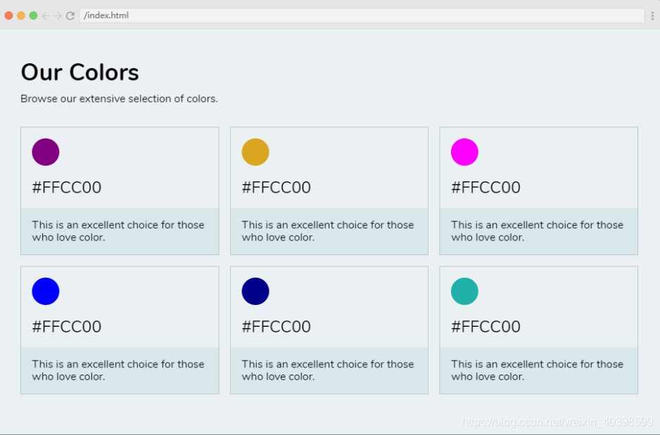
4 比例(scale)
比例是UI设计中的一个重要组成部分,需要仔细考虑每个元素的大小。例如,元素相对于页面应该足够大(即没有大篇幅的空白)。另外,重要性较高的元素,如标题,应该比重要性较低的元素大。
比例示例
调整前

调整后
HTML
<html>
    <head>
        <link rel="stylesheet" href="index.css">
    </head>
    <body>
        <div class="container">
            <h1>Our Colors</h1>
            <p class="subheading">Browse our extensive selection of colors.</p>

            <div class='color-container'>
                <div class="color">
                    <span></span>
                    <p class="code">#FFCC00</p>
                    <p class="desc">This is an excellent choice for those who love color.</p>
                </div>
                <div class="color">
                    <span></span>
                    <p class="code">#FFCC00</p>
                    <p class="desc">This is an excellent choice for those who love color.</p>
                </div>
                <div class="color">
                    <span></span>
                    <p class="code">#FFCC00</p>
                    <p class="desc">This is an excellent choice for those who love color.</p>
                </div>
                <div class="color">
                    <span></span>
                    <p class="code">#FFCC00</p>
                    <p class="desc">This is an excellent choice for those who love color.</p>
                </div>
                <div class="color">
                    <span></span>
                    <p class="code">#FFCC00</p>
                    <p class="desc">This is an excellent choice for those who love color.</p>
                </div>
                <div class="color">
                    <span></span>
                    <p class="code">#FFCC00</p>
                    <p class="desc">This is an excellent choice for those who love color.</p>
                </div>
            </div>
        </div>
    </body>
</html>
CSS
html, body {
    margin: 0;
    padding: 0;
    font-family: 'Nunito';
}

body {
    background: #EBF1F3;
    height: 100vh;
}

.container {
    padding: 2em;
}
h1 {
    font-size: 1.2em;
    margin: .3em 0;
}
p.subheading {
    margin-top: 0;
    margin-bottom: 2em;
}
.color-container {
    display: grid;
    grid-template-columns: repeat(3, 150px);
    grid-gap: 1em;
}
.color {
    border: 1px solid #B8C8CE;
    padding: 1em 1em 0;
}
span {
    width: 40px;
    height: 40px;
    display: block;
    border-radius: 50%;
}
.color:nth-of-type(1) span { background: purple; }
.color:nth-of-type(2) span { background: goldenrod; }
.color:nth-of-type(3) span { background: magenta; }
.color:nth-of-type(4) span { background: blue; }
.color:nth-of-type(5) span { background: darkblue; }
.color:nth-of-type(6) span { background: lightseagreen; }

p.code {
    font-size: .8em;
    margin-bottom: 0;
    margin-top: .8em;
}
p.desc {
    margin-bottom: 0;
    background: #DAE7EB;
    margin: 1em -1em 0;
    padding: 1em;
}

/*调整*/
.color-container {
    grid-template-columns: repeat(3, auto);
}

h1 {
    font-size: 2.2em;
}

p.code {
    font-size: 1.5em;
}
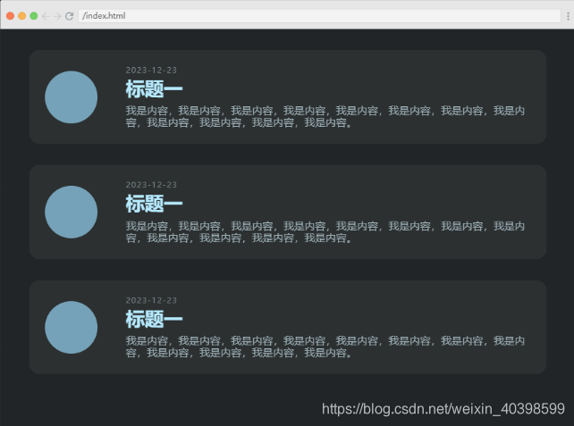
案例实践二
原页面
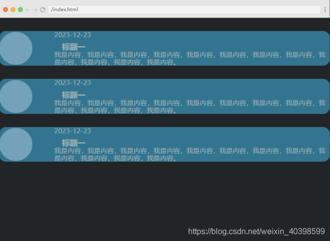
页面改进
以下改进不是唯一改进方案,只是一个参考,为了对比改进前后效果,实际开发中可根据情况灵活应用。
- 卡片区域相对整体页面的留白
- 卡片区域的对比度
- 卡片区域内部留白
- 卡片区域日期标题排版
- 卡片区域内容对齐
- 卡片区域主标题比例
HTML
<html>
    <head>
        <link rel="stylesheet" href="index.css">
    </head>
    <body>
        <div class="container">
            <div class="card">
                <span></span>
                <div class="content">
                    <p class="date">2023-12-23</p>
                    <h3>标题一</h3>
                    <p class="desc">我是内容,我是内容,我是内容,我是内容,我是内容,我是内容,我是内容,我是内容,我是内容,我是内容,我是内容,我是内容。</p>
                </div>
            </div>
            <div class="card">
                <span></span>
                <div class="content">
                 <p class="date">2023-12-23</p>
                    <h3>标题一</h3>
                    <p class="desc">我是内容,我是内容,我是内容,我是内容,我是内容,我是内容,我是内容,我是内容,我是内容,我是内容,我是内容,我是内容。</p>
                </div>
            </div>
        </div>
    </body>
</html>
CSS
html, body {
    margin: 0;
    padding: 0;
}
body {
    background: #212527;
    color: #9FB2B9;
}

.container {
    display: grid;
    width: 100%;
    margin: 2em auto 0;
}
.card {
    background: #337590;
    display: grid;
    grid-template-columns: 1fr 5fr;
    align-items: center;
    border-radius: 1em;
    margin-bottom: 2em;
}
p, h3 {
    margin: 0;
}
h3 {
    margin-left: 1em;
    margin-top: .5em
}
span {
    width: 5em;
    height: 5em;
    background: #75A2B8;
    border-radius: 50%;
}

/* 调整*/

.container {
    width: 90%;
}

.card {
    background: #2C3031;
    padding: 1.5em;
}

p.date {
    text-transform: uppercase;
    font-size: .75em;
    letter-spacing: .1em;
    color: #7A8587;
    margin-bottom: .4em;
}

h3 {
    margin: 0 0 .3em;
    color: #B6EAFF;
    font-size: 1.8em;
}
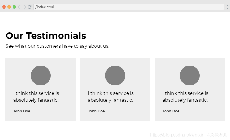
5 排版(typography)
排版对UI设计的效果有非常重要的影响。CSS中可以通过很多方式调整版式,如字体选择,字体大小,对齐方式,字间距,行高,字体样式,字体颜色和对比度。
通常情况下,在一个页面上使用不超过2个字体,结合不同方式建立重要性顺序,即视觉层次(后面会详细说明),遵循这些原则,页面就会很不一样。
排版示例
排版前
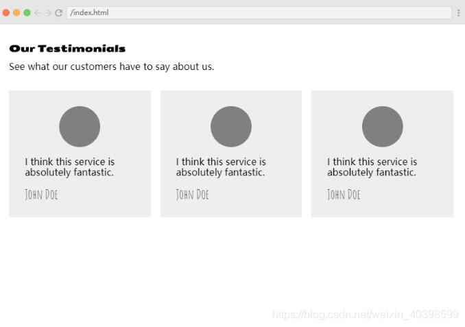
排版后
HTML
<html>
    <head>
        <link rel="stylesheet" href="index.css">
    </head>
    <body>
        <div class="container">
            <h1>Our Testimonials</h1>
            <p class="subheading">See what our customers have to say about us.</p>
            <section>
                <div class="card">
                    <span></span>
                    <blockquote cite="http://someurlx0x.com">
                        <p>I think this service is absolutely fantastic.</p>
                        <cite>John Doe</cite>
                    </blockquote>
                </div>
            </section>
        </div>
    </body>
</html>
CSS
html, body {
    margin: 0;
    padding: 0;
}

.container {
    width: 95%;
    margin: 0 auto;
}
h1, p {
    font-size: 1em;
}
h1 {
    margin: 2em 0 -.2em;
    font-family: 'Seymour One', sans-serif;
}
section {
    display: grid;
    grid-template-columns: repeat(3,auto);
    grid-gap: 1em;
    margin-top: 2em;
}
.card {
    background-color: #eeeeee;
    padding: 1.7em;
}
blockquote {
    margin: 0;
}
span {
    width: 70px;
    height: 70px;
    display: block;
    background: gray;
    border-radius: 50%;
    margin: 0 auto;
}
cite {
    font-style: normal;
    font-family: 'Amatic SC', cursive;
    font-size: 1.4em;
}
/*调整后*/
h1, p, blockquote p, cite {
    font-family: 'Montserrat';
}
h1 {
    font-size: 2em;
}
blockquote p {
    line-height: 1.5em;
}
cite {
    font-size: .7em;
    font-weight: bold;
    color: #373737;
}
6 颜色(color)
最先影响用户体验的UI设计因素是颜色。颜色心理学认为每种颜色对于某些人来说都有某种意义,比如红色代表危险,白色代表干净宁静。
要小心使用颜色,因为颜色的含义会因为文化差异而改变。所以在选择颜色时,一定要针对目标用户进行调查研究。
还需要注意的一点是,过多的颜色会让UI设计看起来很糟糕,而且你应该选择互补的颜色。根据经验,将相同色调不同明暗的颜色放在一起,一般不会出错。
颜色示例
调整前
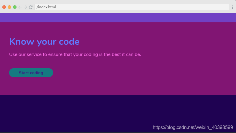
调整后

HTML
<html>
    <head>
        <link rel="stylesheet" href="index.css">
    </head>
    <body>
        <header></header>
        <div class="container">
            <main>
                <h1>Know your code</h1>
                <p>Use our service to ensure that your coding is the best it can be.</p>

                <a href="#">Start coding</a>
            </main>
        </div>
        <footer></footer>
    </body>
</html>
CSS
html, body {
    margin: 0;
    padding: 0;
}

body {
    height: 100vh;
    background: #1F0252;
    color: white;
    font-family: 'Nunito';
}

header {
    background: #7141C4;
    height: 2em;
}

.container {
    padding: 3em 2em 2em;
    background: #811573;
}
h1 {
    margin: 0;
    color: #617BFF;
}
a {
    background: #157A81;
    padding: .5em 2.3em;
    display: inline-block;
    color: #3C1581;
    text-decoration: none;
    border-radius: 1em;
    font-weight: bold;
    font-size: .9em;
    margin-top: 1.5em;
    margin-bottom: 2em;
}

p {
    color: #FF6EEC;
}

footer {
    height: 2em;
    background: #1F0252;
}

/* 调整后 */

.container {
    background: #3C1581;
}

h1, p {
    color: white;
}

a {
    background: #FEED00;
}
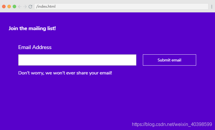
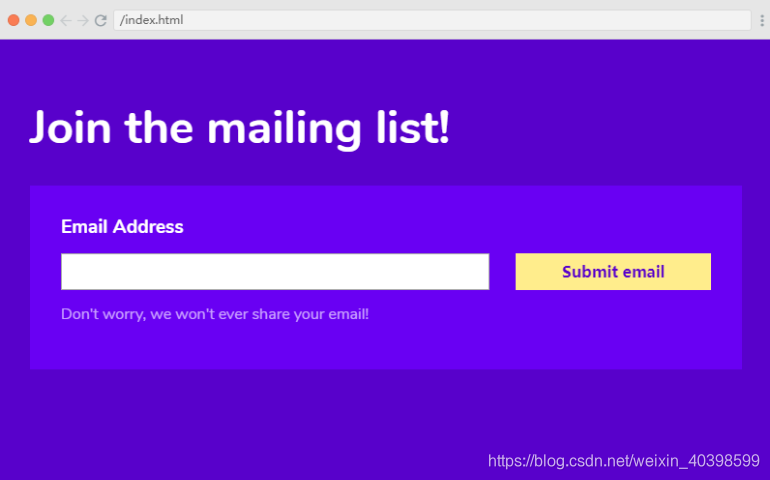
7 视觉层次(visual hierarchy)
视觉层次是UI设计的核心方法之一,致力于以一种用户能够理解的的方式呈现产品内容,用它来组织UI内容,可以使大脑根据物理差异(如位置、比例、颜色、对比度、样式等)来区分对象。
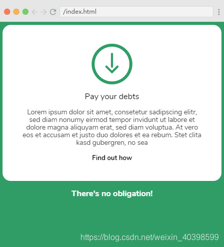
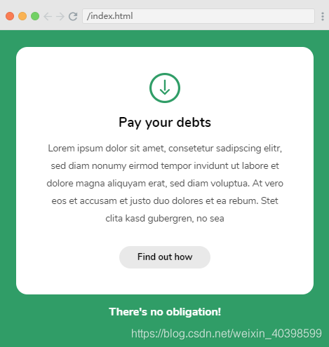
视觉层次示例
调整前
调整后
HTML
<html>
    <head>
        <link rel="stylesheet" href="index.css">
    </head>
    <body>
        <h1>Join the mailing list!</h1>

        <div class="container">
            <form>
                <div class="form-container">
                    <label for="email">Email Address</label>

                    <input type="text" id="email">
                    <p>Don't worry, we won't ever share your email!</p>
                    <input type="submit" value="Submit email">
                </div>
            </form>
        </div>
    </body>
</html>
CSS
html, body {
    margin: 0;
    padding: 0;
}
body {
    padding: 2em;
    background: #5801CB;
    color: white;
    font-family: 'Nunito';
}
h1 {
    font-size: 1.1em;
}

.form-container {
    padding: 2em;
    display: grid;
    grid-template-columns: 70% auto;
    grid-template-rows: repeat(3,auto);
    grid-template-areas:
        "label label"
        "submit button"
        "info info";
}

label {
    display: block;
    font-size: 1.1em;
    grid-area: label;
    margin-bottom: .8em;
}
input[type=text]{
    width: 90%;
    padding: .5em;
}
input[type=submit] {
    padding: .5em;
    font-size: .8em;
    background: none;
    border: 1px solid white;
    color: white;
    cursor: pointer;
}
p {
    grid-area: info;
}
/* 调整*/
h1 {
    font-size: 3em;
}

.form-container {
    background: #6900F3;
}

label {
    font-weight: bold;
    font-size: 1.2em;
}

input[type=submit] {
    font-size: 1em;
    background: #FFED8C;
    color: #5801CB;
    border: none;
    font-weight: bold;
}

p {
    color: #CAA2FF;
}
案例实践三
原页面
页面改进
以下改进不是唯一改进方案,只是一个参考,为了对比改进前后效果,实际开发中可根据情况灵活应用。
1.整体页面留白
2.SVG图片比例
3.标题排版
4.内容段落排版
5.链接排版
HTML
<html>
    <head>
        <link rel="stylesheet" href="index.css">
    </head>
    <body>
        <div class="card">

            <svg viewBox="0 0 96 96">
                <g id="down-arrow" transform="translate(-418 -150)">
                    <g id="Ellipse_2" data-name="Ellipse 2" transform="translate(418 150)" fill="none" stroke="#309d67" stroke-width="7">
                    <circle cx="48" cy="48" r="48" stroke="none"/>
                    <circle cx="48" cy="48" r="44.5" fill="none"/>
                    </g>
                    <g id="Group_1" data-name="Group 1">
                    <path id="Path_2" data-name="Path 2" d="M554,8207.49v29.931" transform="translate(-88 -8033.361)" fill="none" stroke="#309d67" stroke-linecap="round" stroke-width="5"/>
                    <path id="Path_3" data-name="Path 3" d="M541.8,8246.06l13.07,13.069,13.07-13.069" transform="translate(-89 -8042)" fill="none" stroke="#309d67" stroke-linecap="round" stroke-width="5"/>
                    </g>
                </g>
            </svg>

            <h1>Pay your debts</h1>

            <p>Lorem ipsum dolor sit amet, consetetur sadipscing elitr, sed diam nonumy eirmod tempor invidunt ut labore et dolore magna aliquyam erat, sed diam voluptua. At vero eos et accusam et justo duo dolores et ea rebum. Stet clita kasd gubergren, no sea</p>

            <a href="#">Find out how</a>

        </div>

        <p class="obligation">There's no obligation!</p>
    </body>
</html>
CSS
html, body {
    margin: 0;
    padding: 0;
}

body {
    background: #309D67;
    padding: .4em;
    font-family: 'Nunito', sans-serif;
}

.card {
    background: white;
    border-radius: 1em;
    padding: 2.3em;
    text-align: center;
}

svg {
    width: 5em;
}

h1 {
    font-size: 1em;
    font-weight: normal;
}

.card p {
    font-size: .85em;
    color: #474747;
}

a {

    display: inline-block;
    color: black;
    text-decoration: none;
    font-weight: bold;
    border-radius: 5em;
    font-size: .8em;
}
.obligation {
    text-align: center;
    color: white;
    font-weight: bold;
    margin-bottom: 0;
}

/*调整*/


body {
    padding: 1.5em;
}

svg {
    width: 2.7em;
}

h1 {
    font-size: 1.2em;
    font-weight: bold;
}

.card p {
    line-height: 1.9em;
    color: auto;
}

a {
    background: #e9e9e9;
    padding: .7em 2em;
    margin-top: 1em;
}
以上这些UI设计的基础,在UI设计中都同样重要,缺少任何一个元素,都会损害整个用户体验。
资源
[1]: scrimba UI design course
[2]: 色彩无障碍设计(Color Accessibility)之「对比度」的探索


 2924
2924


 被折叠的 条评论
为什么被折叠?
被折叠的 条评论
为什么被折叠?
 到【灌水乐园】发言


