


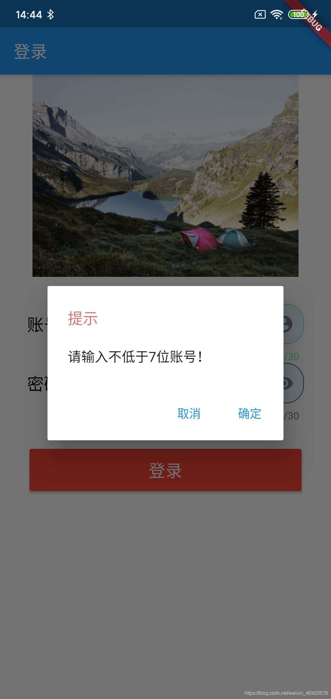
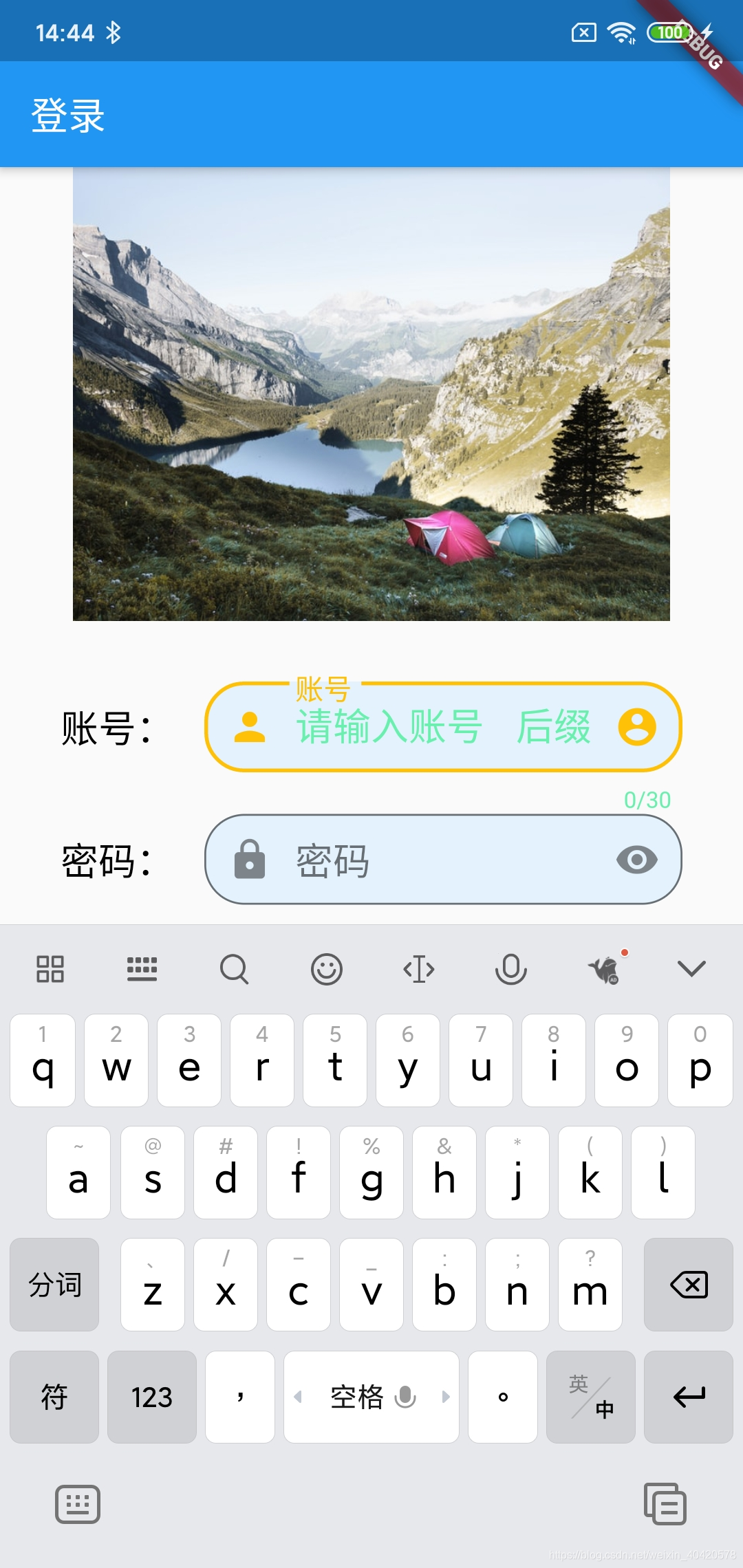
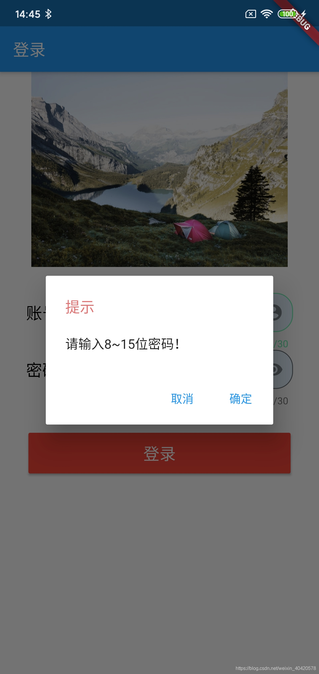
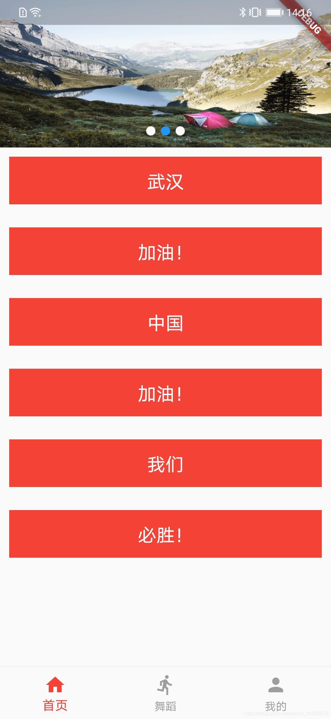
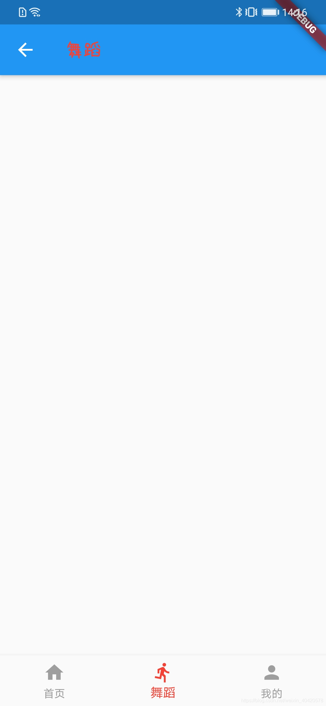
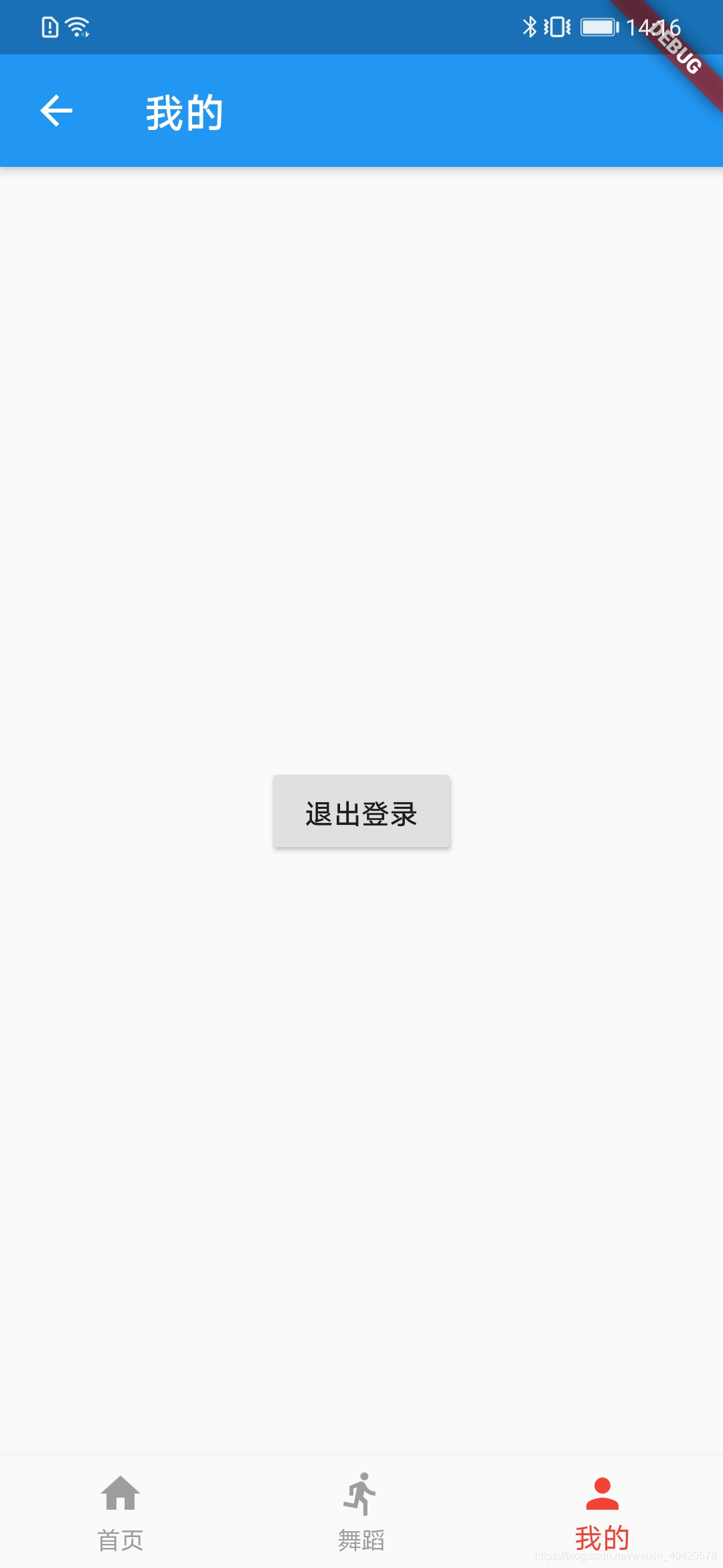
效果图依次如下:
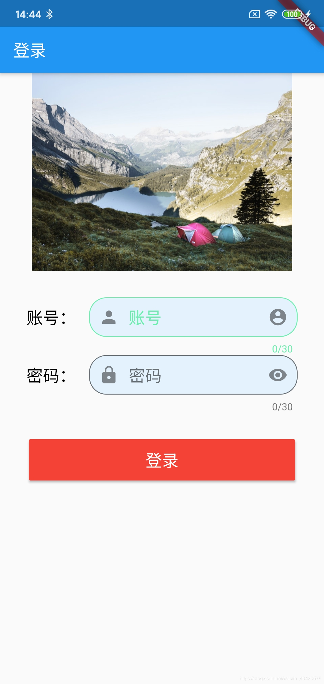
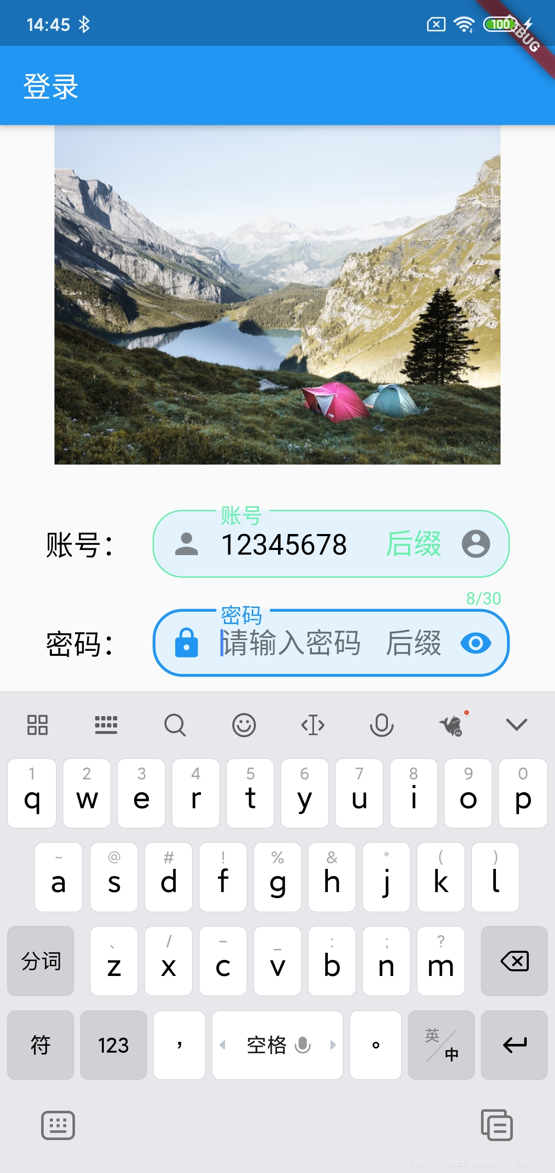
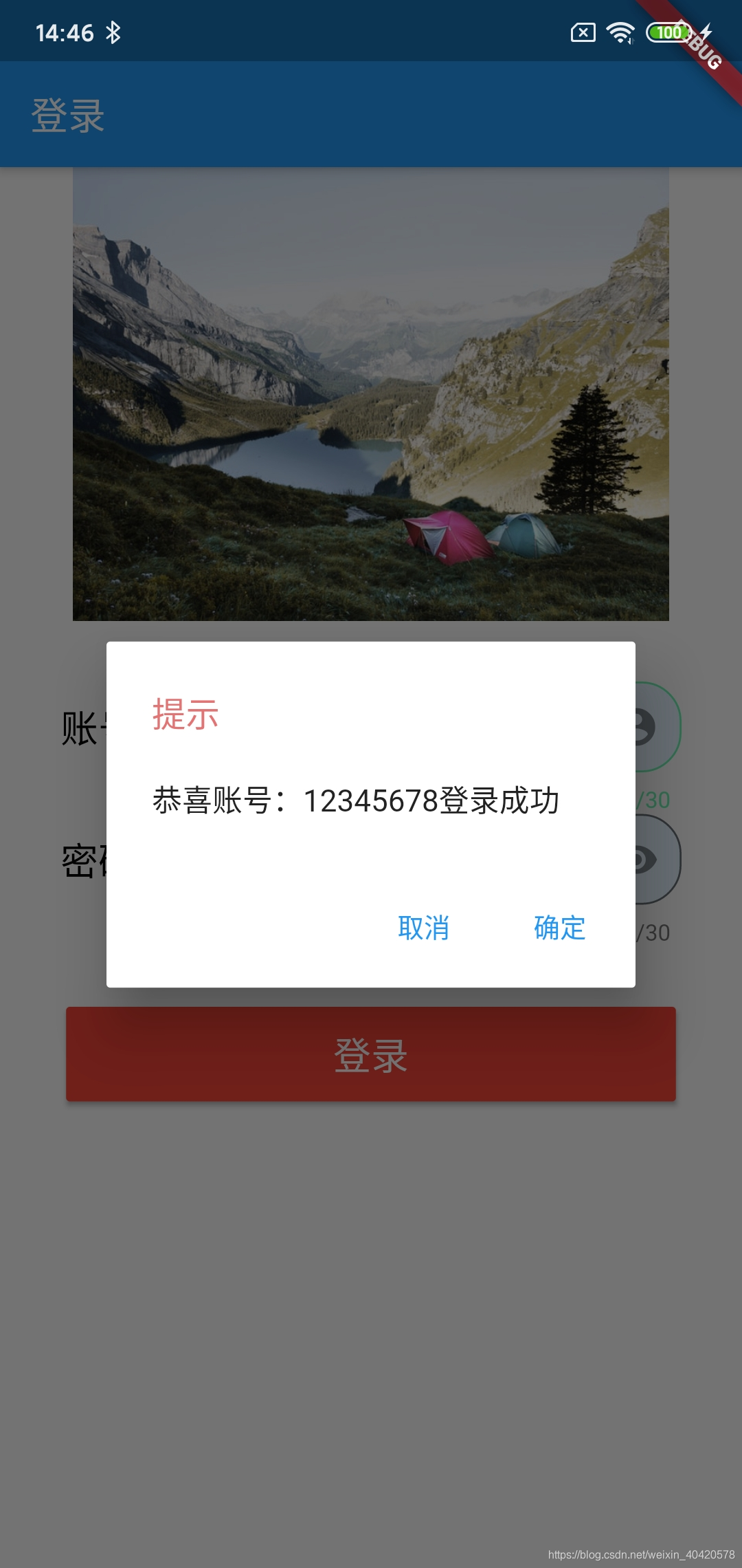
一步一步摸索、查找资源,最后实现登录界面,登录成功后跳转到首页,从我的界面退出登录,这个过程涉及到了:Widgets的使用(TextField、RaisedButton、SizedBox、Row……)、路由、交互……等相关知识,代码有相应的注释(有些是根据自己的理解来写,会有不太贴切的地方,谅解一下),
完整代码如下:
1.main.dar
import 'package:flutter/material.dart';
import 'package:flutter_app/screen/Home.dart';
import 'package:flutter_app/screen/LoginScreen.dart';

void main() => runApp(MyApp());

class MyApp extends StatelessWidget {
  // This widget is the root of your application.
  @override
  Widget build(BuildContext context) {

      return new MaterialApp(
      title: 'Flutter Demo',
      theme: new ThemeData(
        primarySwatch: Colors.blue,
      ),

      routes: {
        /**
         * 命名导航路由,启动程序默认打开的是以'/'对应的界面LoginScreen()
         * 凡是后面使用Navigator.of(context).pushNamed('/Home'),都会跳转到Home(),
         */
        '/': (BuildContext context) => new LoginScreen(),
        '/Home': (BuildContext context) => new Home(),
      },
     }
}
2.1 LoginScreen.dart(类似LoginActivity、login.xml)
import 'package:flutter/cupertino.dart';
import 'package:flutter/material.dart';
import 'package:flutter/services.dart';

class LoginScreen extends StatefulWidget {
  @override
  State<LoginScreen> createState() {
    return new _LoginScreenState();
  }
}

class _LoginScreenState extends State<LoginScreen> {
  //用于登录时判断输入的账号、密码是否符合要求
  static bool _accountState, _passwordState = false;

  //提示语
  static String _checkHint;

  //监听账号输入框的文字变化
  static TextEditingController _accountController = new TextEditingController();

  //监听密码输入框的文字变化
  static TextEditingController _passwordController =
      new TextEditingController();

//用于路由(就是界面的跳转),当跳转的事件没有写在build里面时用到(我这里抽到了loginButton里面)
  static BuildContext context1;

  //校验账号是否符合条件
  static void _checkAccount() {
    //校验账号不为空且长度大于7(自定义校验条件)
    if (_accountController.text.isNotEmpty &&
        _accountController.text.trim().length > 7) {
      _accountState = true;
    } else {
      _accountState = false;
    }
  }

  //校验密码是否符合条件
  static void _checkPassword() {
    //校验密码不为空且长度大于8小于等于15(自定义校验条件)
    if (_passwordController.text.isNotEmpty &&
        _passwordController.text.length > 8 &&
        _passwordController.text.length <= 15) {
      _passwordState = true;
    } else {
      _passwordState = false;
    }
  }

   //账号输入框样式
  static Widget buildAccountTextFied(TextEditingController controller) {
    /**
     *需要定制一下某些颜色时返回Theme,不需要时返回TextField(如后面的密码)
     * 修改输入框颜色:没有获取焦点时为hintColor,获取焦点后为:primaryColor
     */
    return Theme(
      data: new ThemeData(
          primaryColor: Colors.amber, hintColor: Colors.greenAccent),
      child: new TextField(
        //键盘的样式
        keyboardType: TextInputType.text,
        //监听
        controller: controller,
        //最大长度
        maxLength: 30,
        //颜色跟hintColor
        //最大行数
        maxLines: 1,
        //是否自动更正
        autocorrect: true,
        //是否自动化对焦
        autofocus: false,
        //是否是密码格式(输入的内容不可见)
        obscureText: false,
        //文本对齐方式
        textAlign: TextAlign.start,
        //输入文本的样式
        style: TextStyle(fontSize: 20, color: Colors.black),
        //允许输入的格式(digitsOnly数字)
        inputFormatters: [WhitelistingTextInputFormatter.digitsOnly],
        //内容改变回调
        onChanged: (account) {
          print('change $account');
        },
        //提交触发回调
        onSubmitted: (account) {
          print('submit $account');
        },
        //是否禁用
        enabled: true,
        decoration: InputDecoration(
            fillColor: Colors.blue[50],
            //底色
            filled: true,
            //有聚焦,labelText就会缩小到输入框左上角,颜色primaryColor,没聚焦前颜色跟hintColor
            labelText: '账号',
            //聚焦时才显示,颜色跟hintColor
            hintText: '请输入账号',
            //红色
//            errorText: '输入错误',
            //红色,现在在输入框的左下角,跟errorText位置一样(优先显示errorText)
//            helperText: 'acount',
            //输入框内左侧,有聚焦,颜色跟primaryColor
            prefixIcon: Icon(Icons.person),
            //输入框左侧的widget(可是text、icon……)
            icon: Text(
              '账号:',
              style: TextStyle(fontSize: 20, color: Colors.black),
            ),
            //输入框内右侧的widget
            suffixIcon: Icon(Icons.account_circle),
//            有聚焦显示颜色跟hintColor,显示在输入框的右边
            suffixText: "后缀",
            contentPadding: EdgeInsets.all(5),
            border: OutlineInputBorder(
              borderRadius: BorderRadius.circular(21.11), //边框裁剪成11.11°角
              borderSide: BorderSide(
                  color: Colors.black,
                  width: 25.0), //边框颜色、大小没有效果,所以使用返回的是Theme,
            )),
      ),
    );
  }

  //密码输入框样式
  static Widget buildPasswordTextFied(TextEditingController controller) {
    return TextField(
      //键盘的样式
      keyboardType: TextInputType.number,
      //监听
      controller: controller,
      //最大长度
      maxLength: 30,
      //颜色跟hintColor
      //最大行数
      maxLines: 1,
      //是否自动更正
      autocorrect: true,
      //是否自动化对焦
      autofocus: false,
      //是否是密码格式(输入的内容不可见)
      obscureText: true,
      //文本对齐方式
      textAlign: TextAlign.start,
      //输入文本的样式
      style: TextStyle(fontSize: 20, color: Colors.black),
      //允许输入的格式(digitsOnly数字)
      inputFormatters: [WhitelistingTextInputFormatter.digitsOnly],
      //内容改变回调
      onChanged: (password) {
        print('change $password');
      },
      //提交触发回调
      onSubmitted: (password) {
        print('submit $password');
      },
      //是否禁用
      enabled: true,
      decoration: InputDecoration(
          //底色配合filled:true才有效
          fillColor: Colors.blue[50],
          filled: true,
          //输入聚焦以后,labelText就会缩小到输入框左上角,红色,没聚焦前颜色跟hintColor
          labelText: '密码',
          //聚焦时才显示,颜色跟hintColor
          hintText: '请输入密码',
          //红色
//          errorText: '输入错误',
          //红色,现在在输入框的左下角,跟errorText位置一样(优先显示errorText)
//          helperText: 'password',
          //输入框内左侧widget,输入聚焦时,颜色跟primaryColor
          prefixIcon: Icon(Icons.lock),
          //输入框左侧的widget(可是text、icon……)
          icon: Text(
            '密码:',
            style: TextStyle(fontSize: 20, color: Colors.black),
          ),
          //输入框内右侧的widget
          suffixIcon: Icon(Icons.remove_red_eye),
          //聚焦时才显示颜色跟hintColor,显示在输入框的右边
          suffixText: '后缀',
          contentPadding: EdgeInsets.all(5),
          border: OutlineInputBorder(
            borderRadius: BorderRadius.circular(21.11), //边框裁剪成11.11°角
            borderSide: BorderSide(
                color: Colors.black, width: 25.0), //没有效果,想要修改就返回Theme(如前面账号样式)
          )),
    );
  }

  //账号、密码输入框
  Widget textSection = new Container(
    padding: const EdgeInsets.all(32.0),
    child: new Column(
      //主轴Flex的值
      mainAxisSize: MainAxisSize.max,
      //MainAxisAlignment:主轴方向上的对齐方式,会对child的位置起作用
      mainAxisAlignment: MainAxisAlignment.center,
      children: <Widget>[
        buildAccountTextFied(_accountController),
        buildPasswordTextFied(_passwordController),
      ],
    ),
  );

  //登录进行布局及“账号”、“密码”格式校验、弹窗的提示、路由(写在build里面太长了,抽出来)
  Widget loginButton = new Container(
      margin: const EdgeInsets.only(left: 35, right: 35),//这个widget距离父控件左右35(还有个all就是距离左上右下四个方向)
      child: new SizedBox(
          //用来设置宽高,如直接使用RaisedButton则不能设置
          height: 50,
          child: new RaisedButton(//一个凸起的材质矩形按钮
              color: Colors.red,
              child: new Text(
                '登录',
                style: TextStyle(color: Colors.white, fontSize: 20),
              ),
              onPressed: () {//按下时的事件
                _checkAccount();//校验账号格式,以此来更新_accountState
                _checkPassword();//校验账号格式,以此来更新_passwordState
                if (_accountState) {
                  if (_passwordState) {
                    _checkHint =
                        '恭喜账号:' + _accountController.text.toString() + "登录成功";
                  } else {
                    _checkHint = '请输入8~15位密码!';
                  }
                } else {
                  _checkHint = '请输入不低于7位账号!';
                }
                showDialog(
                  context: context1,
                  barrierDismissible: true, //点击弹窗外部是否消失
                  child: new AlertDialog(
                    title: new Text(//标题
                      '提示',
                      style:
                          new TextStyle(color: Colors.red[300], fontSize: 18),
                    ),
                    content: new Text(_checkHint),//提示语
                    actions: <Widget>[
                      new FlatButton(//一个扁平的Material按钮
                          onPressed: () {
                            Navigator.of(context1).pop();//弹窗消失
                          },
                          child: Text('取消')),
                      new FlatButton(
                          //对话框按钮
                          onPressed: () {
                            if (_accountState && _passwordState) {//账号密码都符合条件
                              Navigator.pushNamed(
                                  context1, '/Home'); //使用的是“命名导航路由”,具体去哪个界面,看main.dart 对应routeName('/Home')的界面
                            } else {
                              Navigator.of(context1).pop();//弹窗消失
                            }
                          },
                          child: Text('确定')),
                    ],
                  ),
                );
              })));

  @override
  Widget build(BuildContext context) {
    context1 = context;
    return Scaffold(
        appBar: new AppBar(
          title: new Text('登录'),
        ),
        body: new ListView(
          children: [
            new Image.asset(
              'images/lake.jpg',
              width: 600,
              height: 240,
              //cover(充满容器)、fill(充满父容器)、contain(总有宽或高跟父一样)、none(原图居中显示)、fitWidth(宽度跟父一样)、fitHeight(高度跟父一样)
              fit: BoxFit.contain,
            ),
            textSection,
            loginButton,
          ],
        ));
  }
}
2.2图片资源的添加
- 根目录建立images文件夹,把准备好的lake.jpg图片放进去,如下图
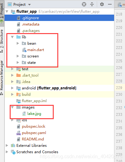
- pubspec.yaml,增加的图片资源,需要加进去,如下:
flutter:
  assets:
    - images/lake.jpg
3.Home.dart(类似MainActivity、main.xml,用来切换fragment)
import 'package:flutter/cupertino.dart';
import 'package:flutter/material.dart';
import 'package:flutter_app/screen/HomePage.dart';
import 'package:flutter_app/screen/MineScreen.dart';


class Home extends StatefulWidget {
  @override
  State<StatefulWidget> createState() {
    return new _HomeState();
  }
}

class _HomeState extends State<Home> {
  int _currentIndex = 0;
  final List<Widget> _children = [
    new HomeScreen(),//首页界面
    new MineScreen(),//我的界面
  ];

  @override
  Widget build(BuildContext context) {
    return Scaffold(
      body: _children[_currentIndex],
      bottomNavigationBar: new BottomNavigationBar(
        onTap: onTabTapped, //点击切换
        currentIndex: _currentIndex,
        items: [
          new BottomNavigationBarItem(
            icon: new Icon(Icons.home),
            title: new Text('首页'),
          ),
          new BottomNavigationBarItem(
            icon: new Icon(Icons.person),
            title: new Text('我的'),
          ),
        ],
      ),
    );
  }

  void onTabTapped(int index) {
    setState(() {
      _currentIndex = index;
    });
  }
}
4.HomeScreen.dart(类似HomeFragment、homefragment.xml)
import 'package:flutter/cupertino.dart';
import 'package:flutter/material.dart';

class HomeScreen extends StatelessWidget {
  Widget build(BuildContext context) {
    return new Scaffold(
      appBar: new AppBar(
        title: new Text('首页'),
      ),
      body: new Center(
        child: new Text(
            '我是Home界面',
          style: TextStyle(color: Colors.red, fontSize: 20),
        )
      ),
    );
  }
}
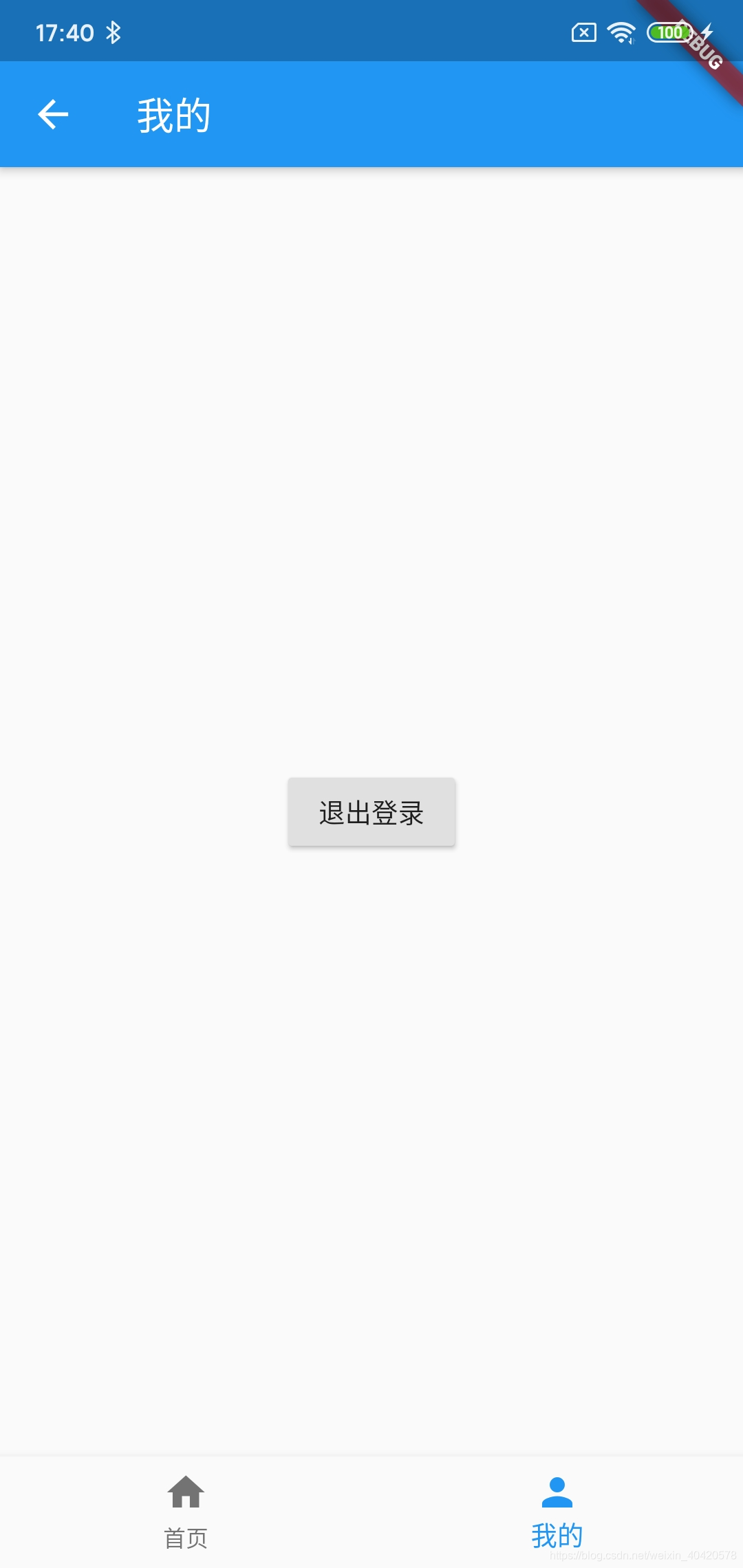
5.MineScreen.dart((类似MineFragment、minefragment.xml))
import 'package:flutter/cupertino.dart';
import 'package:flutter/material.dart';

class MineScreen extends StatelessWidget {
  Widget build(BuildContext context) {
    return new Scaffold(
      appBar: new AppBar(
        title: new Text('我的'),
      ),
      body: new Center(
        child: new RaisedButton(
            child: new Text('退出登录'),
            onPressed: () {
              Navigator.of(context).pushNamed('/');//跳转到main.dart对routeName('/')的界面
            }),
      ),
    );
  }
}
刚刚想到一个问题:当你实现上面的效果后,回顾看一下“账号”、“密码”TextField重复写了,增加了代码量,我们是不是可以封装一下,传参数过去进行分别实现想要的效果,eg:obscureText(是否是密码格式),账号时传个false、密码时传个true。
其它的也是同样的情况,同样的布局,可以抽出来,进行调用即可,自己动手去实现一下哈,我就不重新贴代码了。后期如果有优化或者补充的,我会继续完善博文的。
补充:
1. 2020.3.18,经过后面的学习,可以优化底部导航栏,自定义选中、未选中的icon、text颜色,看效果图、代码:
//底部导航栏
class MainNavigator extends StatefulWidget {
  @override
  _MainNavigatorState createState() => new _MainNavigatorState();
}

class _MainNavigatorState extends State<MainNavigator> {
  final _defaultColor = Colors.grey;//没有选中时icon、文字的颜色
  final _activeColor = Colors.red;//选中的icon、文字的颜色
  int _currentIndex = 0;//默认显示第一个

  final List<Widget> _children = [
    new HomePage(),
    new DancePage(),
    new MinePage(),
  ];

  @override
  Widget build(BuildContext context) {
    return Scaffold(
      body: _children[_currentIndex],
      bottomNavigationBar: new BottomNavigationBar(
        onTap: onTabTapped, //点击切换
        currentIndex: _currentIndex,//当前显示的界面下标
        type: BottomNavigationBarType.fixed, //文字的显示,shifting选中时显示,fixed不选中也显示
        items: [
          BottomNavigationBarItem(
            icon: Icon(Icons.home, color: _defaultColor), //未选中的icon颜色
            activeIcon: Icon(Icons.home, color: _activeColor), //选中时的icon颜色
            title: new Text(
              '首页',
              style: TextStyle(
                  color: _currentIndex != 0
                      ? _defaultColor
                      : _activeColor //不为o表示未选中
                  ),
            ),
          ),
          BottomNavigationBarItem(
            icon: Icon(Icons.directions_run, color: _defaultColor),
            activeIcon: Icon(Icons.directions_run, color: _activeColor),
            title: Text(
              '舞蹈',
              style: TextStyle(
                  color: _currentIndex != 1
                      ? _defaultColor
                      : _activeColor //不为1表示未选中
                  ),
            ),
          ),
          BottomNavigationBarItem(
            icon: Icon(Icons.person, color: _defaultColor),
            activeIcon: Icon(Icons.person, color: _activeColor),
            title: Text(
              '我的',
              style: TextStyle(
                  color: _currentIndex != 2
                      ? _defaultColor
                      : _activeColor //不为2表示未选中
                  ),
            ),
          ),
        ],
      ),
    );
  }

  //点击切换时,更新当前选中的界面下标
  void onTabTapped(int index) {
    setState(() {
      _currentIndex = index;
    });
  }
}


 扫一扫
扫一扫


 434
434

 被折叠的 条评论
为什么被折叠?
被折叠的 条评论
为什么被折叠?
 到【灌水乐园】发言


