


plotly.py
plotly.py是一个交互式的、开源的、基于浏览器的 Python 图形库✨
建立在plotly.js 之上,plotly.py是一个高级的声明性图表库。plotly.js 附带 30 多种图表类型,包括科学图表、3D 图表、统计图表、SVG 地图、金融图表等。
lotly 图表可以在 Jupyter 笔记本、独立的 HTML 文件中查看,或集成到Dash 应用程序中。
该plotly.express模块(通常导入为px)包含可以一次创建整个图形的函数,称为 Plotly Express 或 PX。Plotly Express 是库的内置部分,plotly是创建最常见图形的推荐起点。每个 Plotly Express 函数在内部使用图形对象并返回一个plotly.graph_objects.Figure实例。在整个plotly文档中,您会在任何适用页面的顶部找到构建图形的 Plotly Express 方法,然后是有关如何使用图形对象构建相似图形的部分。使用 Plotly Express 在单个函数调用中创建的任何图形都可以单独使用图形对象创建,但代码量要多 5 到 100 倍。
安装
plotly.py 可以使用 pip 安装…
pip install plotly==5.9.0
示例
helloworld柱状图
大部分的示例都是从helloworld开始的,这里的示例程序从一个柱状图开始:
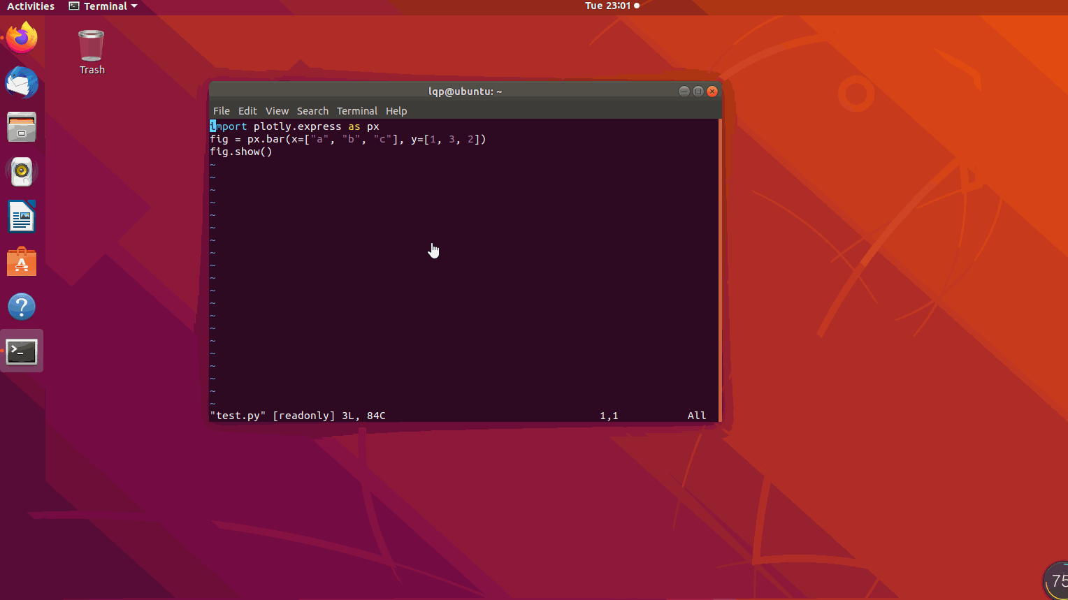
mport plotly.express as px
fig = px.bar(x=["a", "b", "c"], y=[1, 3, 2])
fig.show()
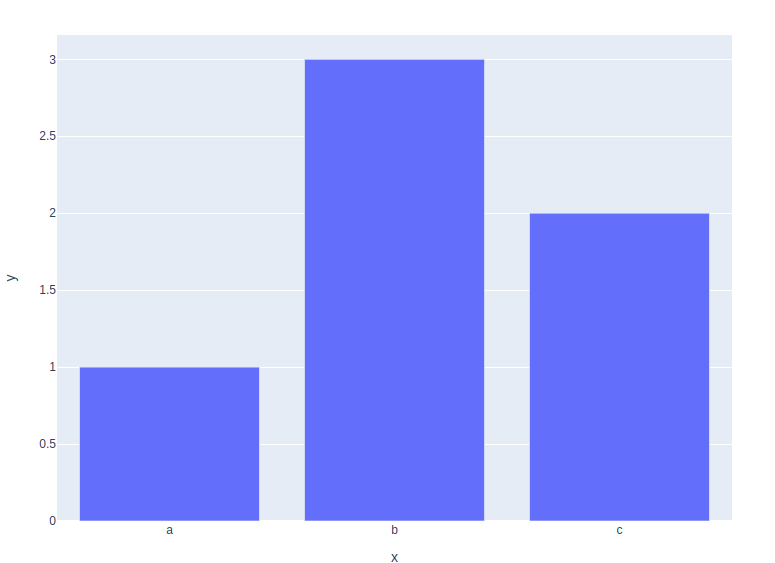
当我们从运行这段程序后,会弹出浏览器,并把结果显示在浏览器上。
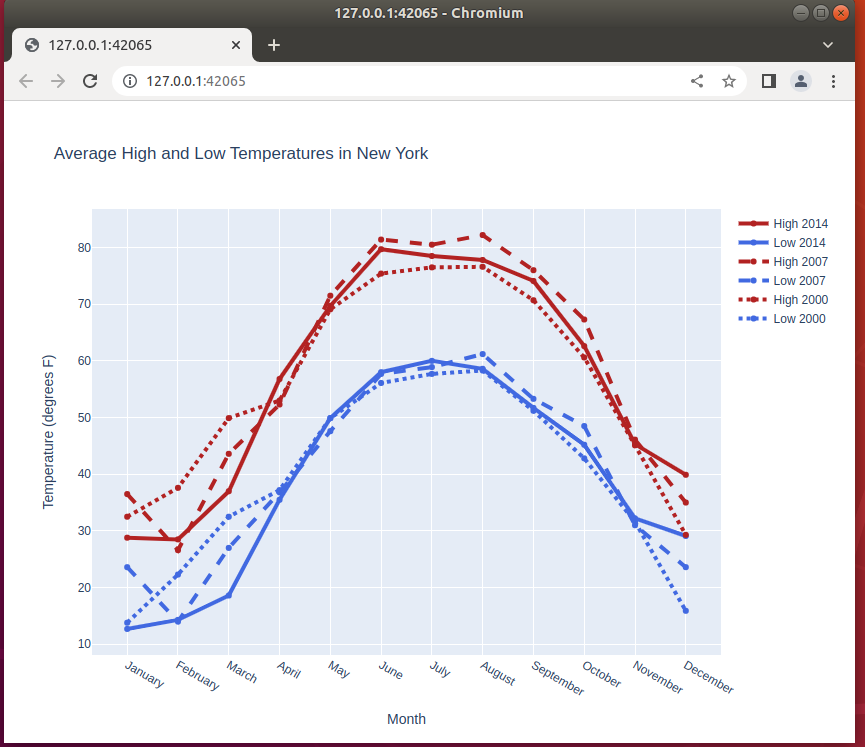
线
此示例对迹线的颜色和虚线设置样式,添加迹线名称,修改线宽,并添加绘图和坐标轴标题。
import plotly.graph_objects as go

# Add data
month = ['January', 'February', 'March', 'April', 'May', 'June', 'July',
         'August', 'September', 'October', 'November', 'December']
high_2000 = [32.5, 37.6, 49.9, 53.0, 69.1, 75.4, 76.5, 76.6, 70.7, 60.6, 45.1, 29.3]
low_2000 = [13.8, 22.3, 32.5, 37.2, 49.9, 56.1, 57.7, 58.3, 51.2, 42.8, 31.6, 15.9]
high_2007 = [36.5, 26.6, 43.6, 52.3, 71.5, 81.4, 80.5, 82.2, 76.0, 67.3, 46.1, 35.0]
low_2007 = [23.6, 14.0, 27.0, 36.8, 47.6, 57.7, 58.9, 61.2, 53.3, 48.5, 31.0, 23.6]
high_2014 = [28.8, 28.5, 37.0, 56.8, 69.7, 79.7, 78.5, 77.8, 74.1, 62.6, 45.3, 39.9]
low_2014 = [12.7, 14.3, 18.6, 35.5, 49.9, 58.0, 60.0, 58.6, 51.7, 45.2, 32.2, 29.1]

fig = go.Figure()
# Create and style traces
fig.add_trace(go.Scatter(x=month, y=high_2014, name='High 2014',
                         line=dict(color='firebrick', width=4)))
fig.add_trace(go.Scatter(x=month, y=low_2014, name = 'Low 2014',
                         line=dict(color='royalblue', width=4)))
fig.add_trace(go.Scatter(x=month, y=high_2007, name='High 2007',
                         line=dict(color='firebrick', width=4,
                              dash='dash') # dash options include 'dash', 'dot', and 'dashdot'
))
fig.add_trace(go.Scatter(x=month, y=low_2007, name='Low 2007',
                         line = dict(color='royalblue', width=4, dash='dash')))
fig.add_trace(go.Scatter(x=month, y=high_2000, name='High 2000',
                         line = dict(color='firebrick', width=4, dash='dot')))
fig.add_trace(go.Scatter(x=month, y=low_2000, name='Low 2000',
                         line=dict(color='royalblue', width=4, dash='dot')))

# Edit the layout
fig.update_layout(title='Average High and Low Temperatures in New York',
                   xaxis_title='Month',
                   yaxis_title='Temperature (degrees F)')


fig.show()
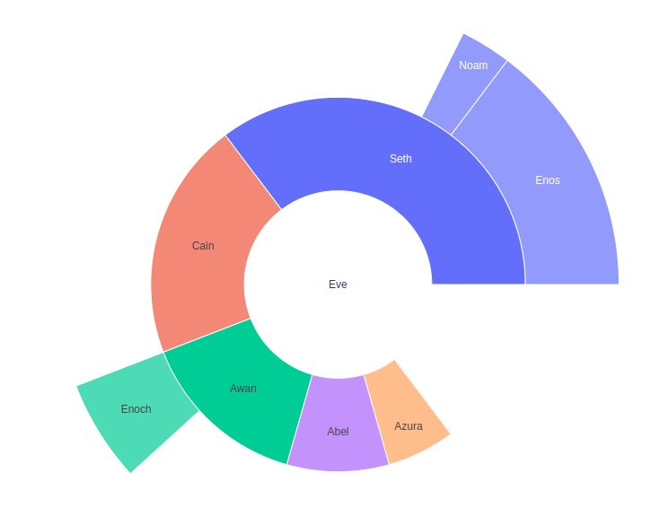
饼状图
对于表示分层数据的多级饼图,您可以使用Sunburst图表。下面给出了一个简单的示例,有关更多信息,请参阅有关 Sunburst 图表的教程。
import plotly.graph_objects as go

fig =go.Figure(go.Sunburst(
    labels=["Eve", "Cain", "Seth", "Enos", "Noam", "Abel", "Awan", "Enoch", "Azura"],
    parents=["", "Eve", "Eve", "Seth", "Seth", "Eve", "Eve", "Awan", "Eve" ],
    values=[10, 14, 12, 10, 2, 6, 6, 4, 4],
))
fig.update_layout(margin = dict(t=0, l=0, r=0, b=0))

fig.show()
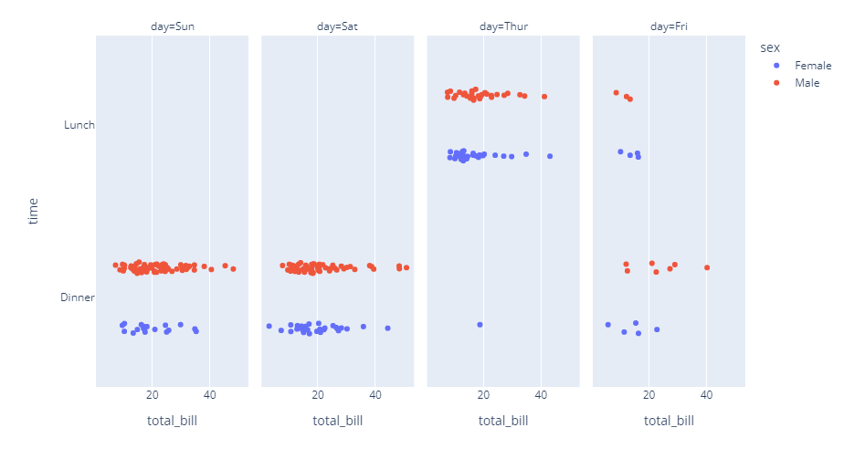
条形图支持刻面和离散颜色:
import plotly.express as px

df = px.data.tips()
fig = px.strip(df, x="total_bill", y="time", color="sex", facet_col="day")
fig.show()
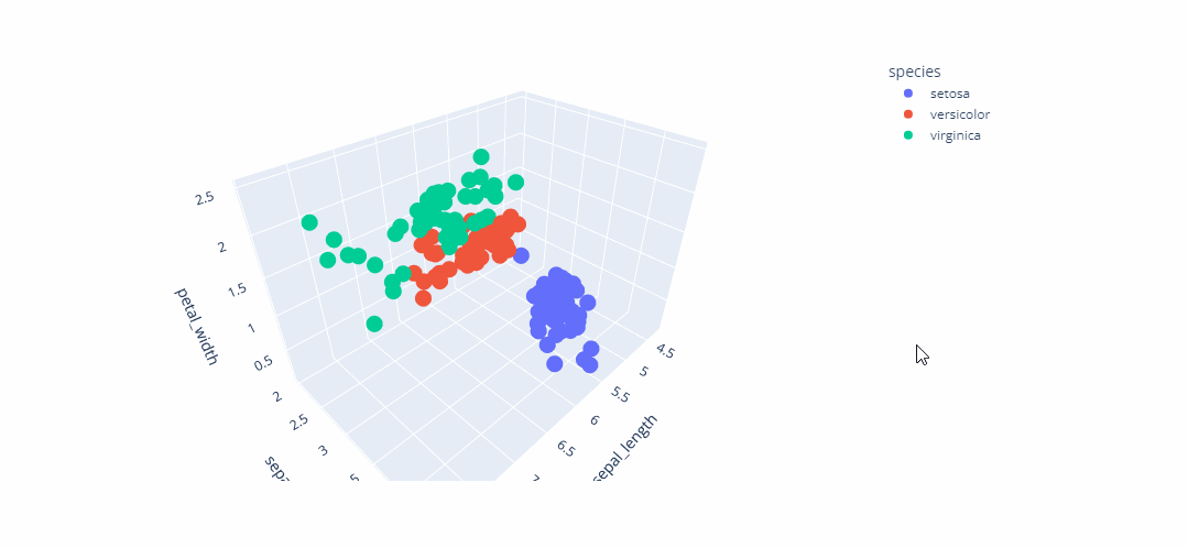
3d
Plotly Express是 Plotly 的易于使用的高级界面,它对各种类型的数据进行操作并生成易于样式化的图形。
与2D 散点图 px.scatter一样,3D 函数px.scatter_3d在三维空间中绘制单个数据。
import plotly.express as px
df = px.data.iris()
fig = px.scatter_3d(df, x='sepal_length', y='sepal_width', z='petal_width',
              color='species')
fig.show()


 1008
1008


 被折叠的 条评论
为什么被折叠?
被折叠的 条评论
为什么被折叠?
 到【灌水乐园】发言


