


响应式布局
根据屏幕的不同尺寸,应用不同的CSS规则。让不同尺寸的设备显示不同的效果。
我们可以通过媒体查询实现响应式布局,CSS3提供了媒体查询,可以判断当前的可视区域的大小。
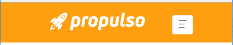
大屏和超大屏幕效果图:即(电脑屏幕尺寸-----大于等于992px)

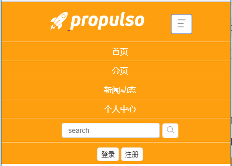
小屏和超小屏幕效果图:(即手机屏幕尺寸----小于768px 和平板屏幕尺寸-----大于等于768px小于992px)
点击按钮后:
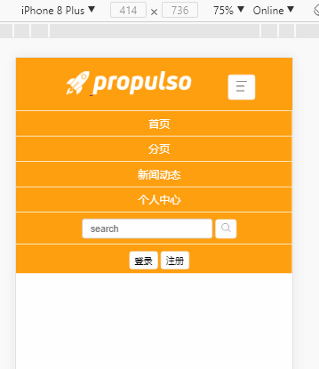
移动端效果图:
HTML代码:
<!DOCTYPE html>
<html lang="en">
<head>
    <meta charset="UTF-8">
    <!-- 如果是在移动端浏览器,需要设置如下元数据 -->
    <meta name="viewport" content="width=device-width, initial-scale=1, minimum-scale=1.0, maximum-scale=1.0, user-scalable=no">
    <title>纯HTML+CSS实现响应式导航条</title>
    <link rel="stylesheet" type="text/css" href="./css/index.css">
    <script type="text/javascript" src="./js/index.js"></script>
</head>
<body>
    <div class="navbar-container">
        <!-- 左边图标和logo -->
        <div class="navbar-left">
            <a href="">
                <img src="./img/logo_rocket.png" class="img1">
            </a>
            <a href="">
                <img src="./img/logo_name.png" class="img2">
            </a>
        </div>
        <!-- 导航菜单-->
        <ul class="navbar-list">
            <li class="navbar-item">
                <a href="">首页</a>
            </li>
            <li class="navbar-item">
                <a href="">分页</a>
            </li>
            <li class="navbar-item">
                <a href="">新闻动态</a>
            </li>
            <li class="navbar-item">
                <a href="">个人中心</a>
            </li>
        </ul>
        <!-- 搜索框 -->
        <div class="navbar-search">
            <input type="text" class="search" placeholder="search">
            <button class="search-btn">
                <img src="./img/search.png">
            </button>
        </div>
        <!-- 登录注册 -->
        <div class="navbar-sign">
            <button>登录</button>
            <button>注册</button>
        </div>
        <!-- 更多按钮 -->
        <!--小屏幕显示 -->
        <div class="navbar-morebox">
            <button class="more-btn">
                <img src="./img/more.png" alt="">
            </button>
        </div>
    </div>
    <!-- 手机或平板屏幕显示 -->
    <ul class="small-list" id="small-list">
        <li class="small-item">
            <a href="">首页</a>
        </li>
        <li class="small-item">
            <a href="">分页</a>
        </li>
        <li class="small-item">
            <a href="">新闻动态</a>
        </li>
        <li class="small-item">
            <a href="">个人中心</a>
        </li>
        <li class="small-item">
            <input type="text" class="search" placeholder="search">
            <button class="search-btn">
                <img src="./img/search.png">
            </button>
        </li>
        <li class="small-item">
            <button class="sign">登录</button>
            <button class="sign">注册</button>
        </li>
    </ul>
</body>
</html>
CSS代码:
 /*大屏或者超大屏显示*/

 @media screen and (min-width: 992px) {
     html,
     body {
         margin: 0px;
         padding: 0px;
     }
     .navbar-container {
         width: 100%;
         background-color: rgba(255, 160, 0, 1);
         padding: 0 20px;
     }
     /*左边图标和logo*/
     .navbar-left {
         display: inline-block;
         text-align: center;
         margin: 20px 0px;
         margin-left: 25px;
     }
     .navbar-left .img1 {
         height: 35px;
     }
     .navbar-left .img2 {
         height: 35px;
     }
     /*导航菜单*/
     .navbar-list {
         display: inline-block;
         list-style-type: none;
         text-align: center;
         margin: 0px;
         padding: 0px;
         position: relative;
         bottom: 10px;
         margin-left: 15px;
     }
     .navbar-list .navbar-item {
         display: inline-block;
         margin: 0 20px;
     }
     .navbar-list .navbar-item a {
         display: inline-block;
         padding: 0px 5px 8px 5px;
         color: #fff;
         text-decoration: none;
     }
     .navbar-list .navbar-item a:hover {
         border-bottom: 3px solid black;
     }
     /*搜索框*/
     .navbar-search {
         display: inline-block;
         position: relative;
         bottom: 10px;
         margin-left: 45px;
     }
     .navbar-search .search {
         padding: 6px 12px;
         font-size: 14px;
         color: #555;
         background-color: #fff;
         background-image: none;
         border: 1px solid #ccc;
         border-radius: 4px;
     }
     .navbar-search .search-btn {
         background-color: #fff;
         padding: 0px;
         border: 1px solid #eee;
         padding: 4px 7px;
         border-radius: 4px;
         position: relative;
         top: 2px;
     }
     .navbar-search .search-btn:hover {
         cursor: pointer;
     }
     /*登录注册*/
     .navbar-sign {
         display: inline-block;
         position: relative;
         bottom: 10px;
         left: 125px;
     }
     .navbar-sign button {
         background-color: #fff;
         padding: 0px;
         border: 1px solid #eee;
         padding: 4px 7px;
         border-radius: 4px;
         position: relative;
         top: 2px;
     }
     .navbar-sign button:hover {
         cursor: pointer;
     }
     /*更多按钮*/
     /*大屏隐藏*/
     .navbar-morebox {
         display: none;
     }
     #small-list {
         display: none;
     }
 }
 /*小屏幕显示  手机屏幕 和平板*/

 @media screen and (max-width:992px) {
     html,
     body {
         margin: 0px;
         padding: 0px;
     }
     .navbar-container {
         width: 100%;
         background-color: rgba(255, 160, 0, 1);
         padding: 0 20px;
         text-align: center;
     }
     /*左边图标和logo*/
     .navbar-left {
         display: inline-block;
         text-align: center;
         margin: 20px 0px;
         margin-right: 50px;
     }
     .navbar-left .img1 {
         height: 35px;
     }
     .navbar-left .img2 {
         height: 35px;
     }
     /*导航菜单*/
     .navbar-list {
         display: none;
     }
     /*搜索框*/
     .navbar-search {
         display: none;
     }
     /*登录注册*/
     .navbar-sign {
         display: none;
     }
     .navbar-morebox {
         display: inline-block;
         margin-right: 20px;
     }
     .more-btn {
         background-color: #fff;
         padding: 0px;
         border: 1px solid #eee;
         padding: 4px 7px;
         border-radius: 4px;
     }
     .more-btn:hover {
         cursor: pointer;
     }
     .more-btn img {
         width: 25px;
         height: 25px;
     }
     .small-list {
         display: none;
         width: 100%;
         background-color: rgba(255, 160, 0, 1);
         margin: 0px;
         padding: 0px;
         position: relative;
         top: 1px;
         list-style-type: none;
         text-align: center;
     }
     .small-list .small-item {
         width: 100%;
         padding: 8px;
         border-bottom: 1px solid #fff;
     }
     .small-list .small-item a {
         color: #fff;
         text-decoration: none;
     }
     .small-list .small-item .search {
         padding: 6px 12px;
         font-size: 14px;
         color: #555;
         background-color: #fff;
         background-image: none;
         border: 1px solid #ccc;
         border-radius: 4px;
     }
     .small-list .small-item .search-btn {
         background-color: #fff;
         padding: 0px;
         border: 1px solid #eee;
         padding: 4px 7px;
         border-radius: 4px;
         position: relative;
         top: 2px;
     }
     .small-list .small-item .sign {
         background-color: #fff;
         padding: 0px;
         border: 1px solid #eee;
         padding: 4px 7px;
         border-radius: 4px;
         position: relative;
         top: 2px;
     }
     .small-list .small-item .sign:hover {
         cursor: pointer;
     }
 }
JS代码:
window.onload = function() {
    var moreBtn = document.querySelector('.more-btn');
    moreBtn.onclick = function() {
        var listBox = document.querySelector('.small-list');
        var val = listBox.style.display;
        console.log(val);
        if (val == 'block') {
            listBox.style.display = 'none';
        } else {
            listBox.style.display = 'block';
        }
    }
}
项目下载地址:
https://github.com/Kawagarbo/Response-navigation-bar


 扫一扫
扫一扫
 7572
7572

 被折叠的 条评论
为什么被折叠?
被折叠的 条评论
为什么被折叠?
 到【灌水乐园】发言


