


 本文详细介绍了Python的Matplotlib库的使用,包括pyplot和pylab模块,展示了如何绘制直线、条形图、直方图、散点图、柱状图、盒状图、小提琴图、对数坐标图、极坐标图和等值线图。还探讨了如何调整颜色、大小、注释,以及如何控制坐标轴显示、添加图例和标题。此外,还介绍了使用matplotlib绘制圆形和椭圆的方法,以及绘图的一些高级技巧,如自定义坐标轴限制和在坐标上添加文字。
Matplotlib.pyplot绘图实例
{使用pyplot模块}
matplotlib绘制直线、条形/矩形区域
import numpy as np
import matplotlib.pyplot as plt
t = np.arange(-1, 2, .01)
s = np.sin(2 * np.pi * t)

plt.plot(t,s)
# draw a thick red hline at y=0 that spans the xrange
l = plt.axhline(linewidth=4, color='r')
plt.axis([-1, 2, -1, 2])
plt.show()
plt.close()

# draw a default hline at y=1 that spans the xrange
plt.plot(t,s)
l = plt.axhline(y=1, color='b')
plt.axis([-1, 2, -1, 2])
plt.show()
plt.close()

# draw a thick blue vline at x=0 that spans the upper quadrant of the yrange
plt.plot(t,s)
l = plt.axvline(x=0, ymin=0, linewidth=4, color='b')
plt.axis([-1, 2, -1, 2])
plt.show()
plt.close()

# draw a default hline at y=.5 that spans the the middle half of the axes
plt.plot(t,s)
l = plt.axhline(y=.5, xmin=0.25, xmax=0.75)
plt.axis([-1, 2, -1, 2])
plt.show()
plt.close()

plt.plot(t,s)
p = plt.axhspan(0.25, 0.75, facecolor='0.5', alpha=0.5)
p = plt.axvspan(1.25, 1.55, facecolor='g', alpha=0.5)
plt.axis([-1, 2, -1, 2])
plt.show()
效果图展示
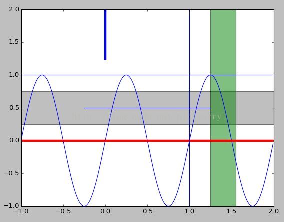
Note: 设置直线对应位置的值显示:plt.text(max_x, 0, str(round(max_x, 2))),也就是直接在指定坐标写文字,不知道有没有其它方法?
另一种绘制直线的方式
plt.hlines(hline, xmin=plt.gca().get_xlim()[0], xmax=plt.gca().get_xlim()[1], linestyles=line_style, colors=color)
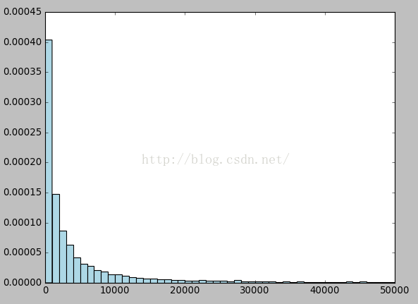
直方图
plt.hist(songs_plays, bins=50,range=(0, 50000), color='lightblue',normed=True)
Note: normed是将y坐标按比例绘图,而不是数目。
hist转换成plot折线图
plt.hist直接绘制数据是hist图
plt.hist(z, bins=500, normed=True)hist图转换成折线图
cnts, bins = np.histogram(z, bins=500, normed=True)
bins = (bins[:-1] + bins[1:]) / 2
plt.plot(bins, cnts)
[ numpy教程 - 统计函数 :histogram]
散点图、梯形图、柱状图、填充图
柱状图bar()
用每根柱子的长度表示值的大小,它们通常用来比较两组或多组值。
bar()的第一个参数为每根柱子左边缘的横坐标;第二个参数为每根柱子的高度;第三个参数指定所有柱子的宽度,当第三个参数为序列时,可以为每根柱子指定宽度。bar()不自动修改颜色。
n = np.array([0,1,2,3,4,5])
x = np.linspace(-0.75, 1., 100)

fig, axes = plt.subplots(1, 4, figsize=(12,3))

axes[0].scatter(x, x + 0.25*np.random.randn(len(x)))

axes[1].step(n, n**2, lw=2)

axes[2].bar(n, n**2, align="center", width=0.5, alpha=0.5)

axes[3].fill_between(x, x**2, x**3, color="green", alpha=0.5);

Note: axes子图设置title: axes.set_title("bar plot")
matplotlib 绘制盒状图(Boxplots)和小提琴图(Violinplots)
盒状图import matplotlib.pyplot as plt
import numpy as np
all_data = [np.random.normal(0, std, 100) for std in range(1, 4)]
fig = plt.figure(figsize=(8,6))
plt.boxplot(all_data,
notch=False, # box instead of notch shape
sym='rs', # red squares for outliers
vert=True) # vertical box aligmnent
plt.xticks([y+1 for y in range(len(all_data))], ['x1', 'x2', 'x3'])
plt.xlabel('measurement x')
t = plt.title('Box plot')
plt.show()
小提琴图
showmeans=False,
showmedians=True
)

[matplotlib 绘制盒状图(Boxplots)和小提琴图(Violinplots)]
散列图scatter()
使用plot()绘图时,如果指定样式参数为仅绘制数据点,那么所绘制的就是一幅散列图。但是这种方法所绘制的点无法单独指定颜色和大小。scatter()所绘制的散列图却可以指定每个点的颜色和大小。
scatter()的前两个参数是数组,分别指定每个点的X轴和Y轴的坐标。
s参数指定点的大 小,值和点的面积成正比。它可以是一个数,指定所有点的大小;也可以是数组,分别对每个点指定大小。
c参数指定每个点的颜色,可以是数值或数组。这里使用一维数组为每个点指定了一个数值。通过颜色映射表,每个数值都会与一个颜色相对应。默认的颜色映射表中蓝色与最小值对应,红色与最大值对应。当c参数是形状为(N,3)或(N,4)的二维数组时,则直接表示每个点的RGB颜色。
marker参数设置点的形状,可以是个表示形状的字符串,也可以是表示多边形的两个元素的元组,第一个元素表示多边形的边数,第二个元素表示多边形的样式,取值范围为0、1、2、3。0表示多边形,1表示星形,2表示放射形,3表示忽略边数而显示为圆形。
alpha参数设置点的透明度。
lw参数设置线宽,lw是line width的缩写。
facecolors参数为“none”时,表示散列点没有填充色。
散点图(改变颜色,大小)
import numpy as np import matplotlib.pyplot as plt
N = 50
x = np.random.rand(N)
y = np.random.rand(N)
area = np.pi * (15 * np.random.rand(N))**2 # 0 to 15 point radiuses
color = 2 * np.pi * np.random.rand(N)
plt.scatter(x, y, s=area, c=color, alpha=0.5, cmap=plt.cm.hsv)
plt.show()

matplotlib绘制散点图给点加上注释
plt.scatter(data_arr[:, 0], data_arr[:, 1], c=class_labels)
for i, class_label in enumerate(class_labels):
    plt.annotate(class_label, (data_arr[:, 0][i], data_arr[:, 1][i]))
[
matplotlib scatter plot with different text at each data point
]
 最低0.47元/天 解锁文章


 1万+
1万+

 被折叠的 条评论
为什么被折叠?
被折叠的 条评论
为什么被折叠?
 到【灌水乐园】发言


