


问题描述
- 左右设置固定宽度, 中间通过 flex-grow 自适配填充剩余空间
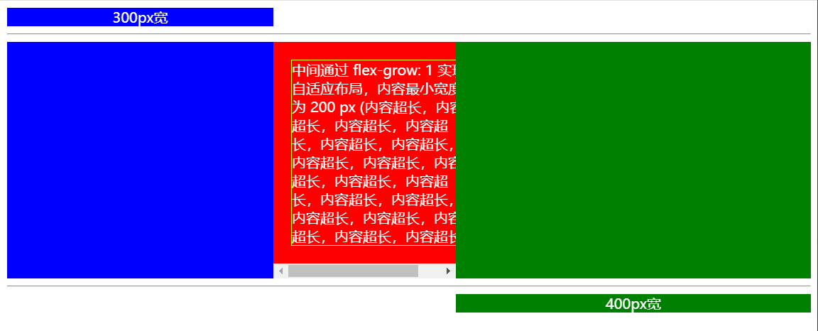
- 当中间内容超长时,会挤压两侧的空间
两侧被挤压的效果
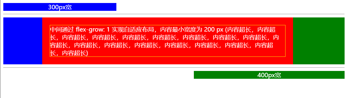
期待的正常效果
问题解析
浏览器默认为flex容器的子元素设置了 “min-width: auto;min-height: auto”,引发flex容器的子元素能被内容撑大
解决方案
将 flex容器的子元素的宽度设置为 0
width: 0px;
完整范例代码

技术要点:
- 整行 flex 布局
- 左右指定固定宽度
- 中间容器使用
flex-grow: 1;自适应布局 - 中间容器设置
width: 0px;将宽度完全交给 flex 分配 - 中间内容设置最小宽度
min-width: 200px;和自动换行word-wrap: break-word; - 中间容器设置
overflow-x: auto;以便在中间容器较小时,显示横向滚动条,方便滚动看内容
<template>
  <div class="page">
    <div class="left">300px宽</div>
    <hr />
    <div class="container">
      <div class="left"></div>
      <div class="middle">
        <div class="content">
          中间通过 flex-grow: 1 实现自适应布局,内容最小宽度为 200 px
          (内容超长,内容超长,内容超长,内容超长,内容超长,内容超长,内容超长,内容超长,内容超长,内容超长,内容超长,内容超长,内容超长,内容超长,内容超长,内容超长,内容超长,内容超长)
        </div>
      </div>
      <div class="right"></div>
    </div>
    <hr />
    <div class="rightExample">
      <div class="right">400px宽</div>
    </div>
  </div>
</template>

<style scoped>
.content {
  min-width: 200px;
  word-wrap: break-word;
  border: 1px solid yellow;
  margin: 20px;
}
.page {
  color: white;
}
.container {
  display: flex;
  background-color: gray;
}
.left {
  width: 300px;
  background-color: blue;
  text-align: center;
}

.middle {
  overflow-x: auto;
  flex-grow: 1;
  width: 0px;
  background-color: red;
}

.right {
  width: 400px;
  background-color: green;
  text-align: center;
}

.rightExample {
  display: flex;
  justify-content: end;
}
</style>


 849
849

 被折叠的 条评论
为什么被折叠?
被折叠的 条评论
为什么被折叠?
 到【灌水乐园】发言


