


今天自己写了个小demo,实现我们平常最常见的UI界面效果,如下图:
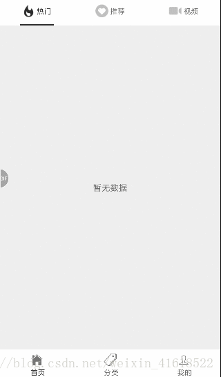
比较常见的是使用 react-navigation 库去实现,但是这里我用的scrollable-tab-view嵌套实现的效果,这里顶部的图标我使用的本地图标,底部图标用的是iconfont库中的图标。
这里我们创建好项目之后,接下来我们一步步来实现它。
第一步:引入相关库
iconfont 图标库 :react-native-vector-icons
自动链接iconfont库:react-native link react-native-vector-icons
滑动切换控件:react-native-scrollable-tab-view
类型检测库:prop-types
第二步:实现外层的底部tab栏
先准备好三个界面文件,我这里分别是Home.js 、Classfy.js、Person.js三个js文件,将其导入在APP.js中,再在APP.js中设置默认的底部tab
这里的图标使用的是在线iconfont库中的,如果想要查看图标的字符串对应表,可以在node_modules->glyphmaps->Ionicons.json文件查看,也可以在iconfont中用自定义图标,可参考这位前辈写的https://blog.csdn.net/f409031mn/article/details/79522129
constructor(props) {
  super(props);
  this.state = {
    tabLabels: ['首页', '分类', '我的'],
    normalIcons: ['ios-home-outline', 'ios-pricetags-outline', 'ios-person-outline'],
    selectIcons: ['ios-home', 'ios-pricetags','ios-person'],
  }
}
render() {
    return (
      <ScrollableTabView
        tabBarPosition='bottom'
        initialPage={0} //默认为第一页
        locked={true} //表示手指是否能拖动视图,默认为false(表示可以拖动)。设为true的话,我们只能点击Tab来切换视图。
        renderTabBar={() =>   <BottomTabBar
          tabNames={this.state.tabLabels}
          tabIconNames={this.state.normalIcons}
          selectedTabIconNames={this.state.selectIcons}/>} // 可使用自定义控件 也可以使用默认的ScrollableTabView
        tabBarBackgroundColor='#fff'
        tabBarActiveTextColor='#2c2c2c'
        tabBarInactiveTextColor='#666'
      >
        <View style={styles.container}><HomePage/></View>
        <View style={styles.container}><ClassfyPage/></View>
        <View style={styles.container}><PersonPage/></View>
      </ScrollableTabView>

    );
  }
}
此处的BottomTabBar是自己定义的组件,如下:
export default class BottomTabBar extends Component {

  static propType = {
    goToPage: PropTypes.func,
    activeTab: PropTypes.number,
    tabs: PropTypes.array,
    tabNames: PropTypes.array,
    tabIconNames: PropTypes.array,
    selectedTabIconNames: PropTypes.array
  };


  render() {
    return (
      <View style={styles.tabs}>
        {this.props.tabs.map((tab, i) => {
          let color = this.props.activeTab === i ? '#2c2c2c' : '#666';
          let bottomLinecolor = this.props.activeTab === i ? '#2c2c2c' : '#fff';
          let icon = this.props.activeTab == i ? this.props.selectedTabIconNames[i] : this.props.tabIconNames[i];
          return (
            <TouchableOpacity
              key={i}
              activeOpacity={0.8}
              style={styles.tabItem}
              onPress={() => this.props.goToPage(i)}>
                <View style={styles.tabItem}>
                  <Icon
                    size = {scaleSize(50)}
                    name={icon}
                    style={{marginTop:5}}/>
                  <Text style={{color: color, fontSize: 12, marginLeft: 3}}>
                    {this.props.tabNames[i]}
                  </Text>
                </View>
            </TouchableOpacity>
          )
        })}
      </View>
    );
  }
}

const styles = StyleSheet.create({
  container: {
    flex: 1,
    backgroundColor: '#ffffff',
    marginTop: 20
  },
  tabs: {
    flexDirection: 'row',
    height: 45,
    backgroundColor: '#ffffff',
  },
  tabItem: {
    flex: 1,
    alignItems: 'center',
    flexDirection:'column',
    justifyContent:'space-between'
  },
});
到现在第一个外层界面已经出来了。
第三步:实现子页面
这里的图标使用本地图标,自己可以新建一个文件夹,将图片进行导入
// 正常展示的顶部图标
import hotNormalIcon from '../imgs/icon_hot_normal.png'
import recommendNormalIcon from '../imgs/icon_recommend_normal.png'
import videoNormalIcon from '../imgs/icon_video_normal.png'


// 选中的顶部图标
import hotSeclectIcon from '../imgs/icon_hot_select.png'
import recommendSeclectIcon from '../imgs/icon_recommend_select.png'
import videoSeclectIcon from '../imgs/icon_video_select.png'

export default class Home extends Component {
  constructor(props) {
    super(props);
    this.state = {
      tabLabels: ['热门', '推荐', '视频'],
      normalIcons: [hotNormalIcon,recommendNormalIcon,videoNormalIcon],
      selectIcons: [hotSeclectIcon,recommendSeclectIcon,videoSeclectIcon],
    }
  }

  render() {
    return (
      <ScrollableTabView
        initialPage={0} //默认为第一页
        locked={false} //表示手指是否能拖动视图,默认为false(表示可以拖动)。设为true的话,我们只能点击Tab来切换视图。
        renderTabBar={() =>
          <TopScrollTabItem
            tabNames={this.state.tabLabels}
            tabIconNames={this.state.normalIcons}
            selectedTabIconNames={this.state.selectIcons}/>} // 可使用自定义控件 也可以使用默认的ScrollableTabView
        tabBarBackgroundColor='#fff'
        tabBarActiveTextColor='#2c2c2c'
        tabBarInactiveTextColor='#666'
        tabBarUnderlineStyle={styles.tabBarUnderline}
      >
        <View style={styles.container}><Text>暂无数据</Text></View>
        <View style={styles.container}><Text>暂无数据</Text></View>
        <View style={styles.container}><Text>暂无数据</Text></View>
      </ScrollableTabView>

    );
  }
}

const styles = StyleSheet.create({
  container: {
    flex: 1,
    justifyContent: 'center',
    alignItems: 'center',
    backgroundColor: '#eeeeee',
  },
  tabBarUnderline: {
    height: 2,
    backgroundColor: '#2c2c2c',
  },
});
上面的这个TopScrollTabItem组件和BottomTabBar组件类似,用的是本地的图标。
就样已经完成了。
代码已经放到github上去了,有兴趣的可以下载,地址:https://github.com/min476/scrollable-tab-view-demo


 扫一扫
扫一扫
 535
535

 被折叠的 条评论
为什么被折叠?
被折叠的 条评论
为什么被折叠?
 到【灌水乐园】发言


