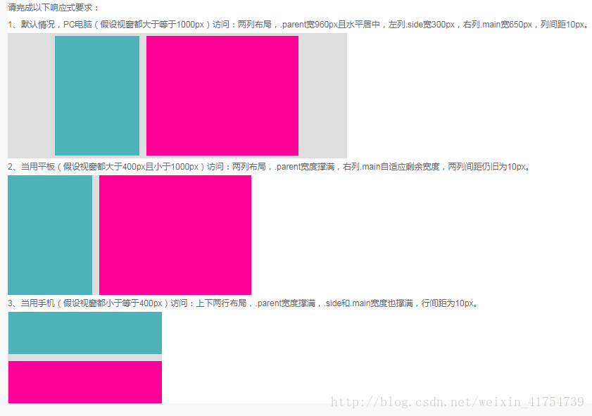
页面相应式要求如下:
代码:
<!DOCTYPE html>
<html lang="en">
<head>
    <meta charset="UTF-8">
    <title>响应式布局练习</title>
    <style>
        /*基本样式*/
        body {
            margin: 0;
            padding: 0;
            background-color: #ddd;
        }
        .side {
            height: 300px;
            background-color: #4eb3b9;
        }
        .main {
            height: 300px;
            background-color: #ff0097;
        }
        /*device-width: >= 1000px*/
         @media screen and (min-width: 1000px) {
            .parent {
                width: 960px;
                margin: 0 auto;
            }
            .side {
                width: 300px;
                height: 300px;
                background-color: #4eb3b9;
                float: left;
            }
            .main {
                width: 650px;
                height: 300px;
                margin-left: 10px;
                background-color: #ff0097;
                float: left;
            }
         }
        /*device-width:400px-1000px*/
        @media screen and (min-width: 400px) and (max-width: 1000px) {
            .parent {
                display: flex;
            }
            .side {
                width: 300px;
            }
            .main {
                flex: 1;
                margin-left: 10px;
            }
        }
        /*device-width: <= 400px*/
        @media screen and (max-width: 400px) {
            .parent {
                display: flex;
                flex-flow: column wrap;
            }
            .side {
                flex: 1;
                margin-bottom: 10px;
            }
            .main {
                flex: 1;
            }
        }
    </style>
</head>
<body>
    <div class="parent">
        <div class="side"></div>
        <div class="main"></div>
    </div>
</body>
</html>


 555
555


 被折叠的 条评论
为什么被折叠?
被折叠的 条评论
为什么被折叠?
 到【灌水乐园】发言


